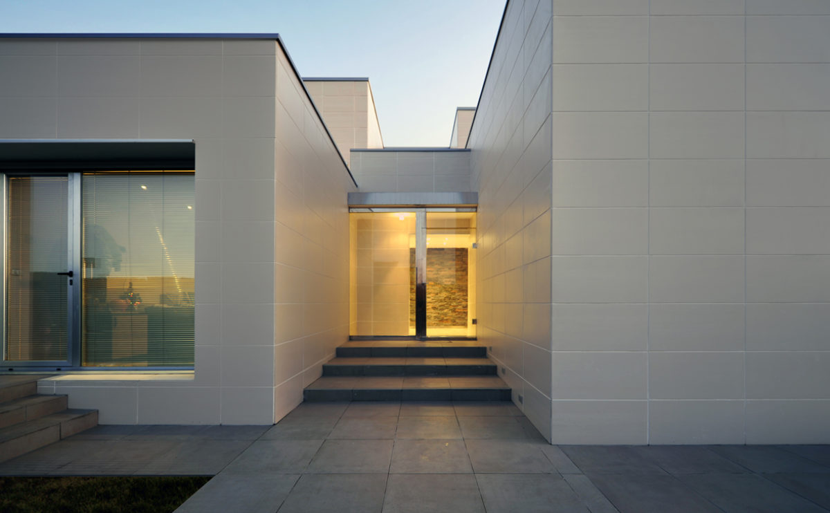
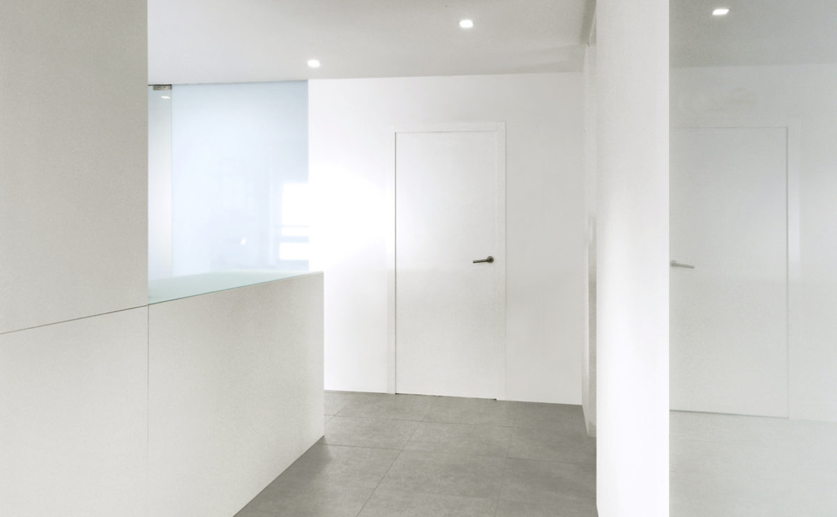
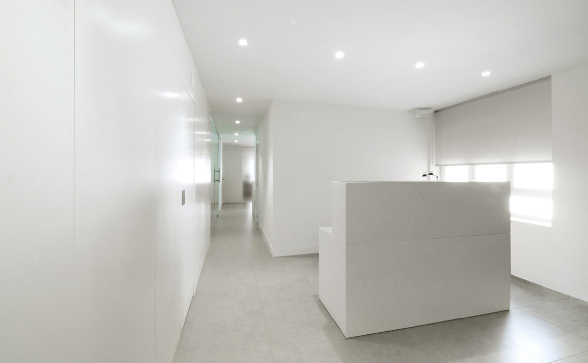
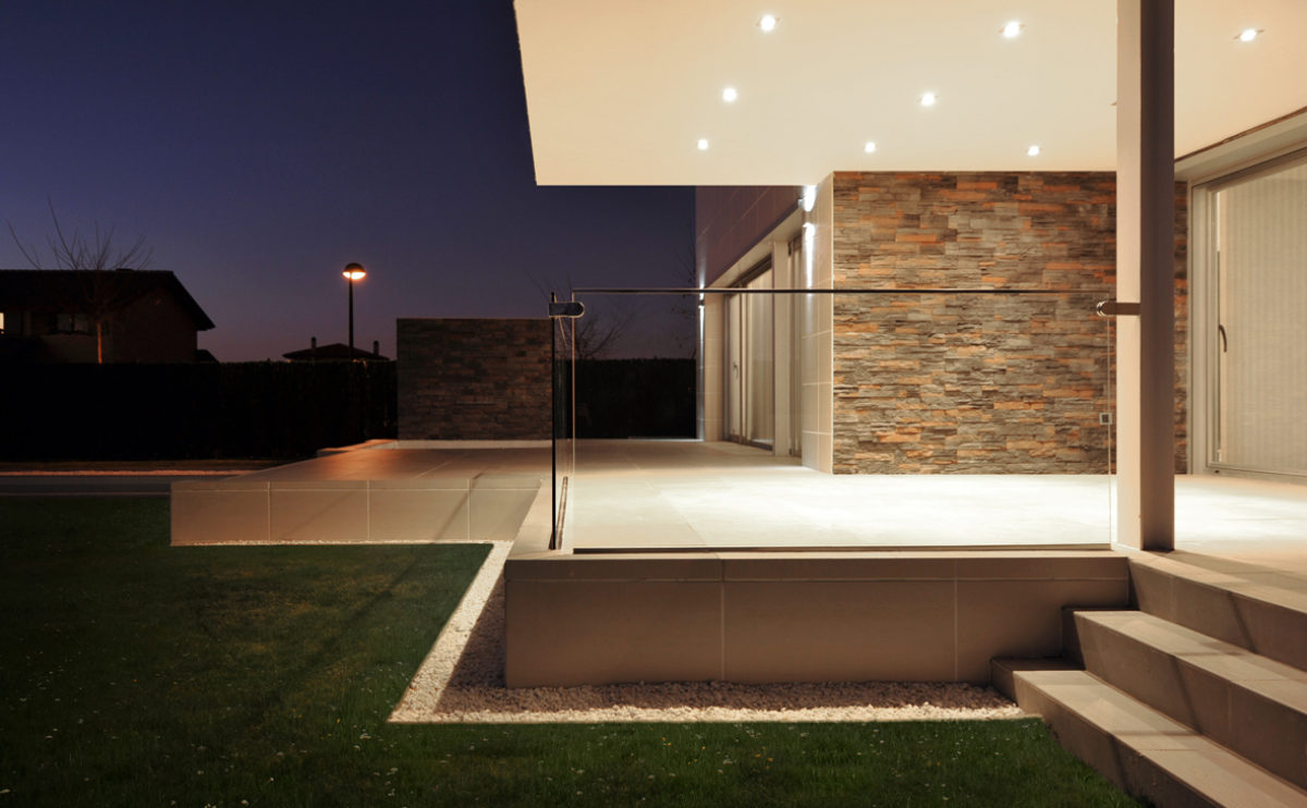
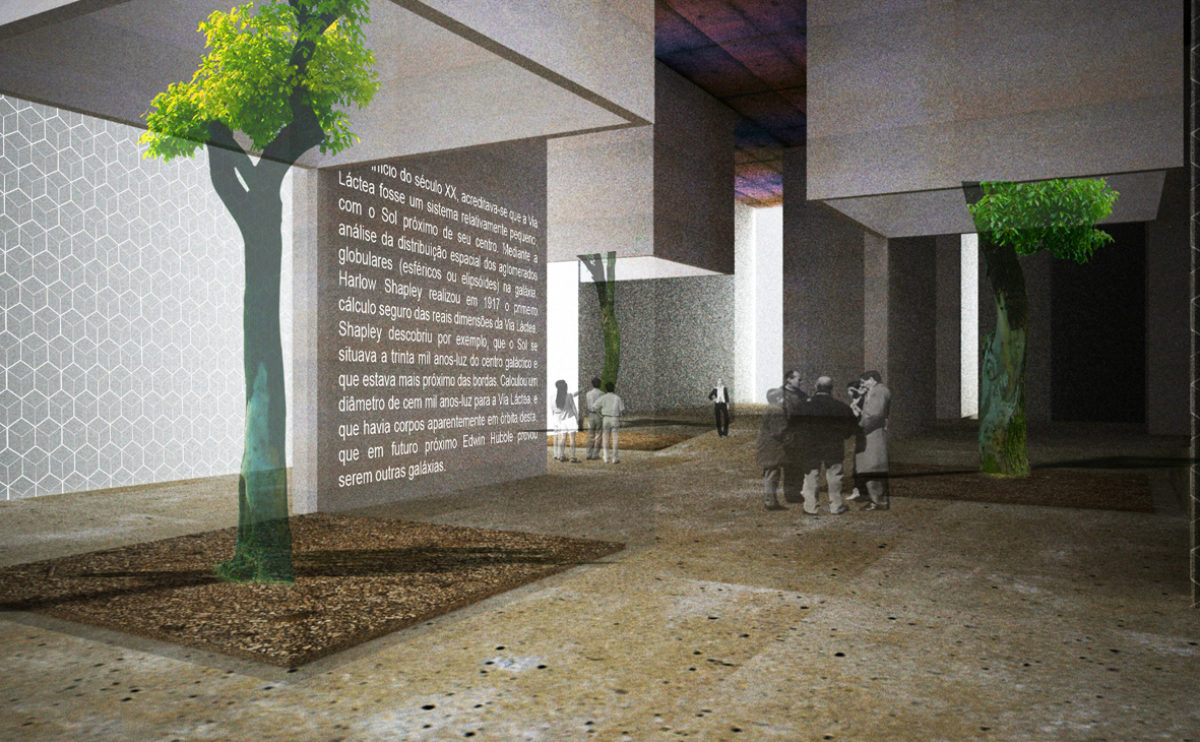
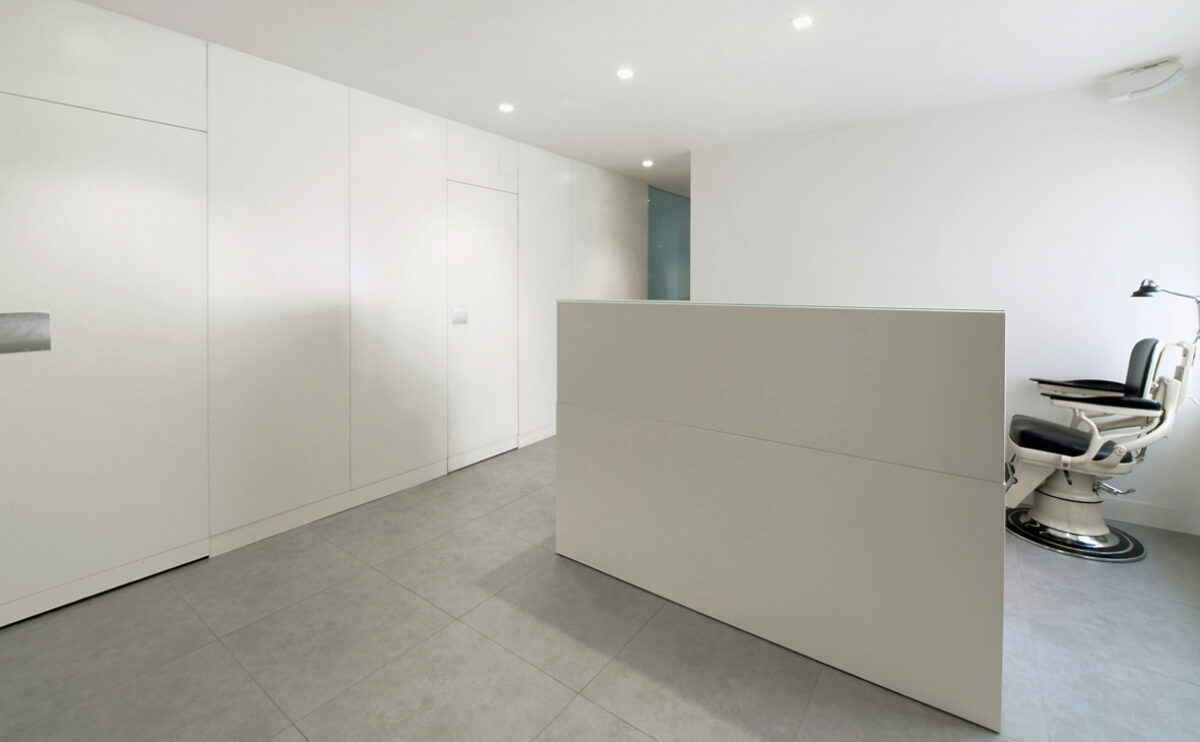
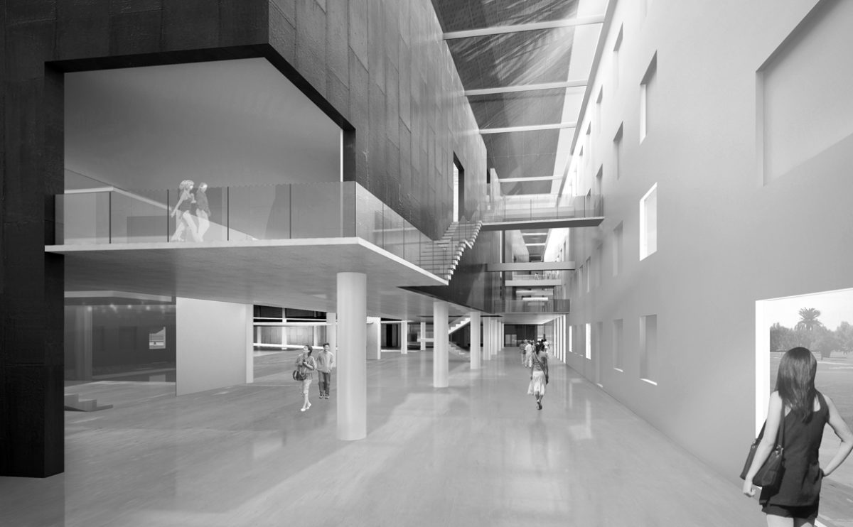
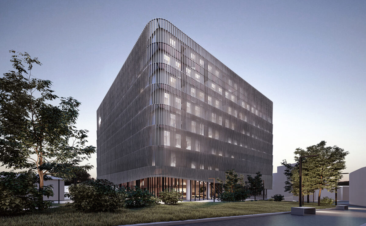
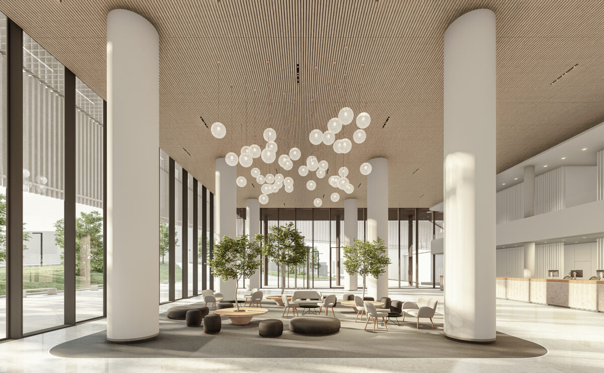
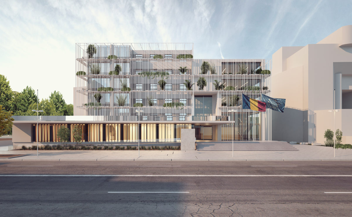
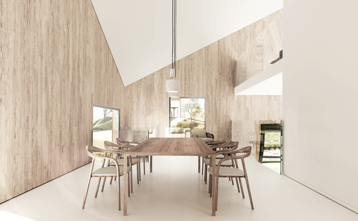
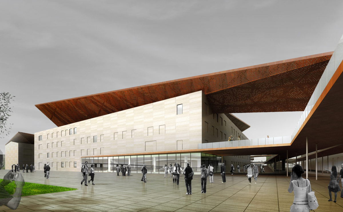
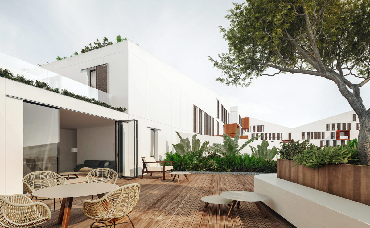
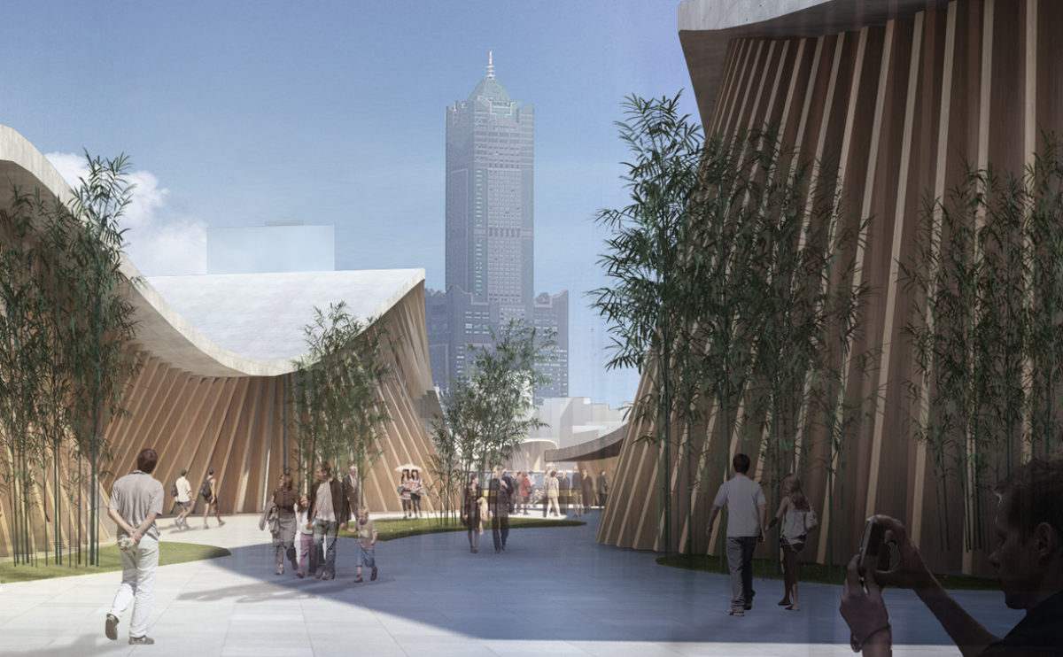
An eye-level view, in the context of architectural photography and visualizations, is a perspective that shows a building or area as it would be seen from the vantage point of a person standing on the ground and looking straight ahead.
This type of view is often used to give the viewer a sense of what it would be like to experience the building or area in person, and can be particularly effective for showing the scale and proportions of the building or area.
Eye-level views can be created using a variety of techniques, including photography, CGI, or sketches. They are often used in conjunction with other types of views, such as bird’s-eye views or detailed views, to provide a complete understanding of the building or area.
cuña house
the view from the top floor
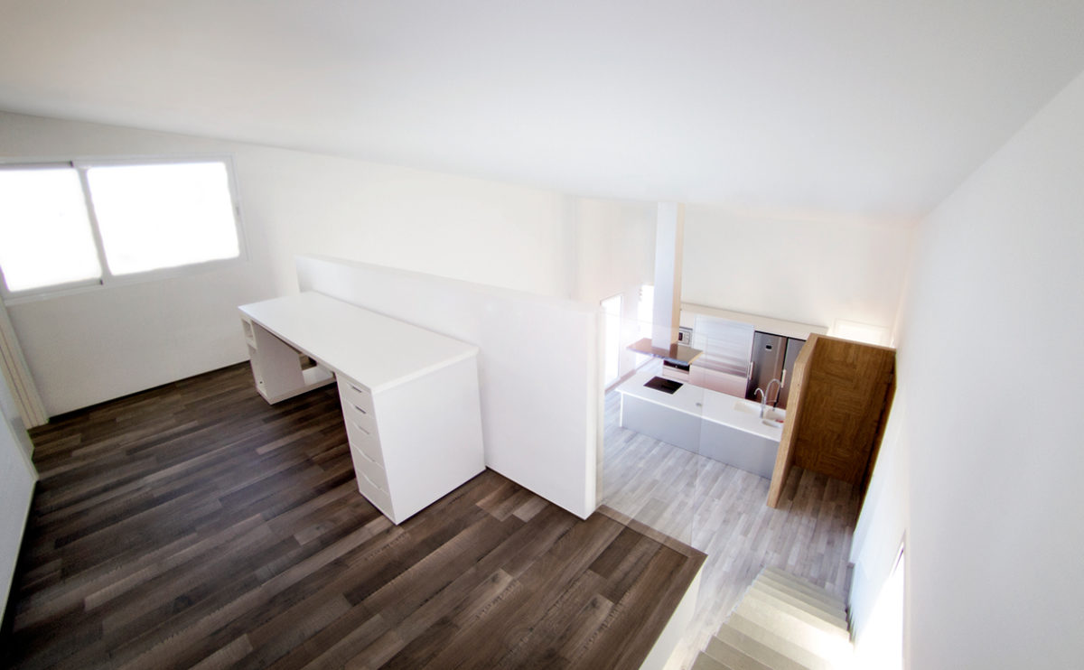
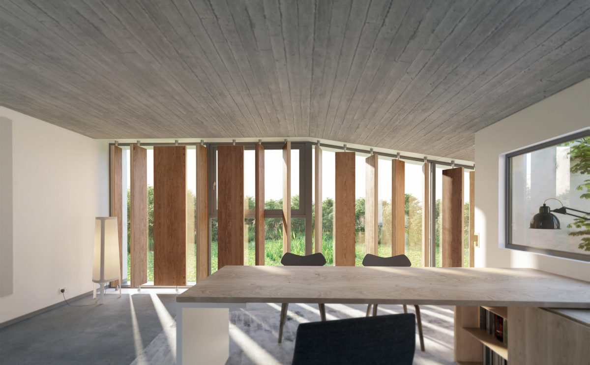
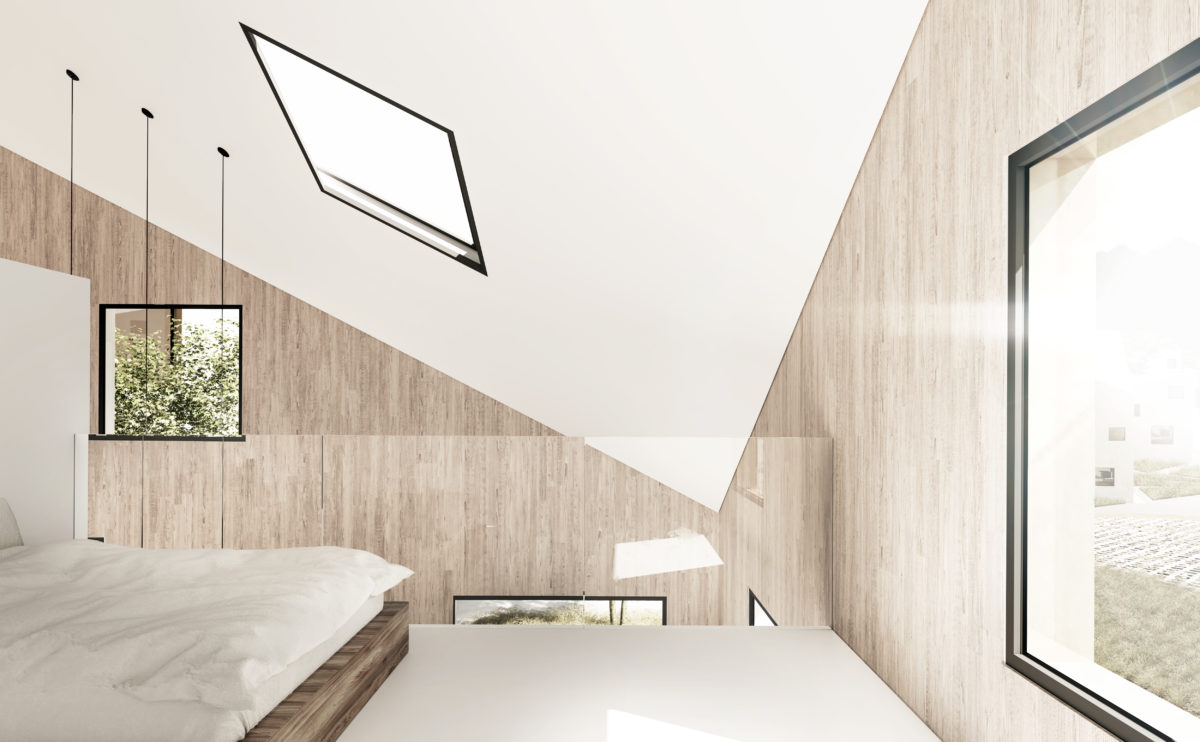
From the first floor of the Cuña house, you can see the living room through an interior balcony. This space serves as a work area and lobby before entering the master bedroom.
market eight
the view from the courtyard
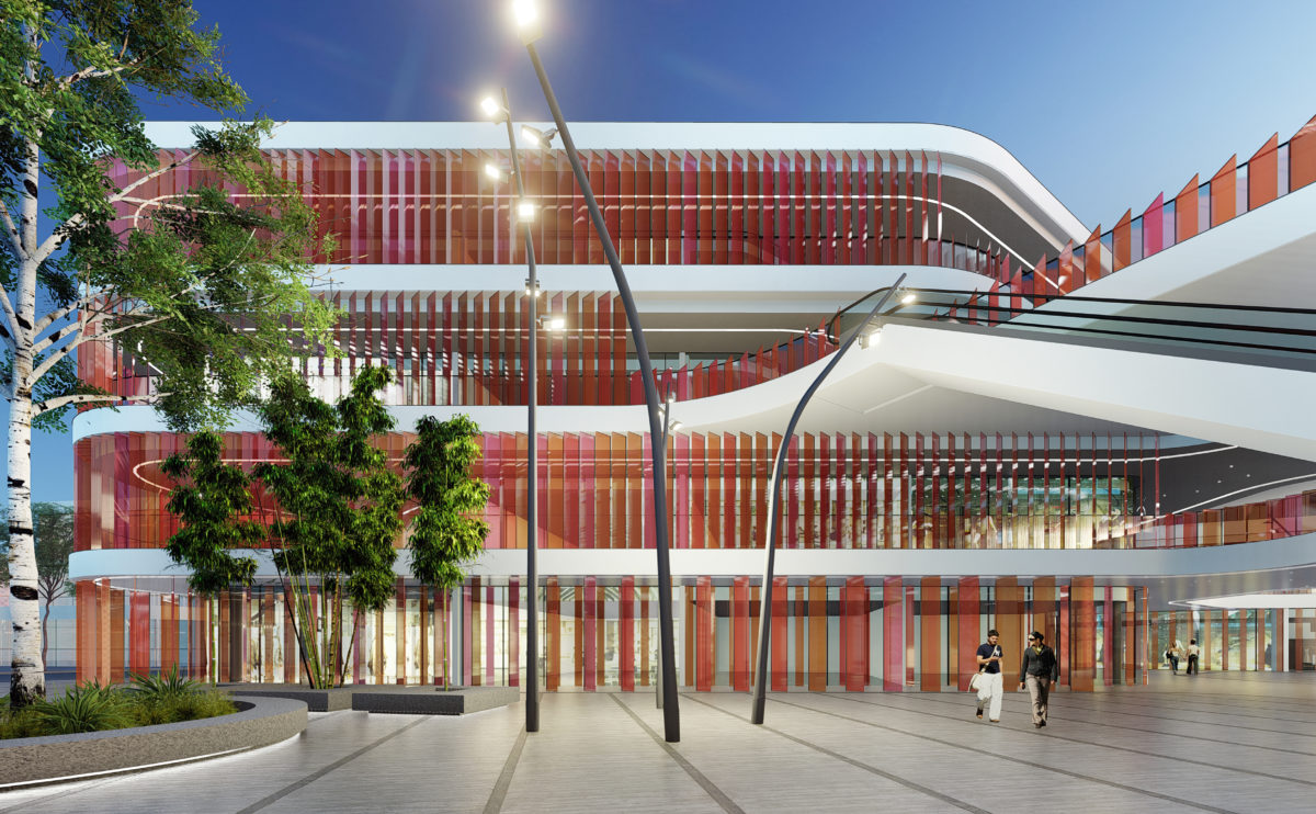
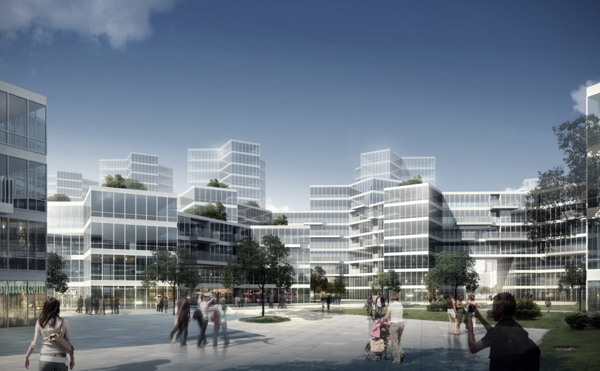
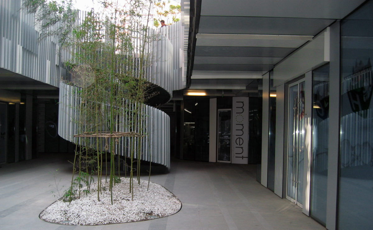
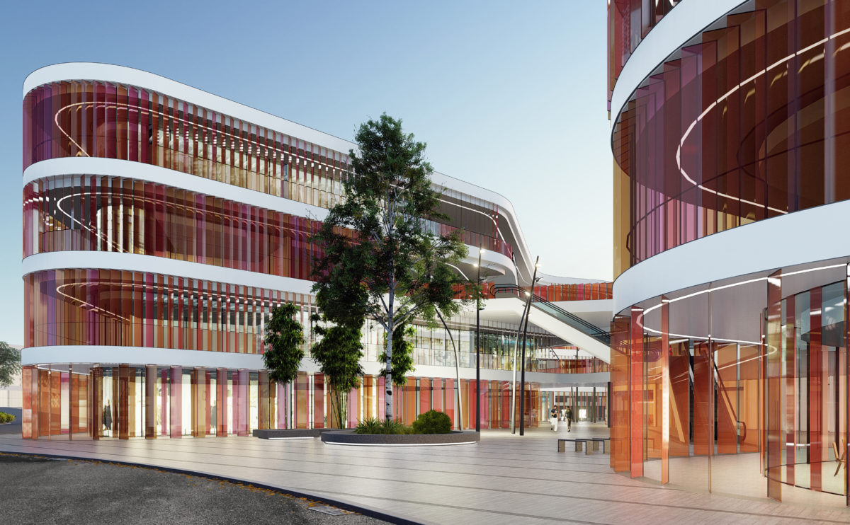
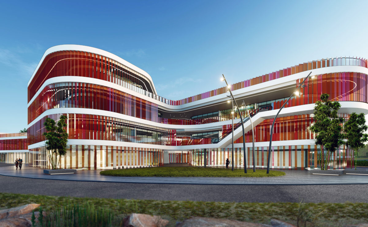
The main entrance to the shopping centre is located in one of the larger courtyards. This public space serves as a plaza for events and visually articulates the different levels of the building.
Allison house
the back garden
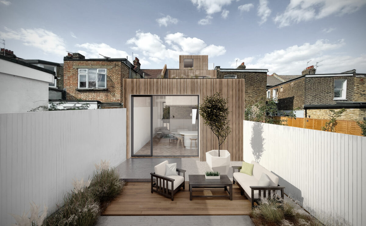
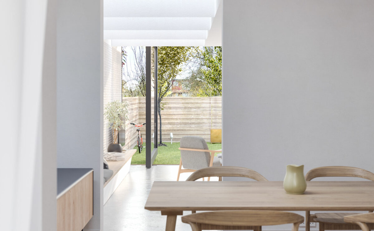
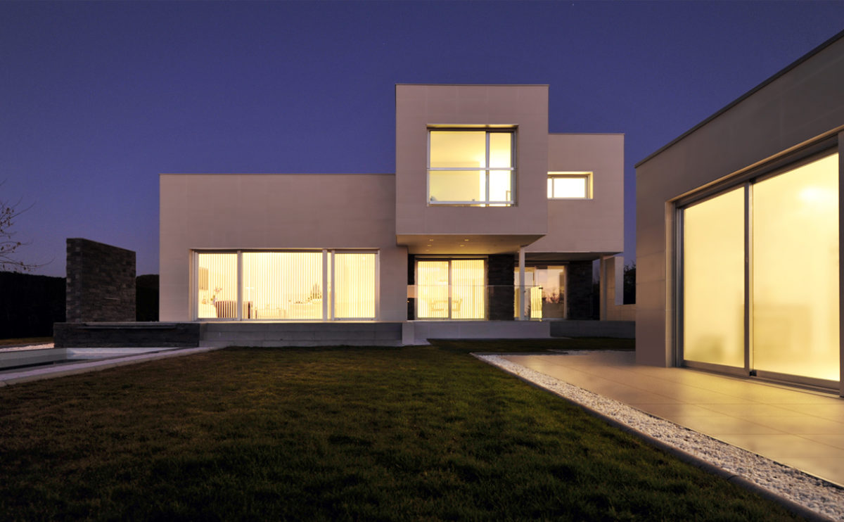
The rear elevation of the house is designed with restrained and contemporary language. The sophisticated façade of wooden slats blends with the traditional brick walls. The simple, functional landscaping of the back garden together with the white wooden fences bring even light into the interior.
Pedraza house
the lounge area
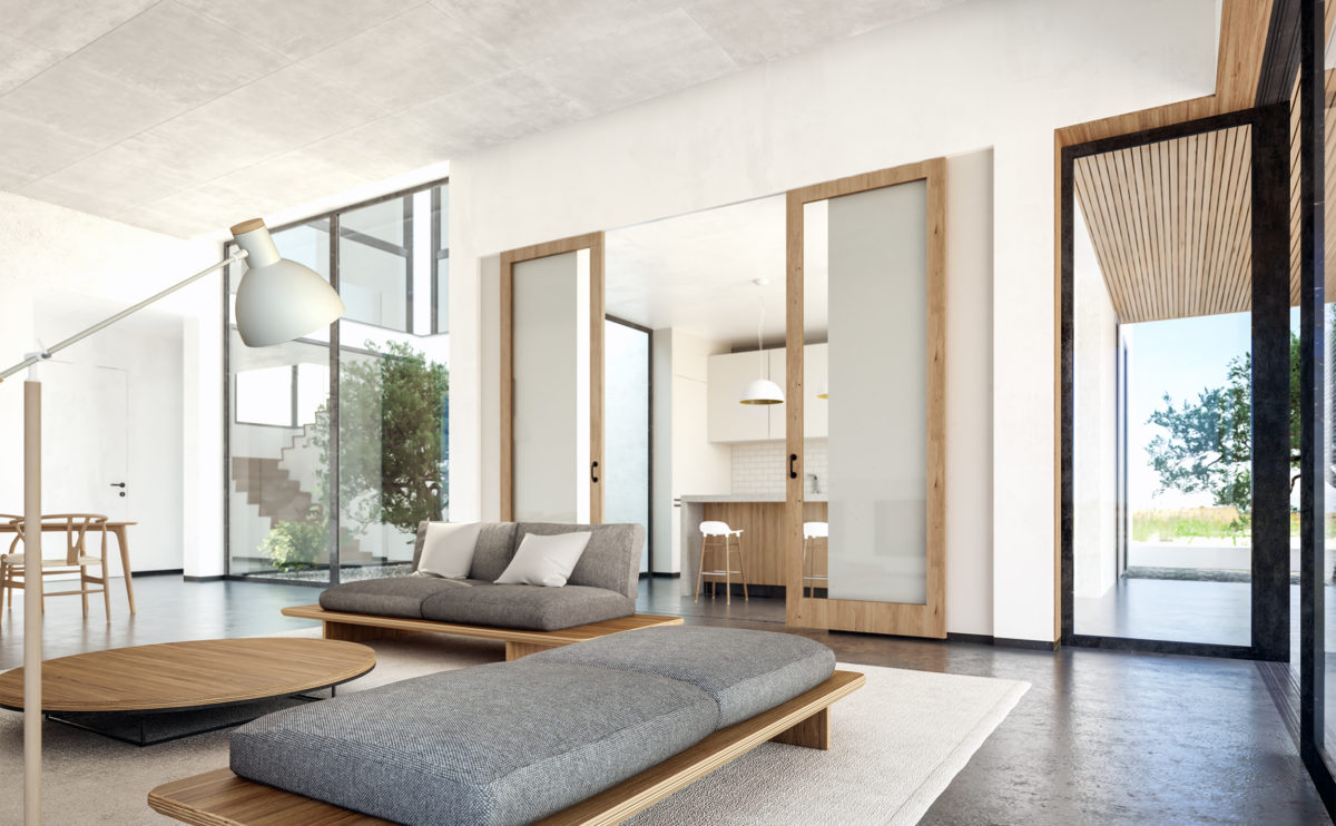
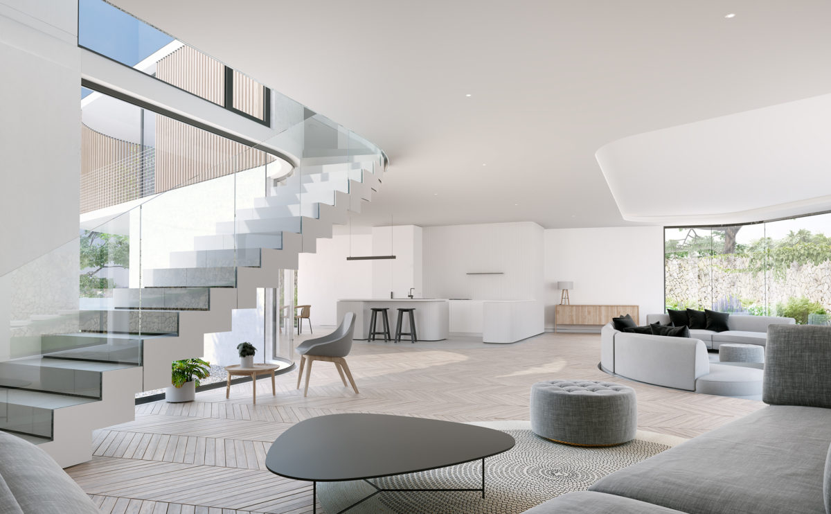
The living room is the heart of the house. The double-height space vertebrates the areas of daily use and connects it with the outdoor landscape. The kitchen is separated by recessed sliding glass doors that open up space, so the living is linked to the bar located there.
K house
the main facade
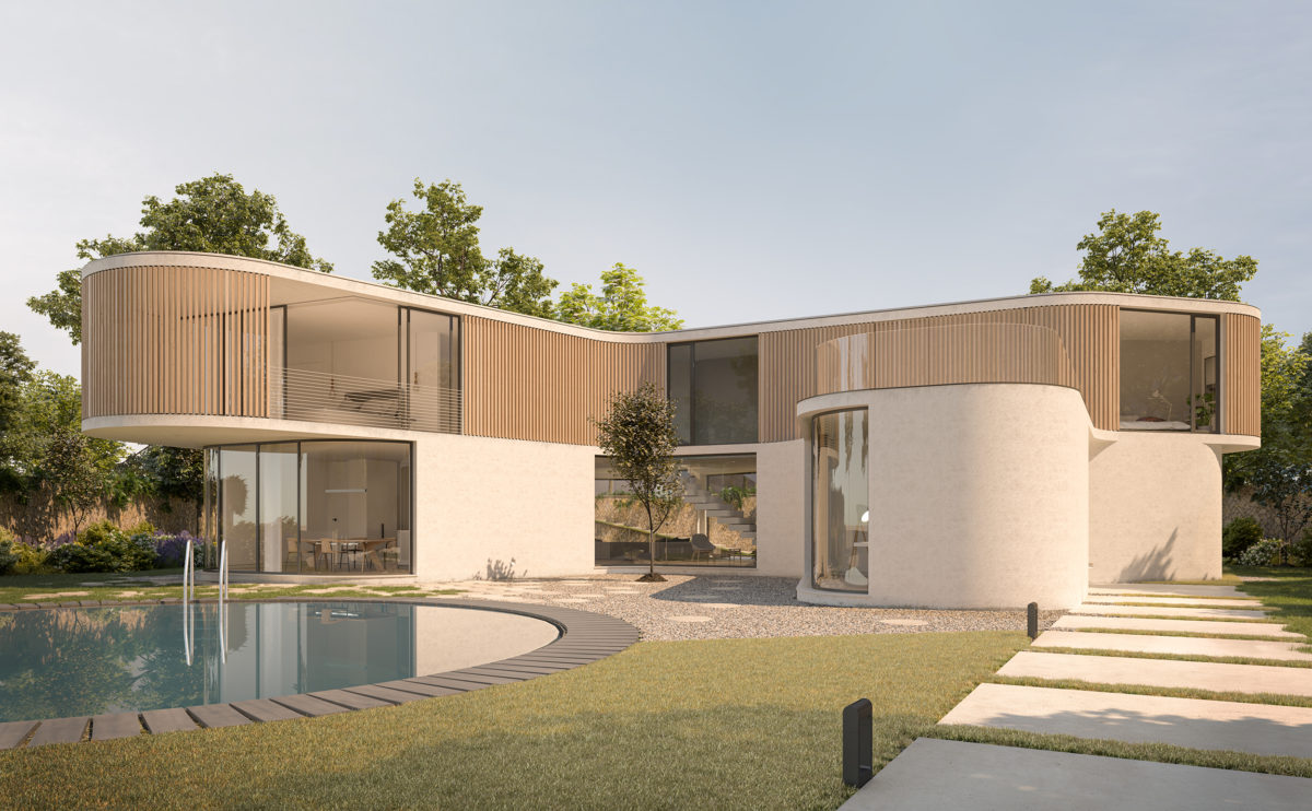
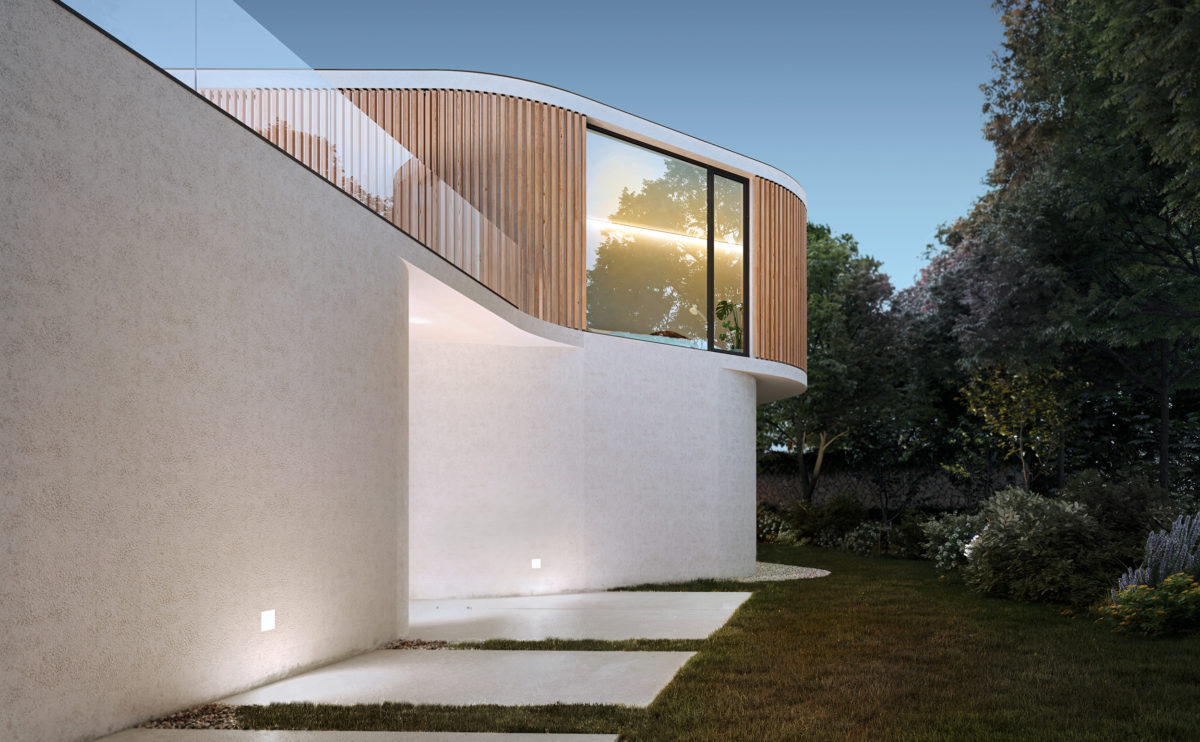
The white concrete slab path leads to the intermediate level of the plot where the house is located. From this point, the elegant silhouette of the building can be observed, a symbolic form that invites to be explored in harmony with nature.
folded auditorium
the cafeteria
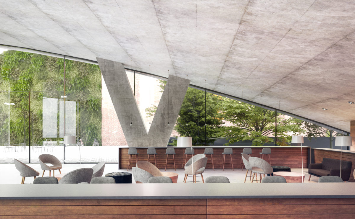
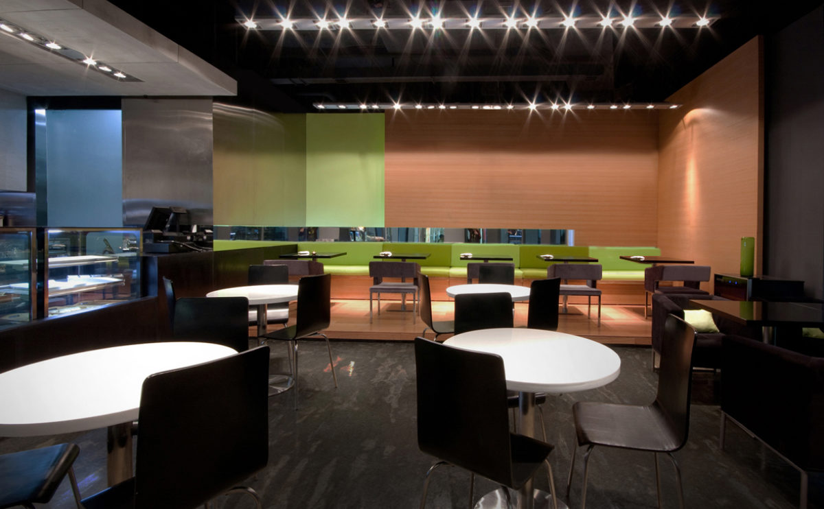
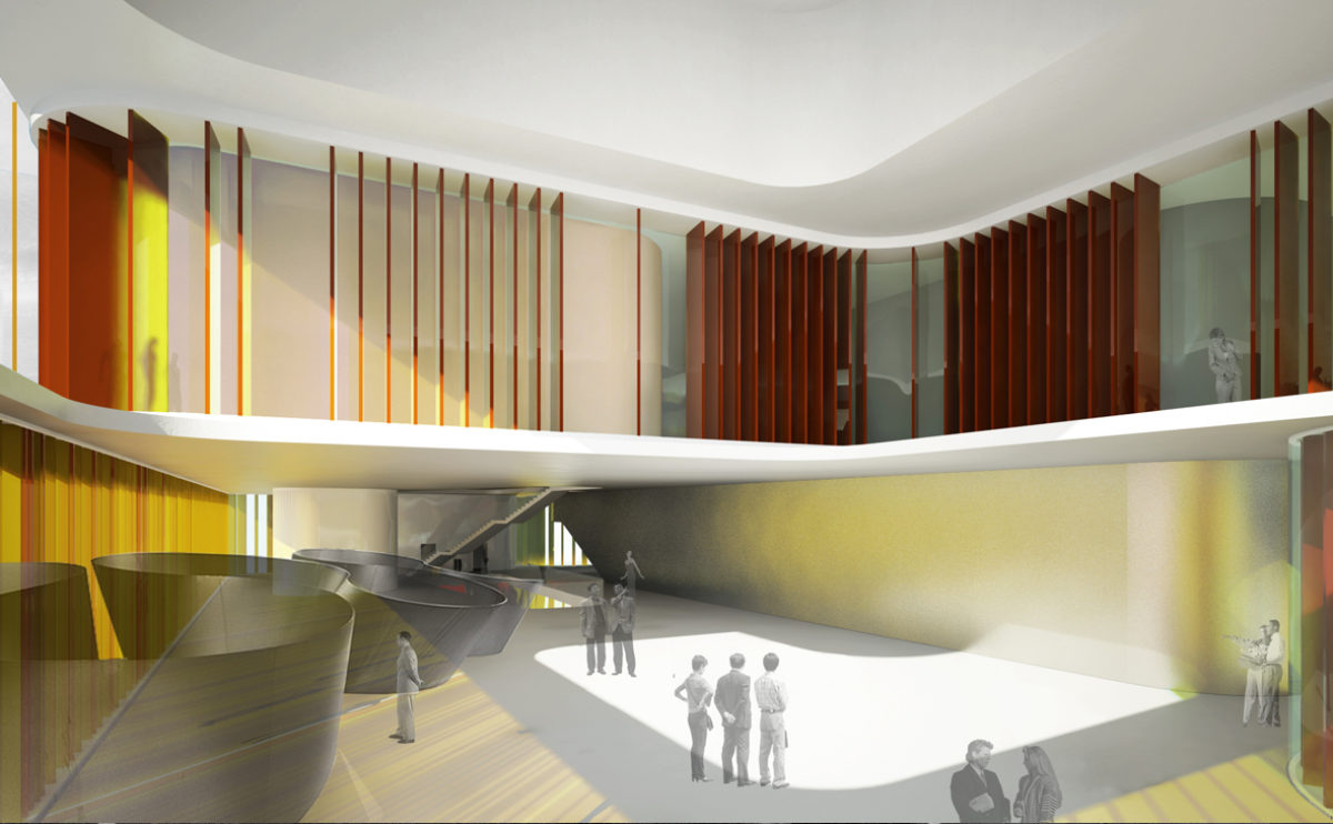
The cafeteria is located under the auditorium stands, as can be seen in the curved reinforced concrete ceiling. This open-plan space is fragmented by a combination of fixed wooden counters and an arrangement of informal loose furniture so the space works also as a waiting room.
Zain tower
the laminated glass wire mesh
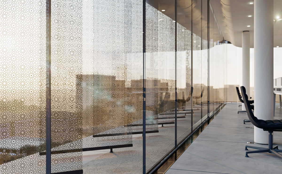
From inside the offices, the arabesque motifs of the louvres can be seen. The brass metal mesh is compressed into the glass when this is in a semi-molten state. It becomes a decorative and strengthening component of the glass fins.
Ivy foundation
the workshop area
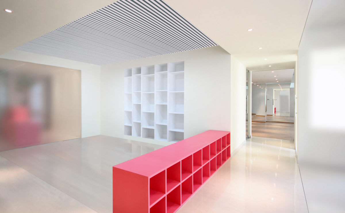
In the central part of the premises is the workshop area, which has a low unit of pink lacquered wood and a shelving unit built into the wall.
Pedraza house
the staircase
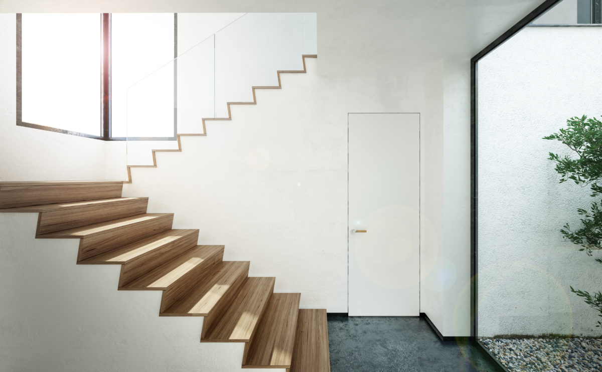
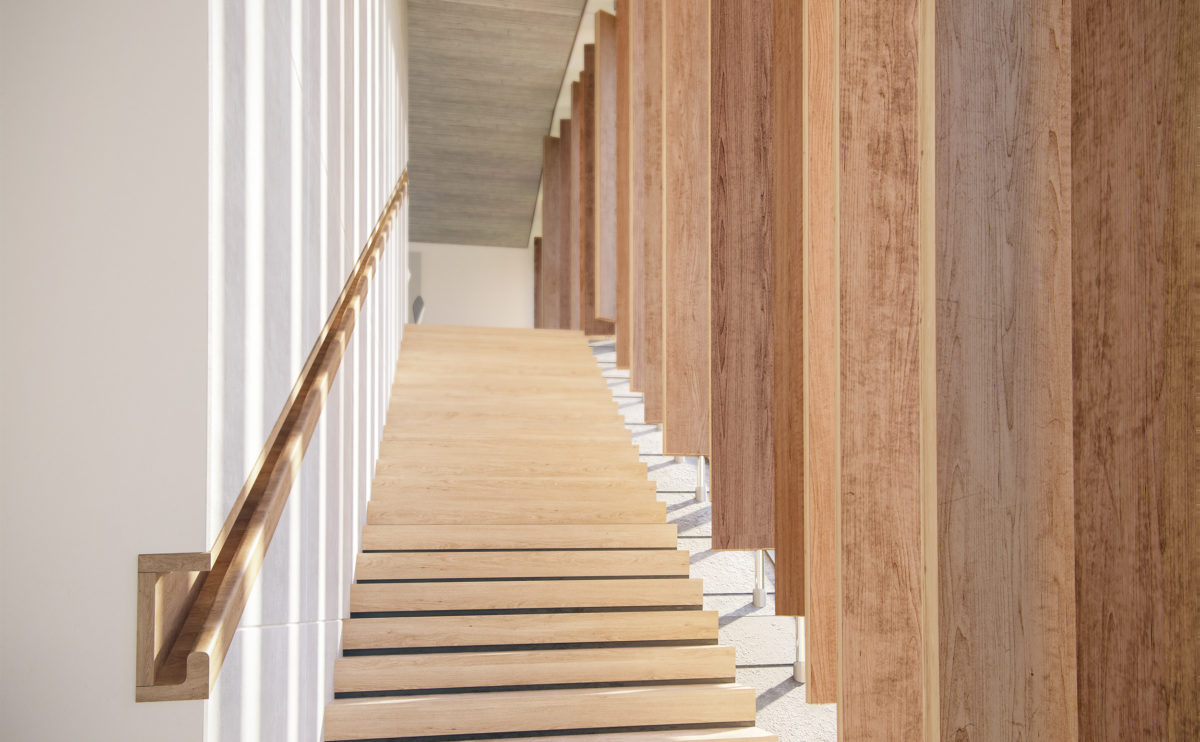
The staircase is defined by the profile of its steps, lined with oak wood. The light sets the rest of the space, where the doors and railings are concealed to give prominence to the ascending path.
Allison house
the double height space
The extension of the house introduces an interior courtyard that provides light to the living/dining room. In front of the elongated courtyard window, a double-height gap is formed to change the perception of space and bring a feeling of spaciousness to the ground floor.
Dehan village
the landscape design
The resort is designed to offer guests a quiet and relaxed space in connection with nature. The landscape design is formed by a network of pedestrian paths and the gardens offer a subtle range of colours and textures.
Burke house
the courtyard
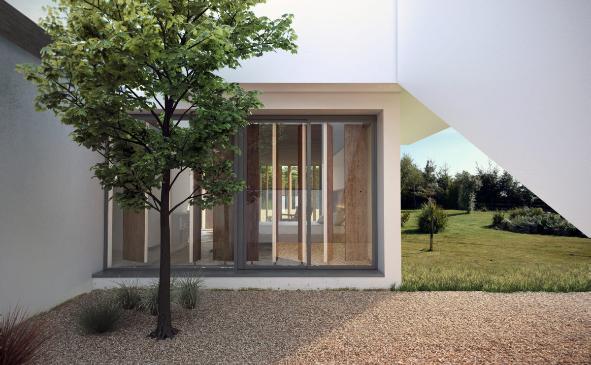
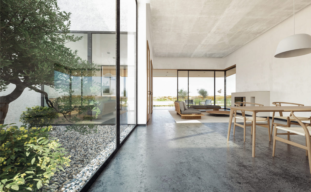
The inner courtyard articulates the space planning of the house while infusing perfectly with the countryside surrounding the property. It provides intimacy to the bedroom, abundant natural light to the living room and depth to the staircase.
K house
the entrance
The entrance of the house is made through a sloping walk on the side of the plot. The upper floor faces the meeting point. The access can be seen through the curved walls.
Dulwich house
the reception room
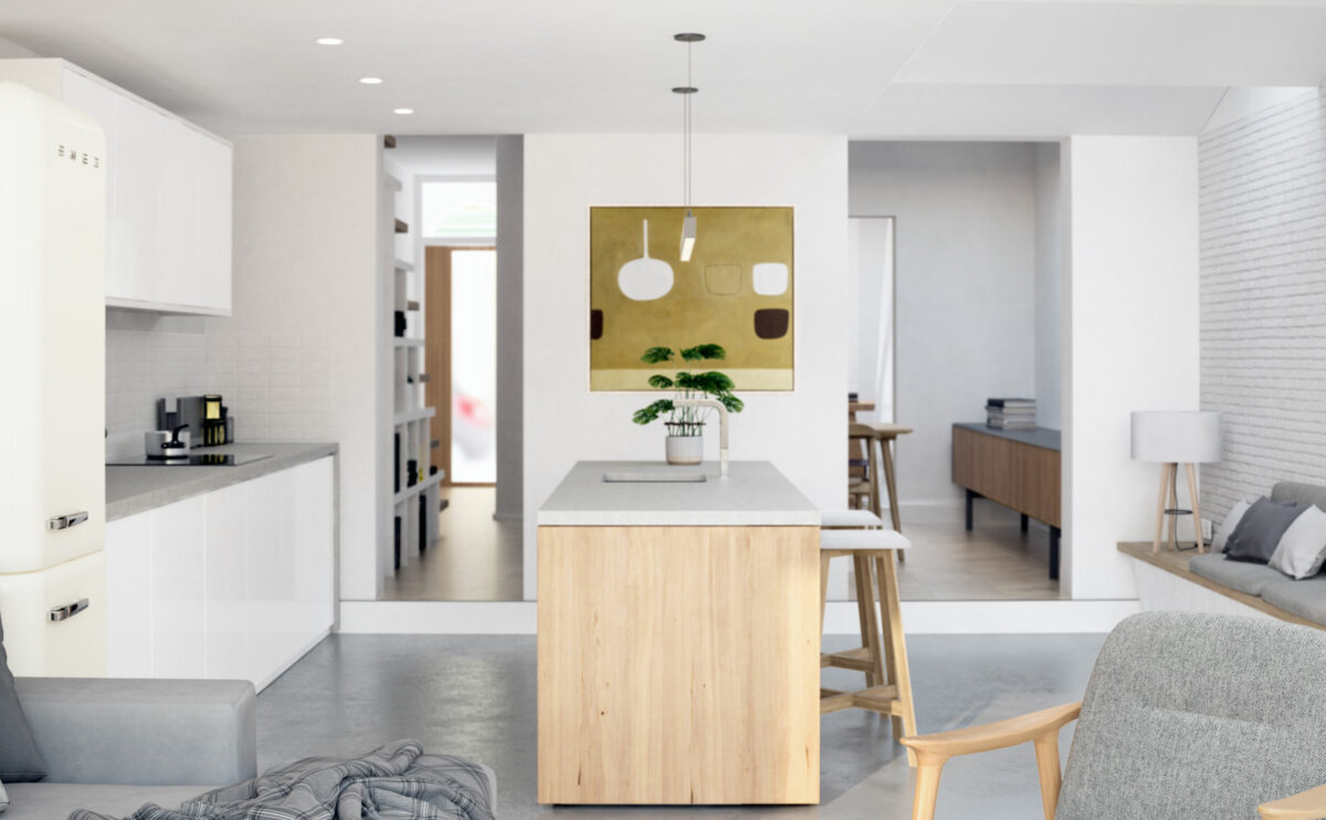
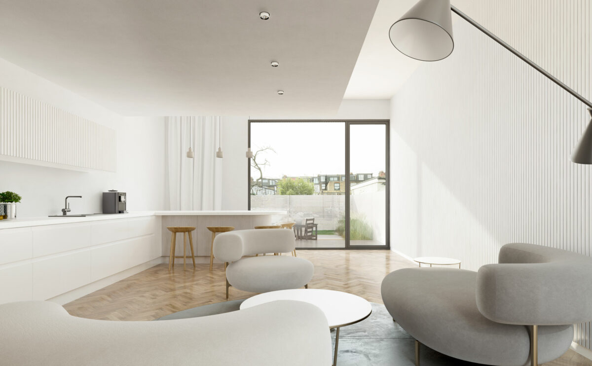
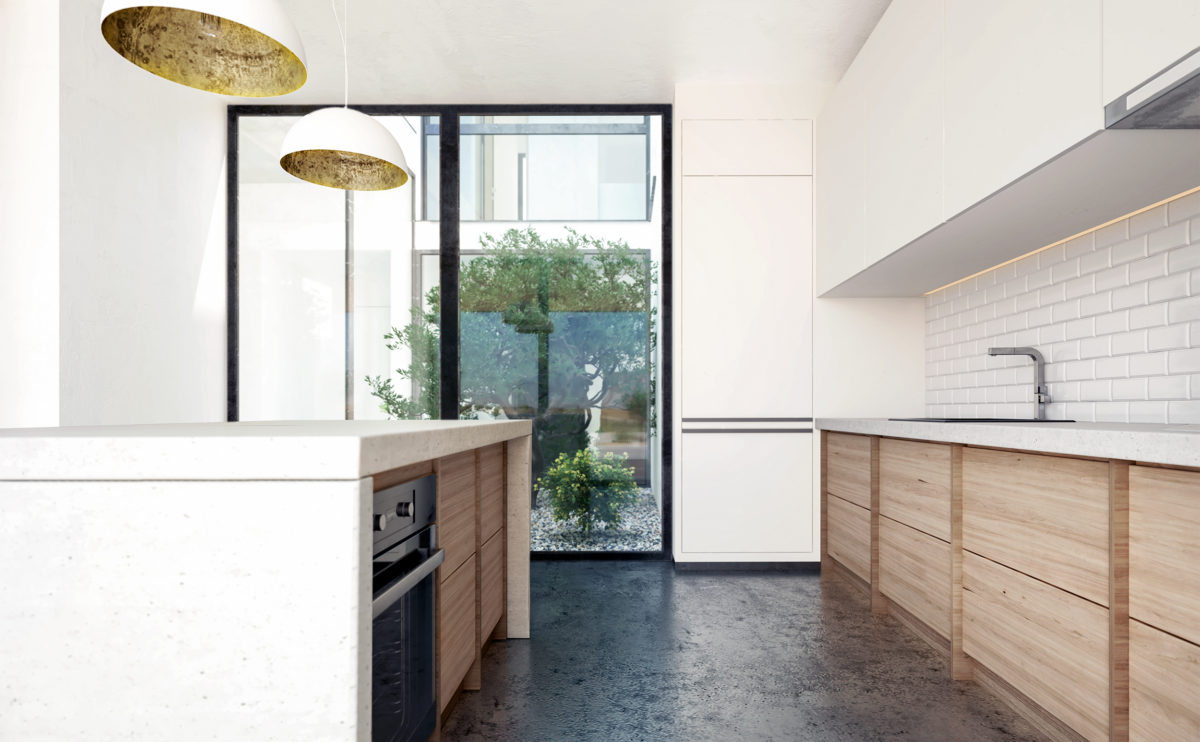
The kitchen is the heart of the home, so the central island is conceived as a workspace, meeting area and dining table. The ground floor is an open and luminous space, where white finish predominates in contrast with the wood and concrete flooring.
market eight
the rear facade
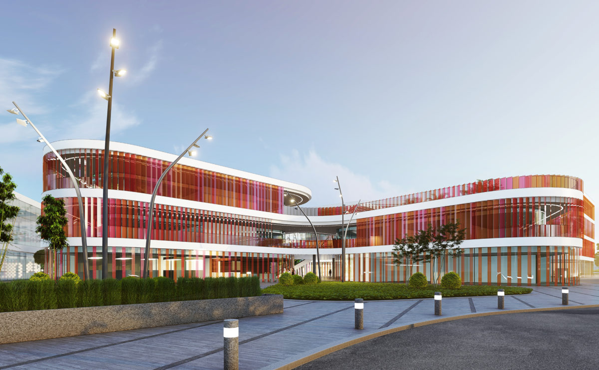
Market Eight is a free-form, undulating building that encloses courtyards between its curves. The façade is a permeable envelope formed by coloured glass louvres. The landscape design surrounding the building continues this organic language.
Xu Beihong foundation
the exterior view
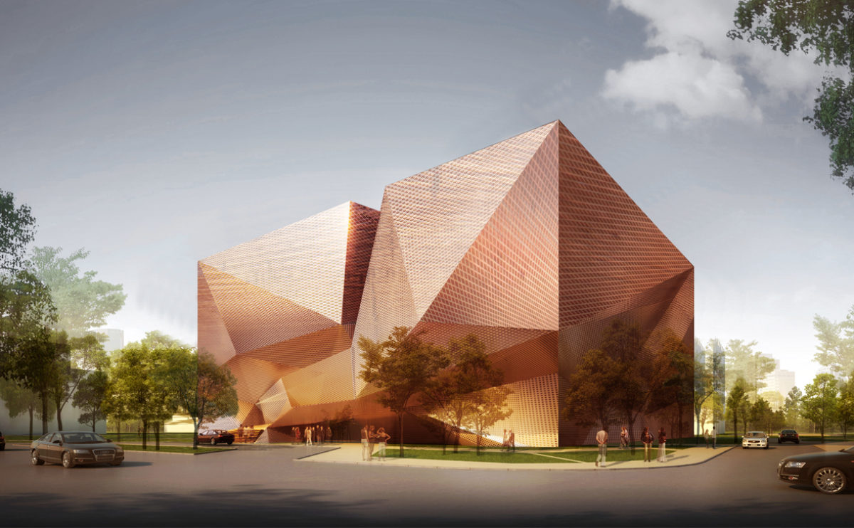
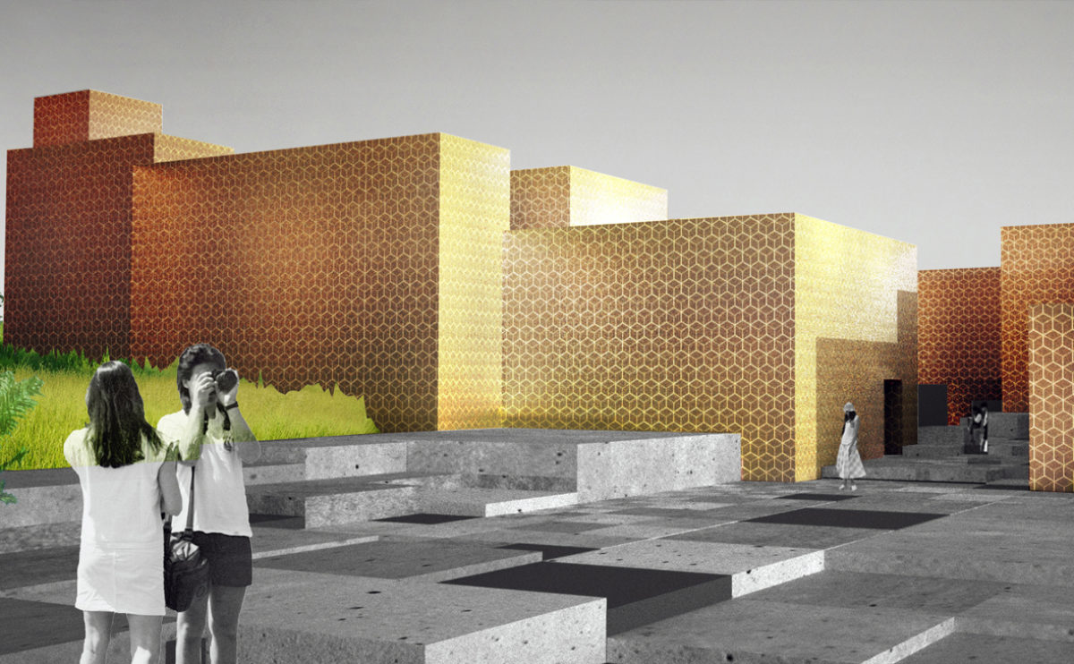
The museum is located in an urban park with abundant vegetation. The form of the building is simple, a sober box, wrapped in a semi-transparent façade of angular shapes in shiny metal.
next stop: hutopolis
the table and screen module
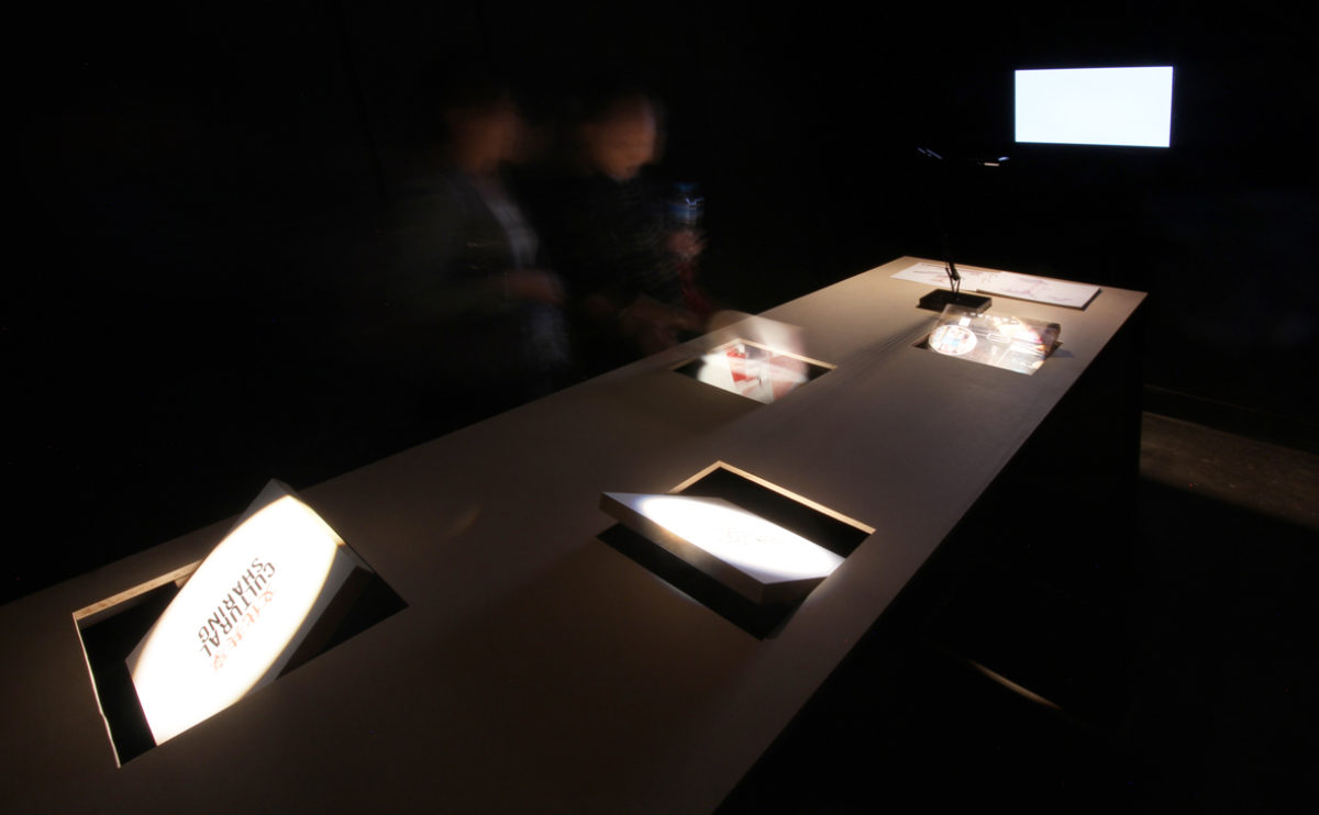
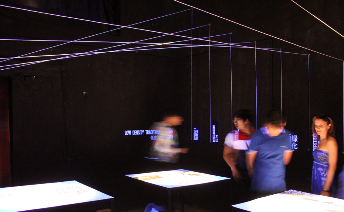
The spatial planning of the exhibition space allows several groups of people to enjoy the content simultaneously in a calm and evocative atmosphere. Each table is associated with a screen on which a documentary is projected to expand on the information shown in the books and rotating panels.
wavescape pavilion
the interior view
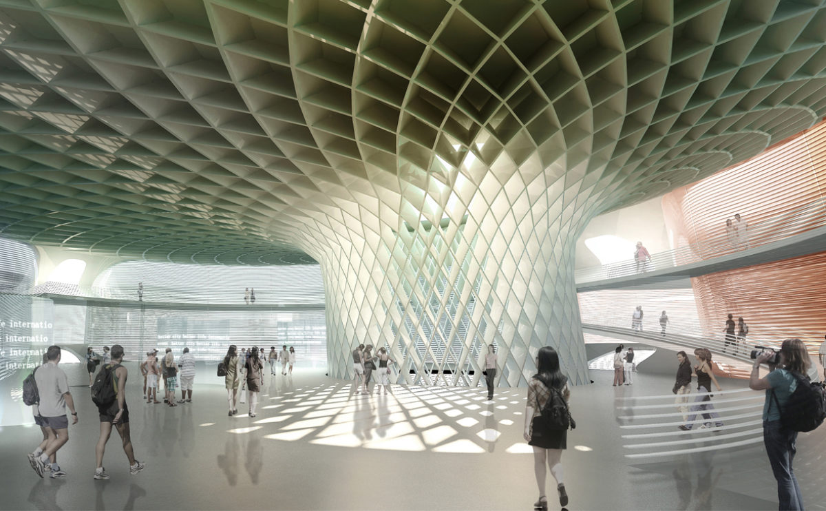
The interior of the pavilion has a large central column supporting the fungiform roof. Around the circular hall, there is a raised walkway that connects the different pavilions and allows a view of the sea through the façade.
Xu Beihong foundation
the top terrace
The upper part of the building leads to the terrace, a space where the tour of the exhibition rooms ends, where visitors can enjoy the natural surroundings where the museum is located.
wavescape pavilion
the view from the seaside
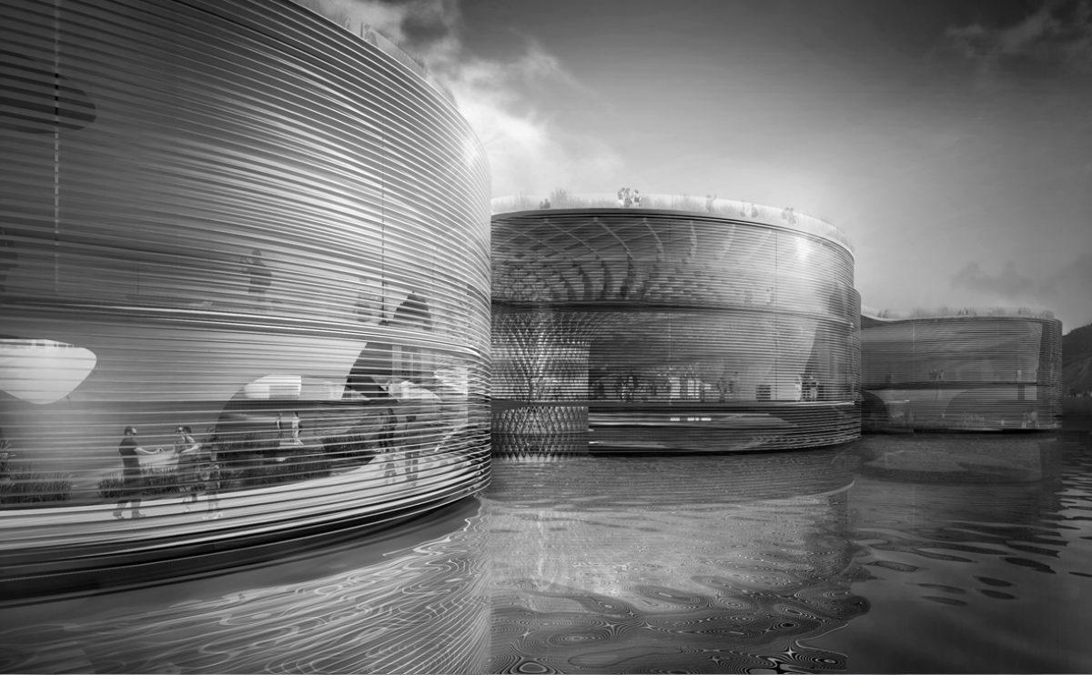
From the seashore, the circular modules of the pavilion are enveloped in a translucent skin formed by the horizontal slats floating in the sea.
maragato lofts
the view from the alley
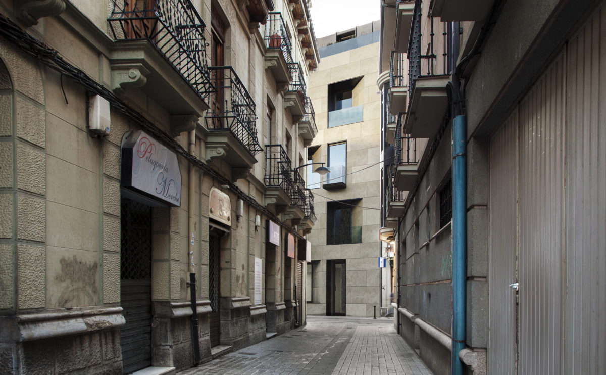
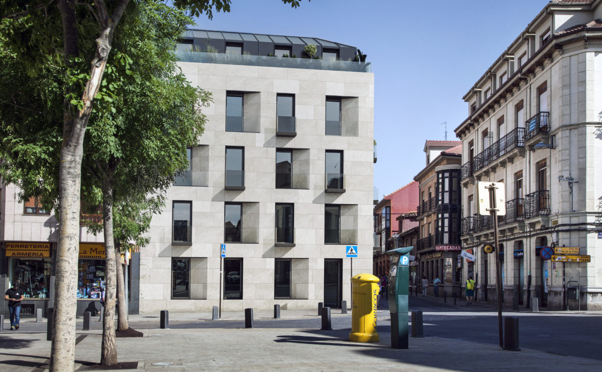
From the narrow perpendicular street, the building is mysterious and elegant, showing its similarities and differences with the rest of historical buildings.
hospital in the forest
the typical room
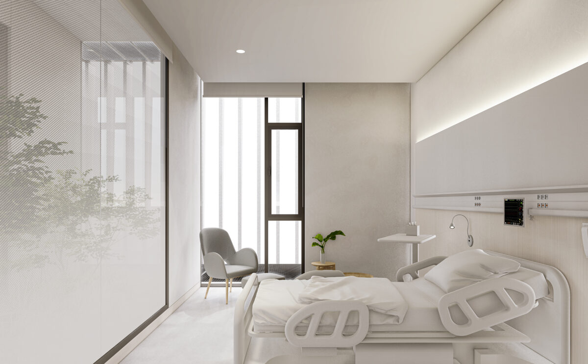
The hospital rooms are designed to ensure the well-being and health of patients. The rooms are separated by a courtyard with greenery that provides privacy and natural lighting.
fragmented house
the main entrance
From the main entrance, you can see the symbolic shape of the volume of the house, which resembles a series of overlapping boxes. A generous corridor leads to the main entrance hall, which is enclosed by a natural stone wall at the front.
fragmented house
the front porch
The first-floor bedroom forms a cantilever over the ground floor. This semi-covered space creates a porch in front of the dining room and kitchen which is raised above the garden level. The natural stone wall contrasts with the simple materials of the façade and the floor.
Dehan village
the spiral staircase
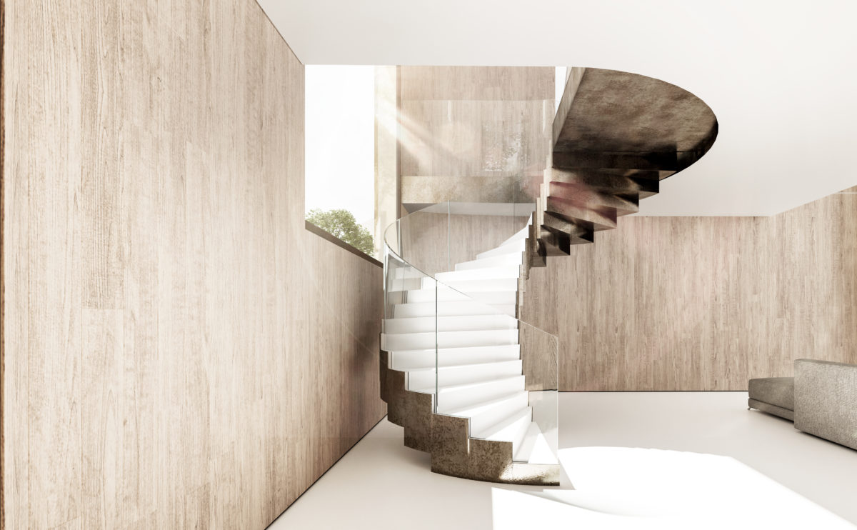
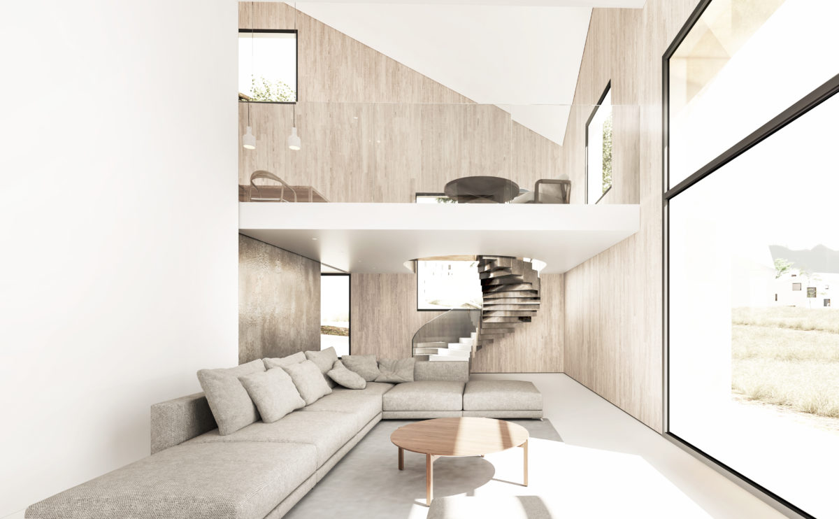
A secondary spiral staircase connects the living room with the dining room on the first floor. The relationship between the two is enhanced through the double-height space and the staircase adopts a sculptural presence reinforced by the light from the window.
cuña house
the reception room
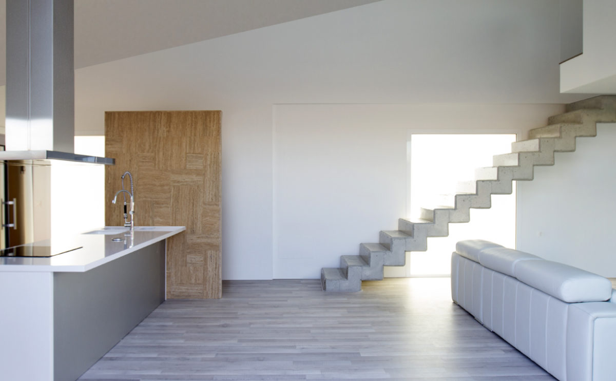
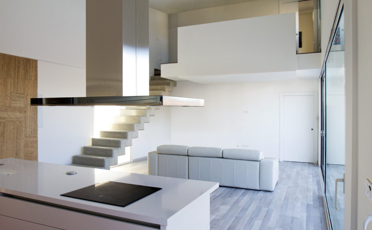
From the garden, the living room occupies a central position between the open kitchen, the travertine windbreak at the entrance and the concrete stairs leading to the upper floor.
wrap manifesto
the entrance lobby
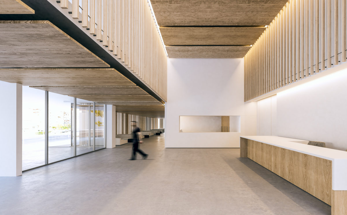
The main entrance hall is a generous, well-lit double-height space with a large reception desk and serves as a foyer for the multifunctional conference room.
Dehan village
the living room
The living room has a large window to enjoy the views of the landscape. This double-height space is connected to the dining room through a spiral staircase and also has access to the guest room on the ground floor.
elemental complex
the view from the courtyard
The hexagonal configuration of the residential complex gives rise to pedestrianised public squares with commercial premises on the ground floor.
Burke house
the staircase
The stairs take on prominence by visually connecting the interior spaces and establishing the formal language of the building’s exterior. This promenade is a contrast between the warm interior and the lushness of the Irish landscape that can be contemplated along the way.
fragmented house
the swimming pool
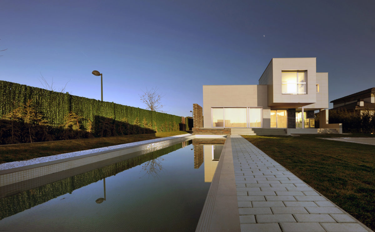
The property has a sports pool and an outdoor spa in the front garden. This elongated pool allows for swimming, while at the far end of the house there is a jacuzzi overlooking the garden.
Dulwich house
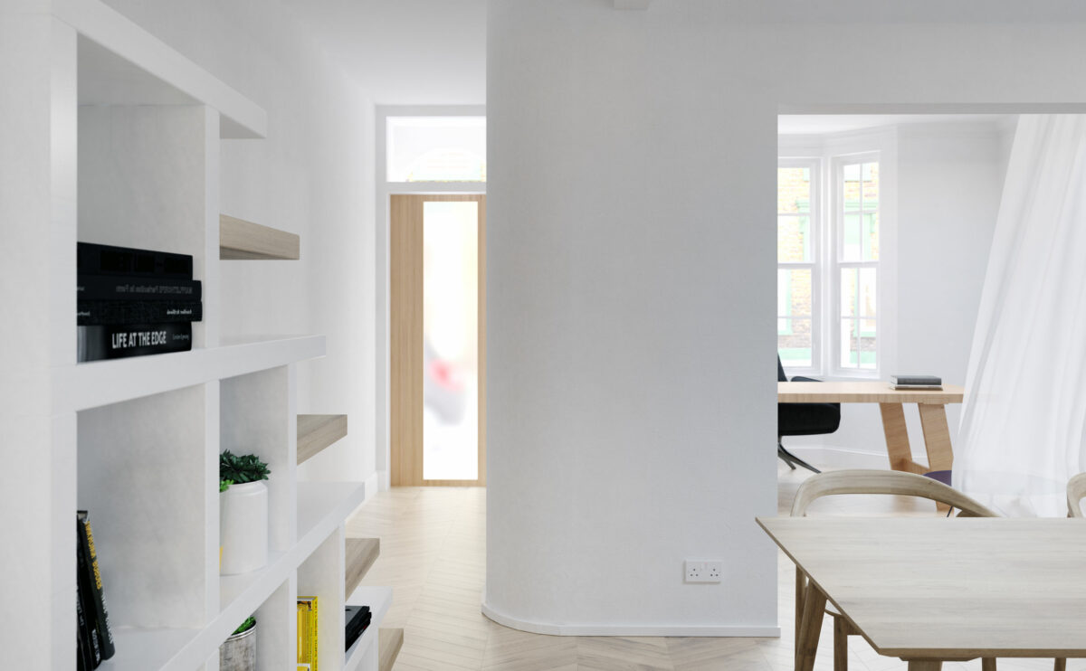
the entrance hall
The visual connection of the spaces and the curated diffuse natural lighting that invades the first floor are perceived from the entrance hall, where the original design of the stairs articulates the relationship between the dining room and the office.
Ivy foundation
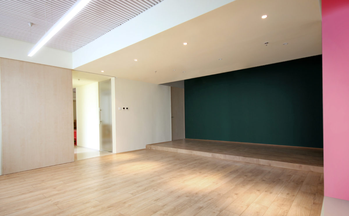
the multifunction room
The multifunctional room of this educational management centre has a sliding door and a blackboard wall.
cuña house
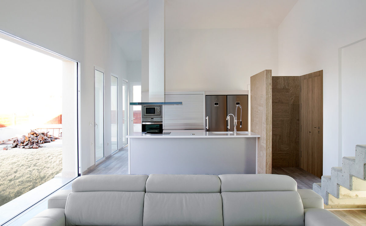
the kitchen
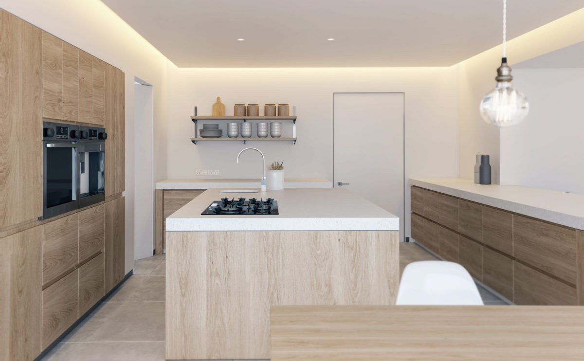
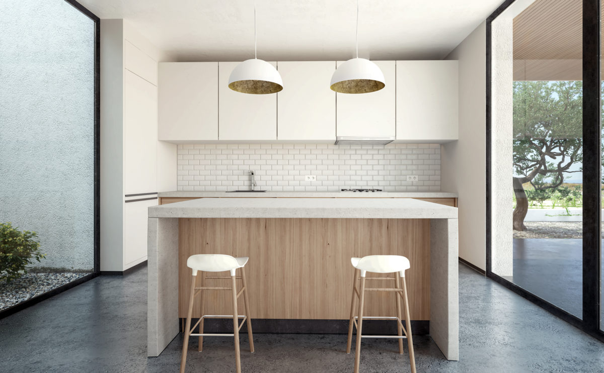
The kitchen has a central presence in the living room, linked to the garden. The front worktop serves as a social and meeting space, while the appliances are located on the back wall.
Ashley Gardens
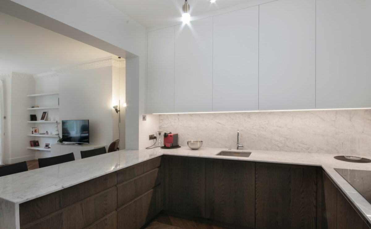
the open kitchen
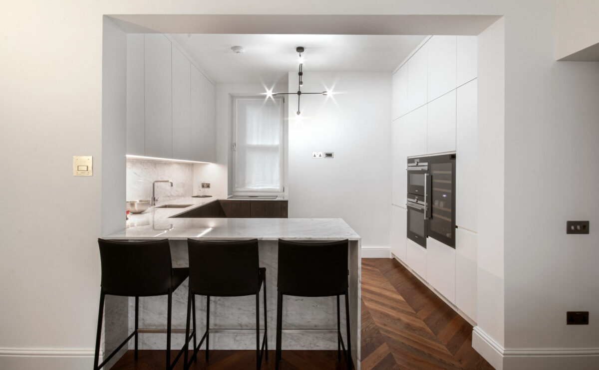
The kitchen opens onto the living room thanks to a large opening with structural reinforcement in the load-bearing wall. The kitchen units combine dark wood, marble worktop and matt white lacquered doors.
W salon
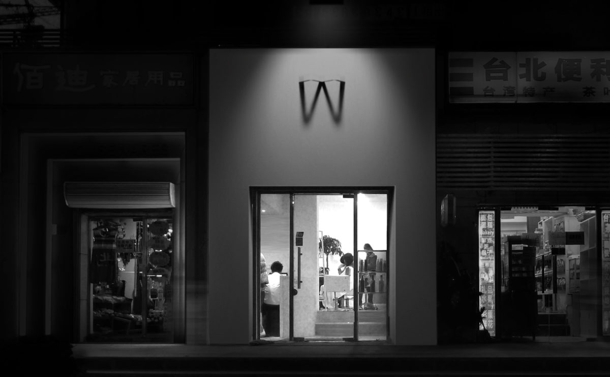
the shopfront
The exterior façade of the hairdressing salon has an illuminated sign that casts the shadow of the letter W on a white wall.
Ivy foundation
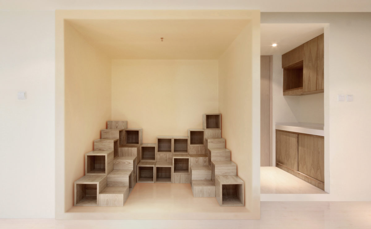
the children’s library
Near the waiting room there is a reading corner for children. This children’s library consists of modular cubes where children can sit.
Bolaños house
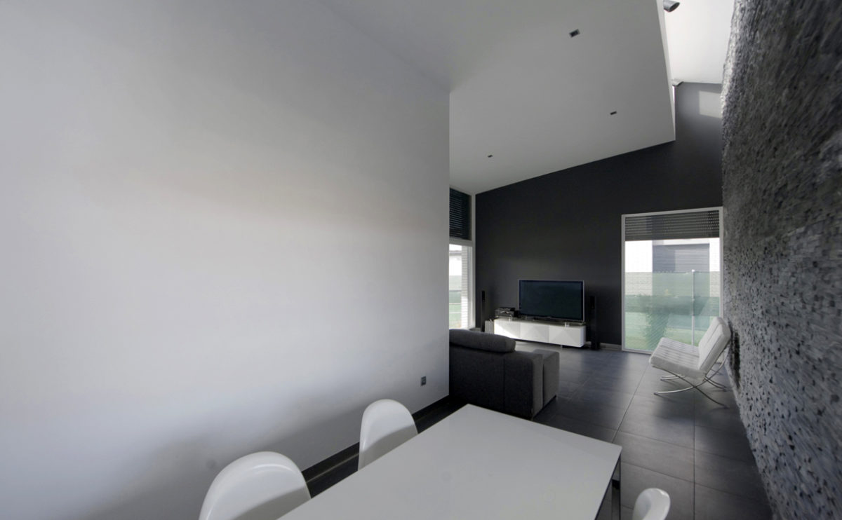
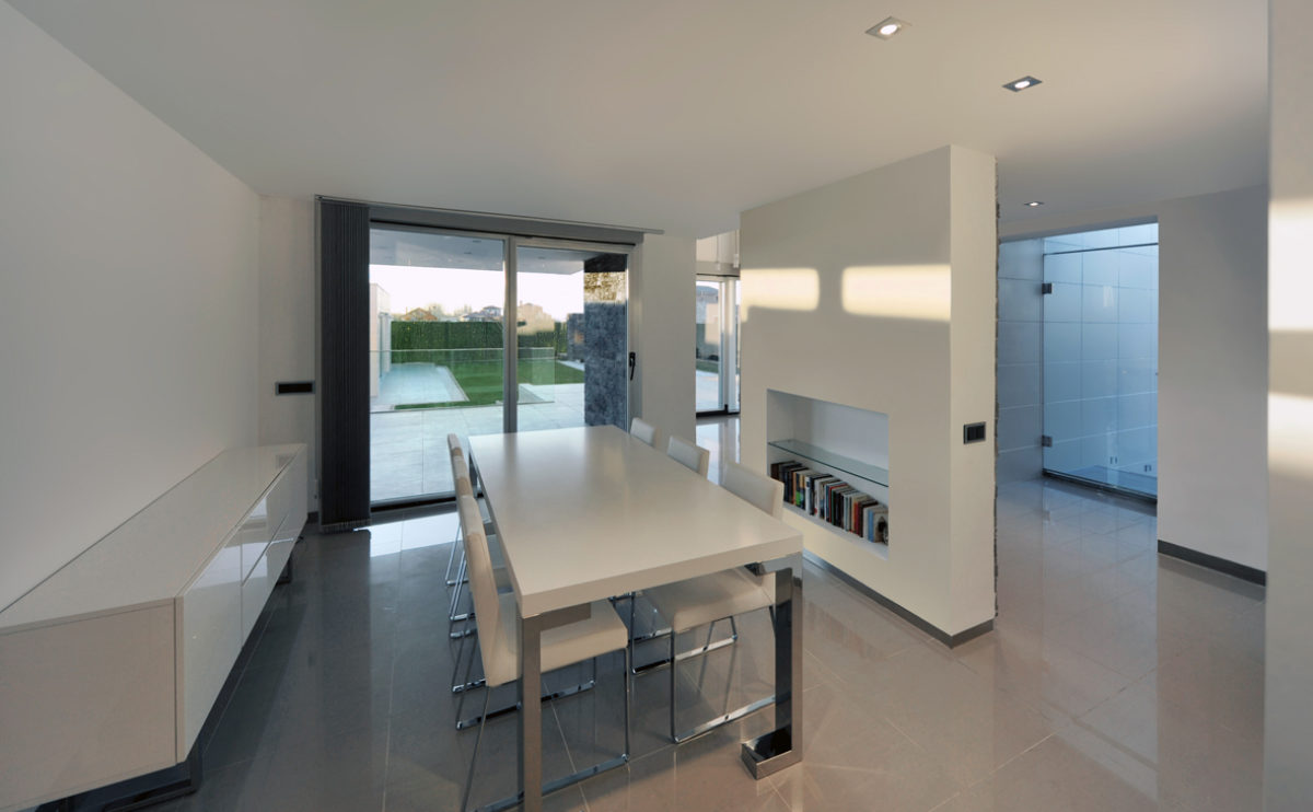
the dining room
The dining room is a transition space to the living room in this open-plan flat. The space is illuminated by the skylight in the ceiling and the large windows facing the garden. The interior design combines neutral colours to create an elegant atmosphere where the texture of the stone wall stands out.
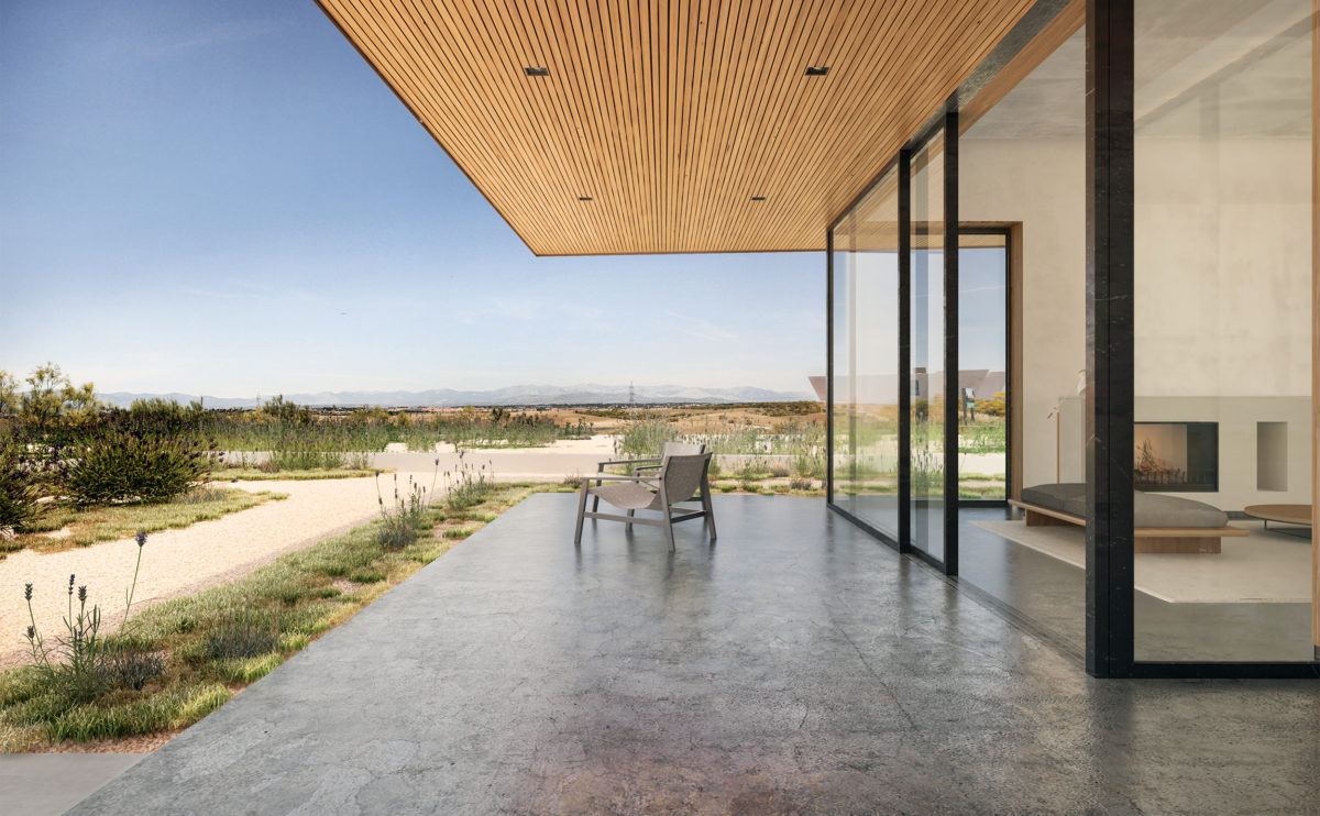
cuña house
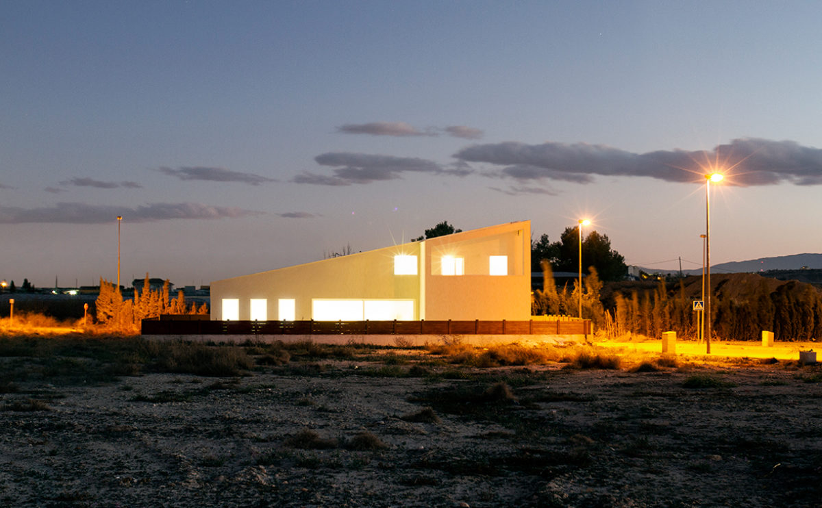
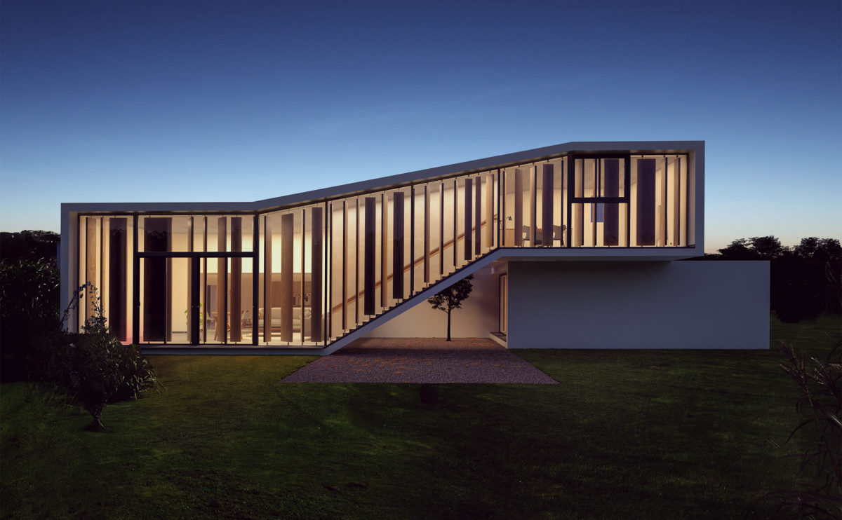
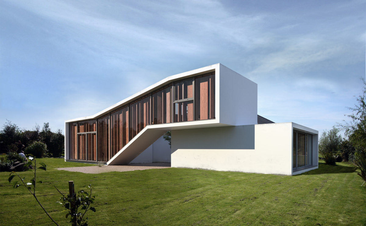
the exterior view
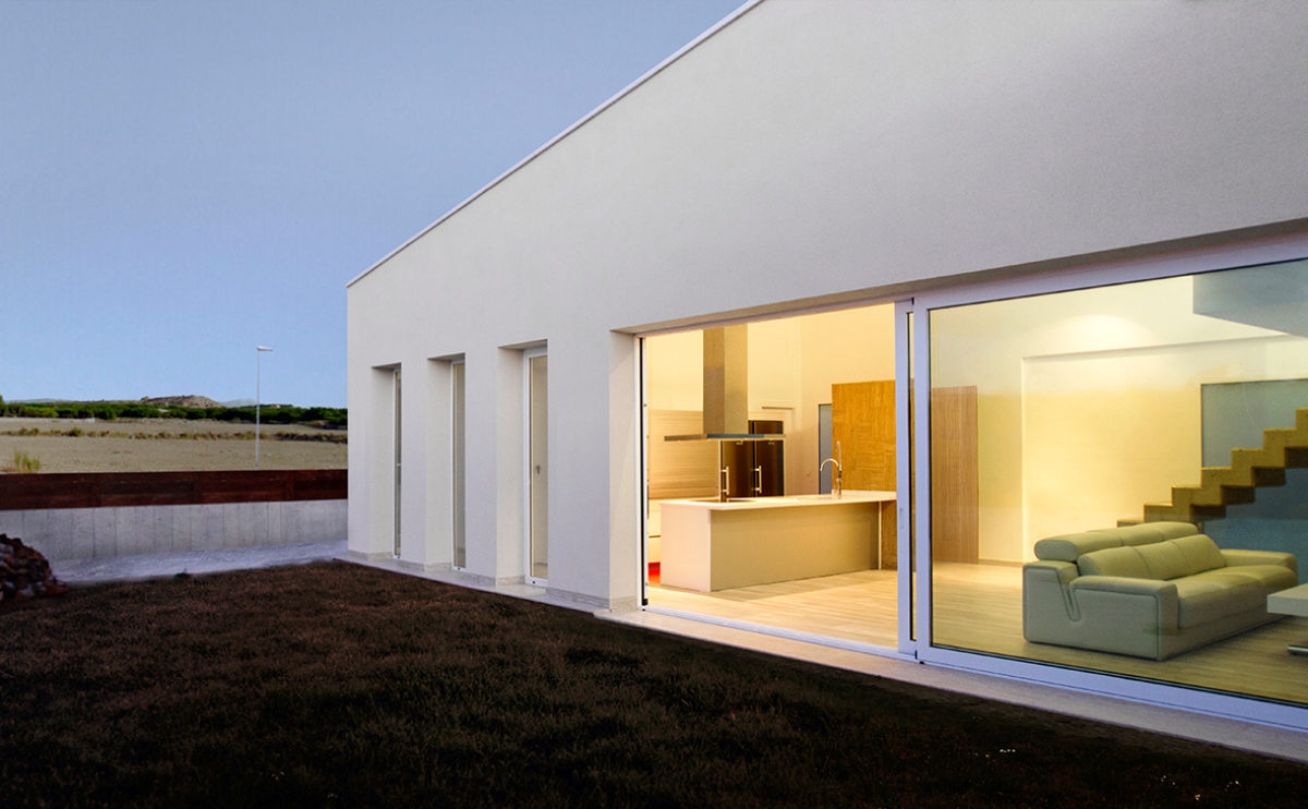
The simple exterior form of the house stands out against the flat landscape of the valley, while the white mountains can be seen in the background.
Dulwich house
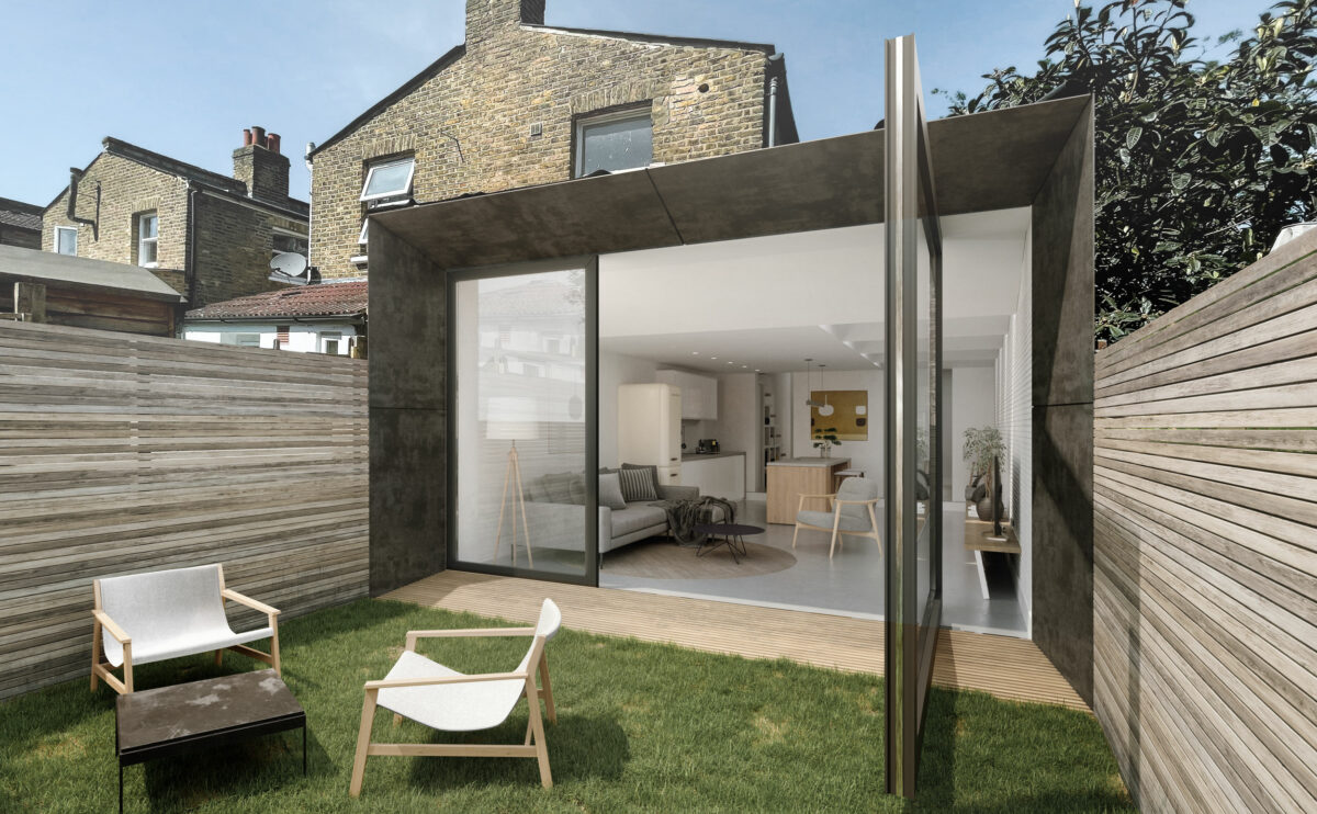
the garden pivot door
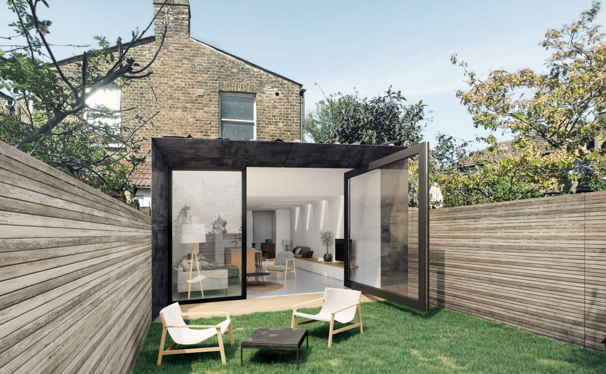
The new rear façade of the building has a strong, contemporary look. A steel frame subtly emphasizes the profile of the building, converted into a large flared window. When the pivot door opens, the garden becomes a natural extension of the interior.
Atienza music hall
the nave and the apse
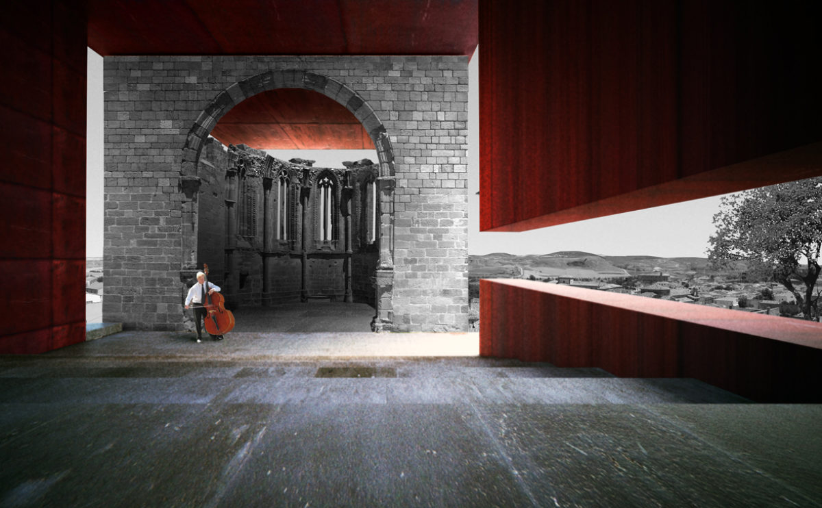
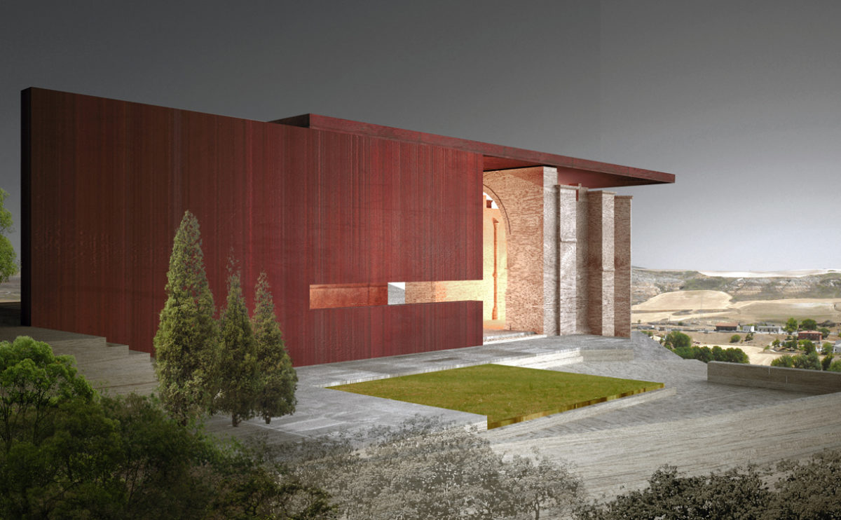
The nave of the church is represented with a new steel structure. In this way, the space becomes an open-air auditorium where you can enjoy the music and the view of the landscape while appreciating the ruin as per the original layout.
folded auditorium
the staircase
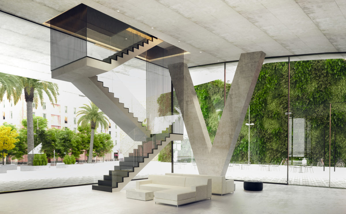
From the entrance hall to the auditorium, the upper floor can be accessed via an elegant staircase suspended by steel cables. The foyer is a large and luminous space with a view of the vertical garden that covers the party wall of the nearby building.
Pedraza house
the open-plan ground floor
The ground floor is a mosaic of interconnected spaces through glass partitions. The visual relationship between them gives a sensation of amplitude, and the simplicity of the forms and finishes create a serene atmosphere in connection with nature.
hospital in the forest
the view from the plaza
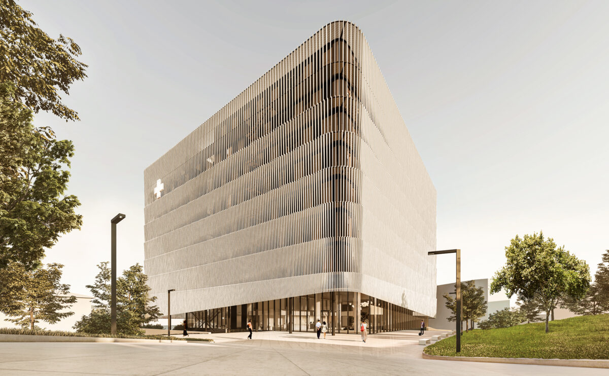
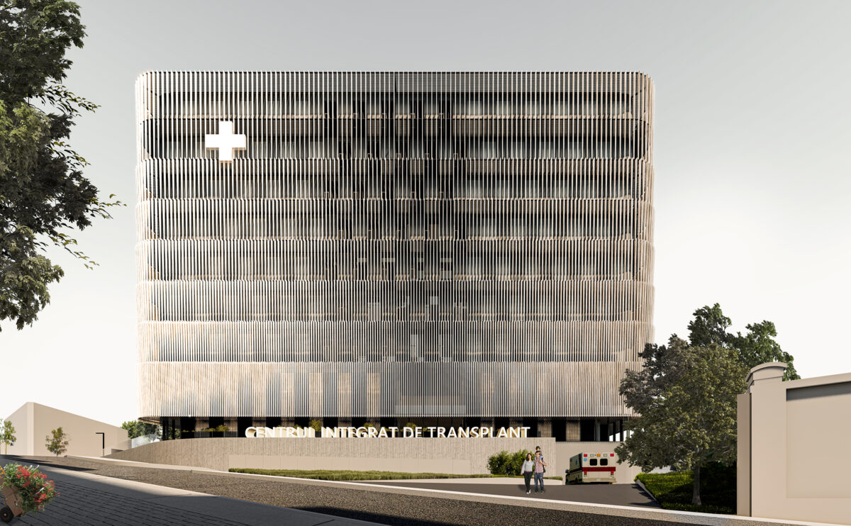
The comprehensive transplantation centre is a building that, despite its powerful form, has a friendly appearance thanks to its wooden louvred façade. This double envelope protects and unifies it, allowing a highly functional interior space planning.
Allison house
the lounge area
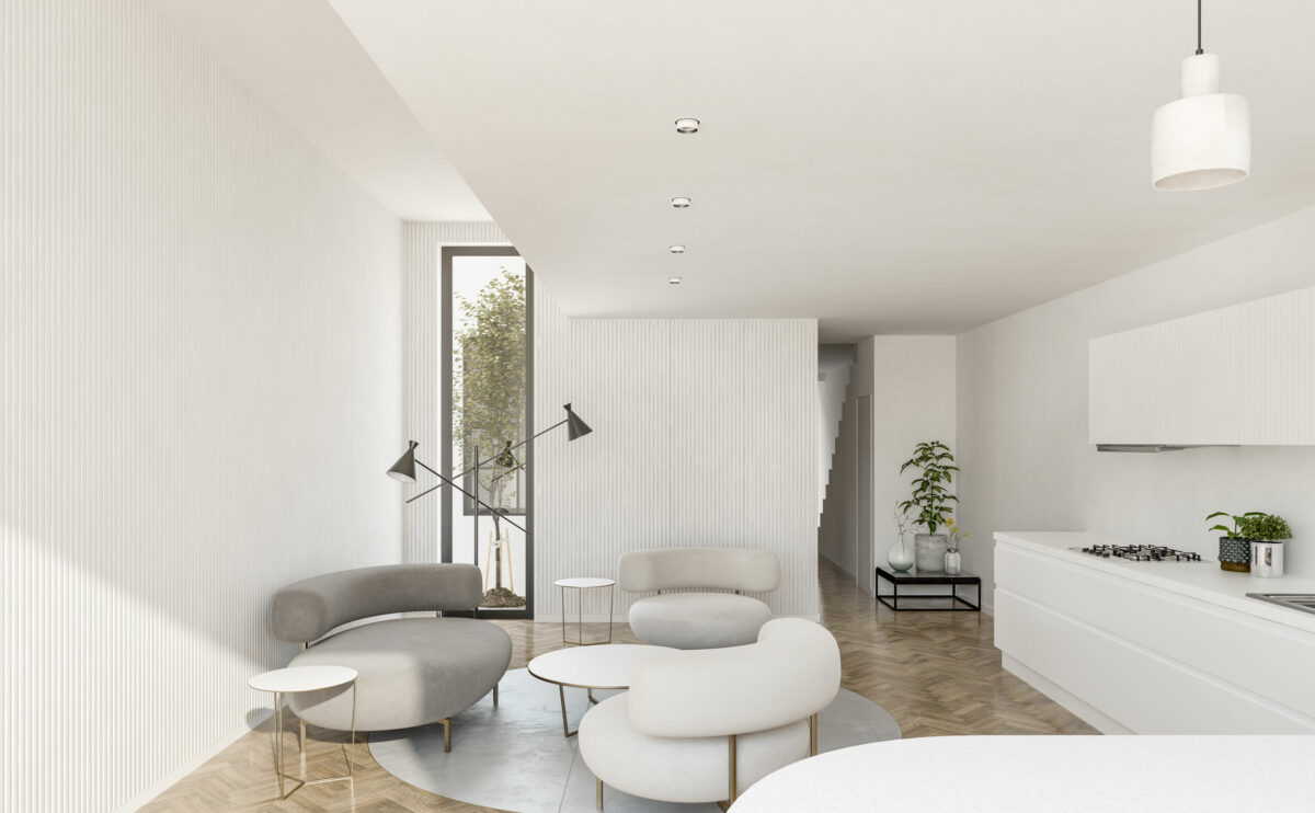
The living room of the house is a multifunctional space that combines a dining room, kitchen and relaxation area. The stony-looking Ela sofas by Piet Boon placed on a polished concrete floor give a natural and organic look to the interior design.
Dehan village
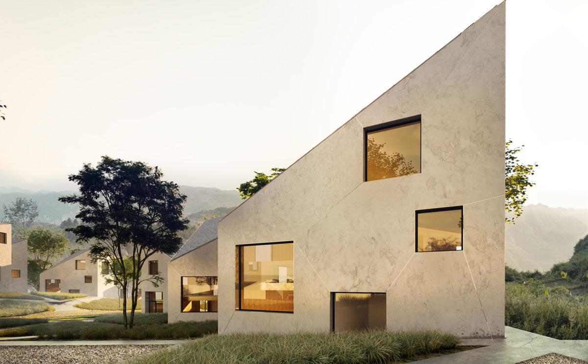
the typical villa elevation
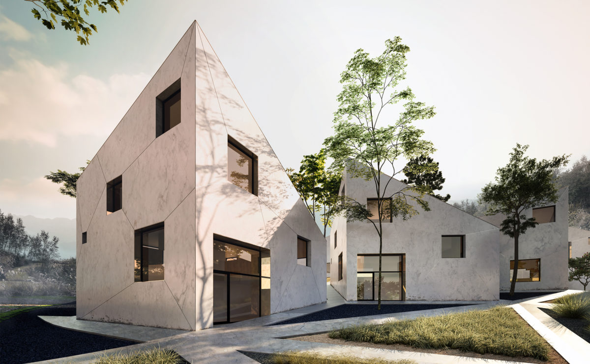
The facade of the villas is rendered with polished cement mortar. The expansion joints hold metal profiles inserted and connect the diagonals of the windows. The result is an almost stony texture in which the brightness of the brass profiles stands out.
Dulwich house
the dinning room view
The skylight in the living room forms a strategic visual axis with the dining room, from which the rear garden of the house can be seen. Diffused light floods the space, decorated with Nordic style furniture.
hospital in the forest
the main elevation
From the main road, the building looks like a floating volume above a podium. The exposed basement provides access to the emergency room while the main lobby can be seen through the transparency of the ground floor.
Zain tower
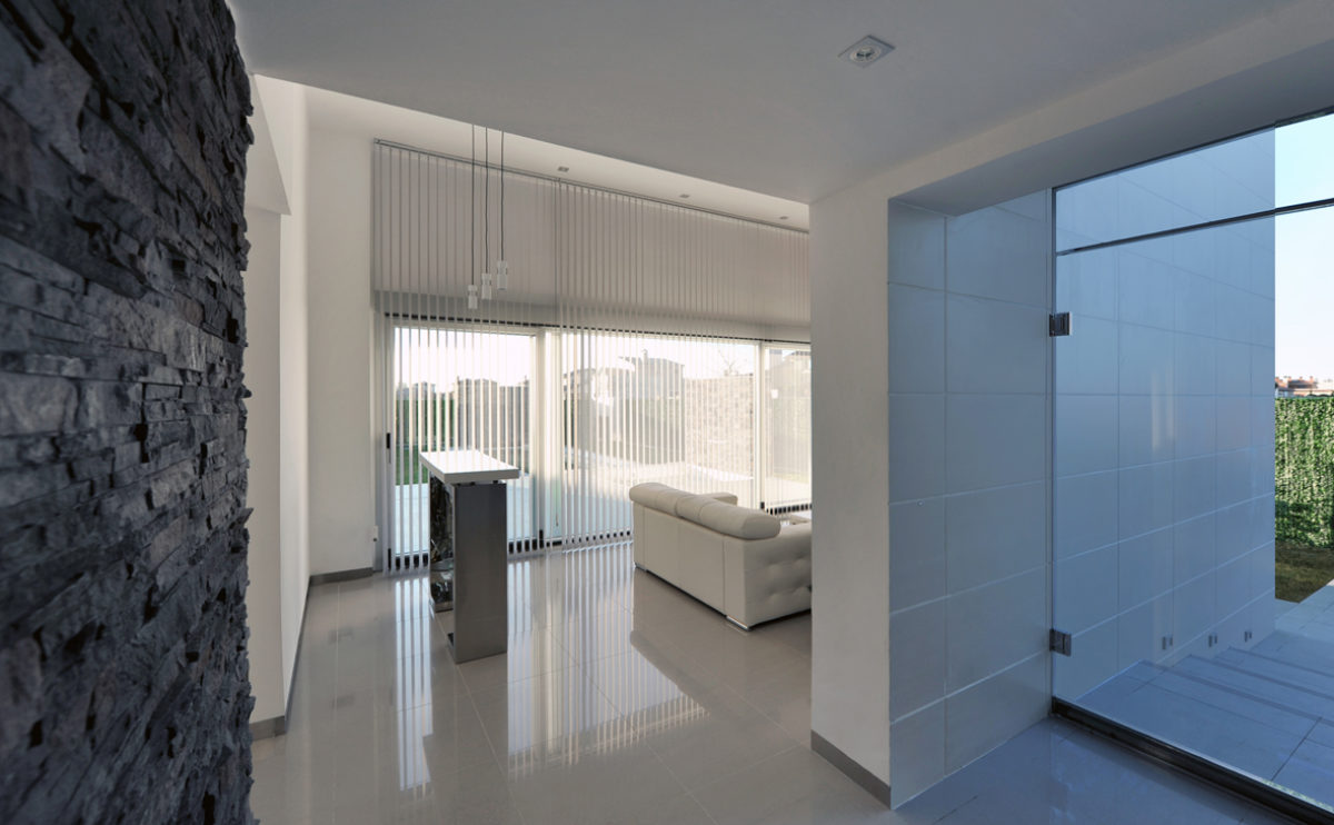
the interior
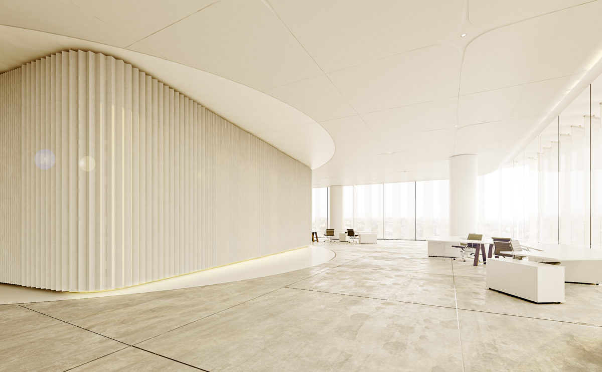
The interior is a luminous and diaphanous space. The white ceiling and the polished concrete floor give a feeling of spaciousness.
Ivy foundation
the entrance
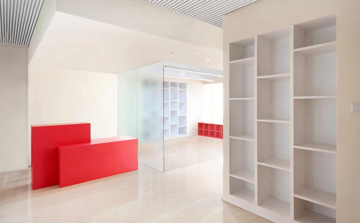
The entrance has a waiting room that connects to the workshop area. The interior design is bright and combines translucent glass partitions with simple coloured furniture.
Pedraza house
the master bathroom
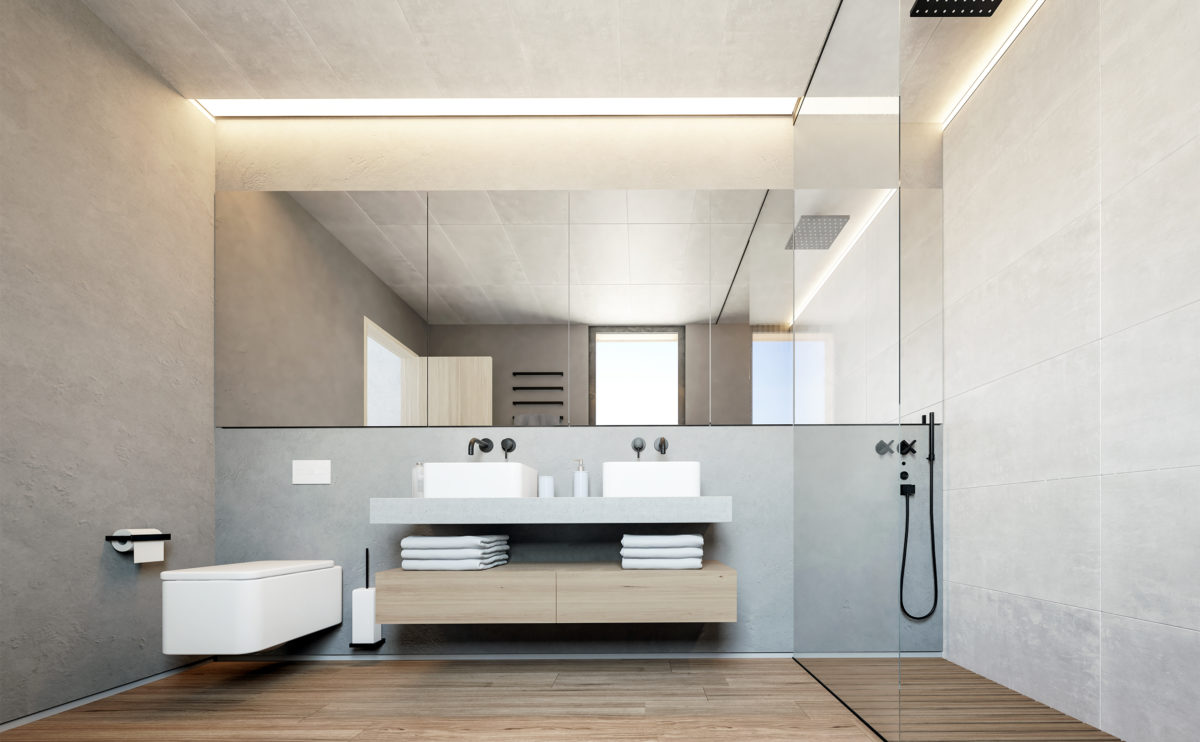
The rational and pure design of the bathroom is based on easy-to-clean surfaces, naturally textured materials and cosy indirect lighting.
K house
the living room
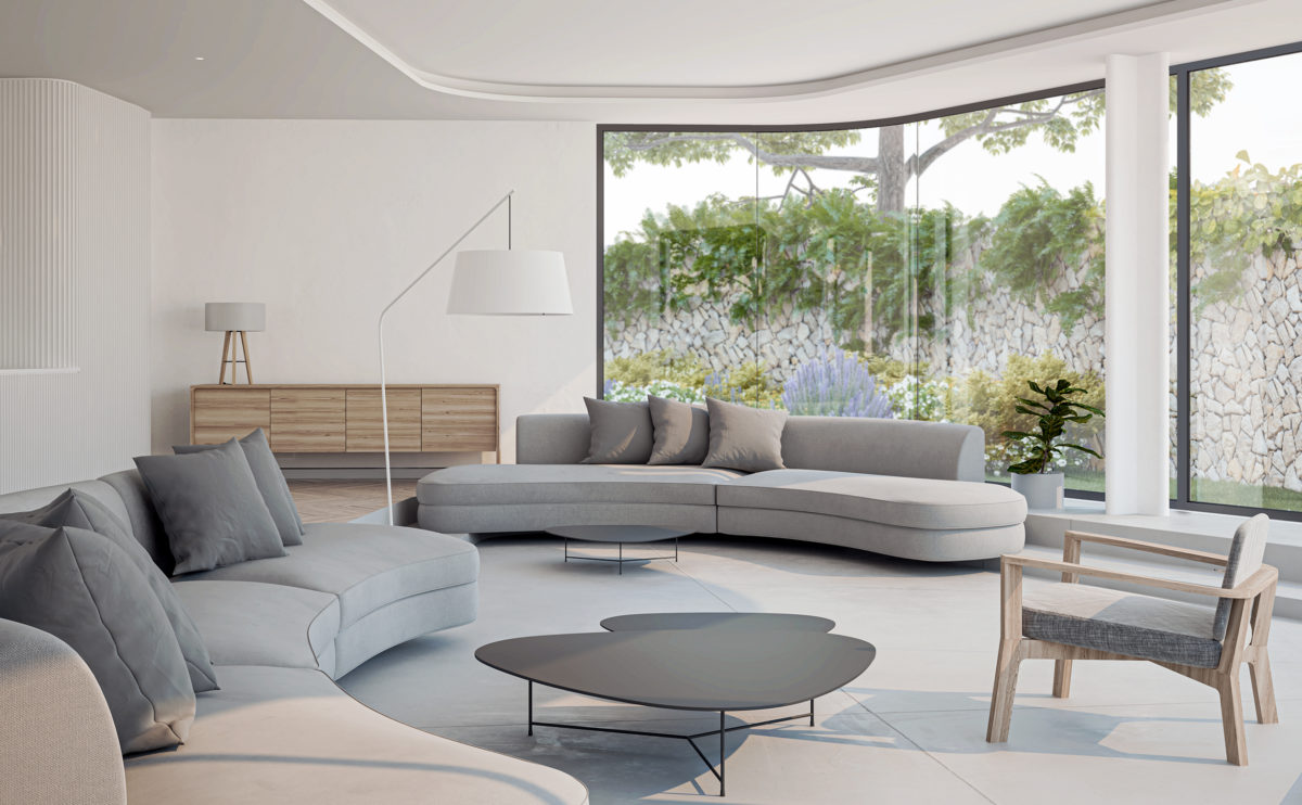
The living room, located at a slightly lower level than the rest of the ground floor, defines a functional, welcoming and relaxed space with large, custom-made sofas. The large windows capture the light of the sunset and make the outside garden part of this lounge area.
folded auditorium
the auditorium
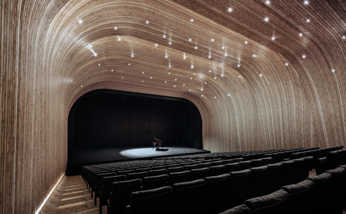
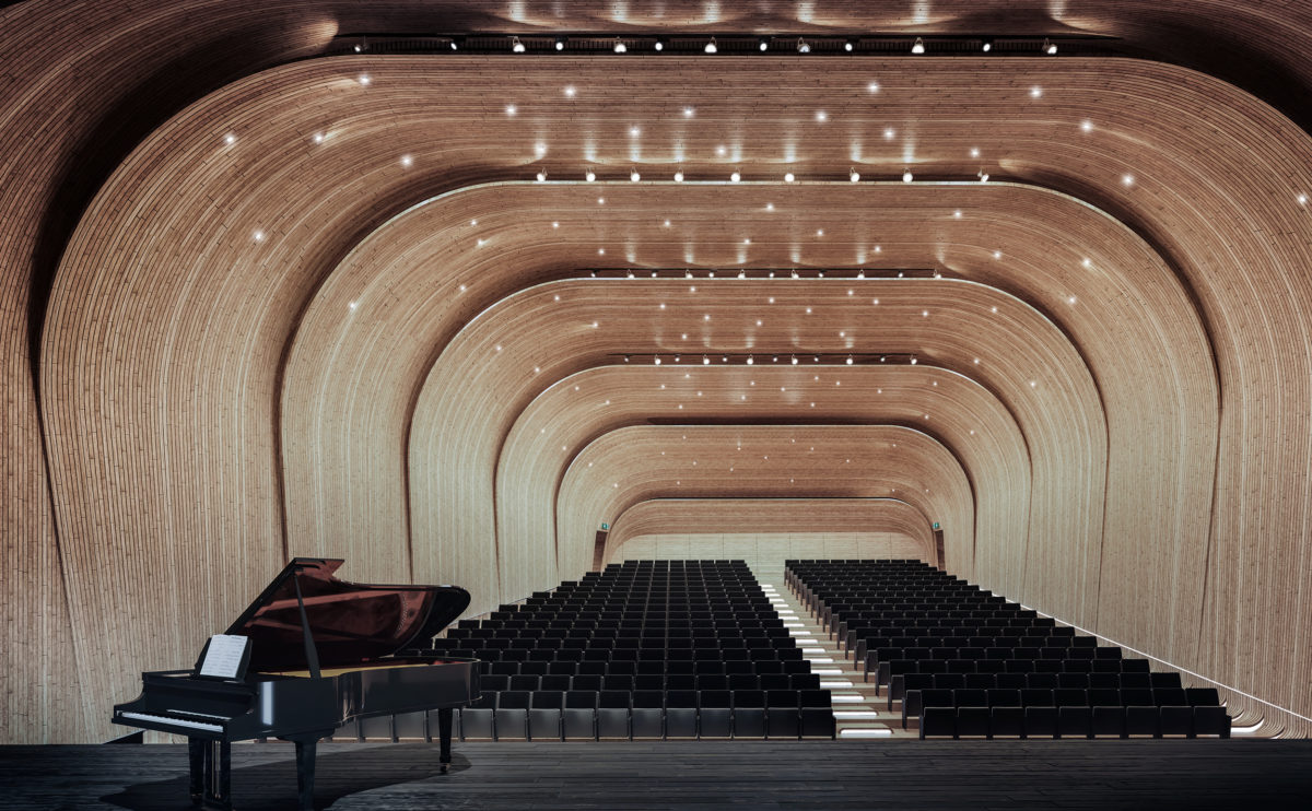
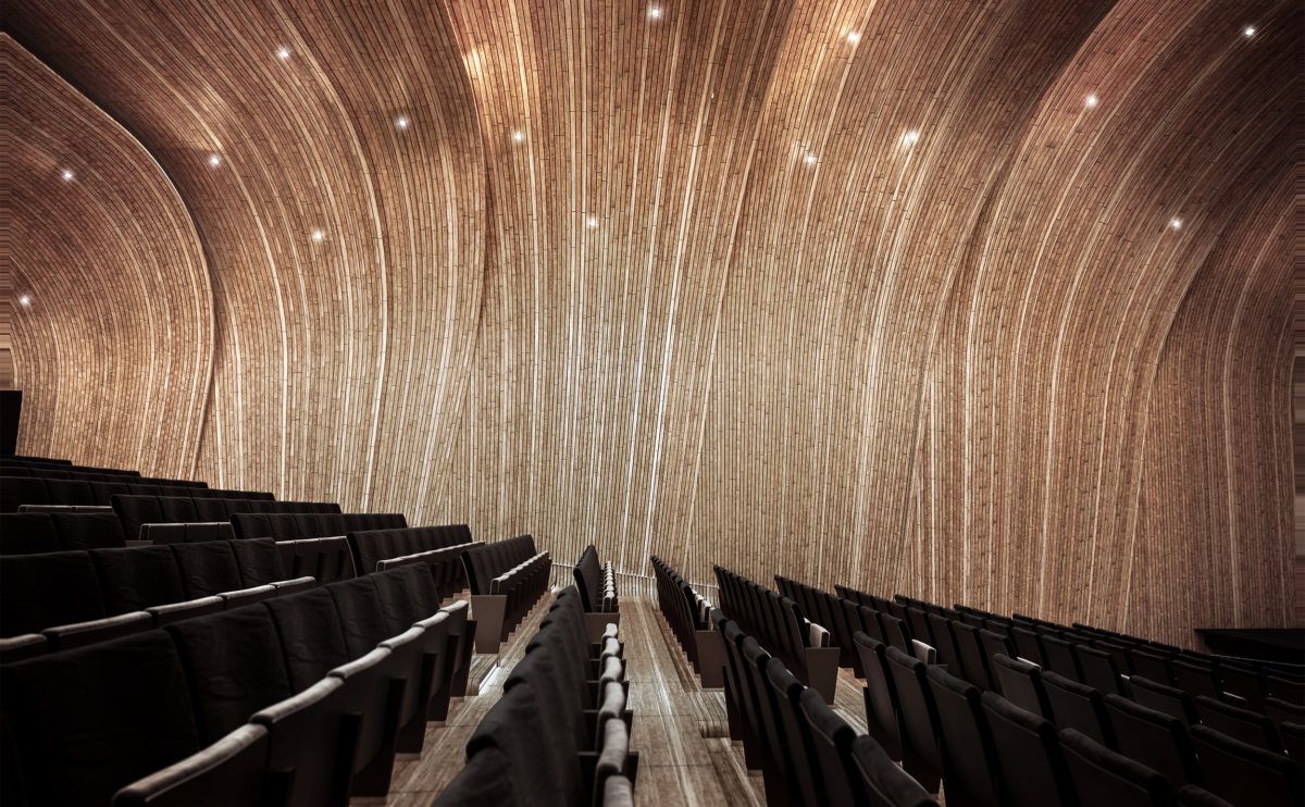
The acoustic ceiling of the auditorium hall is formed by several curved wooden planes that create a shell covering the grandstand. The wood also extends to the steps and floor, creating a cosy and elegant interior.
Atienza music hall
the building and the landscape
The intervention on the ruin is shown as a sculptural element with a protective character. Its form, with a definite contemporary language, responds to the distant landscape while intends to become a landmark.
Dulwich house
the back yard
The brick facade of the original house contrasts with the appearance of the new extension, which looks like a steel and glass box. The thickness of the roof and walls gradually decreases until it ends in a tapered steel profile that offers a light and sophisticated look.
W salon
the main room
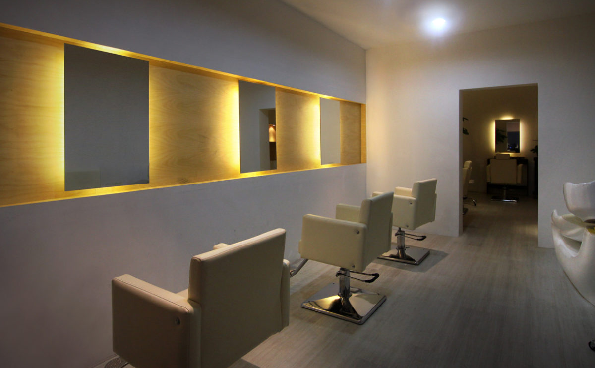
The hairdressing salon has a minimalist interior design that creates a warm and welcoming atmosphere. Indirect light is achieved with backlit mirrors against a background of birch plywood.
Dulwich house
the lounge area
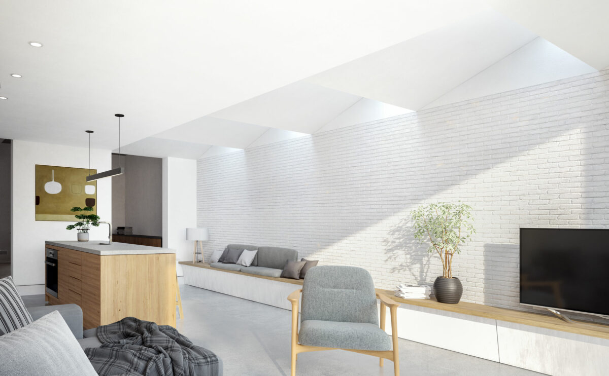
The ground floor extension to the rear garden provides ample living space, which also receives abundant natural light through large windows and skylights.
Pedraza house
the kitchen and the courtyard
The timeless design of the kitchen is based on the warmth of the wood and the simplicity of the white surfaces. The furniture is modular and functional with large oak drawers.
connecting riads
the south courtyard
The lower part of the building encloses the most intimate and secluded garden. Around this space, there are homes on the ground floor, so they have private gardens protected by a fence along its perimeter.
next stop: hutopolis
the four principles desks
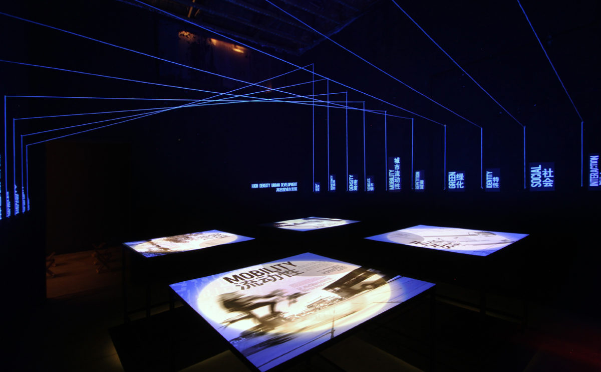
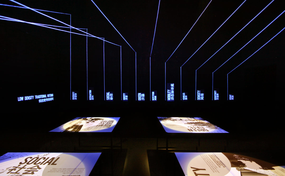
The exhibition hall has four illuminated tables with infographics and illustrations explaining the four fundamentals of urban planning. Above the displays, the ceiling of the space is covered with a three-dimensional graphic of white lines illuminated with ultraviolet light on a black background.
maragato lofts
the view from the plaza
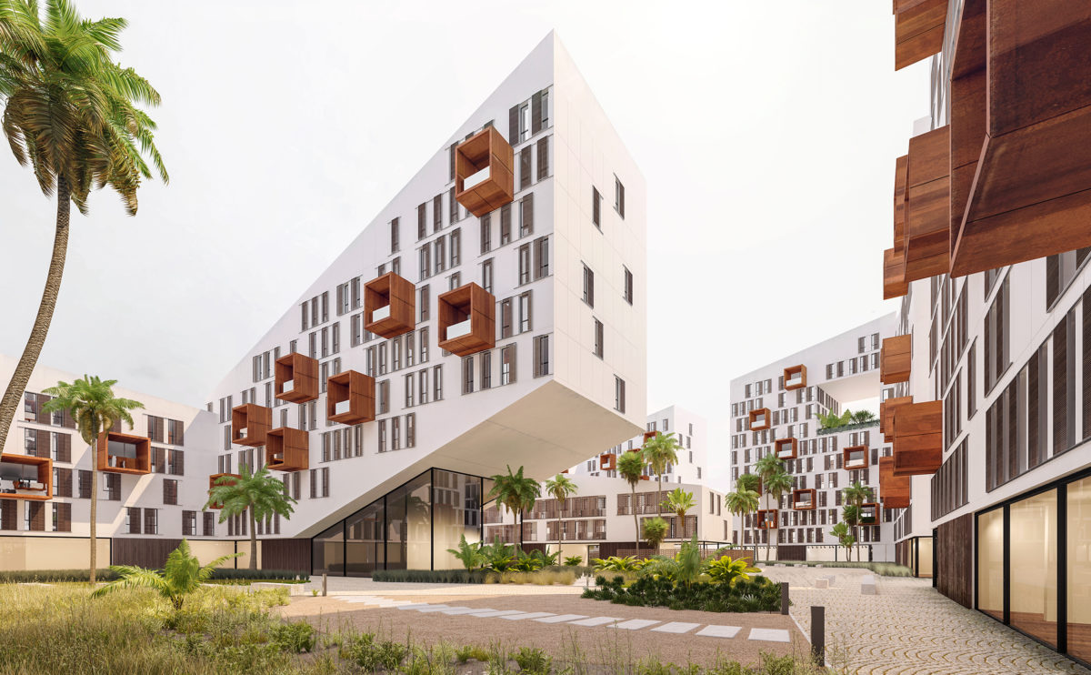
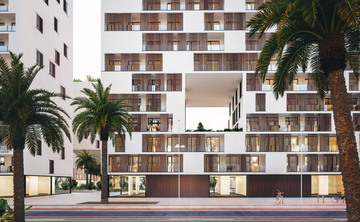
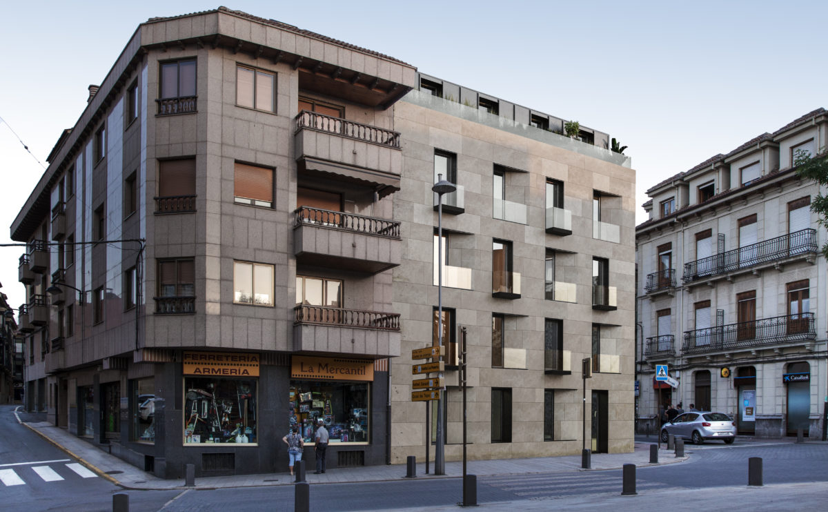
From the public space of the plaza, the design of the facade offers a playful arrangement of openings and balconies. These are perfectly aligned with the levels of the nearby buildings, and they keep the same proportion.
Pedraza house
the inner courtyard
From the entrance of the house, and through the inner courtyard, you can perceive the spaciousness of the living room, whose profusely illuminated double-height space gives a pleasant sensation of spaciousness and comfort.
Ashley Gardens
the masterbedroom
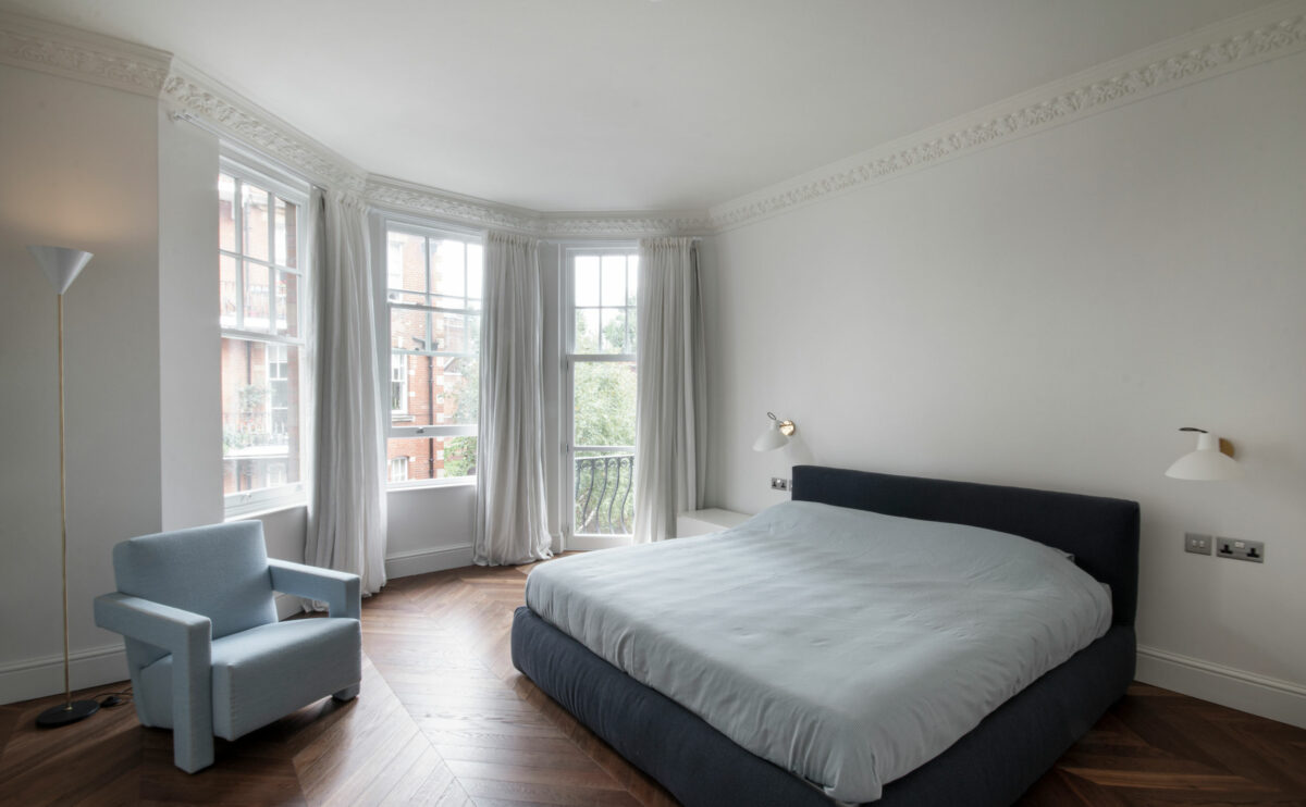
The refurbishment project of this London flat includes the replacement of the original windows and interior finishes. The contemporary style of the interior design blends with the existing Victorian decorative elements.
Pedraza house
the cantilever
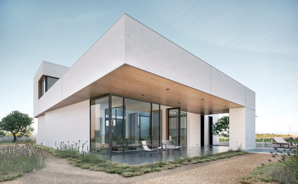
The house is an open viewpoint that captures and forms part of the landscape. With a simple gesture, the flat green roof is extended to form a cantilevered porch. The simple materials are combined with pure lines and the transparency of the large windows.
Shoreditch hotel
the view from Rivington st
From the streets surrounding the scheme, the hotel is adapted to the urban façade, with a proportion of openings similar to that of the adjoining buildings. From these streets, there is an access point to the inner courtyard that separates the hotel from the commercial area.
spliced towers
the landscape design
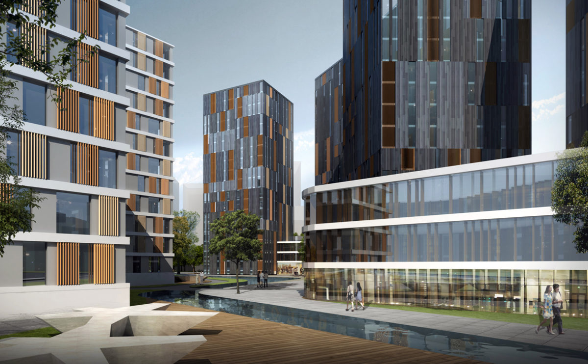
The landscape design combines pedestrian areas, gardens and a man-made stream separating the residential area from the commercial area. A network of streets connects the buildings to facilitate vehicle access.
next stop: hutopolis
the desk with rotating panels
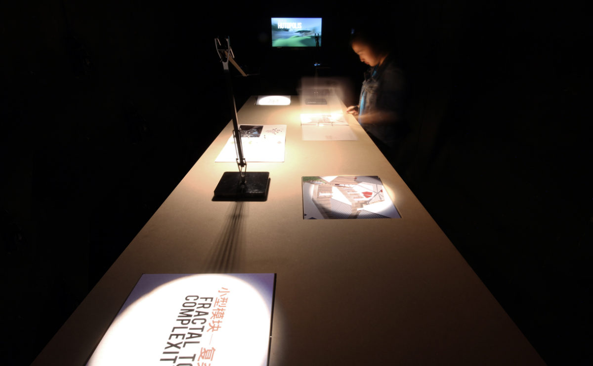
The exhibition tables have rotating panels that allow the public to interact with the content and discover information and images of the projects. The subtle lighting of the space, which focuses attention on the content rather than the continent, creates a mysterious and evocative atmosphere.
connecting riads
the view from the top
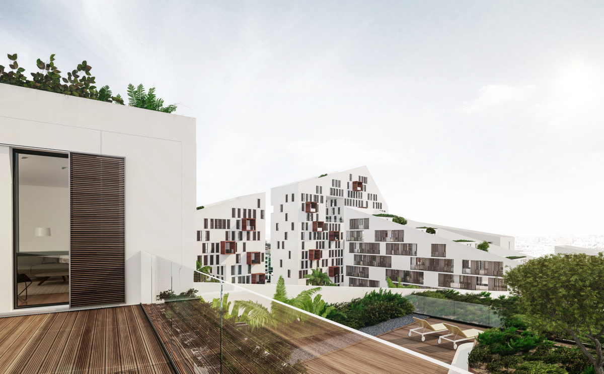
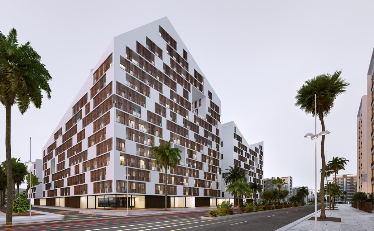
From the top of the roof terrace, you can see the winding silhouette of the building and the view of the city in the background. The image conveys the symbolism of the building’s shape, its relationship with the landscape and the functionality and comfort of the apartments.
hospital in the forest
the night view
The sober form of the building is wrapped in translucent louvred skin. This permeable layer allows seeing the inner facade, made of large openings and courtyards with greenery.
hospital in the forest
the entrance lobby
The entrance lobby is a welcoming double-height space for staff and visitors to gather and meet. The area is well illuminated, enclosed by a curtain wall and a generous reception desk.
Shoreditch hotel
the view from Pitfield St
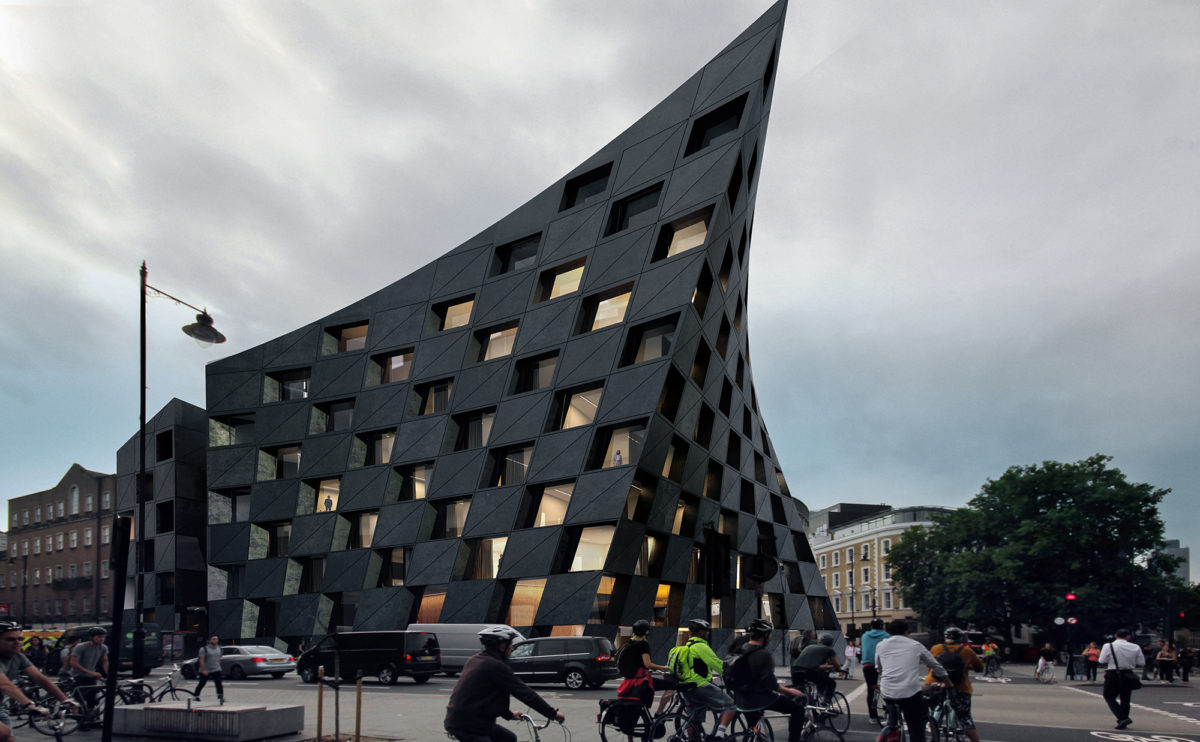
The curved shape of the façade responds to the flow of pedestrians and bicycles crossing the intersection between the two main streets. The building opens up like a giant curtain to allow passage with a welcoming gesture.
K house
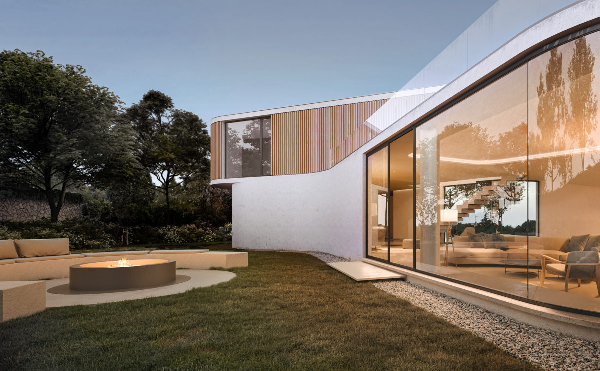
the rear garden
The living room has views towards the west, to capture the sunset light. A large window with curved glass opens to the rear garden, which has a comfortable space to gather around the fire.
fragmented house
the dressing room
On the first floor of the house is the master bedroom, a large space with bathroom, solarium and dressing room overlooking the front garden.
K house
the open space
The free form that the house adopts can be appreciated in the interior, a fluid and diaphanous space that is defined by the views and the light.
cuña house
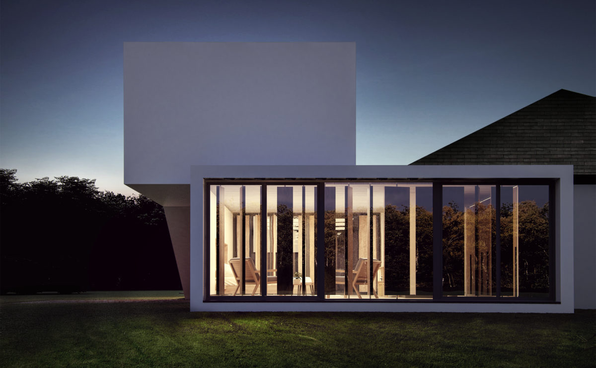
the view from the garden
The double-height living room space opens onto the outdoor garden through a large sliding glass door that allows you to enjoy the serene view of the landscape.
Zain tower
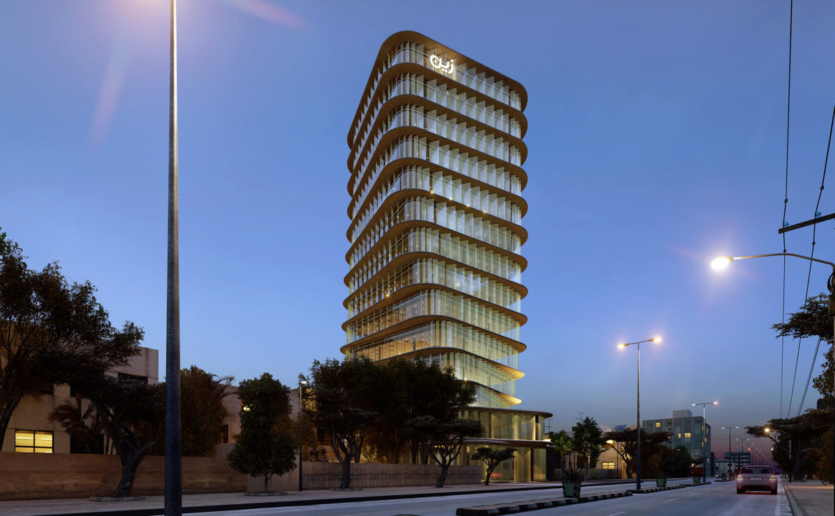
the night view
When night falls the transparent quality of the facade turns the tower into a lantern of the city’s landscape. The vertical slats become translucent and provide privacy to the interior.
Bolaños house
the entrance hall
The house is distributed around the kitchen and the garden. The sloping roof gives more height to the ceiling in the living room and descends towards the bedrooms. The entrance hall articulates the spaces for daytime use, from where you can also go out into the garden.
maragato lofts
the living room and kitchen
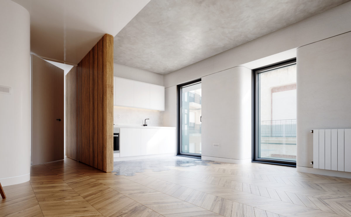
In contrast to the orthogonal rigidity of the exterior, the interior spaces are wrapped in soft, rounded corners. The oak flooring and the concrete ceiling offer a warm visual tone while a featured wooden slats partition serves as a transition and articulates the space.
Burke house
the master bedroom
The bedroom is a spacious and functional space open to the landscape. The furniture merges with the architecture to create a warm and cosy atmosphere governed by light and textures.
Shoreditch hotel
the hotel room
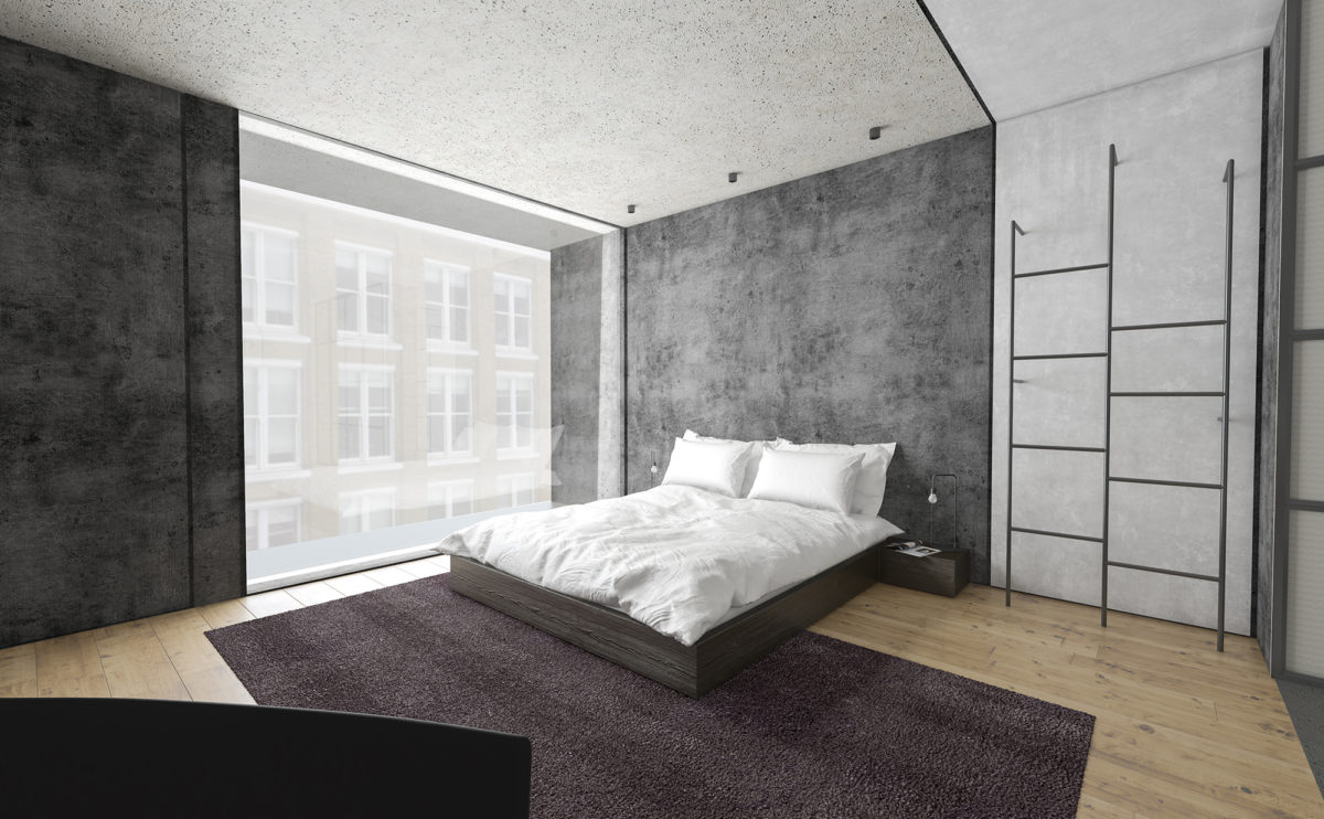
The hotel is designed for young people looking for an urban experience. The industrial-style interior design combines concrete, metal and wood to create a minimalist and functional atmosphere.
Ashley Gardens
the kitchen from the reception room
From the living room, the kitchen is perceived as an extension of the space. The threshold separating the two rooms is delimited by a peninsula worktop with stools. This breakfast table makes the kitchen a perfect place to socialise with guests.
house of arts
the exhibition hall
The exhibition hall of the House of Arts is a double-height space enclosed by the same coloured glass louvres that surround the building.
connecting riads
the south courtyard
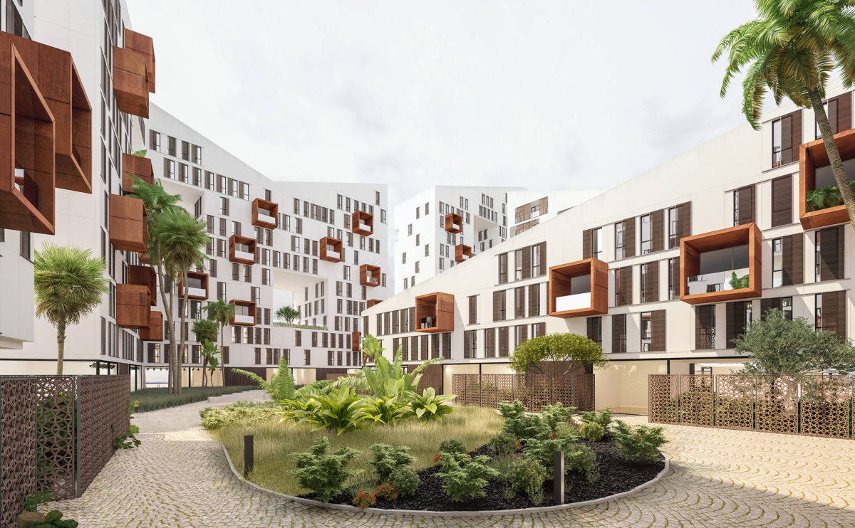
The large block courtyards are pedestrian areas with abundant vegetation. The gardens have fountains and tropical trees, giving the perception of a fresh oasis in the heart of the residential compound.
Bolaños house
the living room
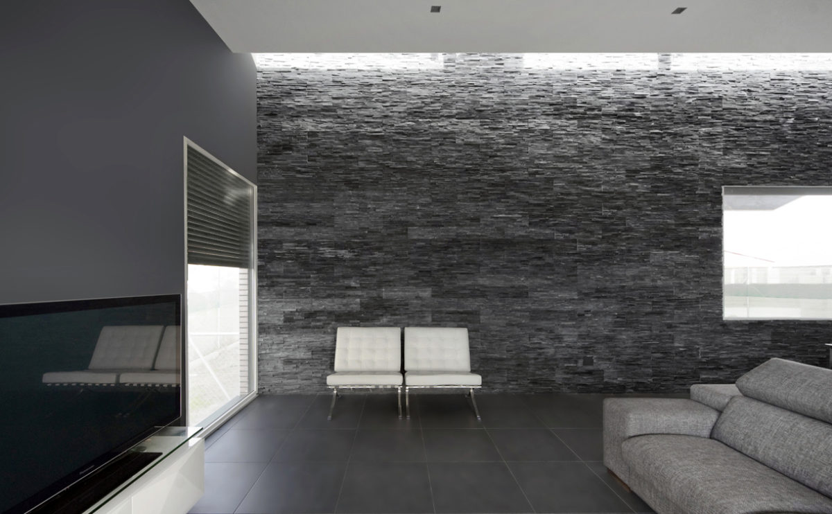
The heart of the house is the living room, lit by large windows and a skylight. The dark walls contrast with the ceiling and the white leather Barcelona armchairs designed by Mies van Der Rohe. The texture of the natural stone wall is highlighted by the zenithal light from the skylight.
Burke house
the office space
The work area on the upper floor has the best views of the house. Linked to the patio and the rear garden, the office is a quiet space with a sober and unique design.
Shoreditch hotel
the view from Paul St
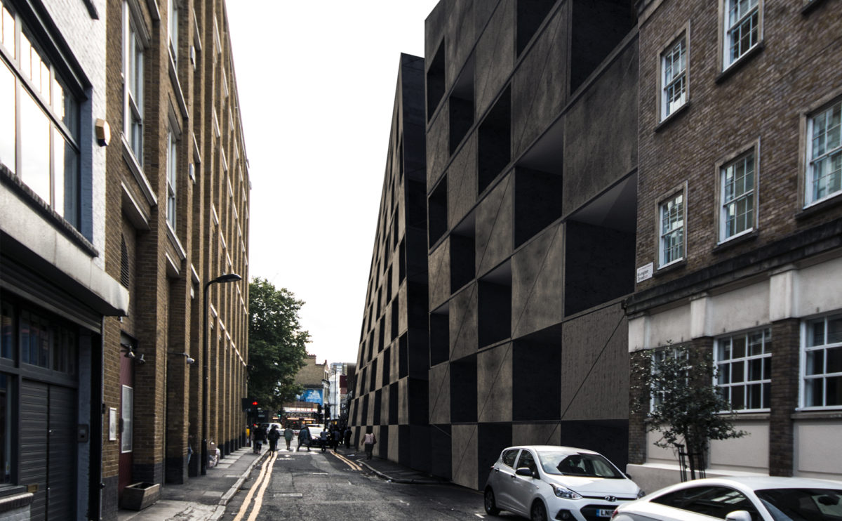
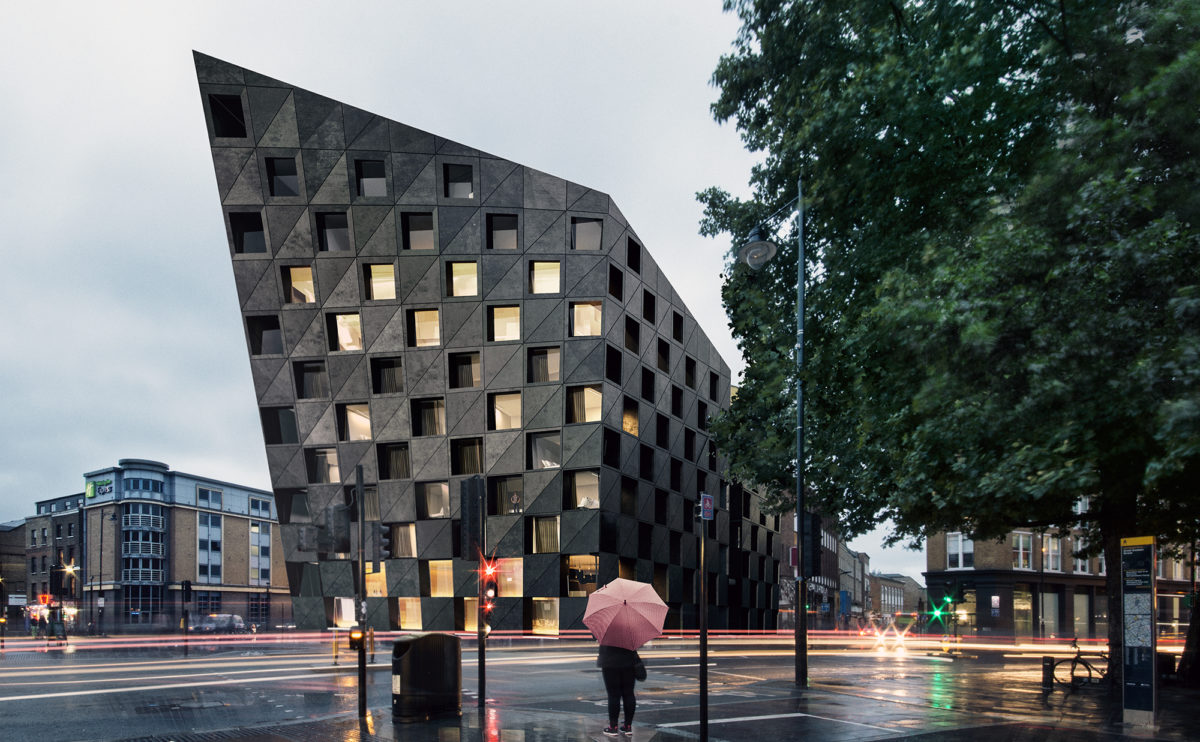
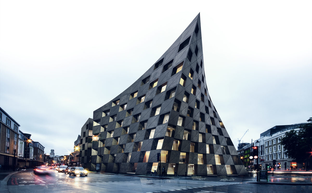
At nightfall, the light from the hotel windows underlines the chequered pattern of the black concrete façade, creating an easily recognisable icon that serves as an urban landmark for the restaurant and shopping area.
connecting riads
the street view
The ground floor of this residential building includes retail units facing the boulevard, and townhouses on the side facing the urban park. From the welcoming access to the inner block, courtyard, you can see the abundance of this hidden oasis.
Shoreditch hotel
the view from Old St
The building is presented as a rotund, stone volume with a chequered pattern of façade openings. This solid, almost tectonic composition is distorted by the deformation of the solid, which turns into a provocative gesture as it reacts to the flow of urban traffic.
Ashley Gardens
the bathroom
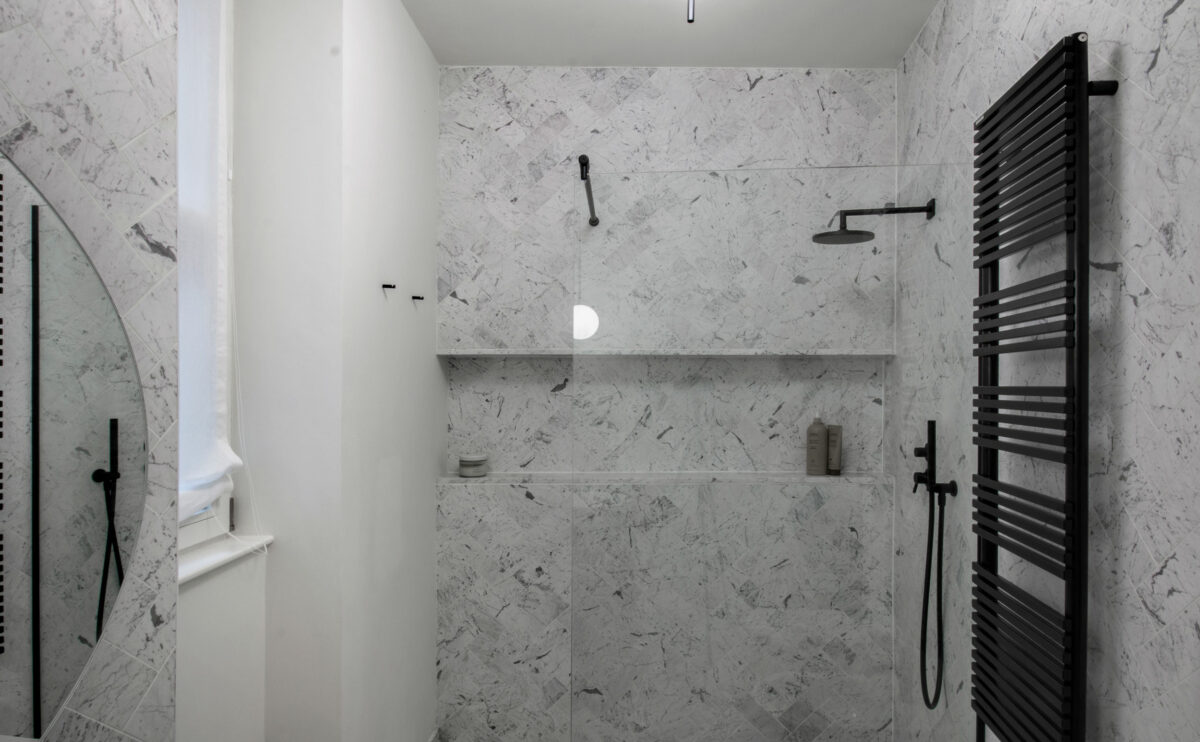
The bathroom is clad in Italian Statuario marble in a herringbone pattern. The design features simple lines. The shower tray is integrated into the floor and the taps and fittings are in matt black lacquered steel.
wrap manifesto
the main elevation
From the main avenue, the green façade of the building can be seen, blending in with the vegetation of the urban landscape. The walkway linking the top of the hill becomes the roof of the ground floor, which extends to form an entrance canopy.
market eight
the main entrance
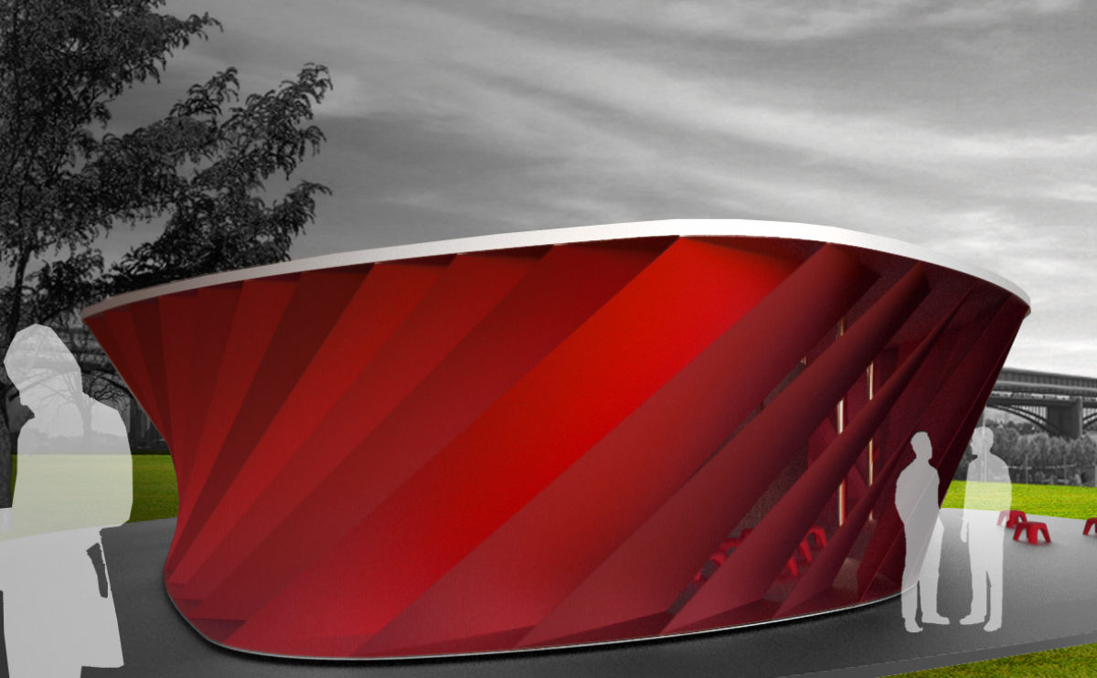
The image of the mall at night is dynamic, colourful and vibrant. The pink glass louvres are oriented in opposite directions on each floor, creating an interesting glare and reflection effect.
Dehan village
the master bedroom
The master bedroom enjoys not only the wide exterior views but also the spaciousness of the double-height interior space that connects the living room and the dining room.
Burke house
the walking wardrobe
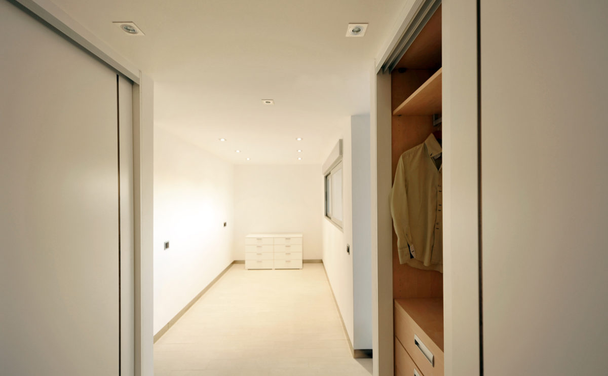
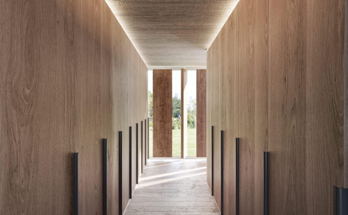
The dressing room is a warm and comfortable space with large floor-to-ceiling wardrobes on both sides. The window to the garden provides abundant natural light sifted by the wooden slats, close enough to give privacy but separated to appreciate the landscape.
Dulwich house
the bench
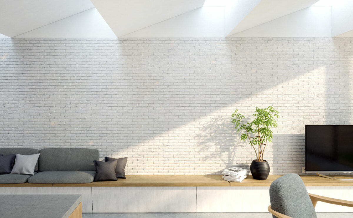
The rough texture of the old brick party wall of the house becomes a distinctive element enhanced by the zenithal light from the skylight. Along this wall, there is a wooden seat, it’s an informal piece of furniture that serves as a sofa, bookshelf and tv bench.
market eight
the view from the river
The different levels of the shopping centre stand out as horizontal lines on the colourful façade of the building. The escalators connecting the different floors on the outside contribute to the organic and dynamic image of the building.
cuña house
the ground floor
The ground floor comprises the common areas of the house, the kitchen, the living room and the dining room, from which you can access the garden through a large sliding glass door.
performing arts complex
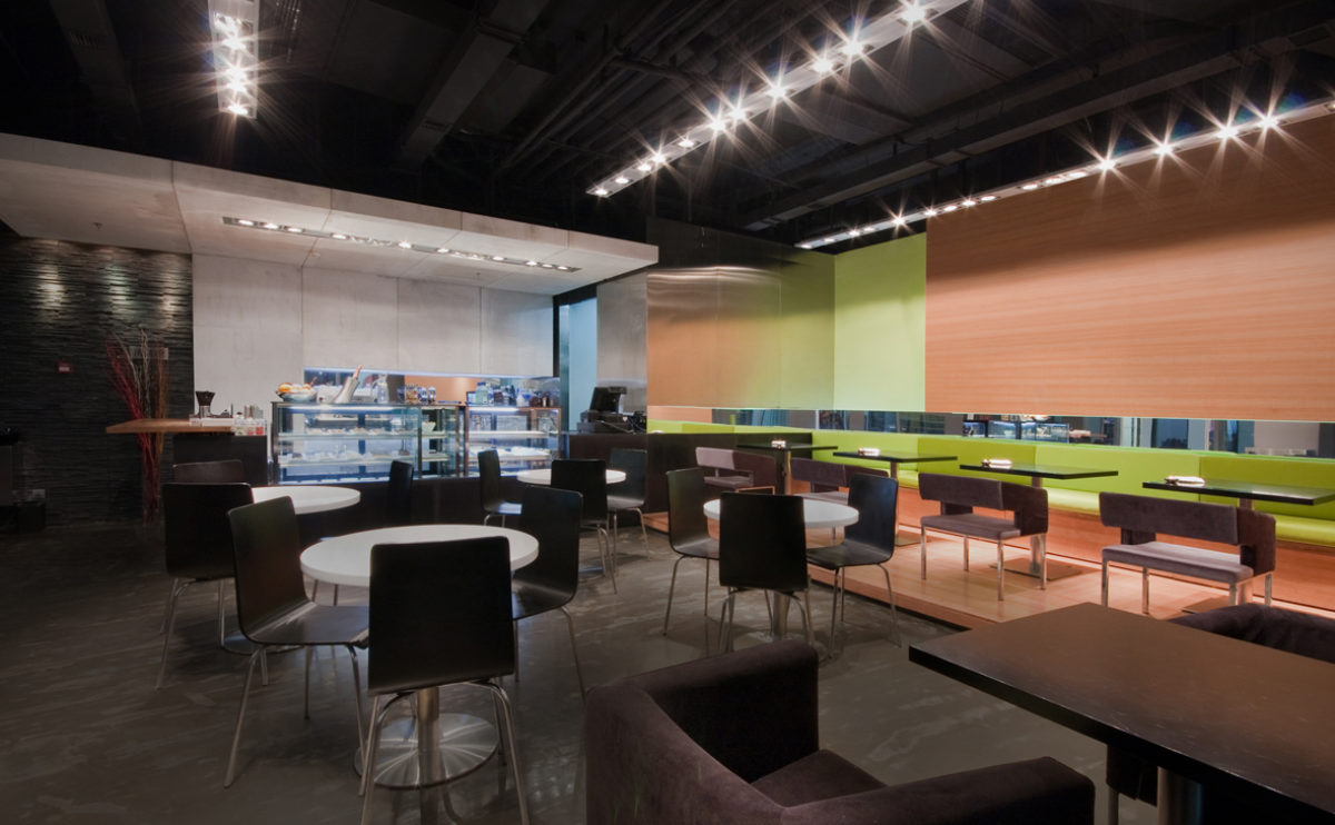
the cafeteria
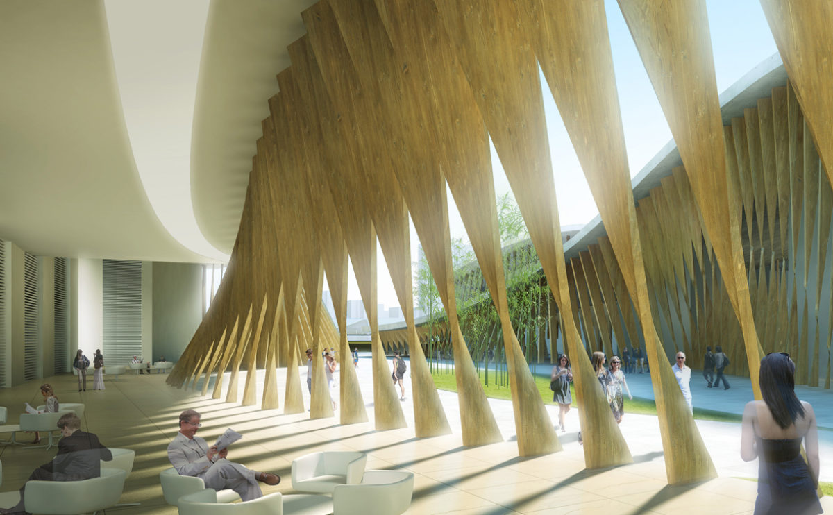
The cafeteria of the performing arts centre is enclosed by an undulating façade made of twisted wooden slats that form a dynamic and protective envelope.
maragato lofts
the west elevation
The building facade aligns with heights of the adjacent buildings, blends with the historic architecture offering a regular balanced composition and it’s coronated with a zinc roof that looks like an interpretation of the traditional dormers.
Zain tower
the view from 15th avenue
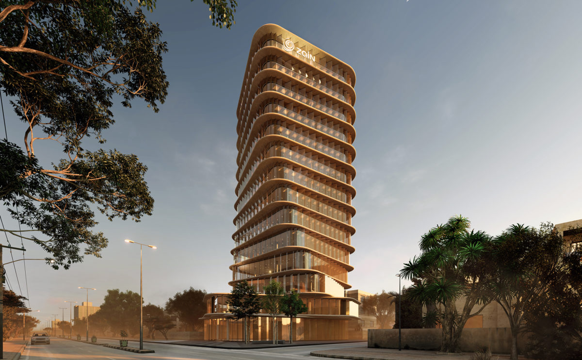
The tower is the tallest building of this diplomatic district of Khartoum, the slender figure is seen from the main avenue, and the twisted facade is a distinctive feature that symbolised the essence of Zain’s brand.
Burke house
the garden
The facade towards the garden is an iconic element of the building. Its unique elevation expresses the function of the interior spaces, and the view of the courtyard adds depth to the structure.
Burke house
the north elevation
The master bedroom of the house opens to the north with a large opening of sliding doors. The vertical rotating wooden slats function as a shutter, controlling the lighting and privacy of the space.
fragmented house
the dining room
The dining room is strategically placed between the living room and the kitchen, protected from view from the entrance by a free-standing wall. The dining room enjoys views of the garden through a glass door that leads out onto the porch.
Burke house
the main facade
The building facade conveys in a simple and elegant gesture the interior layout and the control of natural light, privacy and views. The concrete slabs create a continuous enclosure carefully protected by the glass and the wooden slats.
folded auditorium
the view from the stage
From the stage, you can see the configuration of the acoustic ceiling, formed by curved surfaces mounted on top of each other, like the shell of an armadillo. The stage lighting is placed between the suspended planes of the ceiling, while the hall receives light from the small recessed spotlights that resemble a starry sky.
Dehan village
the view of the village from the south
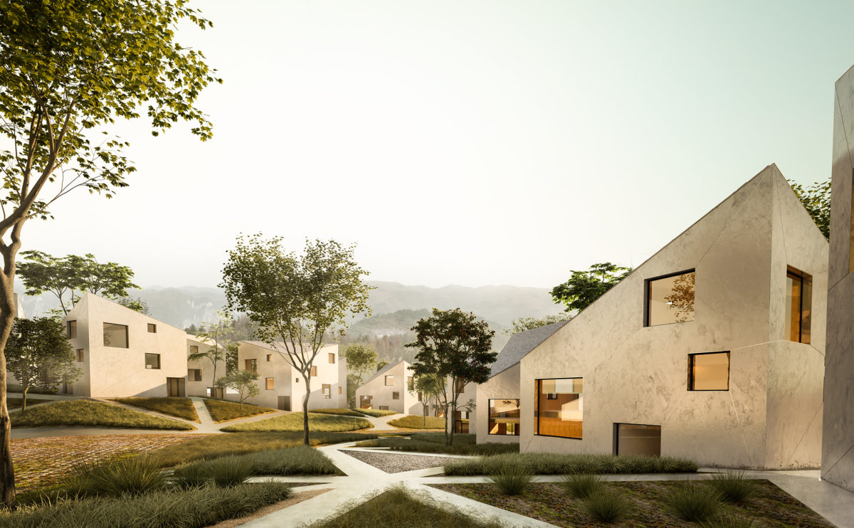
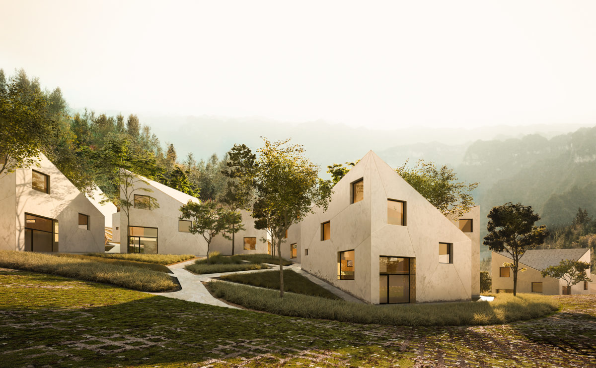
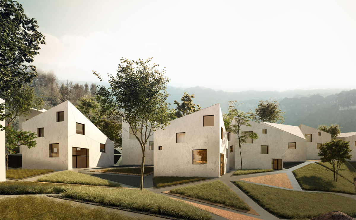
The resort, seen from the lowest part of the land, looks like a village immersed in a forest. The methodical variation of the houses produces a random and capricious effect, a natural articulation that invites guests to explore and discover mysterious spaces.
Burke house
the kitchen
The existing kitchen is refurbished and expanded to form part of the living room. A central island articulates the space, which includes a work area, a bar and a dining table.
Dehan village
the typical cluster of villas
The diagonal arrangement of the houses does not only respond to the triangulation of the land. The rotation of the villas results in obtuse and sharp angles that allow for privacy control. In each group of houses, residents can enjoy the landscape without seeing the neighbours.
Dehan village
the dining room
The dining room on the first floor is a generous space that is linked to the service area and kitchen located behind the stairwell. The different levels seem to float in the space, an effect reinforced by the glass railings protecting them.
folded auditorium
the auditorium acoustic ceiling
The overlapping wooden strips that wrap around the ceiling create a dynamic and contemporary image of the auditorium’s interior. The texture of the curved wood together with the random arrangement of the ceiling lights creates a warm atmosphere with excellent acoustic conditions.
next stop: hutopolis
the table with rotating panels
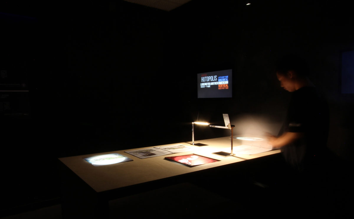
The exhibition space is a dark room featuring long tables with interactive rotating panels, books and video screens. The lighting consists of spotlights from the ceiling and table lamps from the Italian brand Flos that create a warm and cosy atmosphere.
Burke house
the recessed headboard
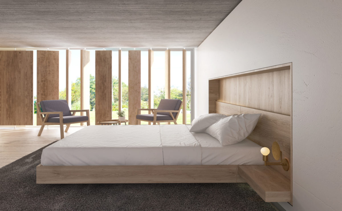
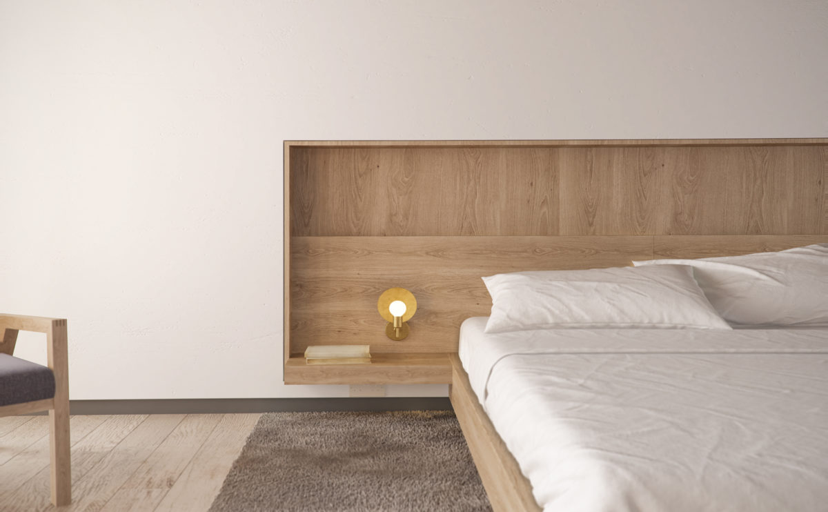
Architecture and interior design are considered as a whole, so the bespoke furniture is perfectly integrated into the configuration of the space. The bed headboard, the bedside tables and the lights form a proportionate and elegant composition recessed in the wall.
Pedraza house
the dinning area
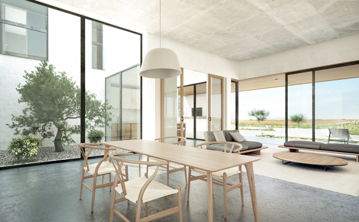
The dining area is linked to the open kitchen and the comfortable lounge area. The courtyard and the presence of the landscape flood the generous space, creating a visual connection with nature.
Bolaños house
the stone wall
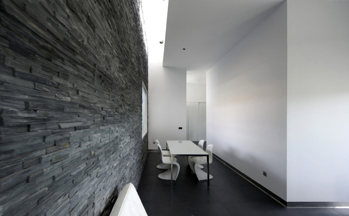
The interior of the living room has a black natural stone wall illuminated by a skylight. The dining table separates the foyer from the lounge area and is surrounded by stackable chairs designed by Vener Panton.
Ashley Gardens
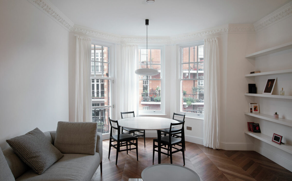
the reception room
The living/dining room enjoys views of the street, and has access to the balcony. The herringbone wooden flooring contrasts with the white walls and ceilings and the neutral colours of the furniture.
fragmented house
the living room
The main entrance to the house is hidden behind a natural stone wall which provides privacy to the dining room. The living room overlooks the front garden through a large window that can be opened with sliding doors.
wavescape pavilion
the view from the marina
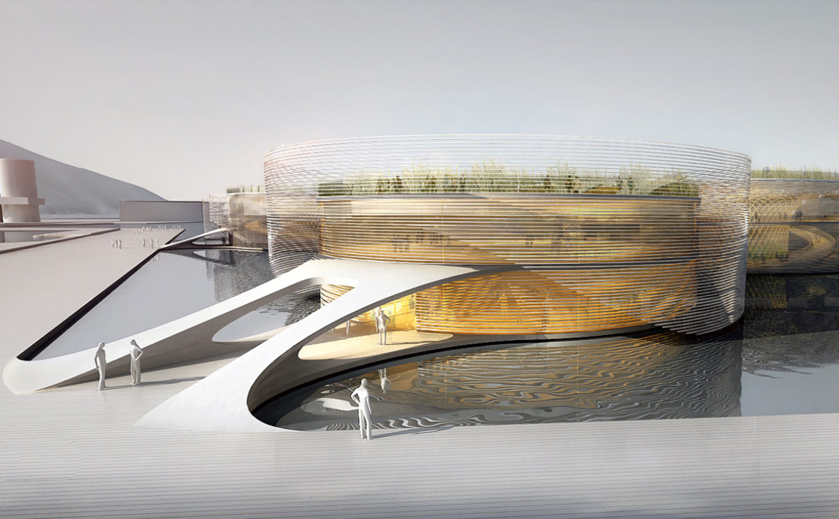
The themed pavilion for the World Expo floats on the sea and is connected to the quay via a gangway. The floating façade of horizontal slats creates a moiré effect as it moves with the waves.
Pedraza house
the kitchen
The kitchen is a generous space full of light. The continuity of the polished concrete pavement, the large windows and the distribution around an island make this room blend with the surrounding landscape.
next stop: hutopolis
the main hall
The main exhibition hall is a dark cubic space with four illuminated tables corresponding to the principles of urban research. Above these displays is an illuminated three-dimensional graphic.
hospital in the forest
the nursing station
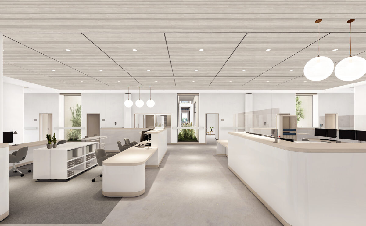
The centralized nursing station provides a visual connection with the patient’s rooms and other areas of the hospital. The space is warm and welcoming, intuitive to circulate around and well illuminated.
ramp up the 'mun
the view from the plaza
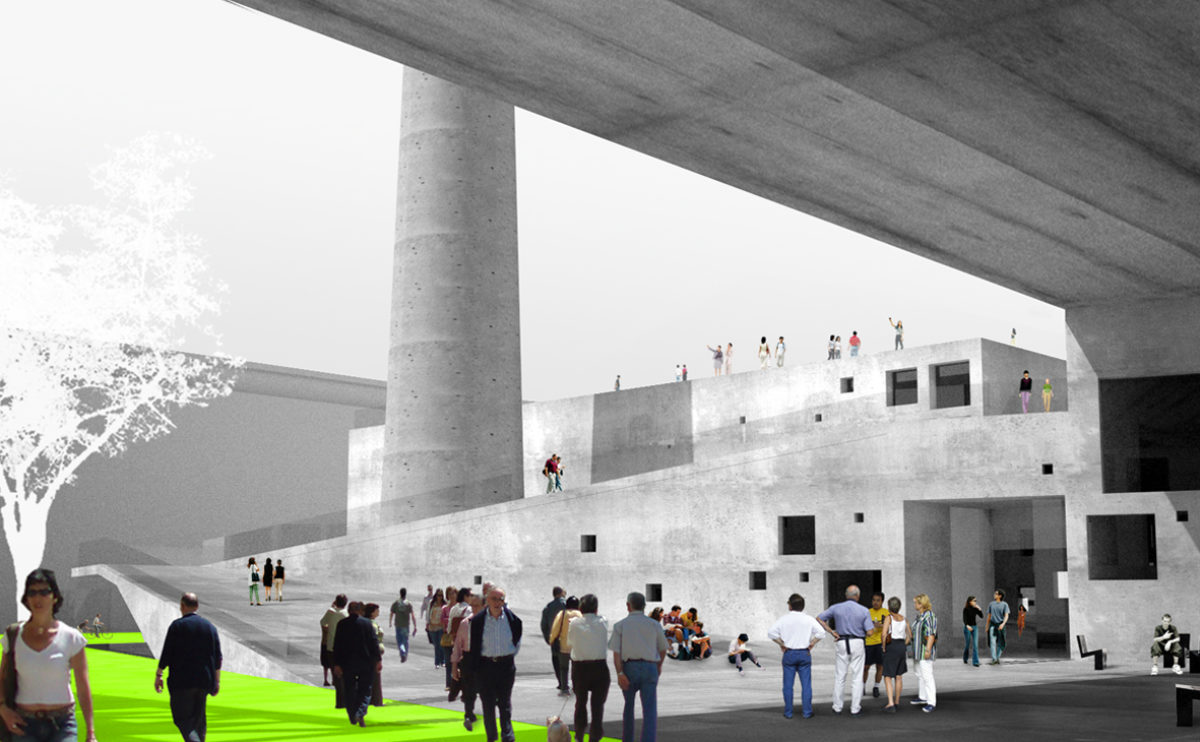
The structure of the old boiler house is extended by an apartment building to enclose a public square with a ramp leading up around the chimney to the roof.
Xu Beihong foundation
the atrium
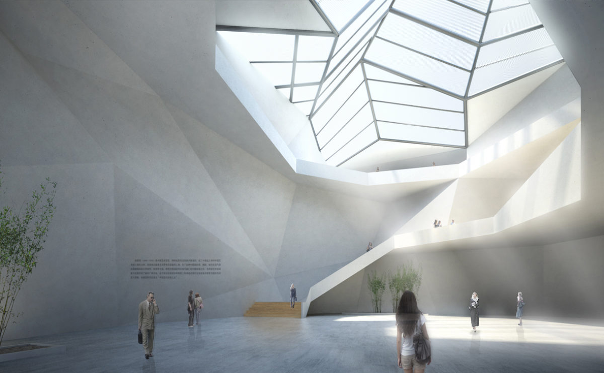
The central atrium of the building is a space illuminated by a large skylight. The plasticity of its concrete walls reminds us of a natural cave dominated by the stairs leading to the upper level.
Xu Beihong foundation
the main facade
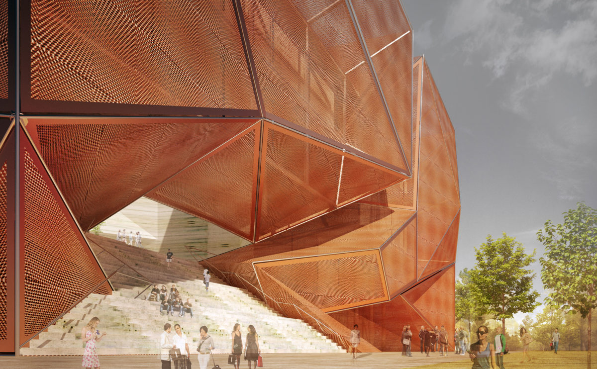
The façade of the building consists of a double metal mesh envelope with angular shapes. The access is located on the first floor, through a grandstand that connects the street with the inner courtyard.
next stop: hutopolis
the low density wall chart
The exhibition shows an infographic with the characteristics of low-density neighbourhoods. A bar chart represents the values of mobility, urban greenery or social diversity among others. These parameters are diametrically opposed to those in the dense city model, so the union of both graphs generates a hyperbolic paraboloid on the ceiling.
K house
the dining area
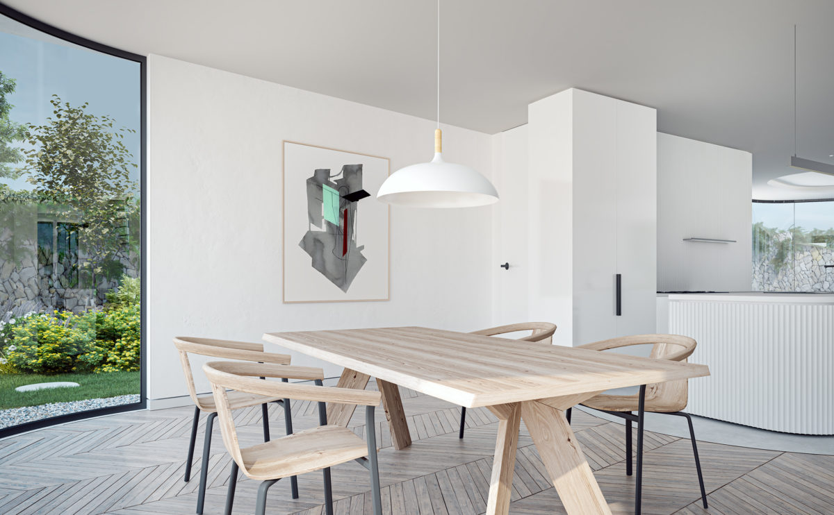
The dining area is a bright and spacious space. The windows with curved glass form a sort of modern conservatory or veranda overlooking the garden, protected by the cantilever of the upper terrace.
fragmented house
the view from the porch
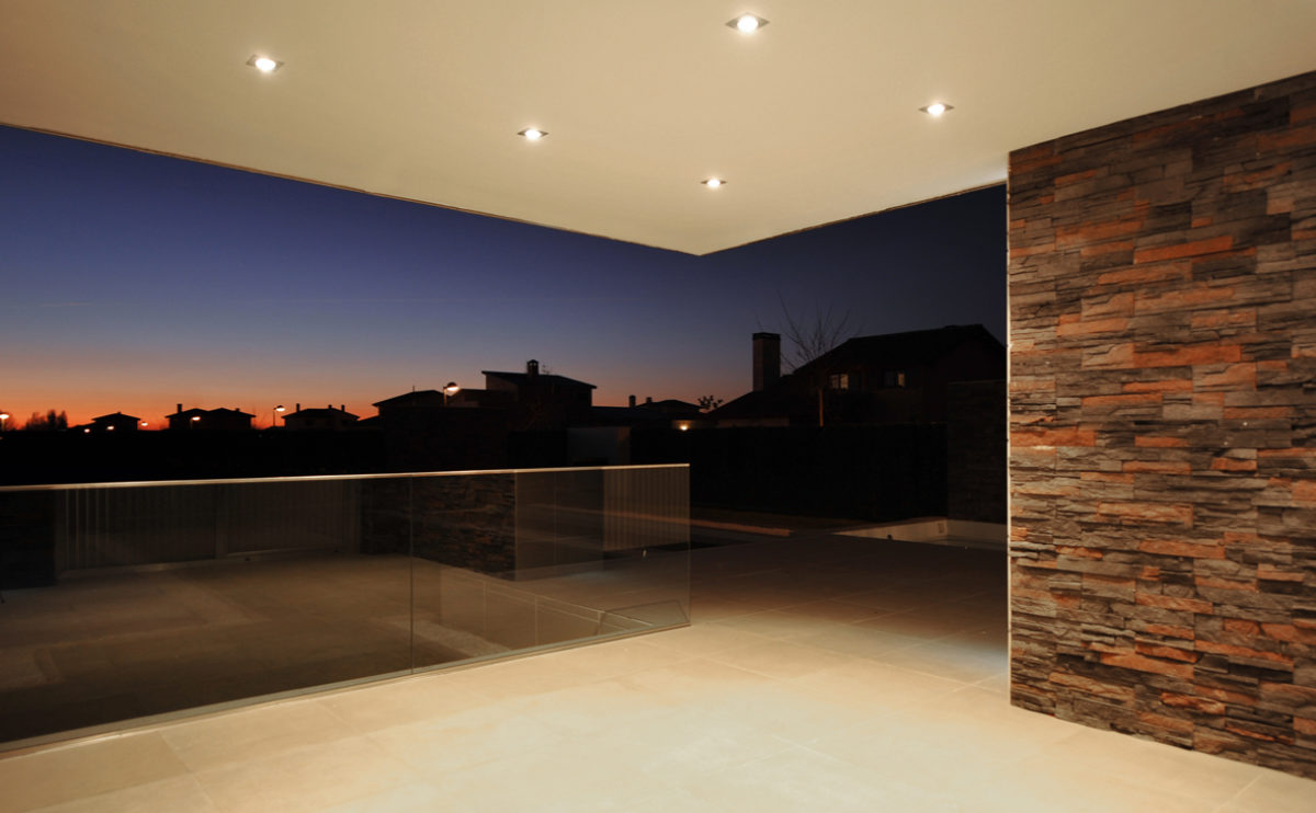
From the front porch of this modern home, covered by a cantilevered roof, the silhouette of the nearby village can be seen. The simple tempered glass balustrade protects the deck without obscuring the landscape, while the natural stone wall contrasts with the smooth finishes of the exterior.
connecting riads
the boulevard view
From the broad boulevard, the building presents a resounding and iconic image. The silhouette is reminiscent of the archetype of the gabled-roofed house, providing an exciting play of scales.
Dehan village
the village skyline and the mountains
The landscape composition is based on a rhythmic and almost melodic repetition of key elements. The orientation of the houses, their levels and the random window sizes result in an arbitrary and naive appearance, similar to the vernacular architecture.
Zain tower
the retail store
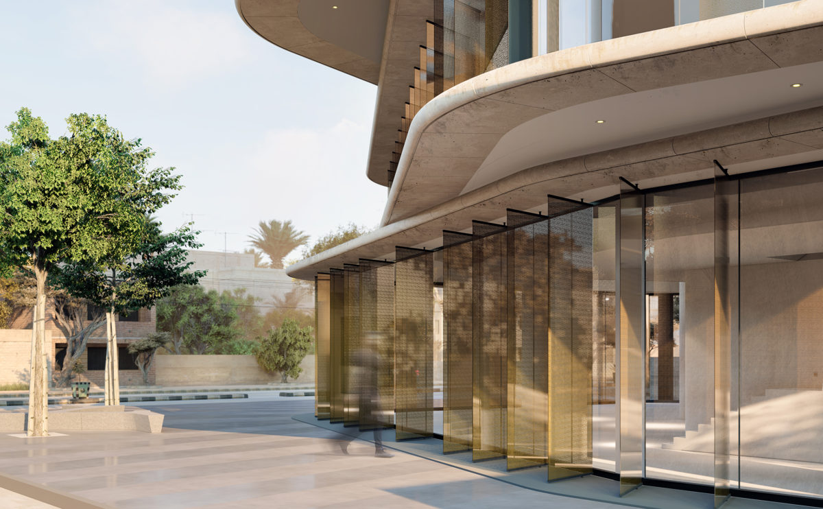
The tower base leaves a public space on the corner of the plot to mark the entrance of the flagship store. This gesture defines the rotation of the tower and provides a welcoming access point protected by the cantilever of the floors above.
fragmented house
the front yard
The main façade of this contemporary style detached house has large windows and a cantilevered body overlooking the garden where the swimming pool and a gazebo are located. The ground floor has a porch in front of the dining room and kitchen.
Pedraza house
the porch
The cantilevered canopy that covers the porch of the house frames the view of the landscape. The living room becomes a glass enclosure, which opens a corner to see the horizon.
connecting riads
the top terrace
The building is lower towards the urban park located behind the boulevard, so the roof is formed by a series of staggered terraces, with abundant vegetation, which enjoys the pleasant views.
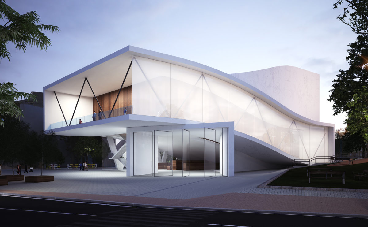
folded auditorium
the view from the plaza
The auditorium has an undulating shape, the white concrete façade forms a balcony over the main entrance facing the square. It is an organic, futuristic design that blends into the vegetation of the urban park.
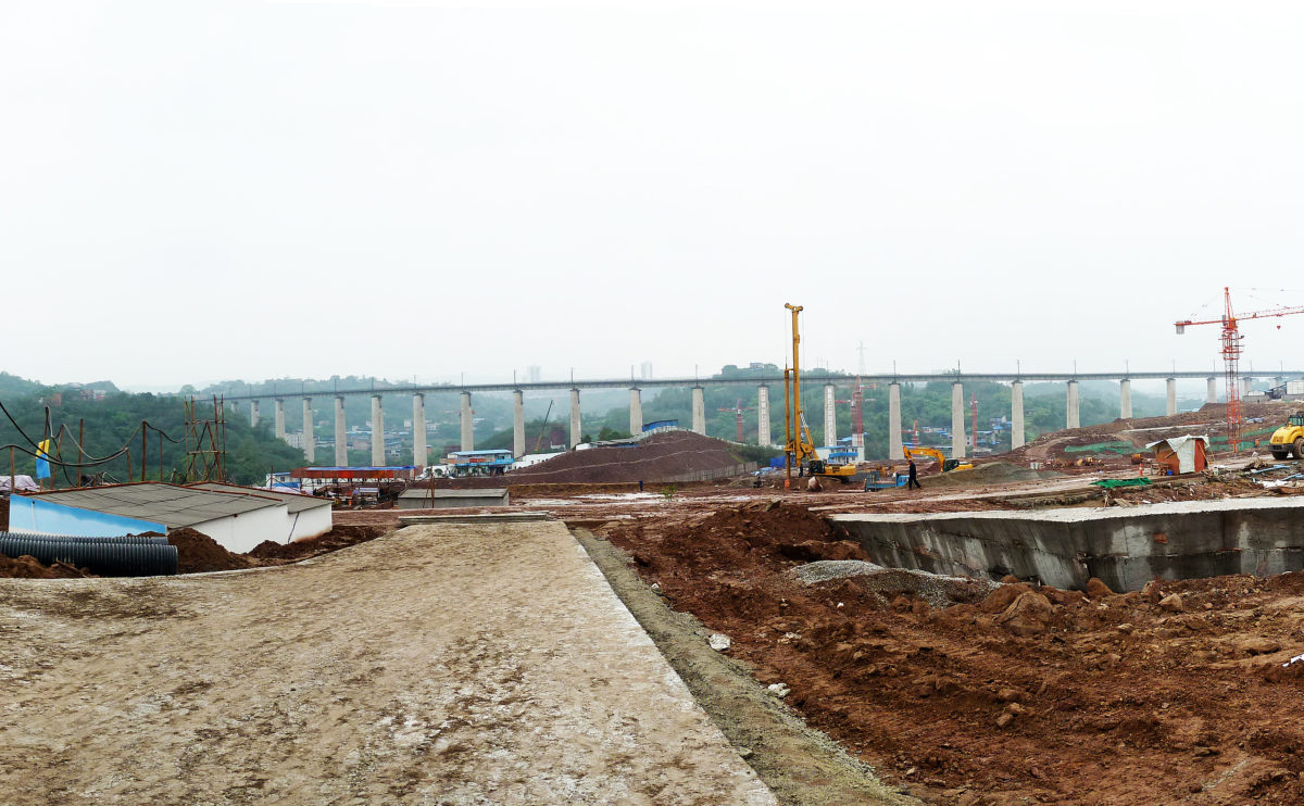
Tangjiatuo planning
the urban infraestructure
Works of the Tangjiatuo residential district in Chongqing, the new urban network of streets provides an efficient transportation system in line with the urban density.
performing arts complex
the promenade towards the marina
The undulating concrete roofs and meandering walls of wooden slats characterise the pavilions that make up the building. The pedestrian walkways leading to the marina are landscaped with lush bamboo shrubs.
