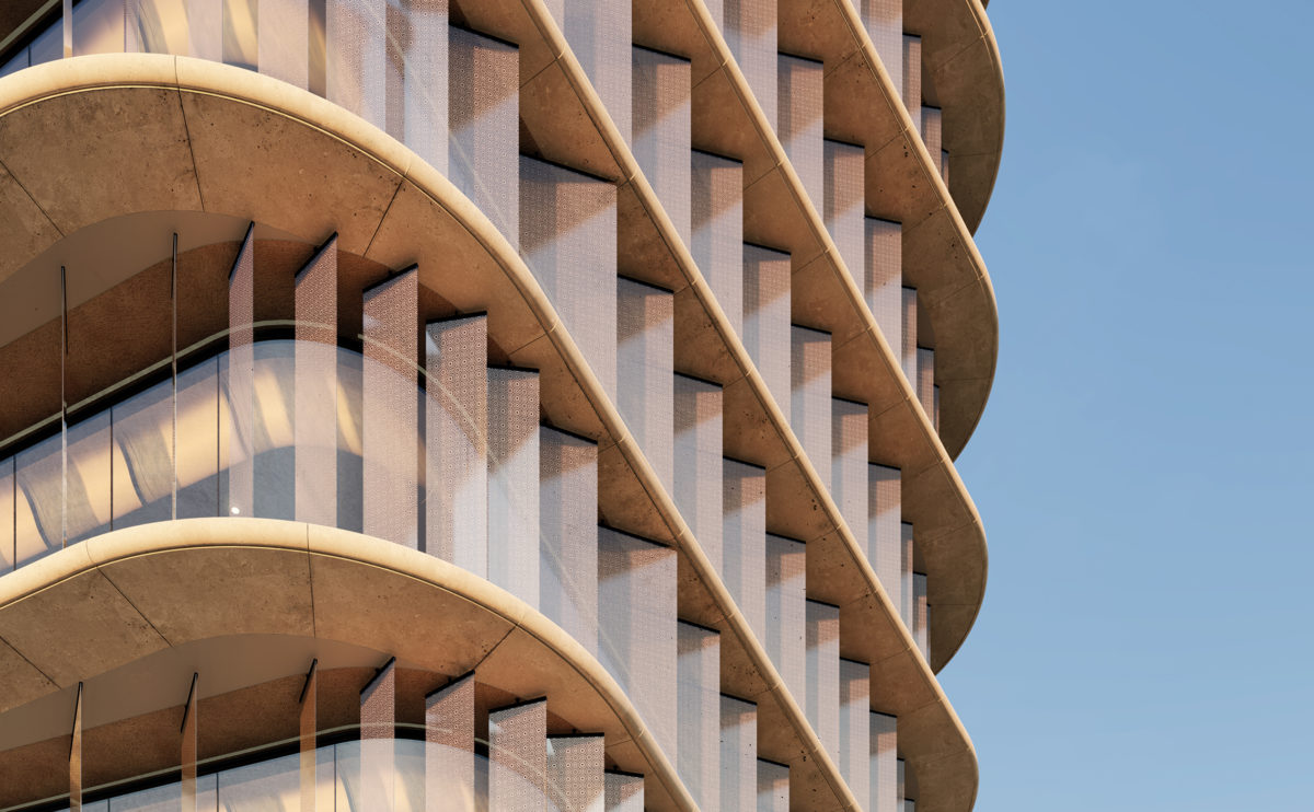
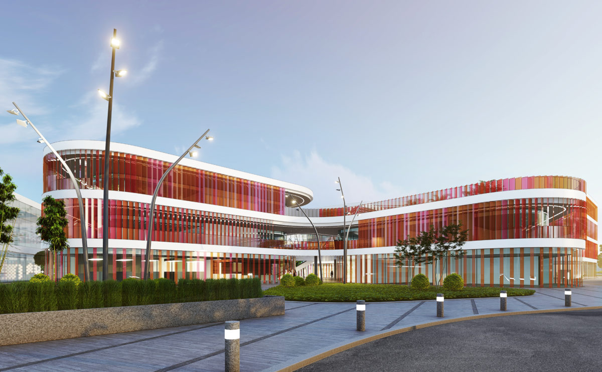
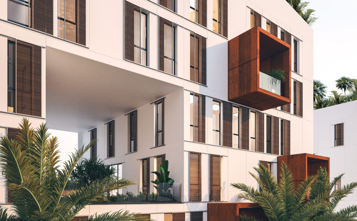
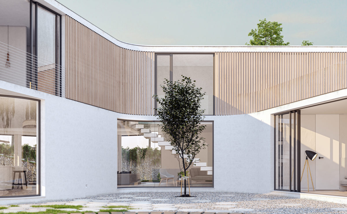
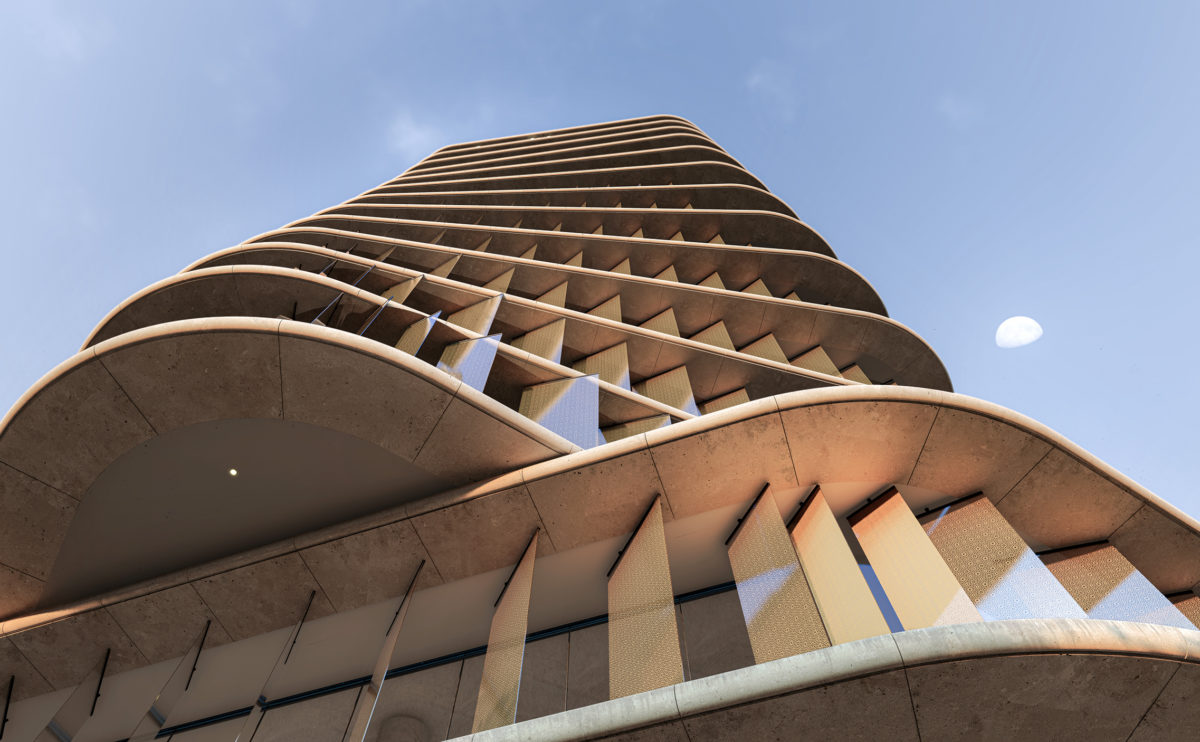
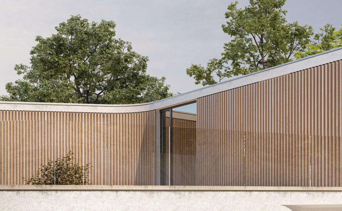
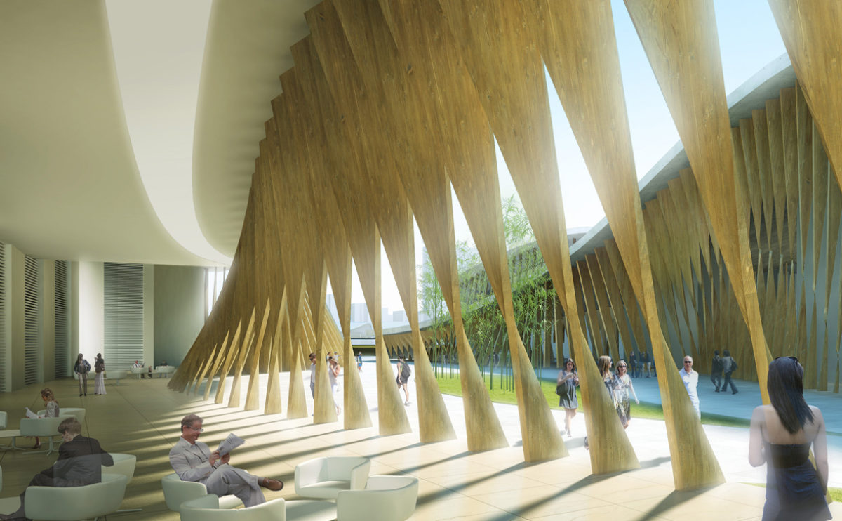
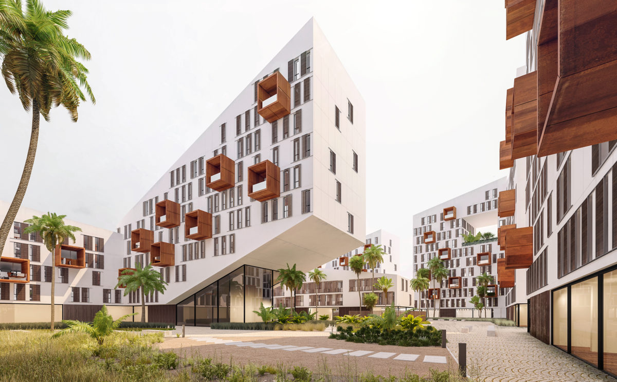
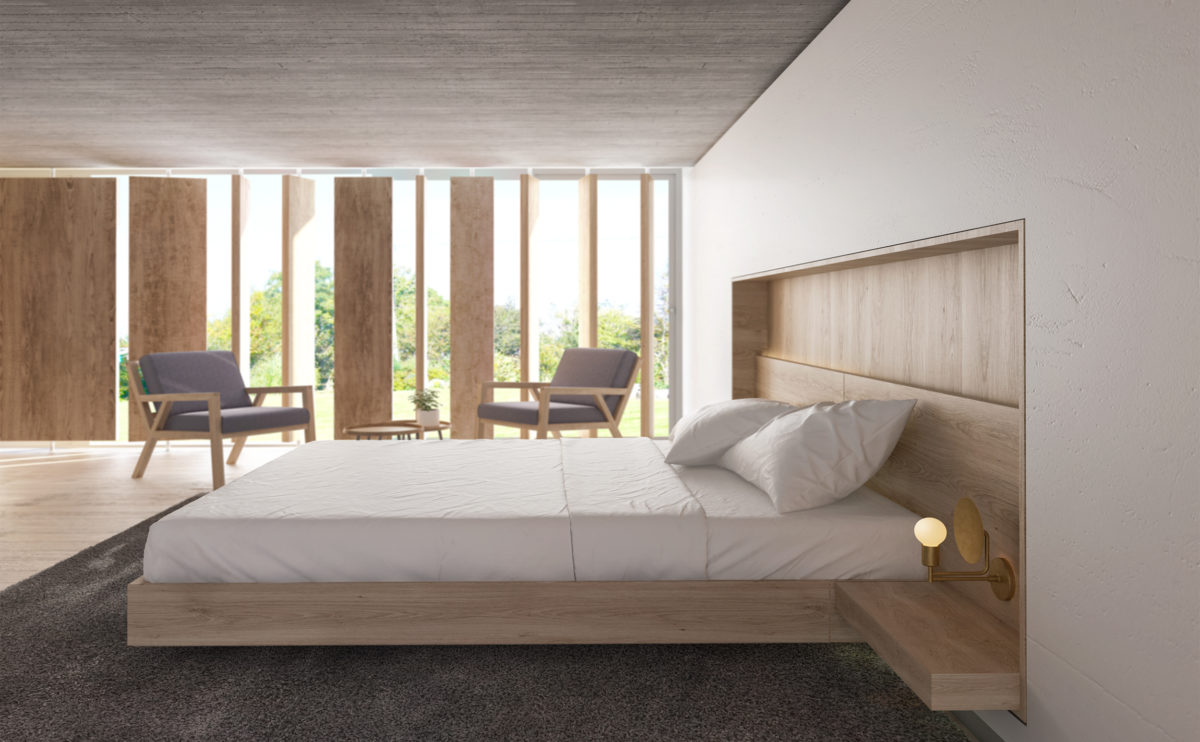
Architectural louvers are a type of building element that is used to control the amount of light, air, and sound that enters a building. They are typically installed on the exterior, and are designed to be adjustable, allowing the user to control the angle at which they are oriented.
Louvers consist of a series of parallel slats or blades, which are set at a fixed angle to the wall or window on which they are mounted. The angle of the blades can be adjusted manually or with a motorized system, depending on the specific design of the louver. The blades can be oriented horizontally or vertically, to block the passage of light and air or provide privacy.
There are several different types of architectural louvers, including fixed louvers, which are non-adjustable, and adjustable louvers, which can be changed to allow more or less light and air to pass through. Louvers can also be categorized based on the material they are made from, such as aluminum, wood, or plastic.
In addition to controlling light and air flow, architectural louvers can also be used to reduce noise levels within a building. When installed on the exterior of a building, louvers can help to deflect noise away from the interior, reducing the amount of sound that enters the building.
Architectural louvers are both a design feature and an important element of building design and construction, as they provide a means of controlling the environment within a building and improving the comfort and functionality of the space.
market eight
the facade detail
Flows of people, personnel and goods are very important in shopping centres. The Market Eight consists of a striking semi-transparent façade and a series of interlocking slabs that make it easy to find your way around the building.
wrap manifesto
the elevation and the cross section
The refurbishment of the existing building consists of the optimisation of the interior spaces, an extension and the installation of a new envelope that unifies the image of the complex, providing an institutional and contemporary appearance.
market eight
the main entrance
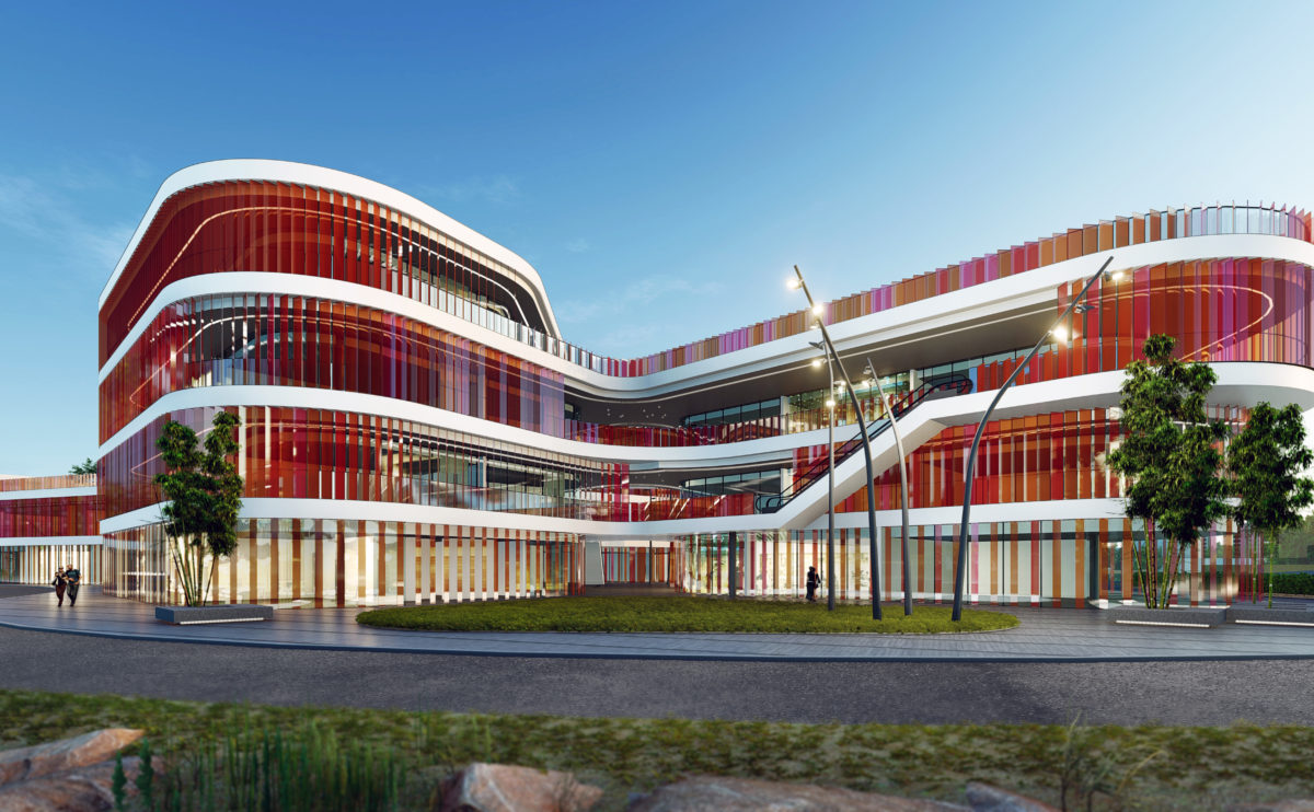
The image of the mall at night is dynamic, colourful and vibrant. The pink glass louvres are oriented in opposite directions on each floor, creating an interesting glare and reflection effect.
Burke house
the living room
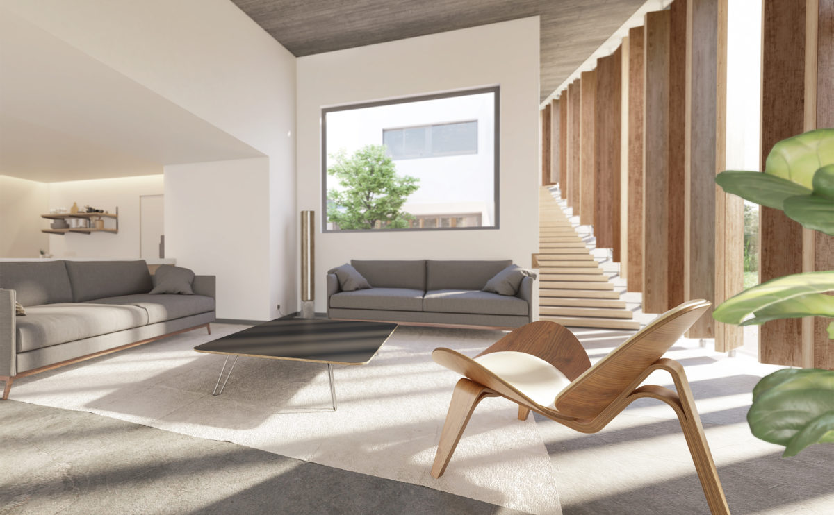
The living room is the heart of the house and visually articulates all the spaces. The double-height offers a generous amplitude that extends to the staircase leading up to the office on the upper floor.
Zain tower
the floor plans
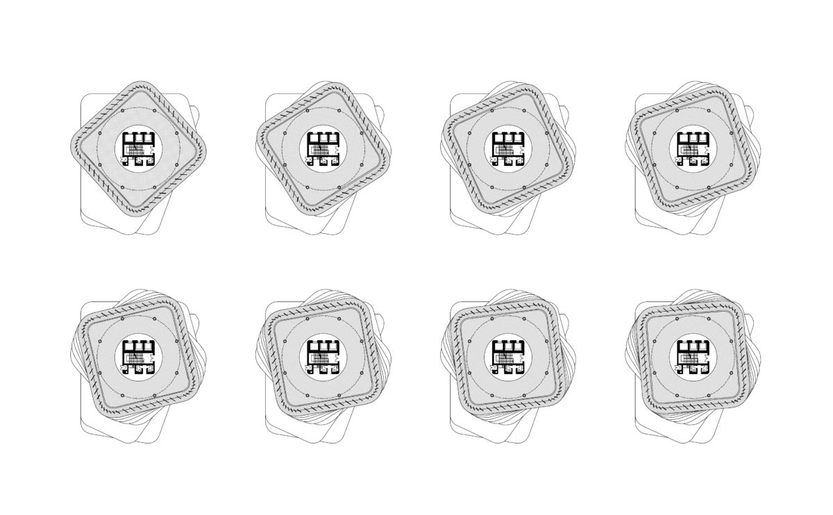
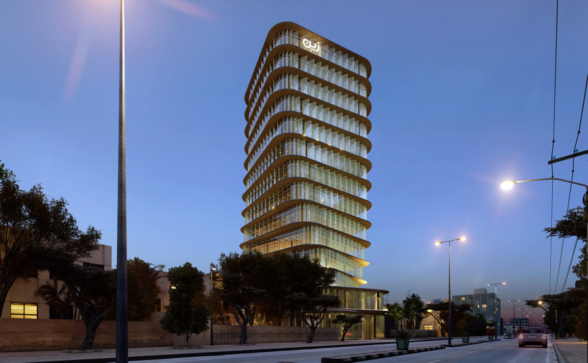
As the tower increases in height, each of its floors revolves around a central core. The result is a tower that is twisted at its base and becomes slender at the top.
house of arts
the longitudinal and cross sections
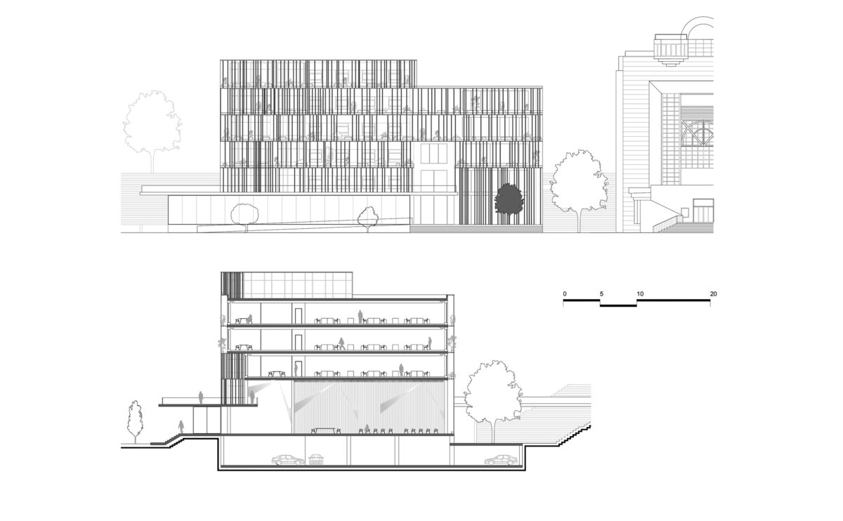
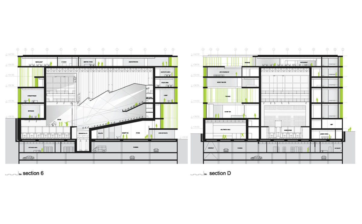
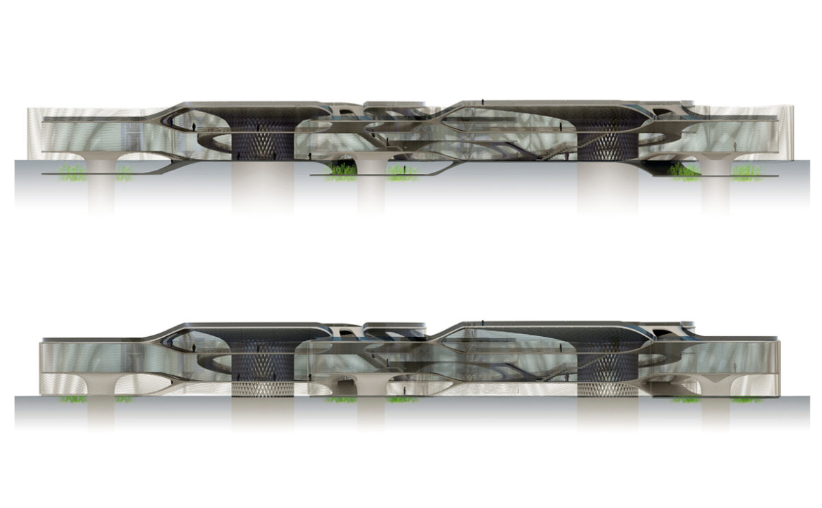
The cross-section drawing of this public building shows the library, exhibition hall and auditorium. This multifunctional hall is situated in the heart of the building, enveloped by a glass louvred façade.
performing arts complex
the promenade towards the marina
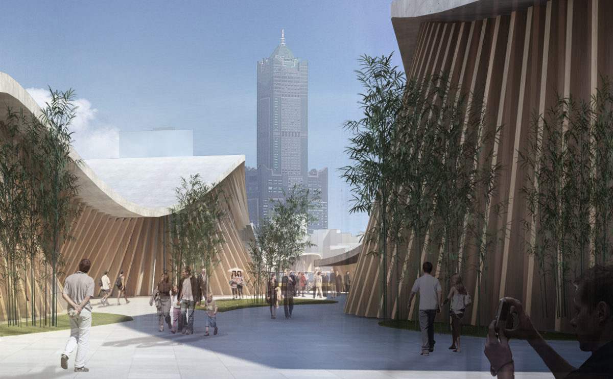
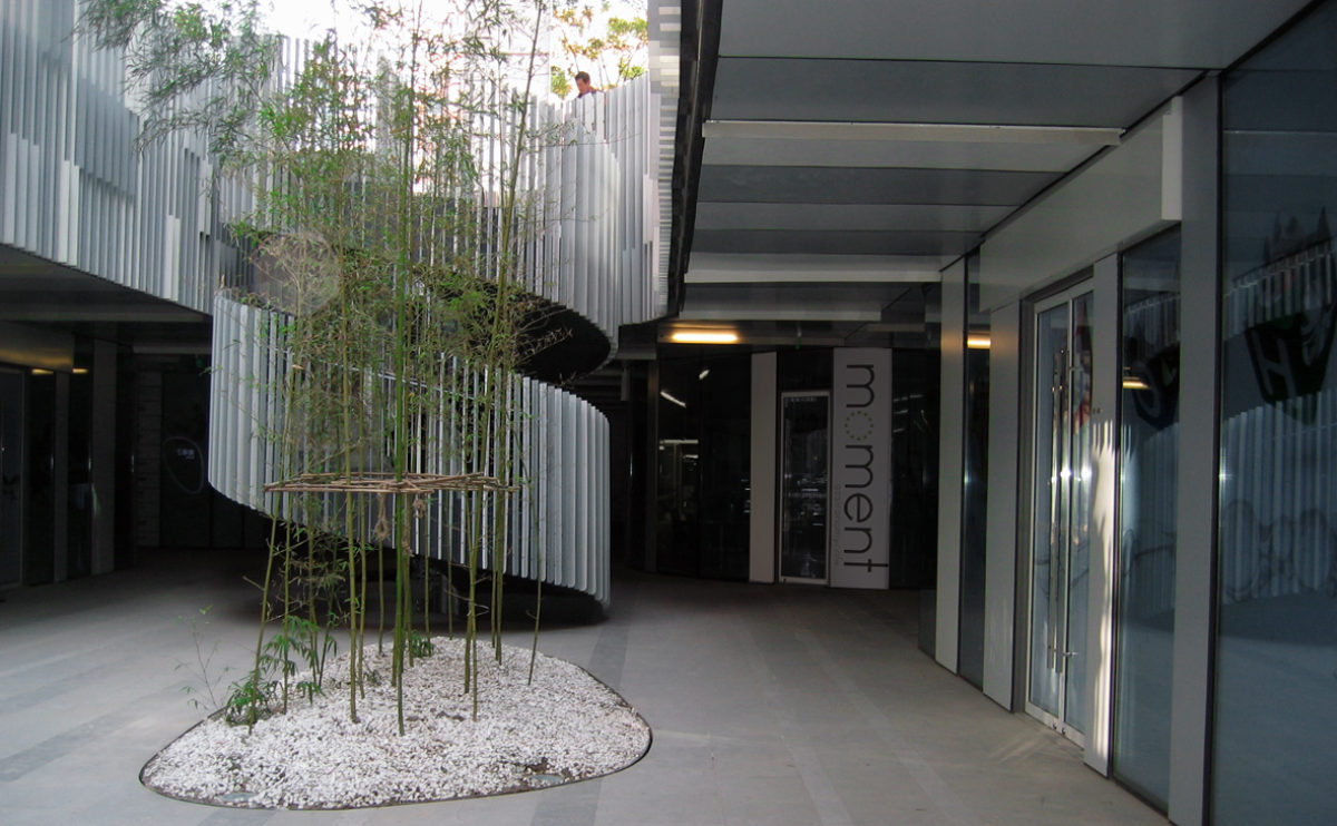
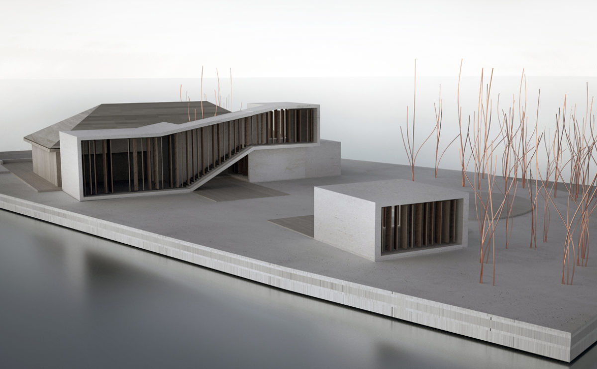
The undulating concrete roofs and meandering walls of wooden slats characterise the pavilions that make up the building. The pedestrian walkways leading to the marina are landscaped with lush bamboo shrubs.
wrap manifesto
the facade detail
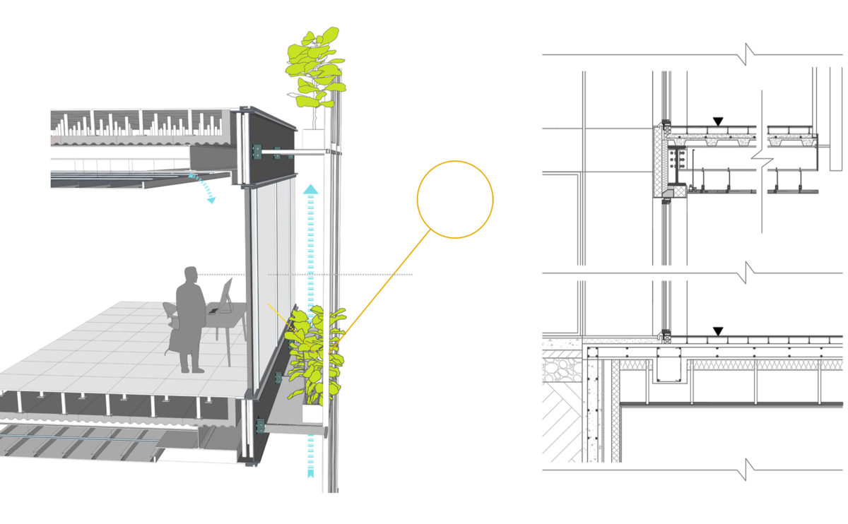
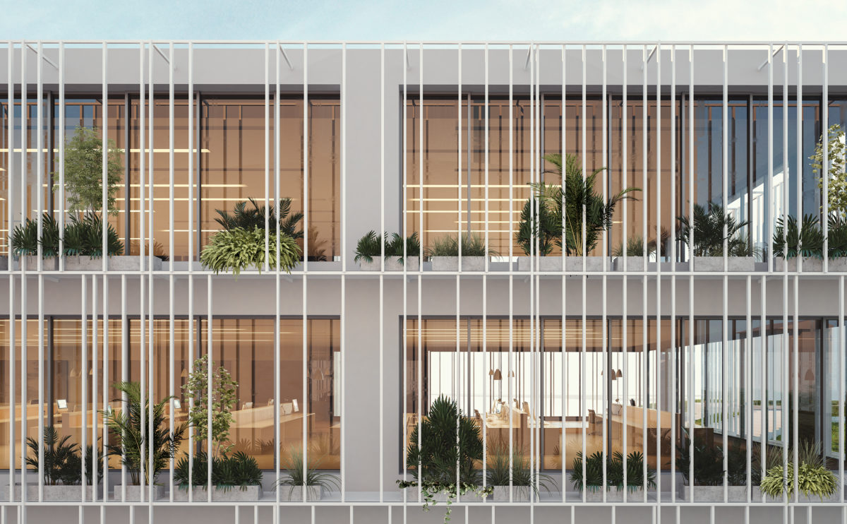
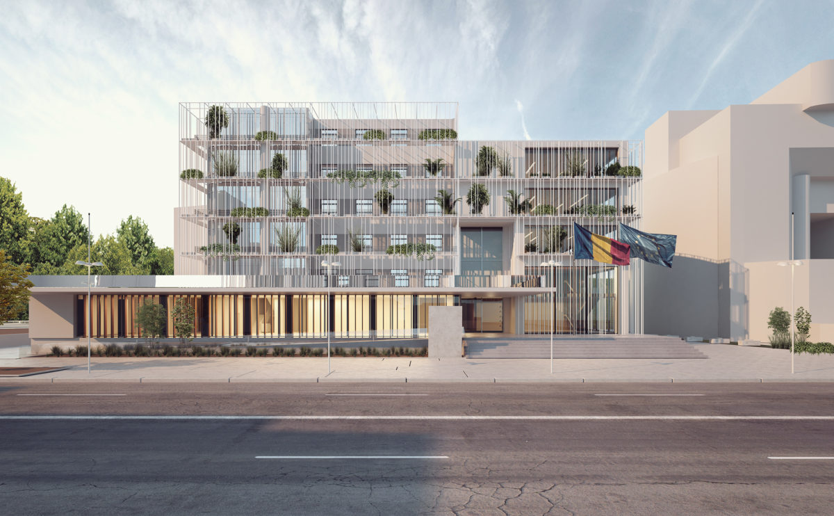
The façade system proposed for the building functions as a double skin that provides a homogeneous appearance, it regulates ventilation and the incidence of sunlight on the curtain wall behind and introduces greenery on each level creating a vertical garden.
Zain tower
the laminated glass wire mesh
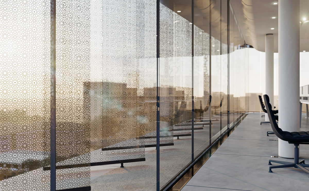
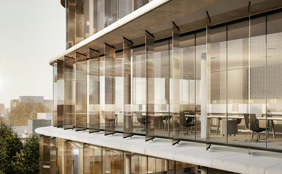
From inside the offices, the arabesque motifs of the louvres can be seen. The brass metal mesh is compressed into the glass when this is in a semi-molten state. It becomes a decorative and strengthening component of the glass fins.
hospital in the forest
the entrance lobby
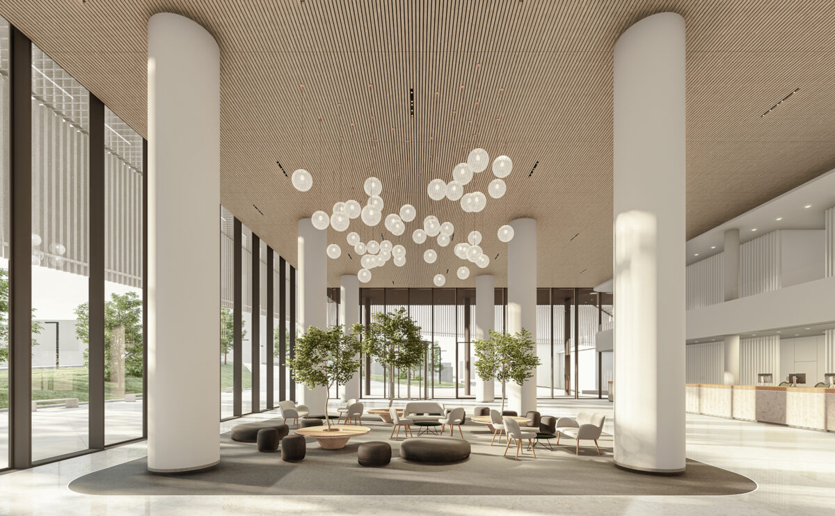
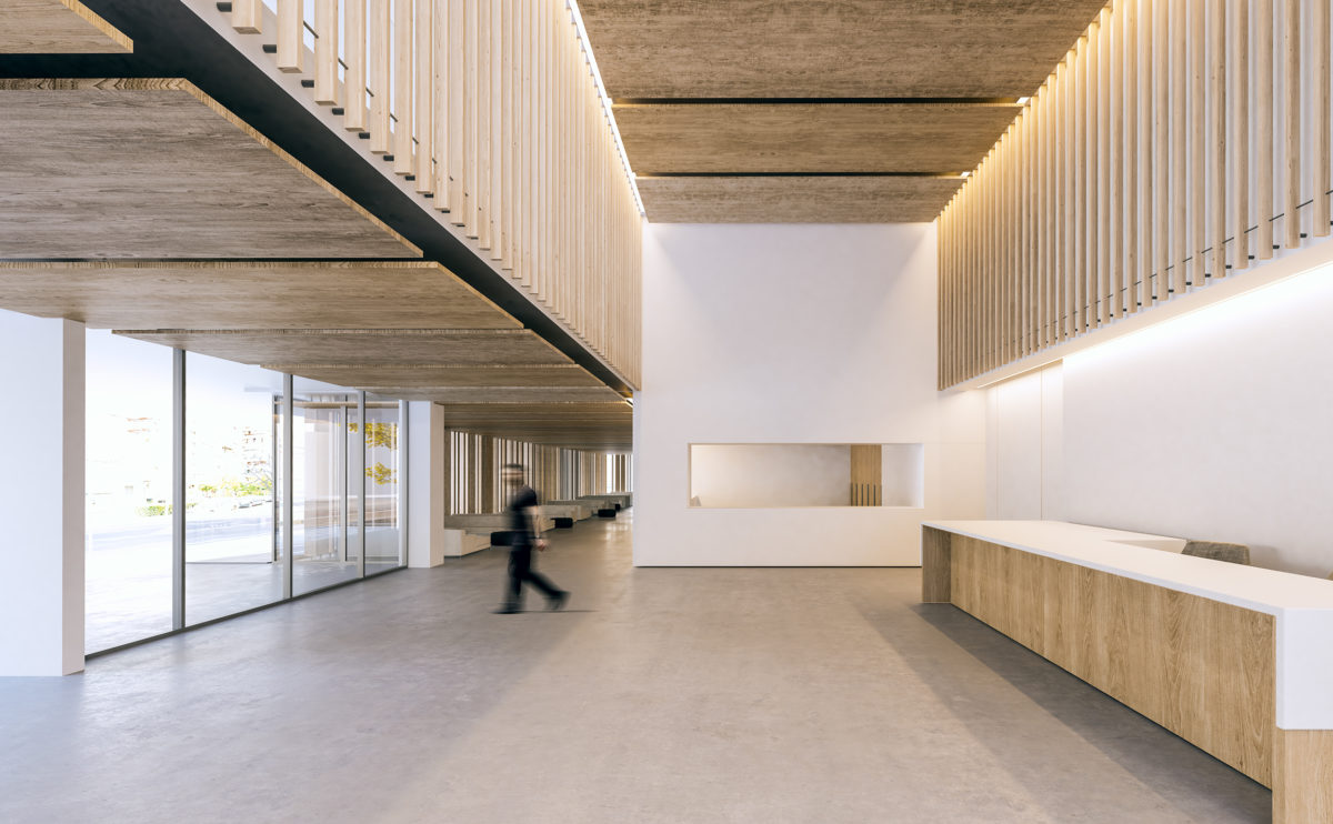
The entrance lobby is a welcoming double-height space for staff and visitors to gather and meet. The area is well illuminated, enclosed by a curtain wall and a generous reception desk.
wrap manifesto
the louvered facade
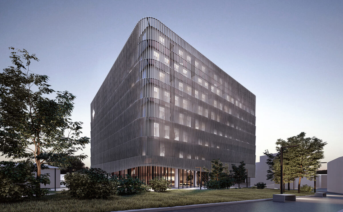
The institutional image of an office building does not have to be cold and intimidating. The headquarters of the Cluj Regional Council brings a welcoming, friendly and domestic design that represents an environmentally friendly building that is close to its community.
market eight
the physical model
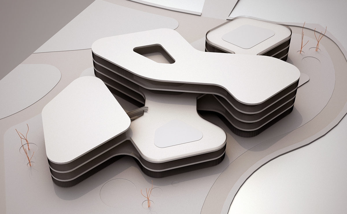
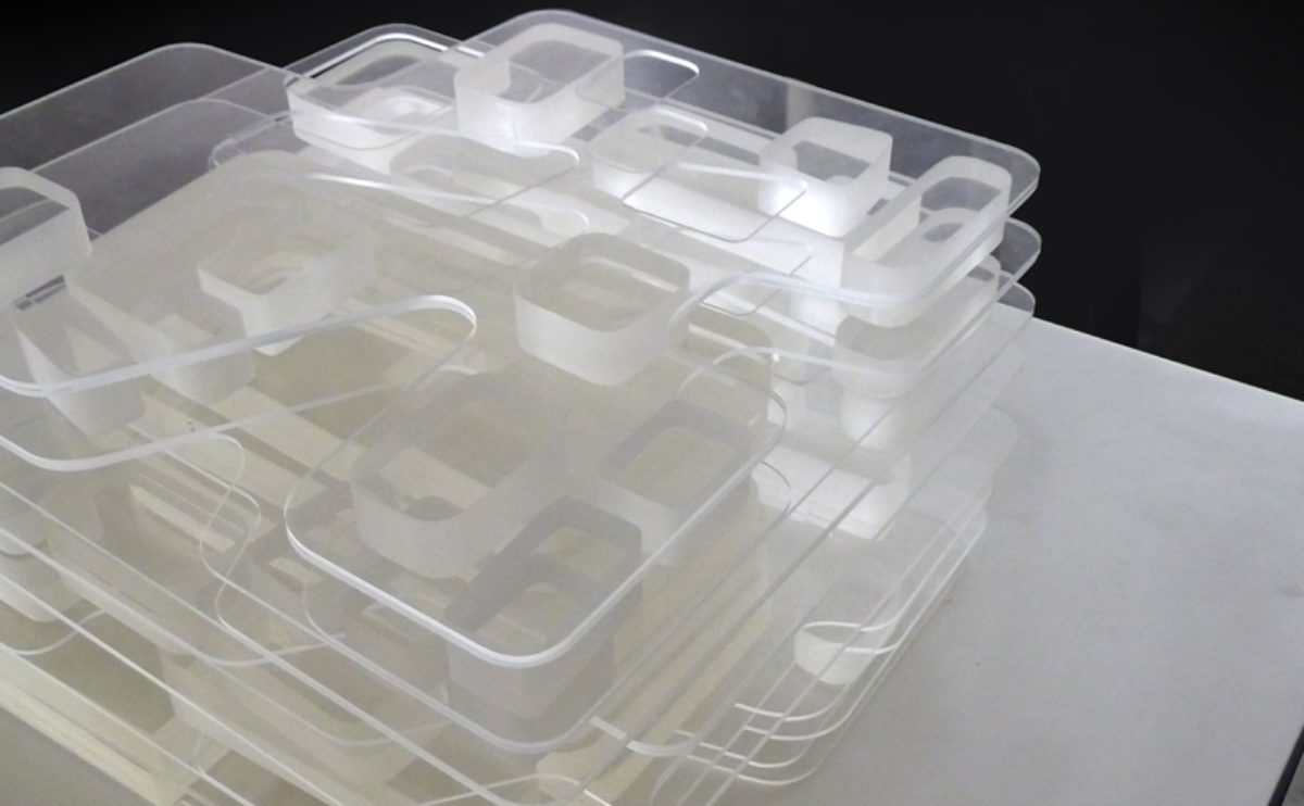
The building’s five interconnected volumes are adapted to the shape of the plot, which is surrounded by a river. This configuration can be seen in the model, which also shows the courtyards and the façade.
hospital in the forest
the physical model
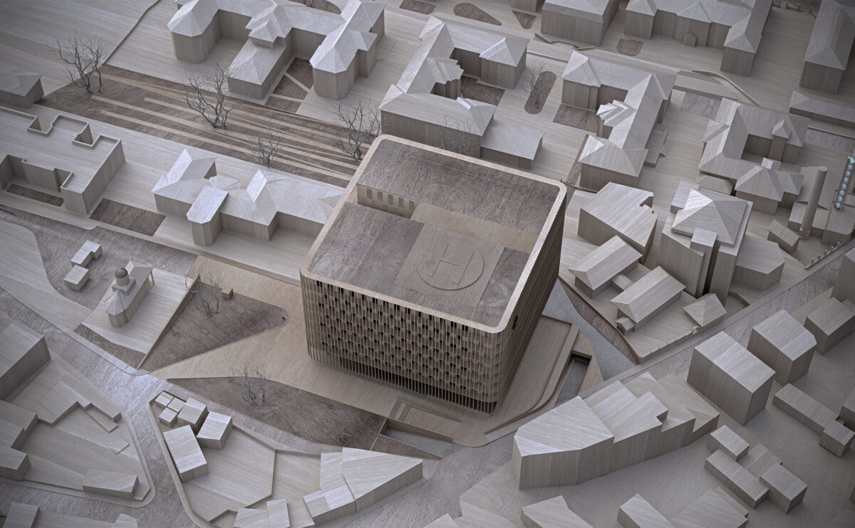
The top view of the physical model shows the relation between the building and its context. The urban park is linked to the main plaza and the urban design provides access for vehicles and pedestrians from the south side of the plot.
Burke house
the main facade
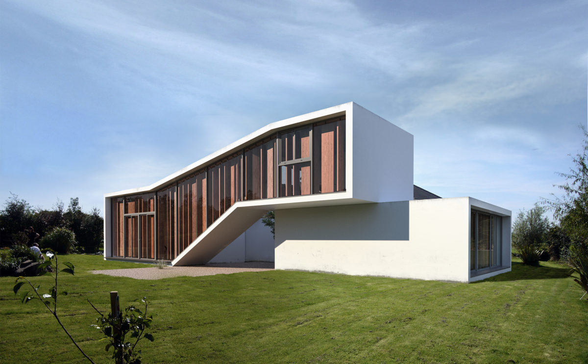
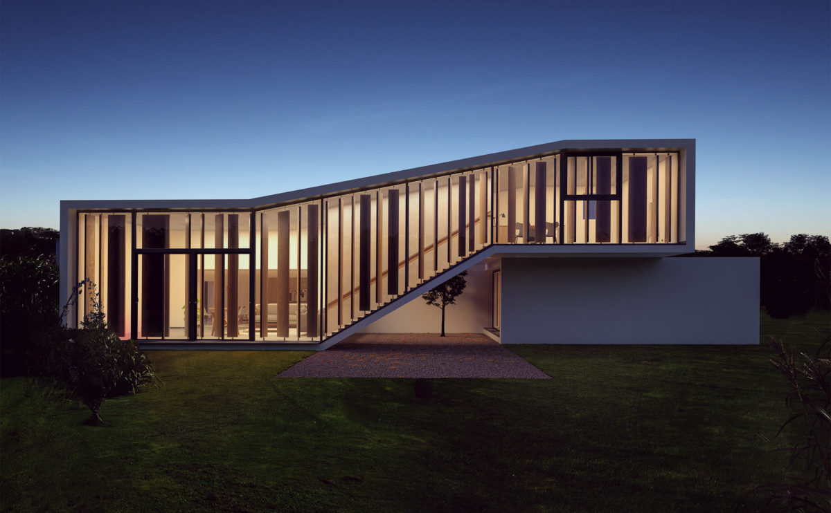
The building facade conveys in a simple and elegant gesture the interior layout and the control of natural light, privacy and views. The concrete slabs create a continuous enclosure carefully protected by the glass and the wooden slats.
market eight
the first floor plan
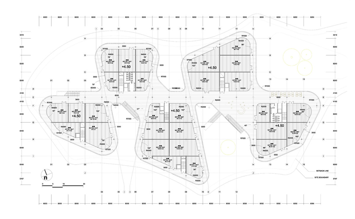
The circulation system of the shopping centre is based on an axis linking the five volumes of the building and a series of ring-shaped corridors around it. These open-air balconies, protected by glass louvres, provide a pleasant space for strolling and visiting the shops.
Zain tower
the brise-soleil
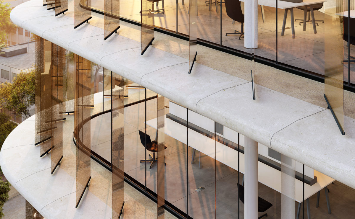
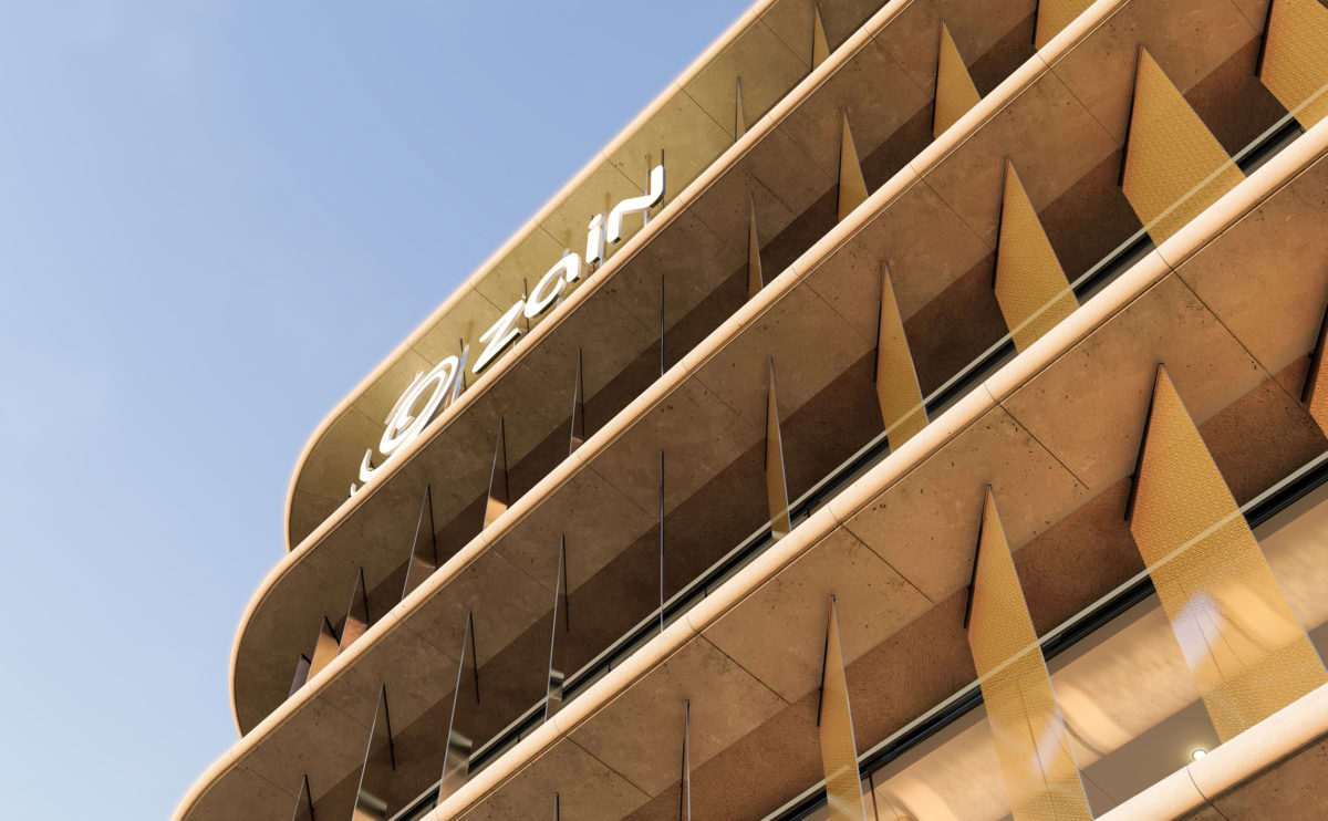
The building envelope is made of sun-shading structures. On one side the protruding slab edges, cladded with prefabricated GRC pieces, cast shadows against the glazing. The glass louvres offer an additional layer of protection.
market eight
the rear facade
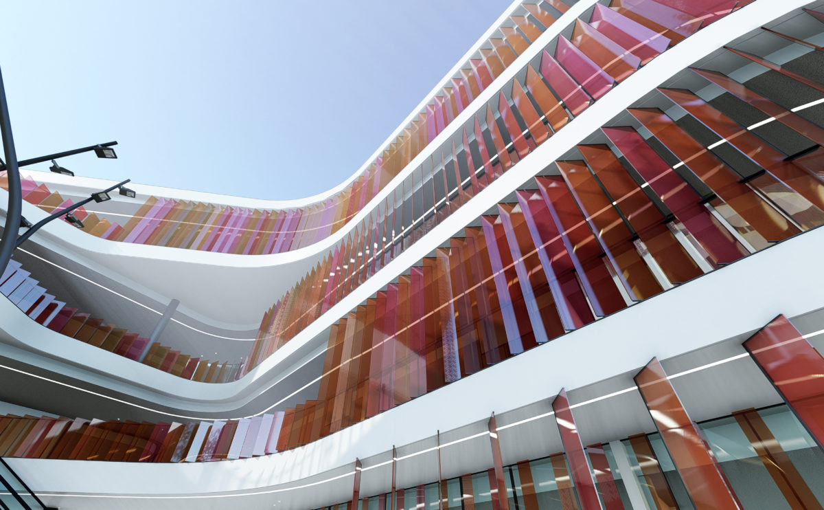
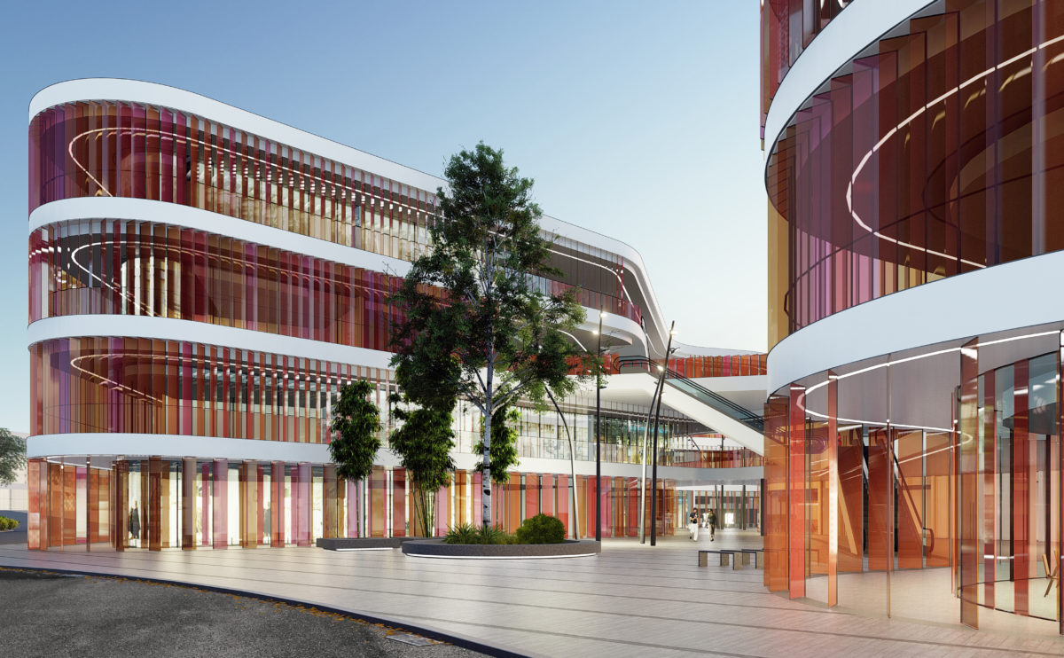
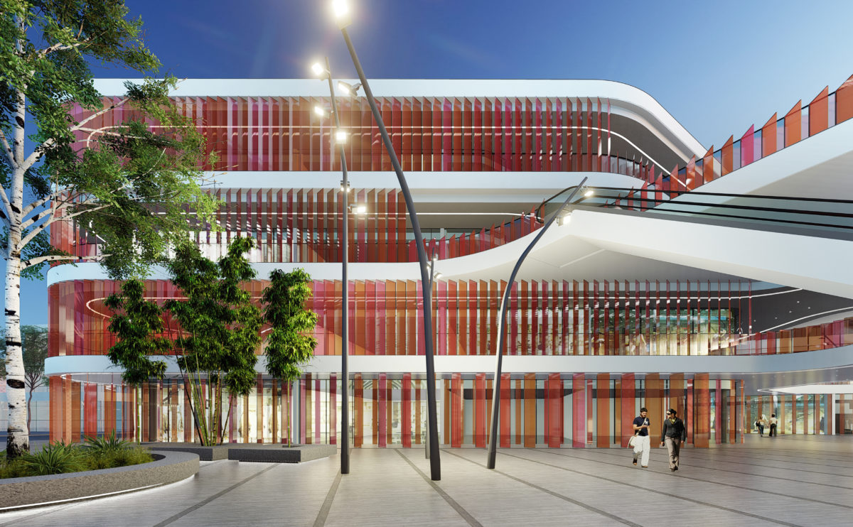
Market Eight is a free-form, undulating building that encloses courtyards between its curves. The façade is a permeable envelope formed by coloured glass louvres. The landscape design surrounding the building continues this organic language.
connecting riads
the riad facade
The massing of the building is a balance of filled and empty spaces. The large openings are balanced with the rotundity of the hanging balconies, cantilevering over the inner courtyard.
K house
the courtyard
The house closes in on itself to embrace a small courtyard. This concave space opens up to the swimming pool, which dominates the slope on which the house is situated.
wavescape pavilion
the cross sections
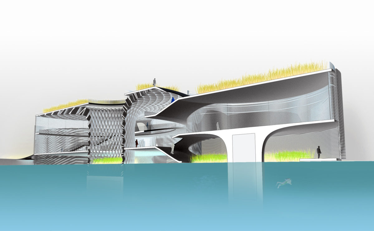
The sections show the changing position of the pavilion façade depending on the tide. The skin enveloping this building on stilts floats on the surface of the sea.
Burke house
the garden
The facade towards the garden is an iconic element of the building. Its unique elevation expresses the function of the interior spaces, and the view of the courtyard adds depth to the structure.
Zain tower
the retail store
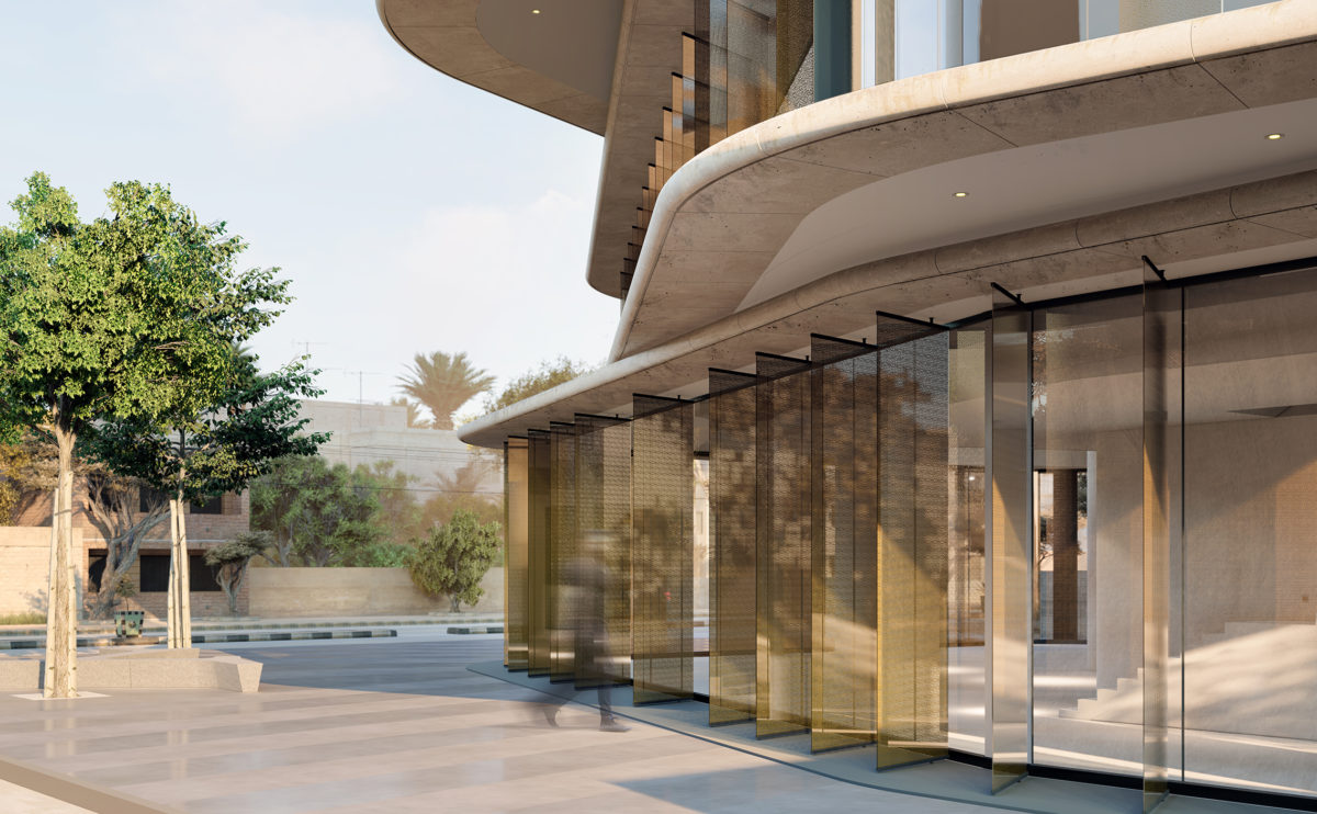
The tower base leaves a public space on the corner of the plot to mark the entrance of the flagship store. This gesture defines the rotation of the tower and provides a welcoming access point protected by the cantilever of the floors above.
wavescape pavilion
the view from the seaside
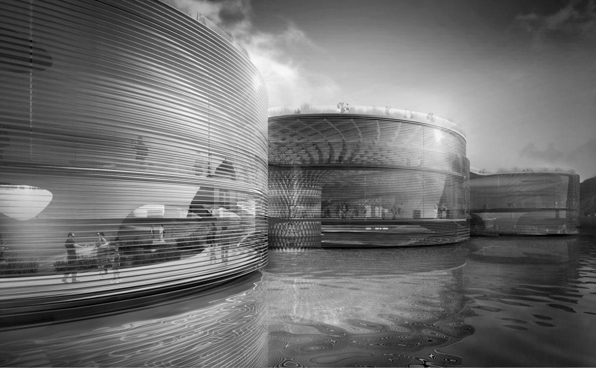
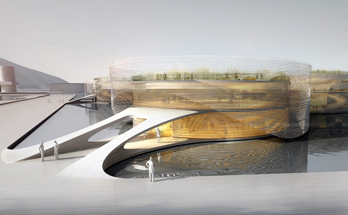
From the seashore, the circular modules of the pavilion are enveloped in a translucent skin formed by the horizontal slats floating in the sea.
Zain tower
the night view
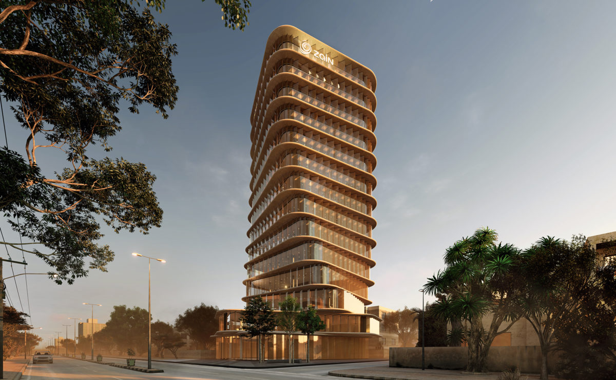
When night falls the transparent quality of the facade turns the tower into a lantern of the city’s landscape. The vertical slats become translucent and provide privacy to the interior.
wrap manifesto
the main elevation
From the main avenue, the green façade of the building can be seen, blending in with the vegetation of the urban landscape. The walkway linking the top of the hill becomes the roof of the ground floor, which extends to form an entrance canopy.
spliced towers
the office facade diagram
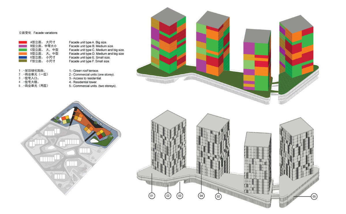
The façade of office buildings is made up of a variety of openings that change in size depending on the orientation and incidence of the sun on the towers.
market eight
the ground floor plan
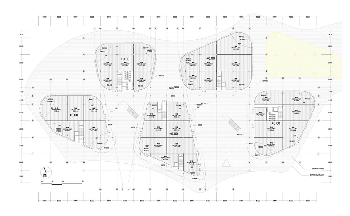
The ground floor of the building has a large pedestrian area that allows circulation between the five groups of shops. In the larger courtyards there are escalators to the upper levels. In each of the five main blocks there are also lift cores and staircases.
house of arts
the exhibition hall
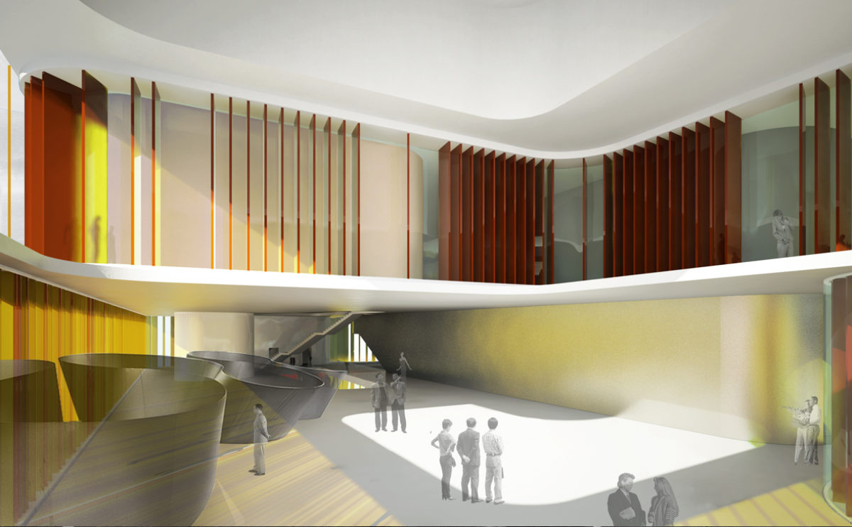
The exhibition hall of the House of Arts is a double-height space enclosed by the same coloured glass louvres that surround the building.
spliced towers
the facade detail
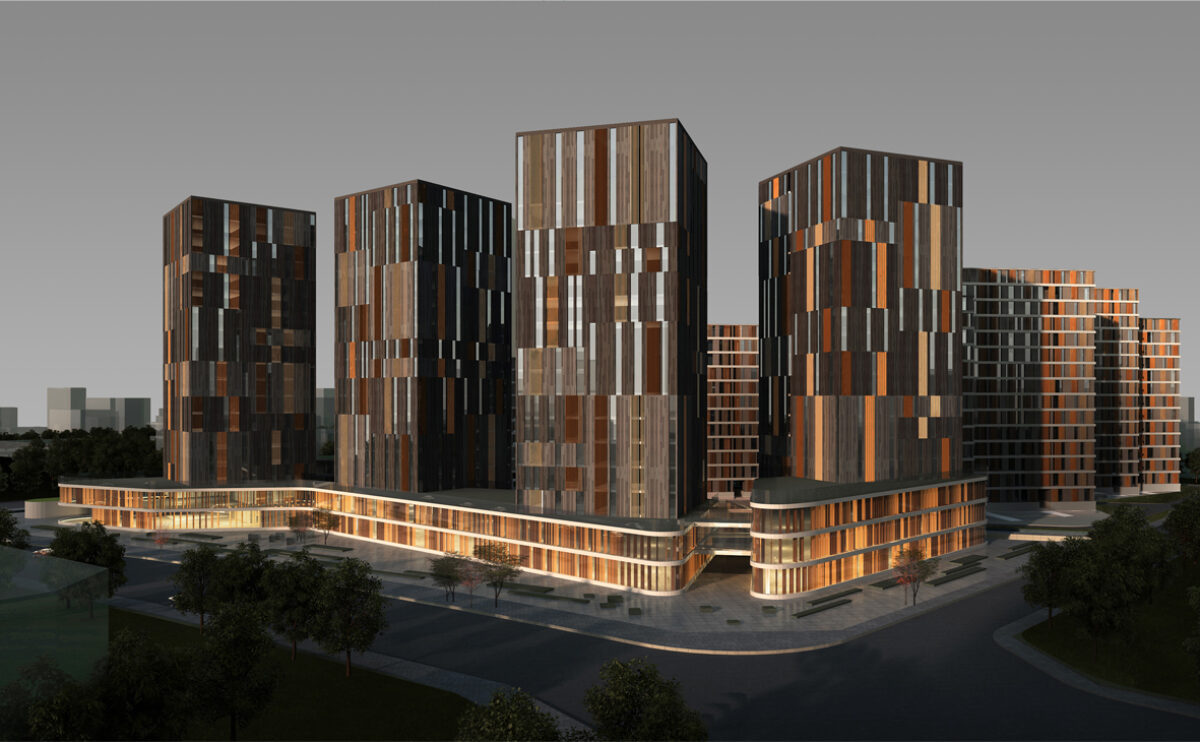
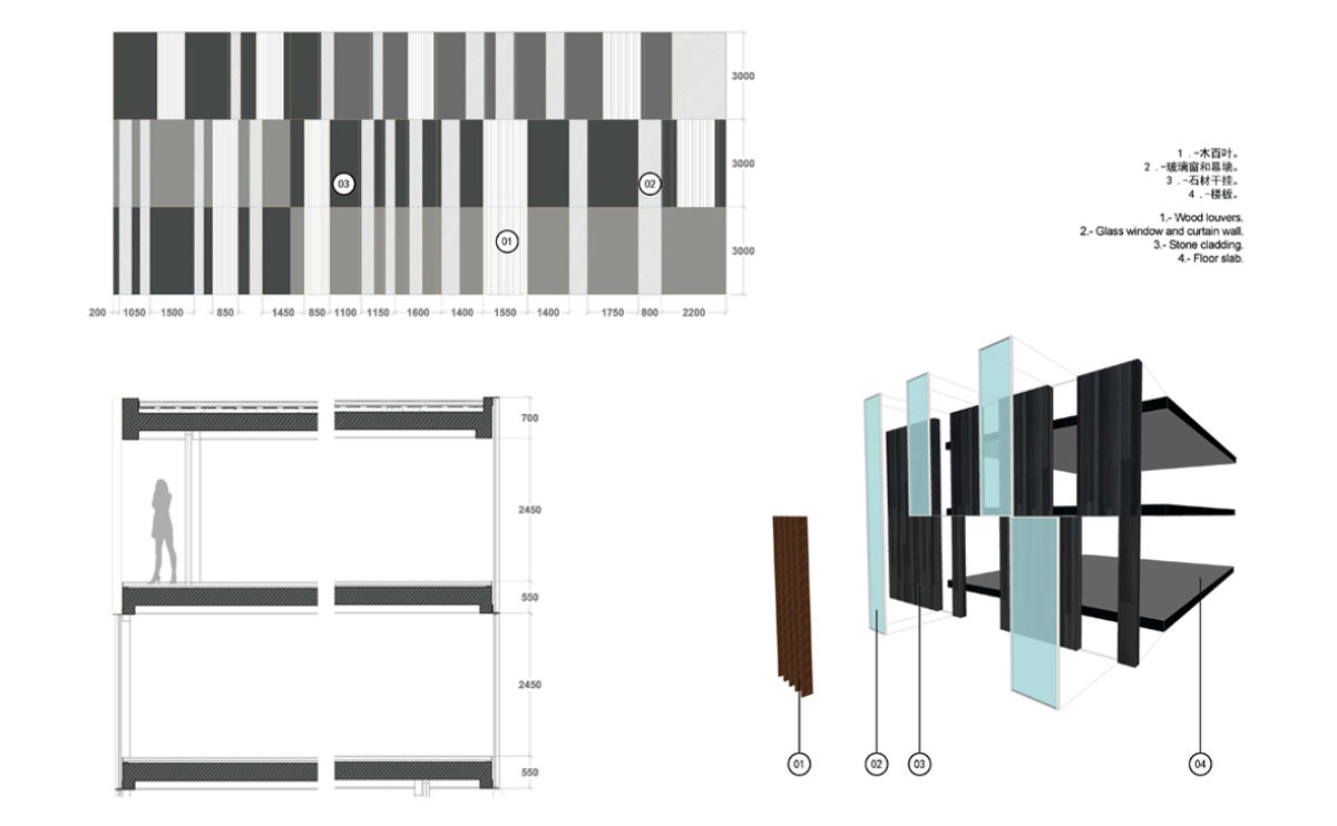
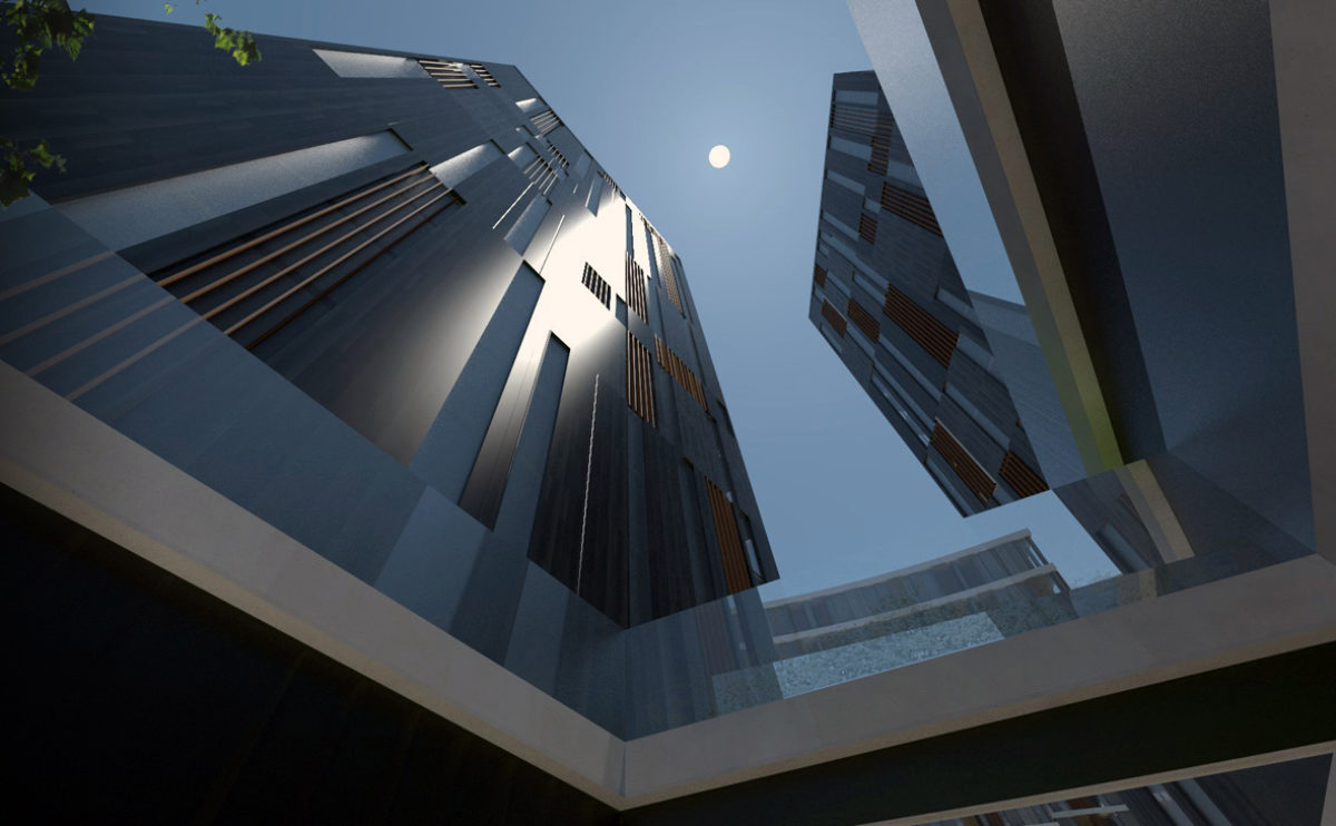
The office towers are wrapped in a curtain wall of modular parts. The façade cladding combines strips of wood, stone and glass of different widths.
Zain tower
the view from 15th avenue
The tower is the tallest building of this diplomatic district of Khartoum, the slender figure is seen from the main avenue, and the twisted facade is a distinctive feature that symbolised the essence of Zain’s brand.
hospital in the forest
the view from the plaza
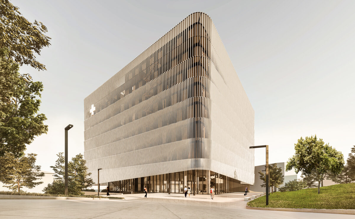
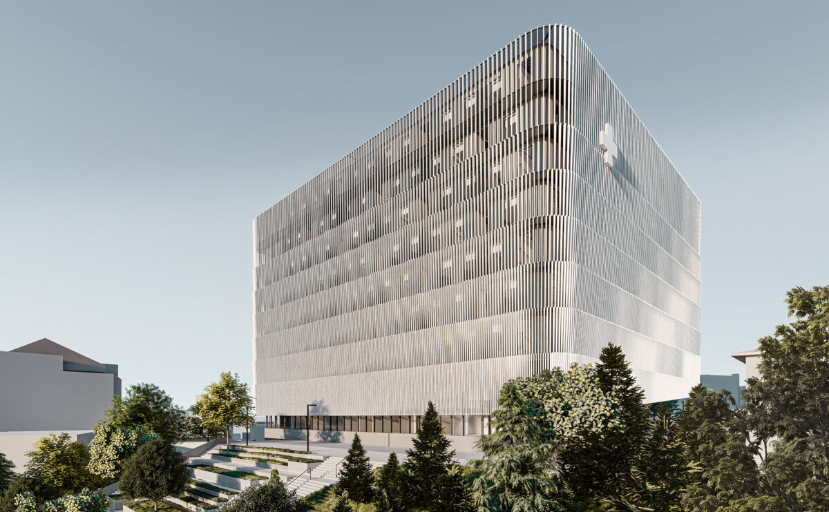
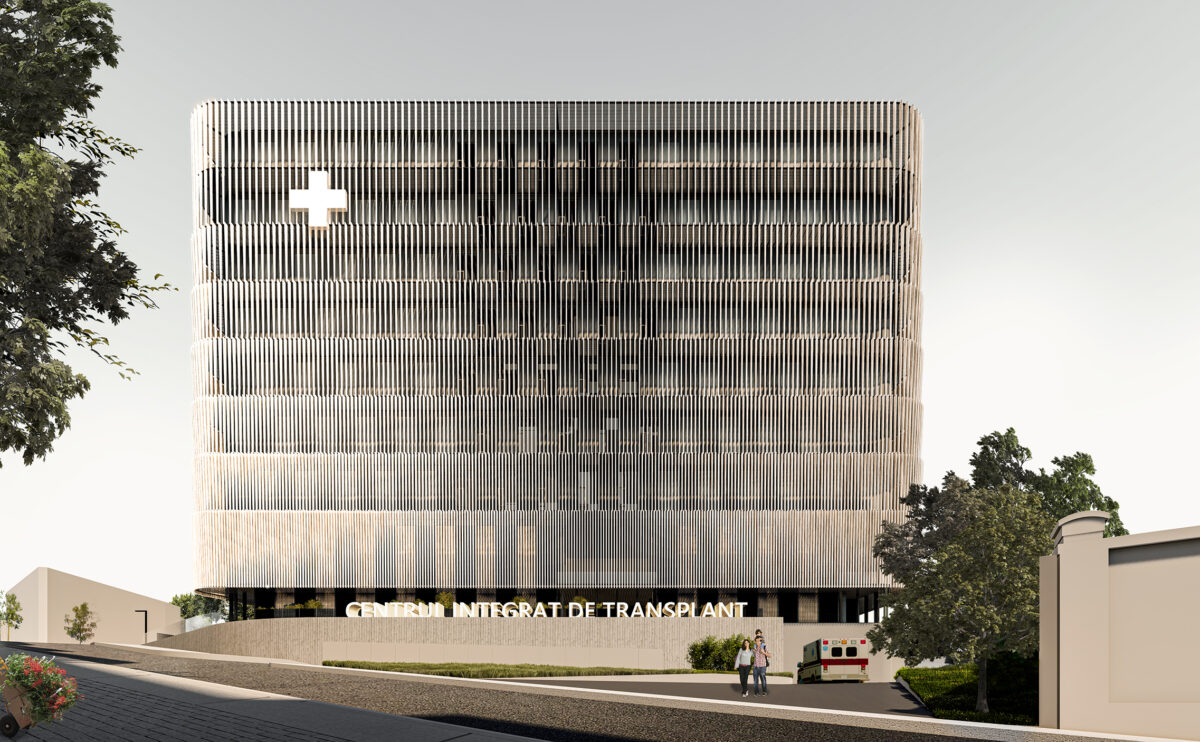
The comprehensive transplantation centre is a building that, despite its powerful form, has a friendly appearance thanks to its wooden louvred façade. This double envelope protects and unifies it, allowing a highly functional interior space planning.
spliced towers
the landscape design
The landscape design combines pedestrian areas, gardens and a man-made stream separating the residential area from the commercial area. A network of streets connects the buildings to facilitate vehicle access.
house of arts
the facade detail
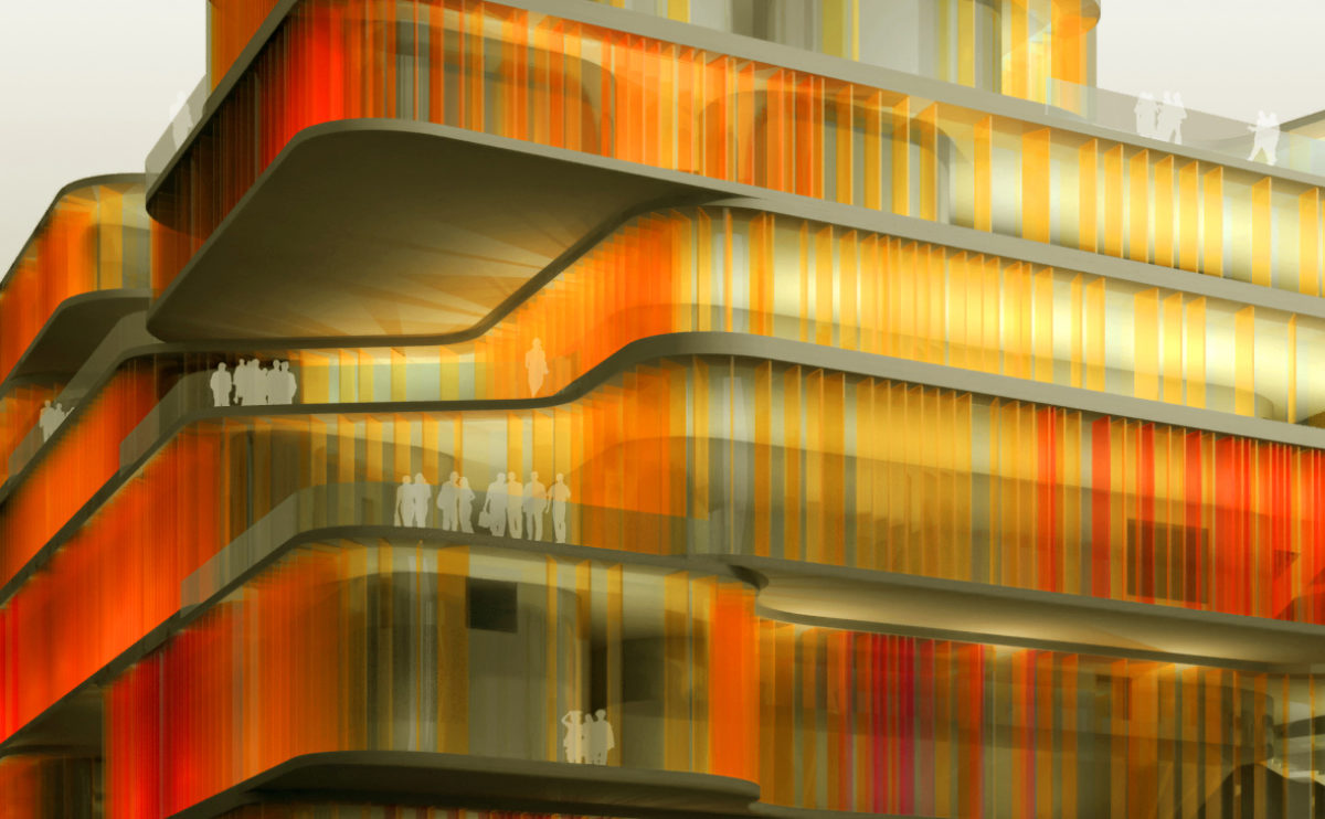
The façade of this public building is made of coloured glass louvres. The floor slabs on each floor are free-form and form balconies and overhangs.
spliced towers
the office towers
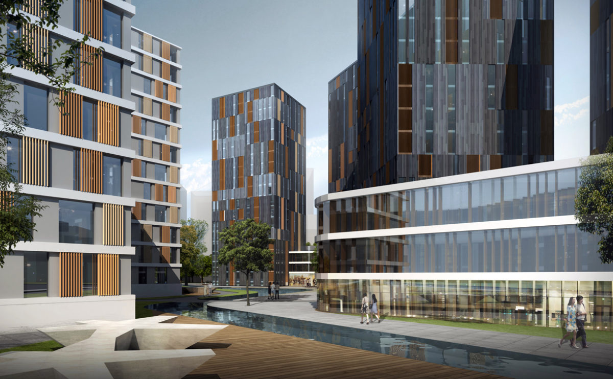
The four office towers have a façade clad in wood, natural stone and glass. The composition forms a pattern of irregular vertical lines in shades of brown and ochre.
K house
the rear garden
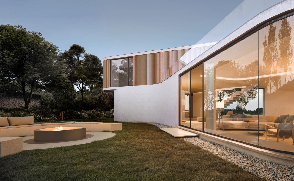
The living room has views towards the west, to capture the sunset light. A large window with curved glass opens to the rear garden, which has a comfortable space to gather around the fire.
Burke house
the physical model
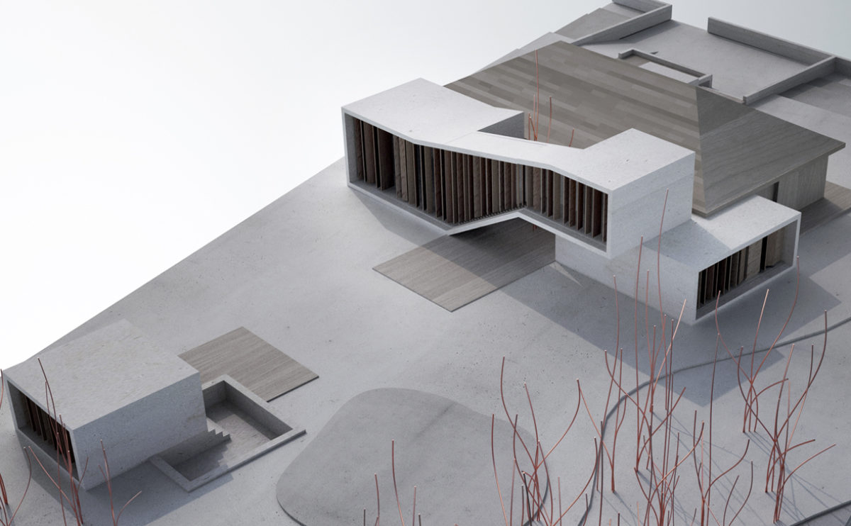
The top view of the architectural model reveals the relationship between the different buildings comprising the project: the existing house, the extension, the landscape design and the spa pavilion.
market eight
the construction detail
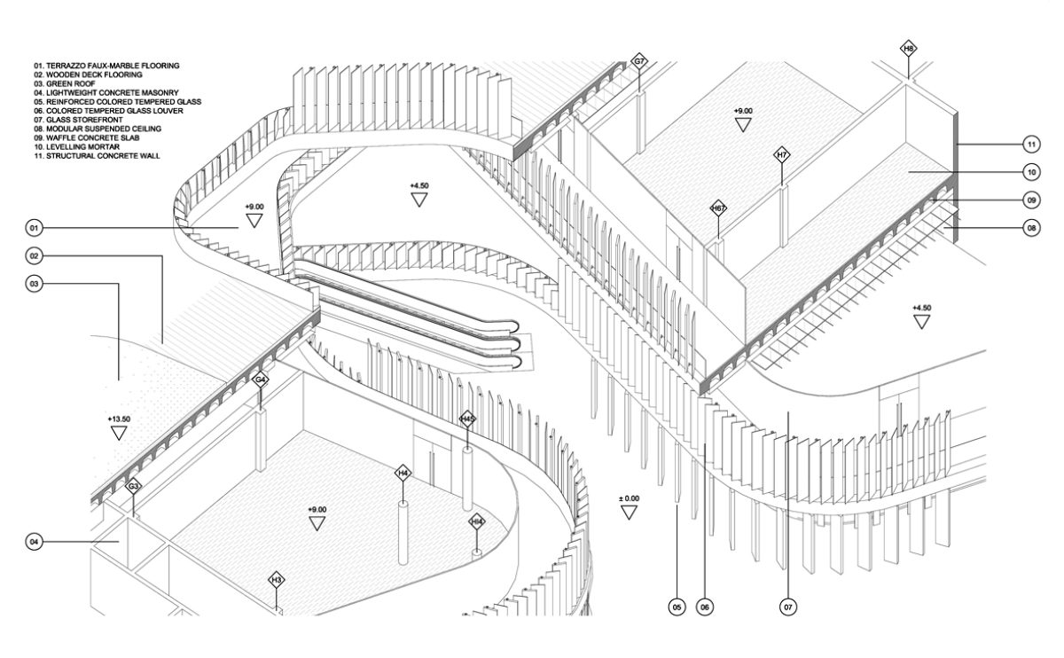
This three-dimensional construction detail shows the building’s construction system and the functioning of the façade. The waffle slabs allow for large overhangs, while the tempered glass louvres adapt to the curves around the perimeter.
wavescape pavilion
the interior view
The interior of the pavilion has a large central column supporting the fungiform roof. Around the circular hall, there is a raised walkway that connects the different pavilions and allows a view of the sea through the façade.
hospital in the forest
the night view
The sober form of the building is wrapped in translucent louvred skin. This permeable layer allows seeing the inner facade, made of large openings and courtyards with greenery.
hospital in the forest
the view from the urban park
The park connecting the campus and the new transplant centre slopes up towards the south. The landscape provides access through stairs and ramps, so the building is discovered through the forest on the way up to the main plaza.
Burke house
the courtyard
The inner courtyard articulates the space planning of the house while infusing perfectly with the countryside surrounding the property. It provides intimacy to the bedroom, abundant natural light to the living room and depth to the staircase.
Zain tower
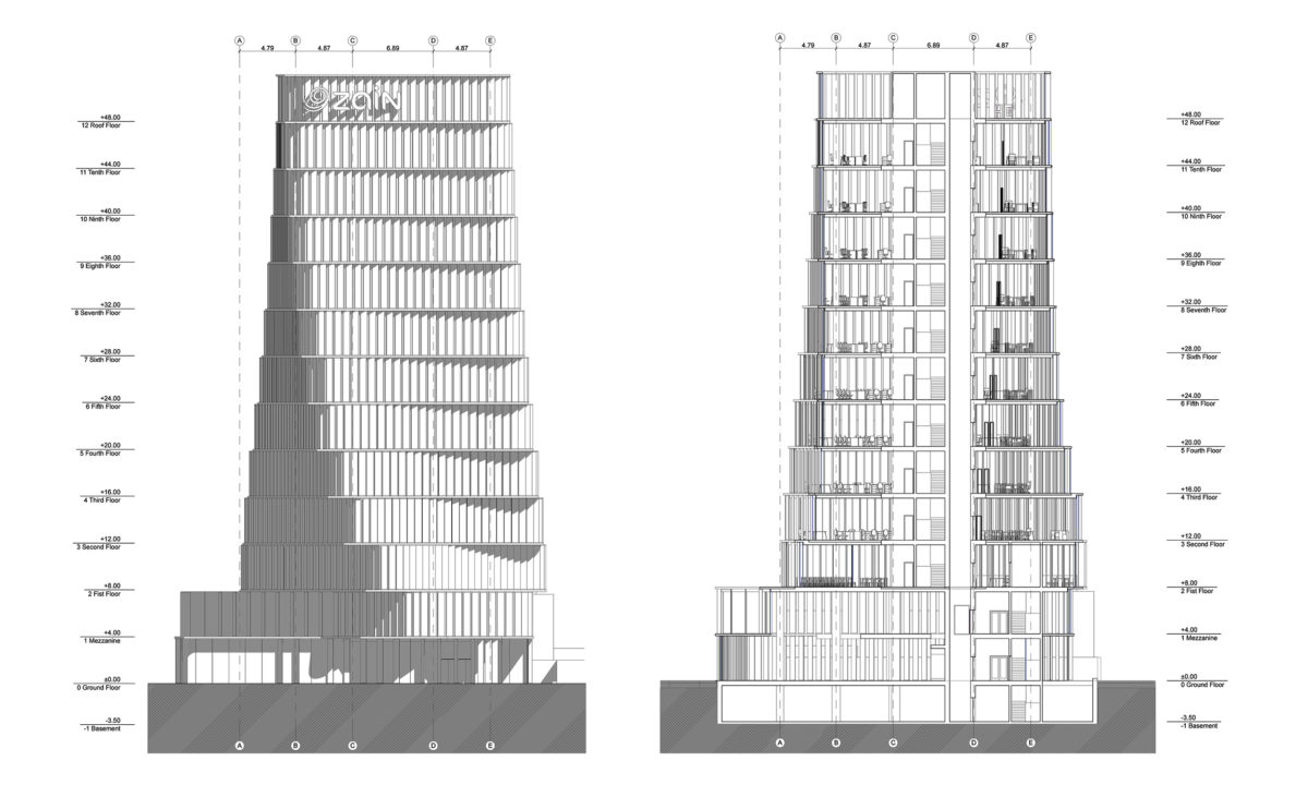
the section and elevation
Due to the rotation of the typical floor of the building, the elevation shows a significant variation in width. The turning movement of the floors does not affect the central core and the vertical structure.
wavescape pavilion
the view from the marina
The themed pavilion for the World Expo floats on the sea and is connected to the quay via a gangway. The floating façade of horizontal slats creates a moiré effect as it moves with the waves.
house of arts
the floor plan layouts
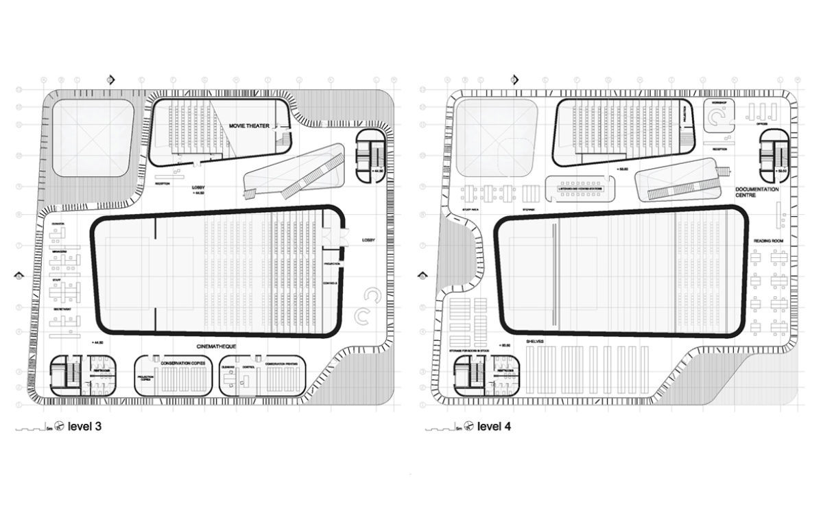
Plans of the House of Arts, showing the central hall of the auditorium, the theatre, the film library, the reading rooms and the library. The skin of the building forms waves and envelops the floor slabs with louvres.
Burke house
the north elevation
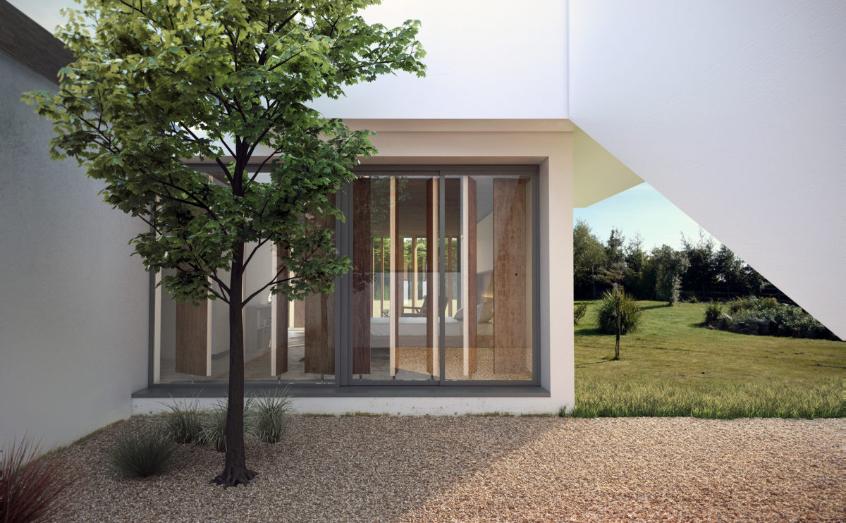
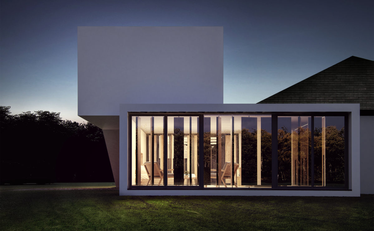
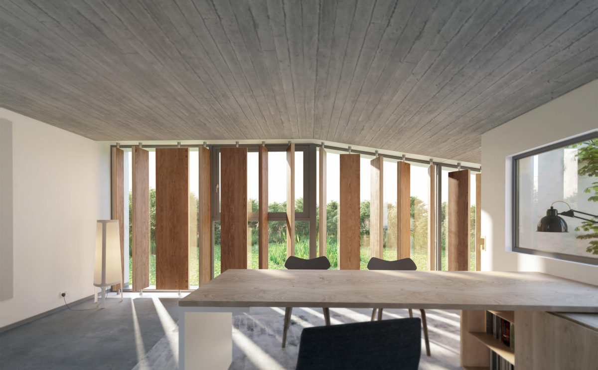
The master bedroom of the house opens to the north with a large opening of sliding doors. The vertical rotating wooden slats function as a shutter, controlling the lighting and privacy of the space.
cuña house
the ground floor
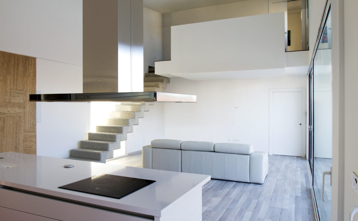
The ground floor comprises the common areas of the house, the kitchen, the living room and the dining room, from which you can access the garden through a large sliding glass door.
Zain tower
the interior
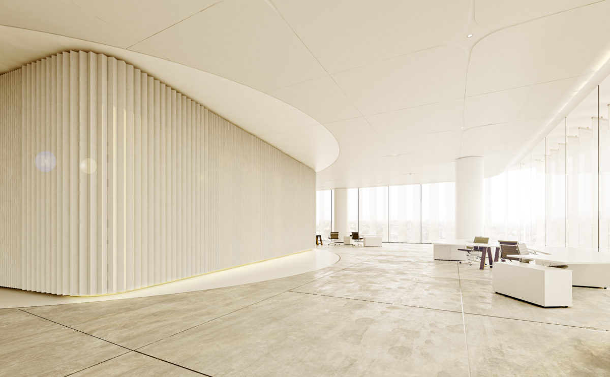
The interior is a luminous and diaphanous space. The white ceiling and the polished concrete floor give a feeling of spaciousness.
everything under the sun
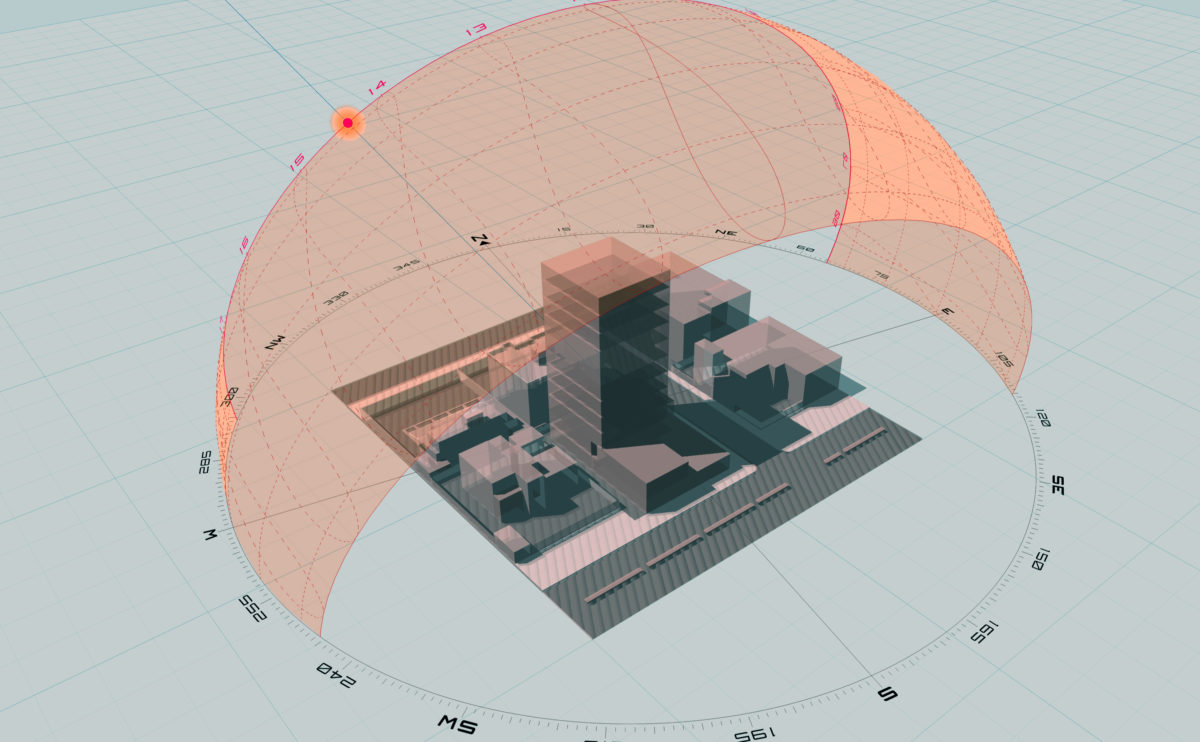
Sun studies help us understand not only the behaviour of light over time and its interaction with architecture. This type of approach is essential regardless of the geographical location of the building, not just regarding energy efficiency. The experience of users and their perception of space is determined by the way daylight interacts with the […]
wrap manifesto
the physical model
The building is situated close to a steep slope, so the new extension also serves as a pedestrian bridge connecting the upper street with the main avenue. This secondary public access is linked to the access to the multi-purpose hall.
Zain tower
the twisted figure
The central core of the tower and the ring of columns around it allow the rotation of the floor slabs. This suggestive movement, gradually decreasing towards the top, is well appreciated from the street level, where the building leaves space for a public plaza.
wavescape pavilion
the concept diagram
The building has a garden terrace which is accessed via a spiral ramp. Beneath the secondary pavilions is a floating garden around which the façade floats.
K house
the entrance
The entrance of the house is made through a sloping walk on the side of the plot. The upper floor faces the meeting point. The access can be seen through the curved walls.
Zain tower
the facade detail
The external facade of the tower is defined by a series of horizontal slabs. Prefabricated pieces of GRC cover the edges, carefully positioned to cover the part exposed of the floor below due to the rotation of the storeys. Between them, a series of vertical louvres protect the glazing against the sun.
K house
the balcony
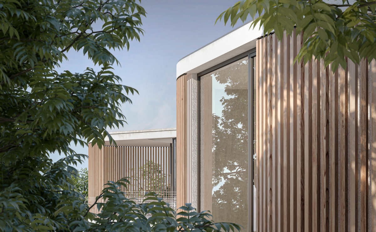
The facade of the upper floor, covered in Canadian cedarwood, gives a warm and natural character to the building. Seen through the abundant vegetation, it almost looks like a wooden house hidden in the forest.
Allison house
the cross section
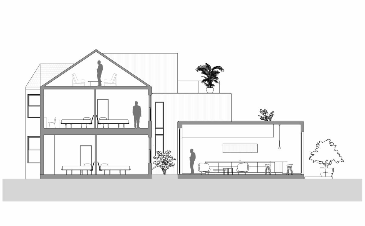
The section shows the transformation of the original house: the extension of the living room and kitchen on the ground floor, the new inner courtyard with greenery, the terraces of the bedrooms overlooking the garden and the loft conversion at the top.
Burke house
the office space
The work area on the upper floor has the best views of the house. Linked to the patio and the rear garden, the office is a quiet space with a sober and unique design.
wavescape pavilion
the floor plan layouts
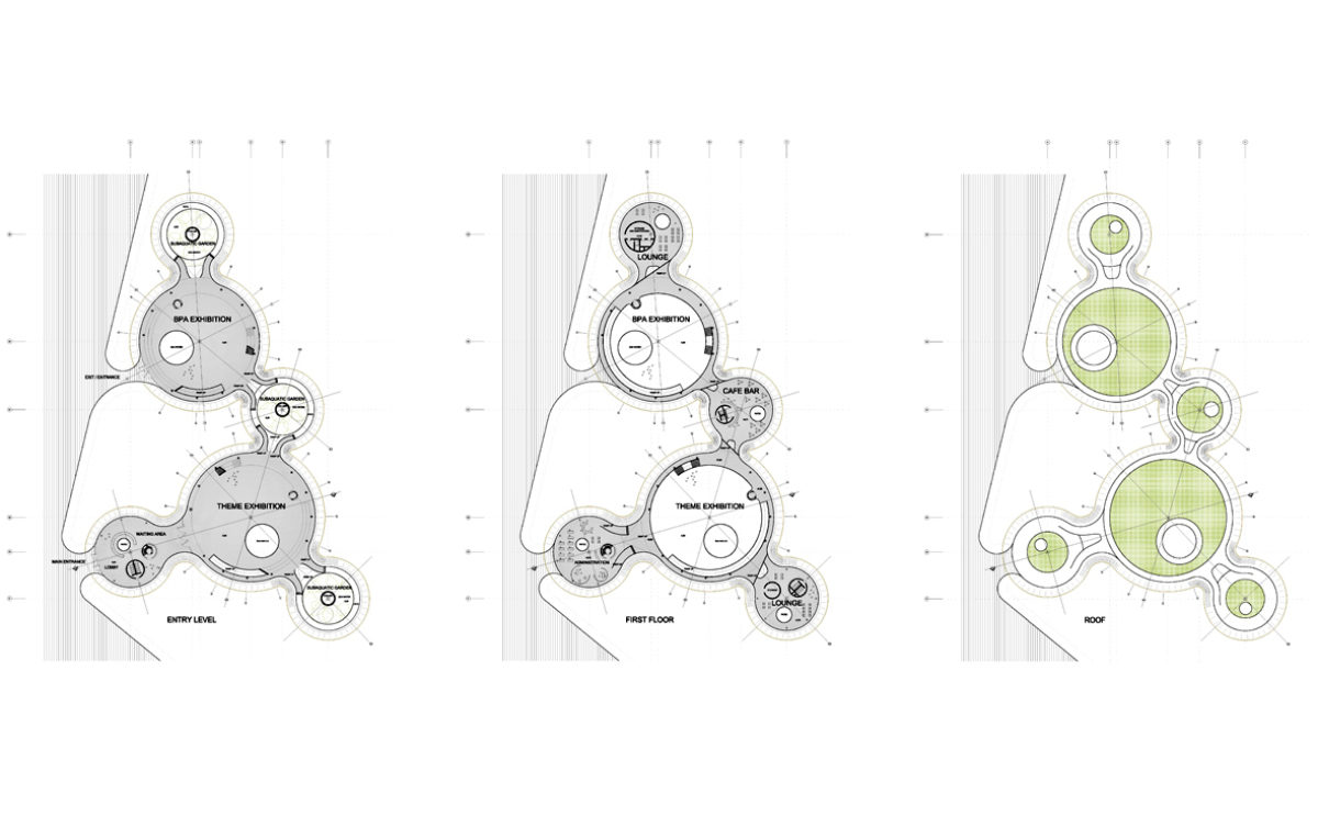
The building consists of two main circular pavilions connected to four secondary pavilions. In plan, the building has an organisation reminiscent of a water molecule.
connecting riads
the south courtyard
The lower part of the building encloses the most intimate and secluded garden. Around this space, there are homes on the ground floor, so they have private gardens protected by a fence along its perimeter.
Zain tower
the vertical glass shades
The architectural solar glass is protected with sun glades for an optimised daylight and energy control. The glazed shades are made of laminated glass with a metal frit.
market eight
the view from the river
The different levels of the shopping centre stand out as horizontal lines on the colourful façade of the building. The escalators connecting the different floors on the outside contribute to the organic and dynamic image of the building.
open arte-fact exhibited in Beirut
The proposal for the house of arts, a large cultural building to be built in Lebanon, will be exhibited along with the rest of participants of the international competition between 23 March & 14 April 2009 at the Forum de Beyrouth.
wrap manifesto
the entrance lobby
The main entrance hall is a generous, well-lit double-height space with a large reception desk and serves as a foyer for the multifunctional conference room.
connecting riads
the inner facade
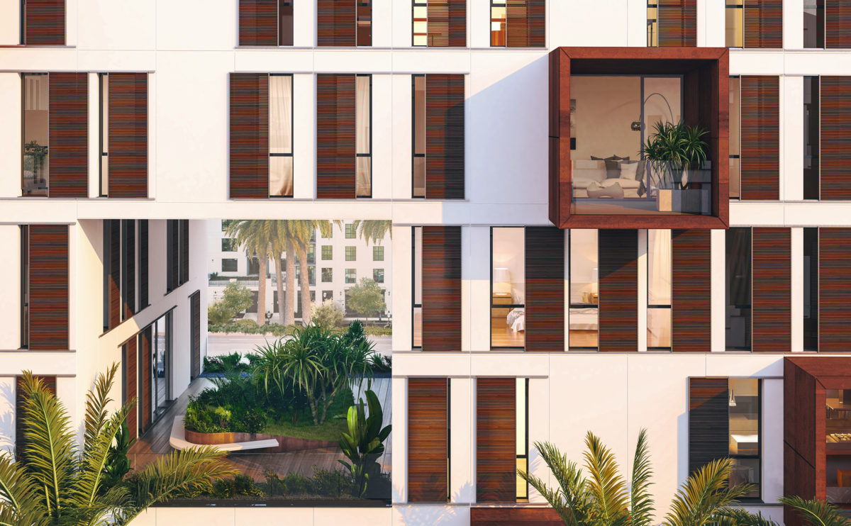
The building envelope overlooking the inner courtyard has a simple and functional design. The regular arrangement of the windows contrasts with the position of the sliding shutters protecting them.
connecting riads
the external elevations
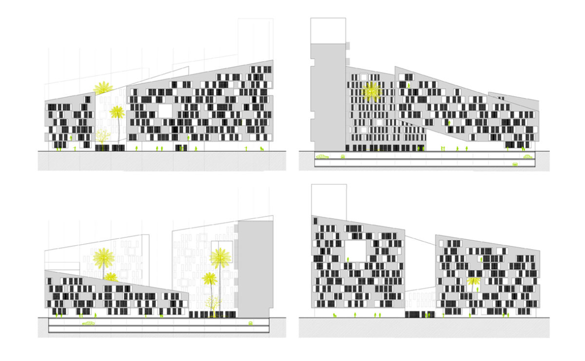
The exterior elevations show a unique pattern formed by the long balconies and the sliding panels that protect them from the sun.
maragato lofts
the living room and kitchen
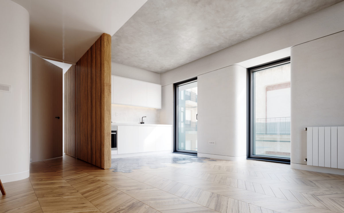
In contrast to the orthogonal rigidity of the exterior, the interior spaces are wrapped in soft, rounded corners. The oak flooring and the concrete ceiling offer a warm visual tone while a featured wooden slats partition serves as a transition and articulates the space.
wrap manifesto
the concept diagram
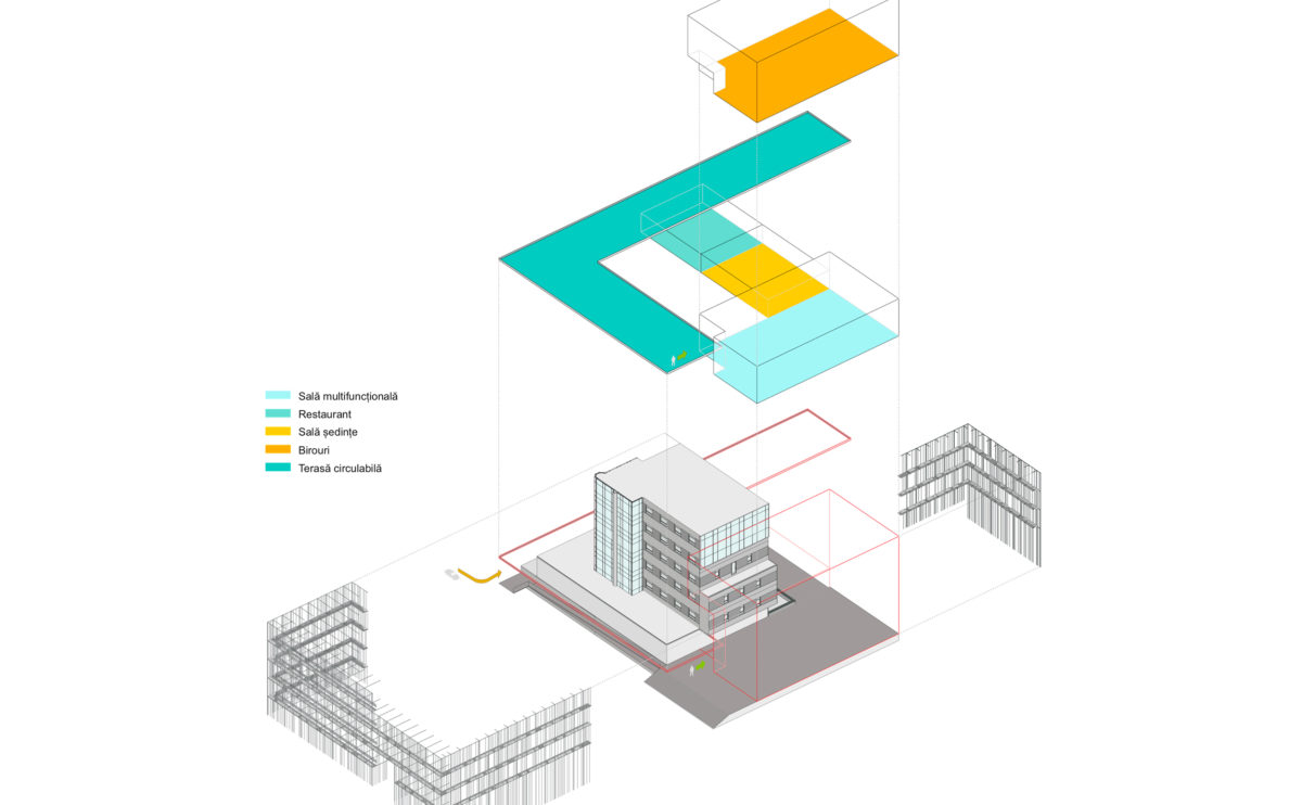
The diagram shows the different uses of the new building extension modules and the unifying treatment applied to the façade. The result is a more compact and symbolic volume with an improved institutional and intuitive access control.
Allison house
the back garden
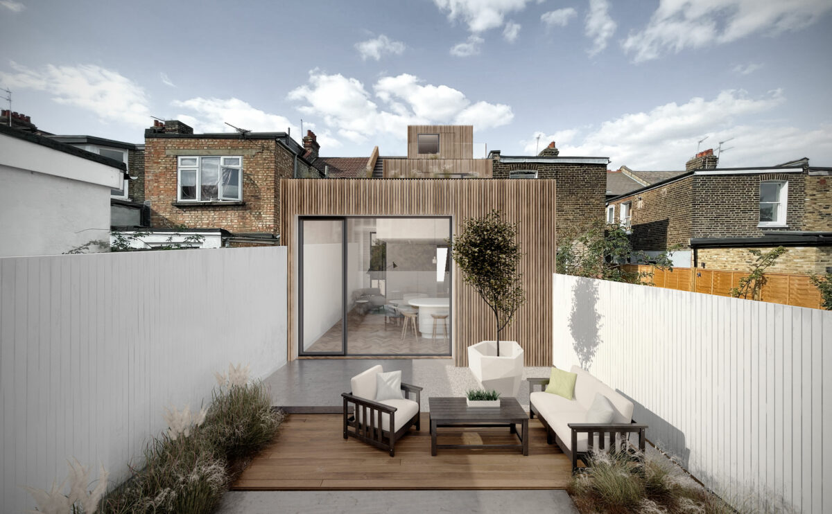
The rear elevation of the house is designed with restrained and contemporary language. The sophisticated façade of wooden slats blends with the traditional brick walls. The simple, functional landscaping of the back garden together with the white wooden fences bring even light into the interior.
K house
the main facade
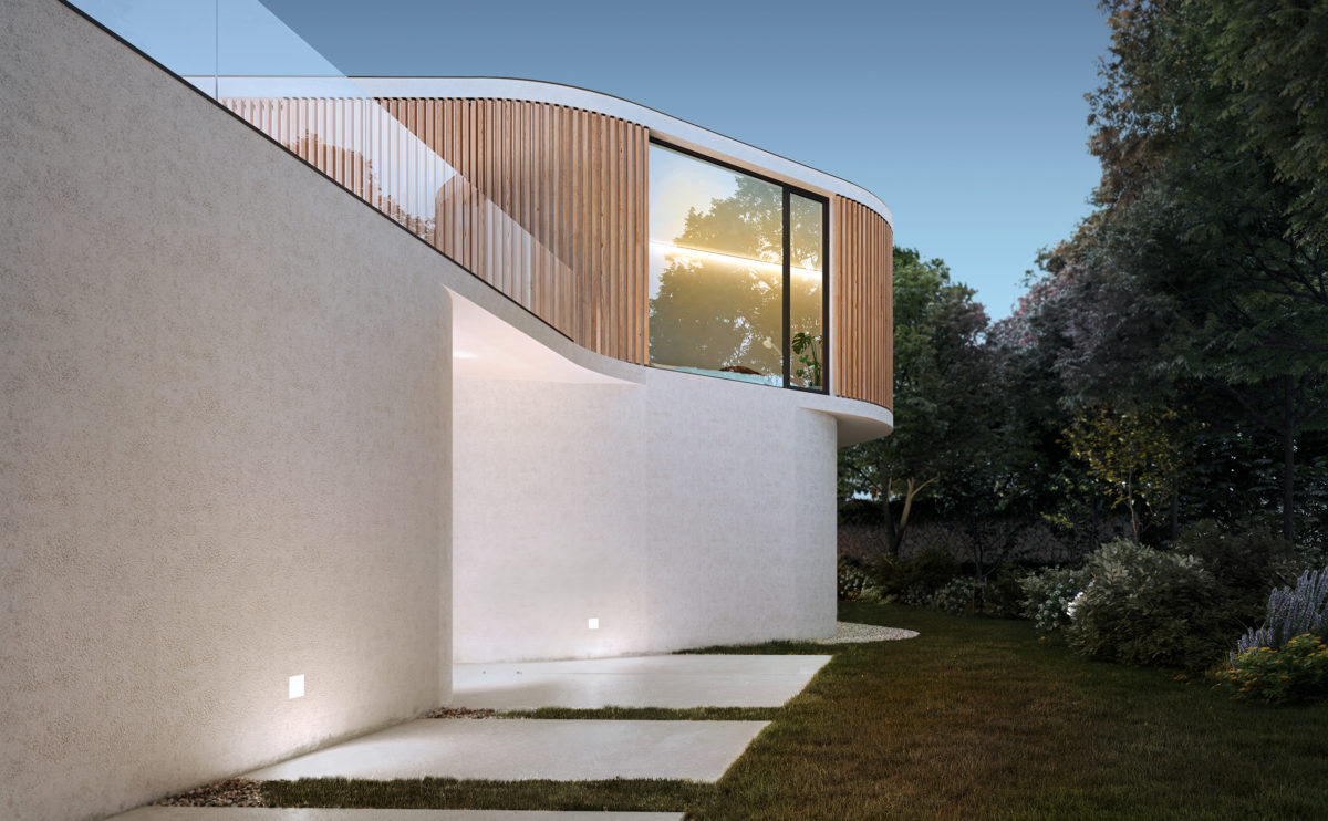
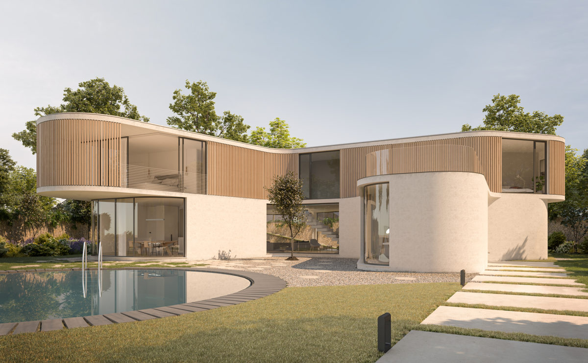
The white concrete slab path leads to the intermediate level of the plot where the house is located. From this point, the elegant silhouette of the building can be observed, a symbolic form that invites to be explored in harmony with nature.
connecting riads
the big facade openings
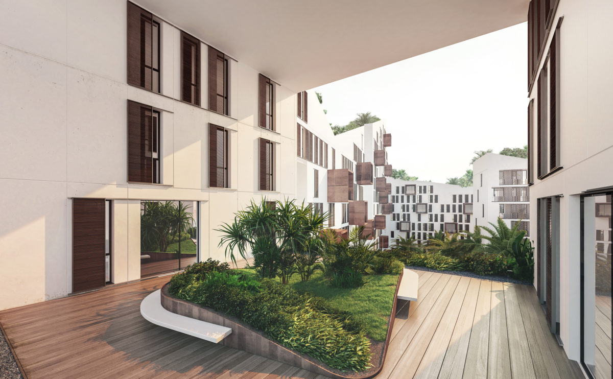
The housing blocks have large holes or perforations that allow light to enter the courtyards. These semi-public spaces have abundant vegetation and allow residents to enjoy a garden with views.
market eight
the view from the courtyard
The main entrance to the shopping centre is located in one of the larger courtyards. This public space serves as a plaza for events and visually articulates the different levels of the building.
K house
the slatted wooden facade
The wooden slatted façade of the upper floor, topped by the line of the flat roof slab, cuts out the lush vegetation at the back.
performing arts complex
the cafeteria
The cafeteria of the performing arts centre is enclosed by an undulating façade made of twisted wooden slats that form a dynamic and protective envelope.
connecting riads
the south courtyard
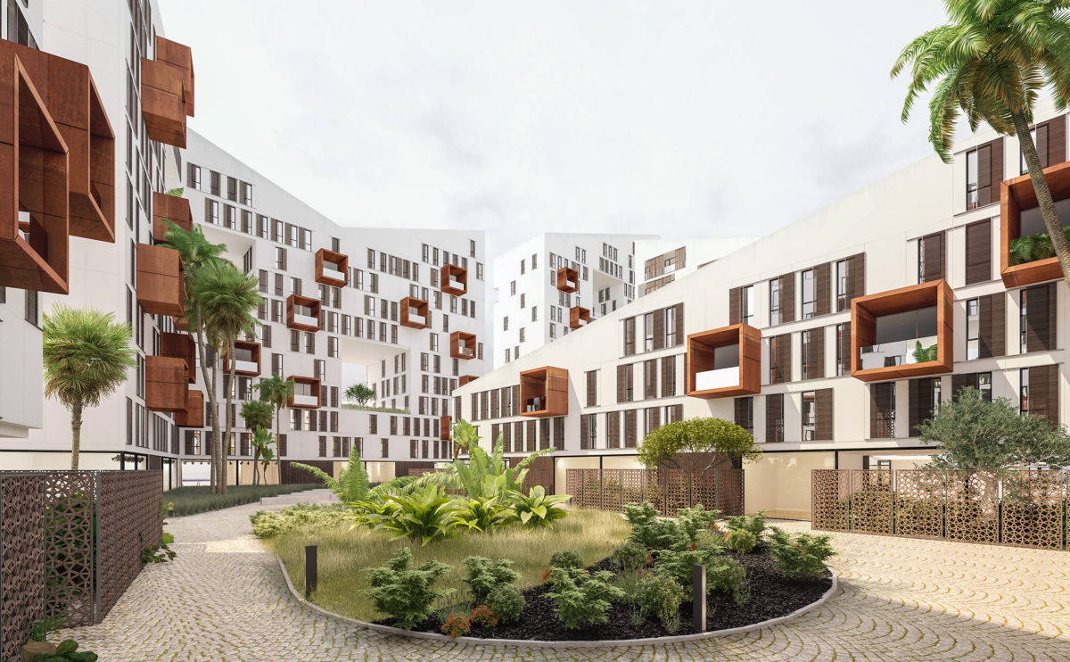
The large block courtyards are pedestrian areas with abundant vegetation. The gardens have fountains and tropical trees, giving the perception of a fresh oasis in the heart of the residential compound.
Burke house
the master bedroom
The bedroom is a spacious and functional space open to the landscape. The furniture merges with the architecture to create a warm and cosy atmosphere governed by light and textures.
spliced towers
the detail of the towers façade
View of the office towers. The façade is formed by a curtain wall of stone, glass and wood in dark colours to form a modern and contemporary design.
hospital in the forest
the main elevation
From the main road, the building looks like a floating volume above a podium. The exposed basement provides access to the emergency room while the main lobby can be seen through the transparency of the ground floor.
Burke house
the physical model
The cardboard model represents the extension of the house and the new jacuzzi pavilion in relation to the structure of the existing house.
connecting riads
the view from the top
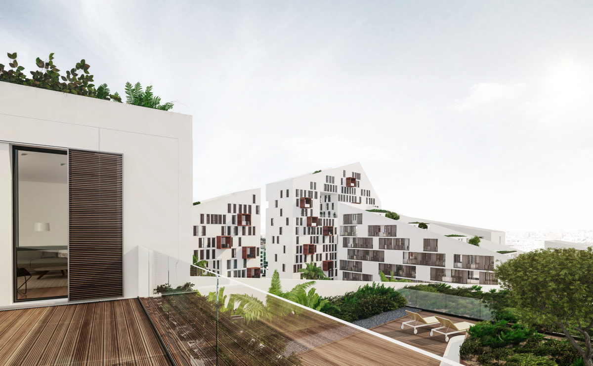
From the top of the roof terrace, you can see the winding silhouette of the building and the view of the city in the background. The image conveys the symbolism of the building’s shape, its relationship with the landscape and the functionality and comfort of the apartments.
Zain tower
the top floor
The rotation of the tower finishes on a top floor fully aligned with the urban grid. The square shape of each floorplate becomes a straight and slender figure, crowned by the sign of the telecommunications company.
Burke house
the staircase
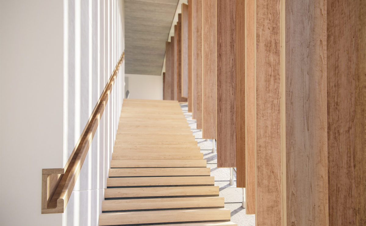
The stairs take on prominence by visually connecting the interior spaces and establishing the formal language of the building’s exterior. This promenade is a contrast between the warm interior and the lushness of the Irish landscape that can be contemplated along the way.
Burke house
the walking wardrobe
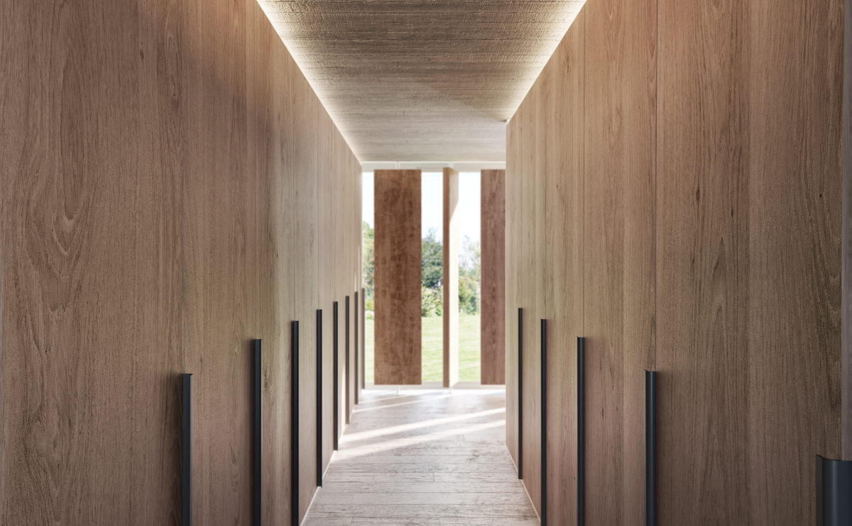
The dressing room is a warm and comfortable space with large floor-to-ceiling wardrobes on both sides. The window to the garden provides abundant natural light sifted by the wooden slats, close enough to give privacy but separated to appreciate the landscape.
