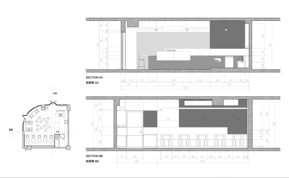
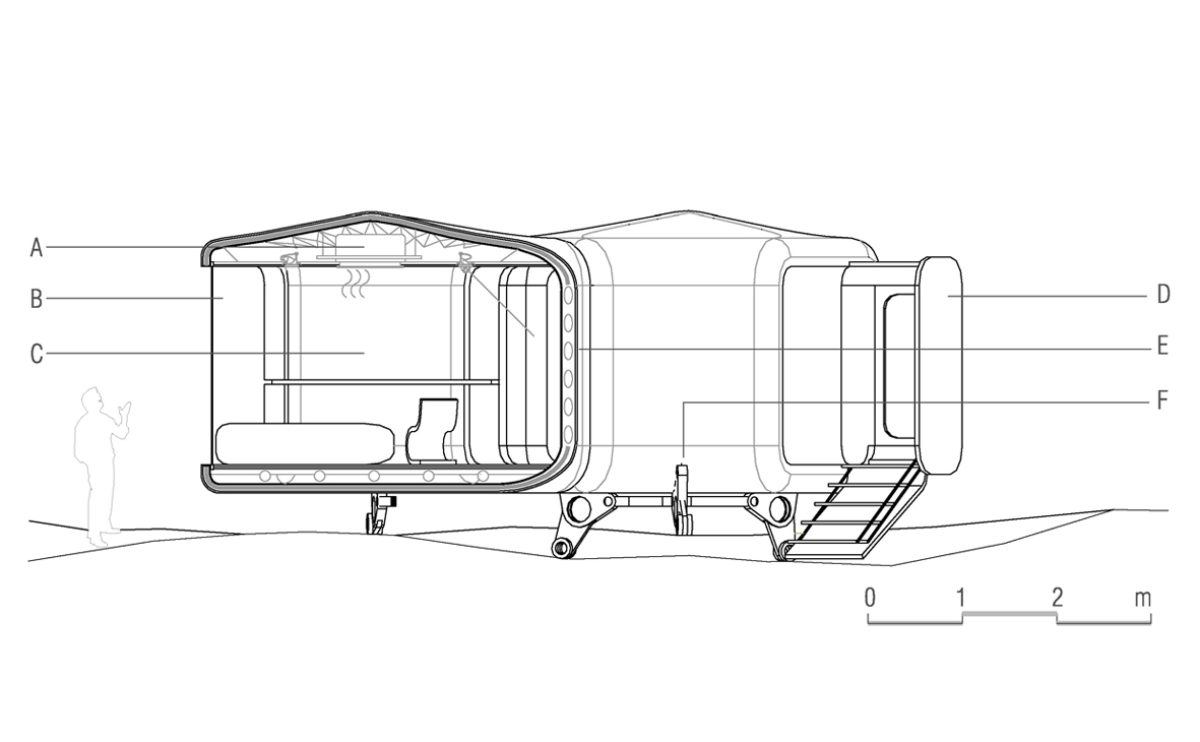
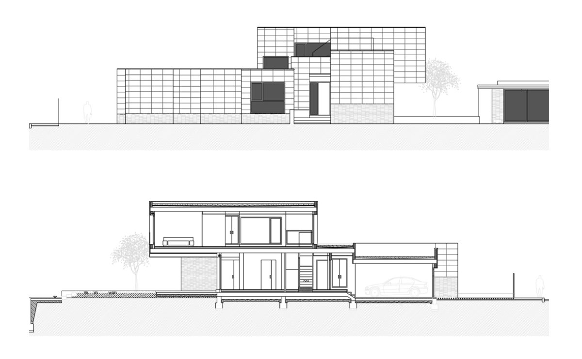
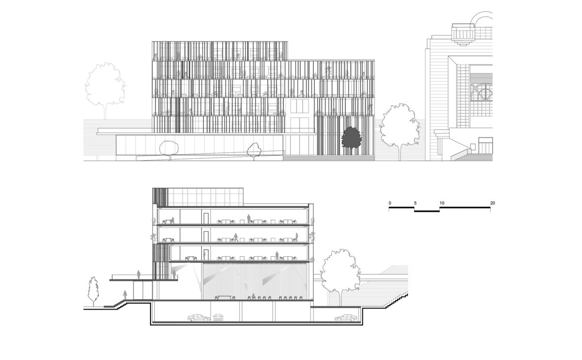
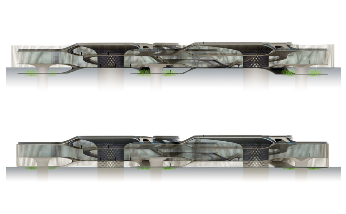
In the context of architecture, a section is a drawing that depicts the vertical cut of a building or structure, showing the internal and external relationships of the building as if it had been cross-sectioned through along a particular plane.

Sections are an important tool in the design and documentation of buildings, as they provide a detailed representation of the internal and external relationships of an architectural design.

Sections typically show the location of walls, floors, roofs, doors, windows, and other features, as well as the materials and construction details of these elements. They may also include dimensions, materials, and other technical details, as well as annotations that provide additional information.

Sections are an important tool for understanding and analyzing the internal and external relationships of a building or structure. They can be used to explore the functional, spatial, and structural aspects of a design, the specific heights of a space and to study the relationships between different building elements and systems.
hospital in the forest
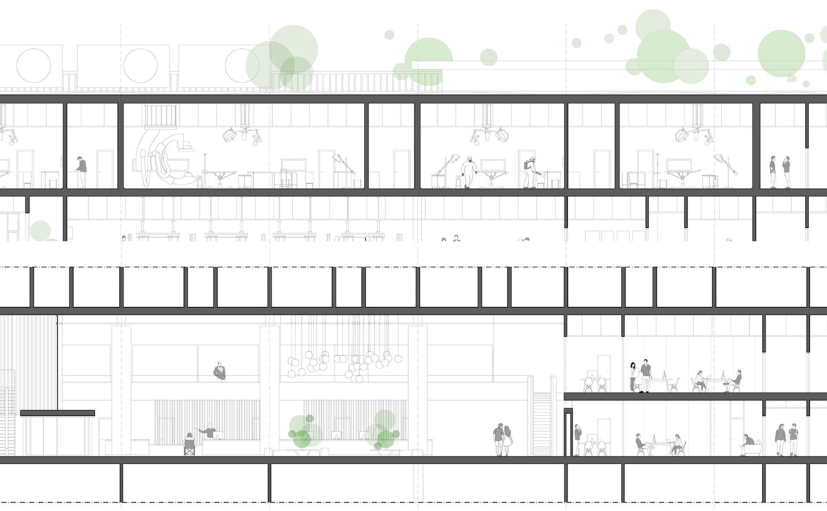
the detailed section

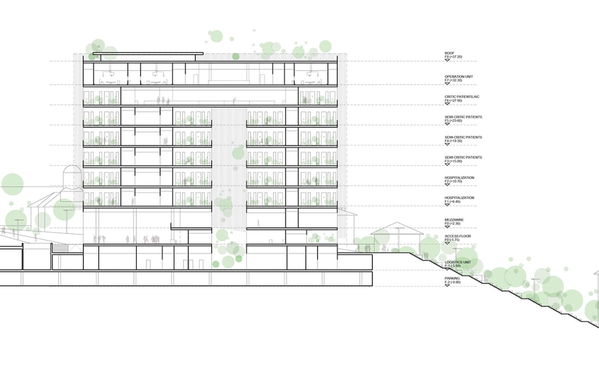
The entrance lobby on the ground floor is a generous double-height space open to the public plaza, while the operation rooms on the top floor are connected to the heliport and the roof garden.

wrap manifesto
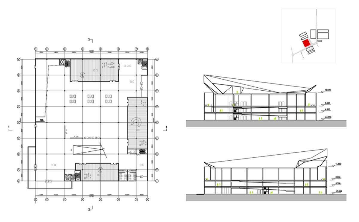
the elevation and the cross section

The refurbishment of the existing building consists of the optimisation of the interior spaces, an extension and the installation of a new envelope that unifies the image of the complex, providing an institutional and contemporary appearance.

wavescape pavilion
the cross sections

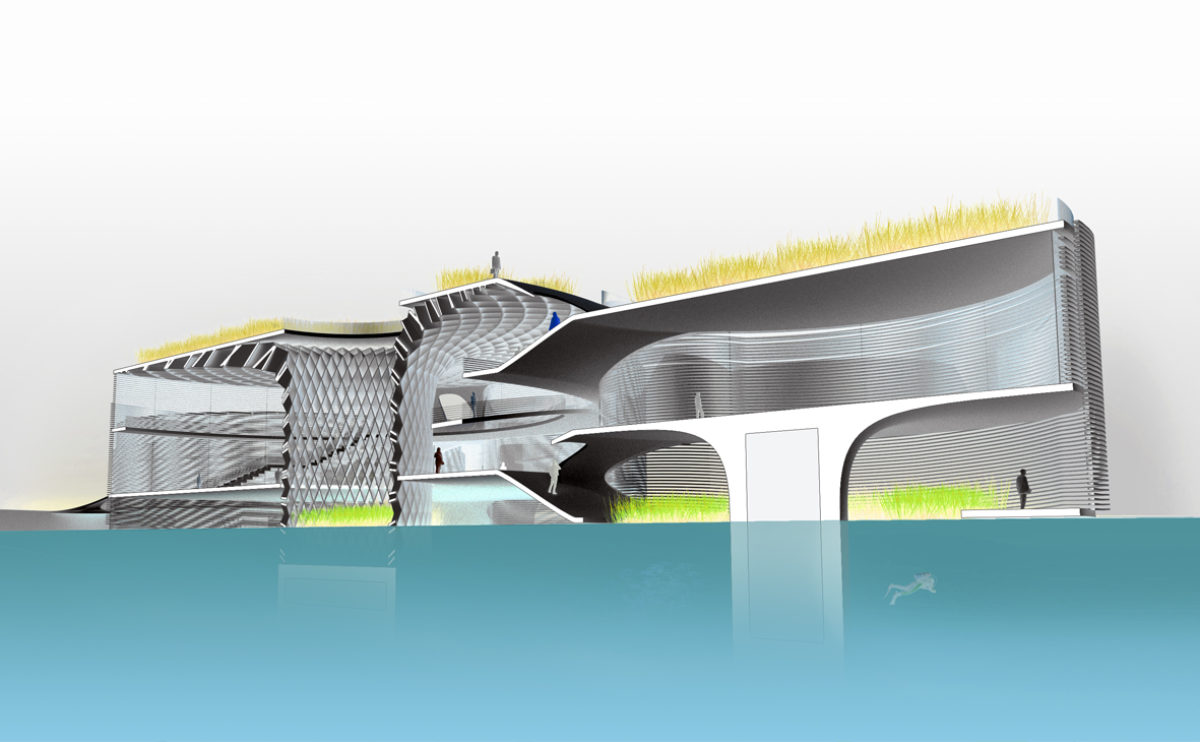
The sections show the changing position of the pavilion faƧade depending on the tide. The skin enveloping this building on stilts floats on the surface of the sea.

Slatina square
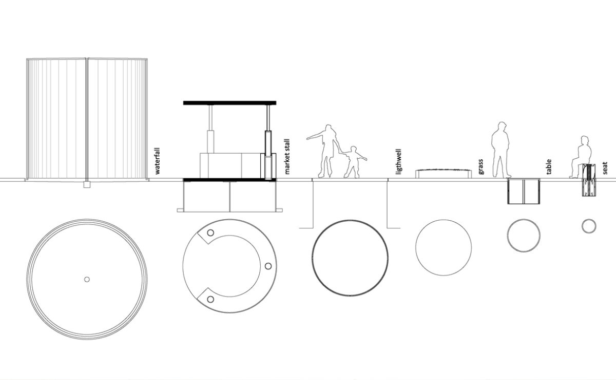
the urban furniture detailing

The street furniture in the square consists of various cylindrical elements. Some of them, such as kiosks, tables and seats, can be hidden under the pavement by means of a hydraulic system, so that the square can be left free for other uses.

Zain tower
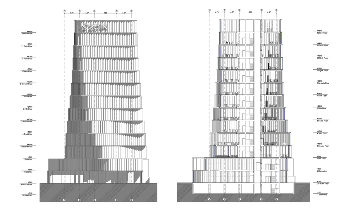
the section and elevation

Due to the rotation of the typical floor of the building, the elevation shows a significant variation in width. The turning movement of the floors does not affect the central core and the vertical structure.

Allison house
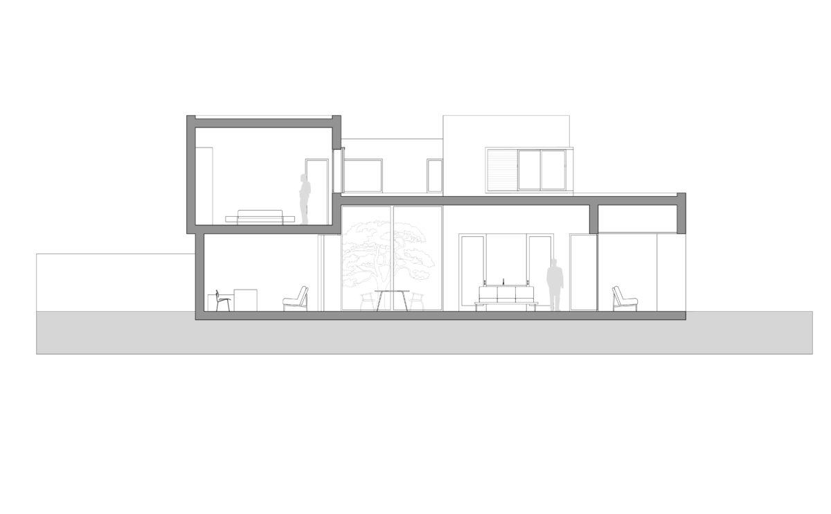
the cross section

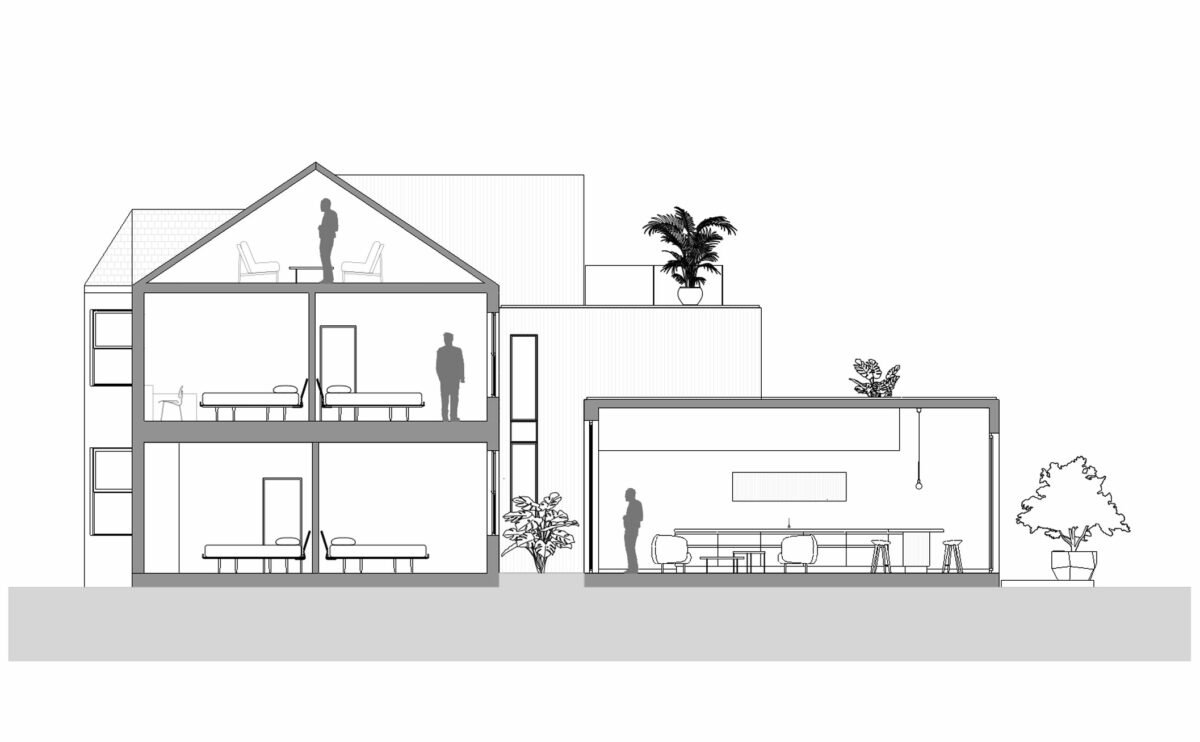
The section shows the transformation of the original house: the extension of the living room and kitchen on the ground floor, the new inner courtyard with greenery, the terraces of the bedrooms overlooking the garden and the loft conversion at the top.

Atienza music hall
the cross section

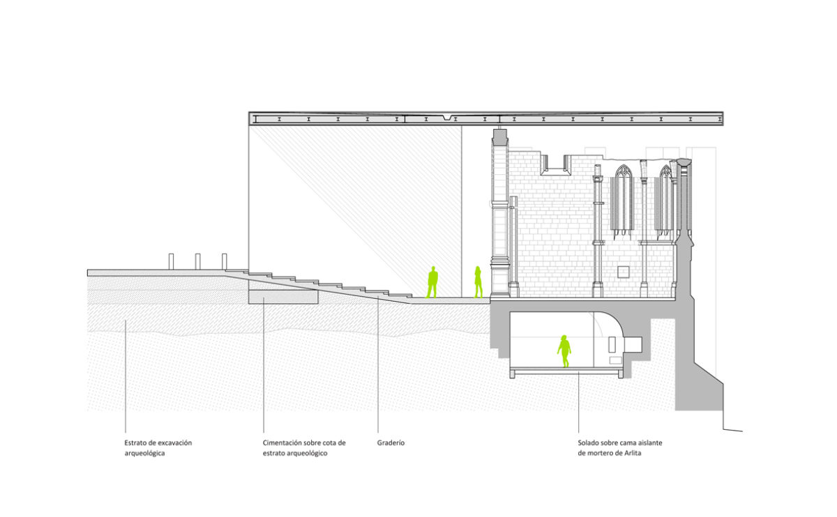
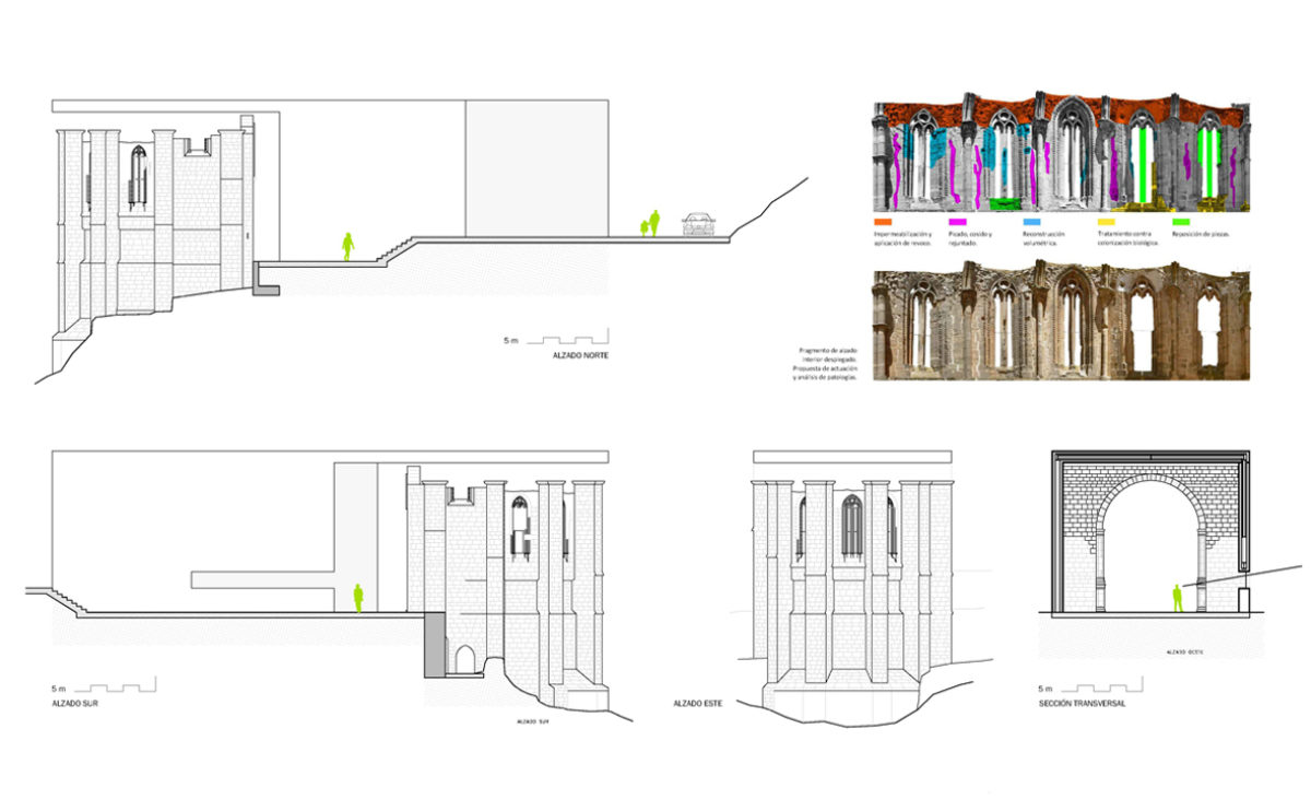
The section of the building shows the relationship between the ruin and the new building. Formal language and materials further differentiate these two styles, combined to provide a new use of the space.

Dehan village
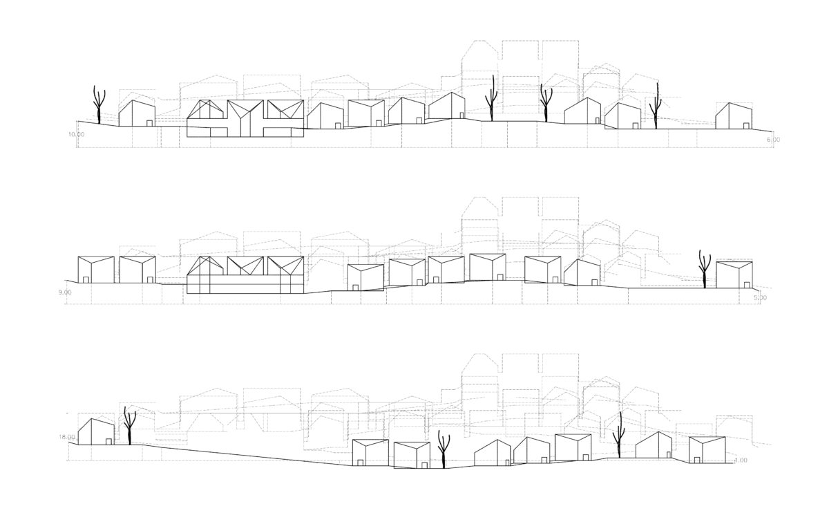
the masterplan sections

The sections of land show the layout of the villas and their relationship with the landscape. Despite the rhythmic and geometric modulation of the masterplan, the result is a dynamic and capricious arrangement that provides a domestic and intimate character to the village.

Dulwich house
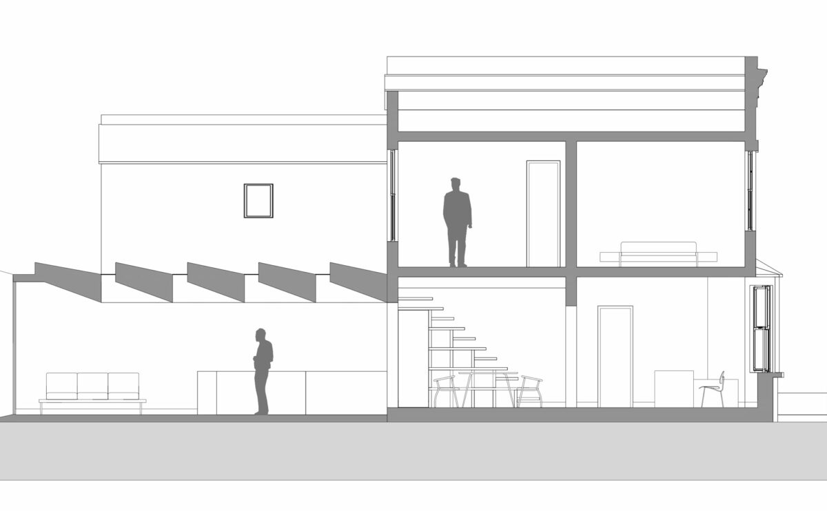
the cross section

The cross-section of the building reveals the relationship between the original Victorian house and the new extension towards the garden, with a series of skylights facing west.

wavescape pavilion
the concept diagram

The building has a garden terrace which is accessed via a spiral ramp. Beneath the secondary pavilions is a floating garden around which the faƧade floats.

house of arts
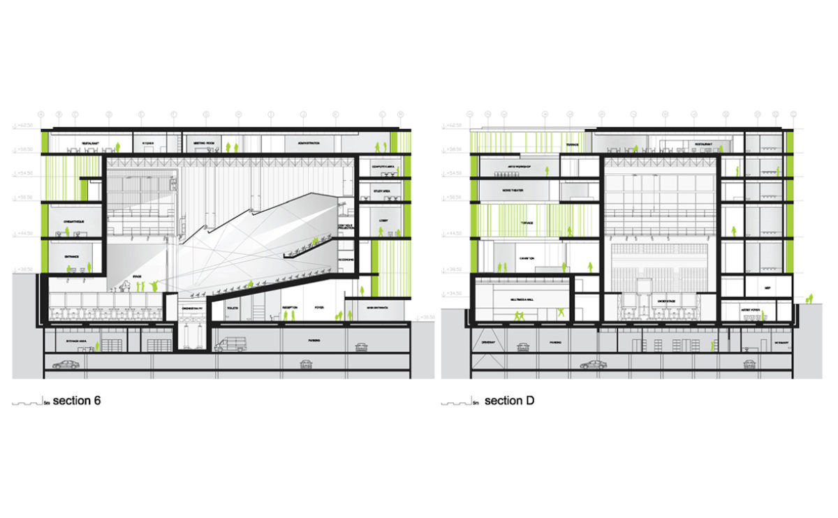
the longitudinal and cross sections

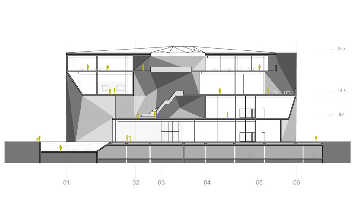
The cross-section drawing of this public building shows the library, exhibition hall and auditorium. This multifunctional hall is situated in the heart of the building, enveloped by a glass louvred faƧade.

hospital in the forest
the cross section

The site of the transplant centre is a sloping plot of land that is urban in character but surrounded by lush vegetation.

Shoreditch hotel
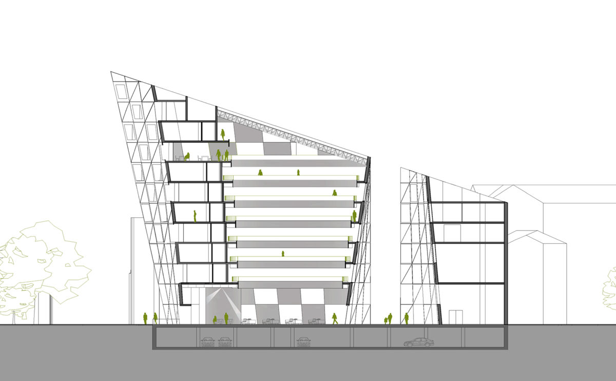
the cross section

The cross-section shows the change in height of the building, which, starting from the level of the structures next to the party wall, rises like the prow of a ship towards the intersection of the streets.

Pedraza house
section

The cross-section shows the different heights of the slab that articulate the relationship between the living room, the courtyard and the upper floor.

wavescape pavilion
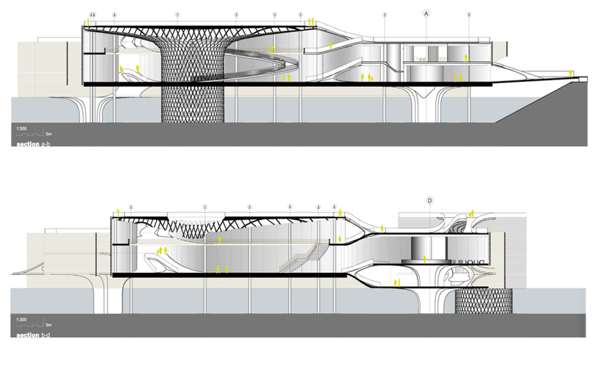
the cross and longitudinal section

The sections show the fungiform roof structure, the floating faƧade and the interior walkways and ramps connecting the interior of the pavilions and the roof.

fragmented house
the section and elevation

The house is distributed over two floors that do not correspond to each other in their entire perimeter. This generates cantilevered bodies in some areas and terraces in others, as shown in the section and elevation of the building.

folded auditorium
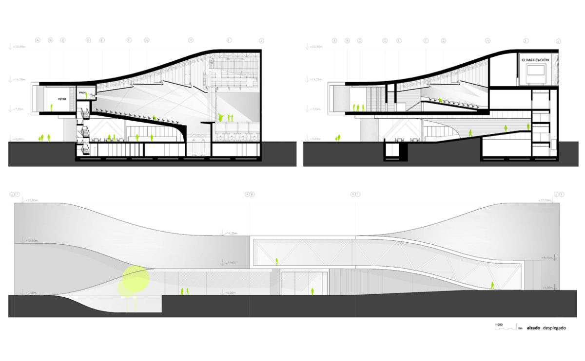
the sections and the unfolded elevation

The auditorium section shows the appearance of the concert hall, the acoustic ceiling, the fly loft, the stage, the stalls and the orchestra pit. All this is wrapped in a corrugated skin of white concrete.

K house
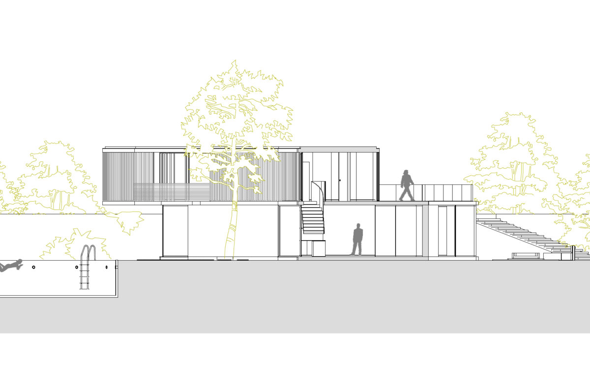
the cross section

The plot has a slight slope. The platform where the house is located is levelled by means of staggered terraces. The infinity pool defines the edge of the landscape.

Dehan village
the villa cross sections

The cross-section of the villas shows the relationship between spaces, connected by double heights. The unique shape of the roof and the openings result in a fluid and diaphanous space.

Atienza music hall
the elevations

The silhouette of the new building contrasts with the steep slope. The steel roof has a protective character, and with a simple gesture brings a new function to the old temple.

Xu Beihong foundation
the cross section

This section of the museum shows the central atrium on the first floor, covered by the skylight, and the various exhibition rooms.

spliced towers
the cross sections

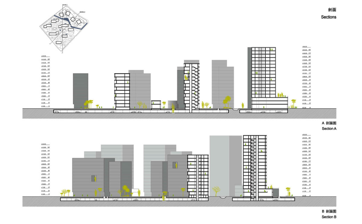
The longitudinal sections of the building complex show the basements, the landscaping and the distance between the office towers and the residential blocks.

cuƱa house
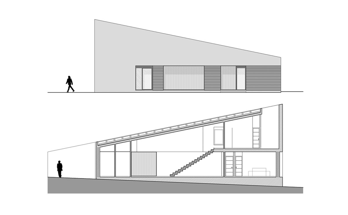
the section and elevation

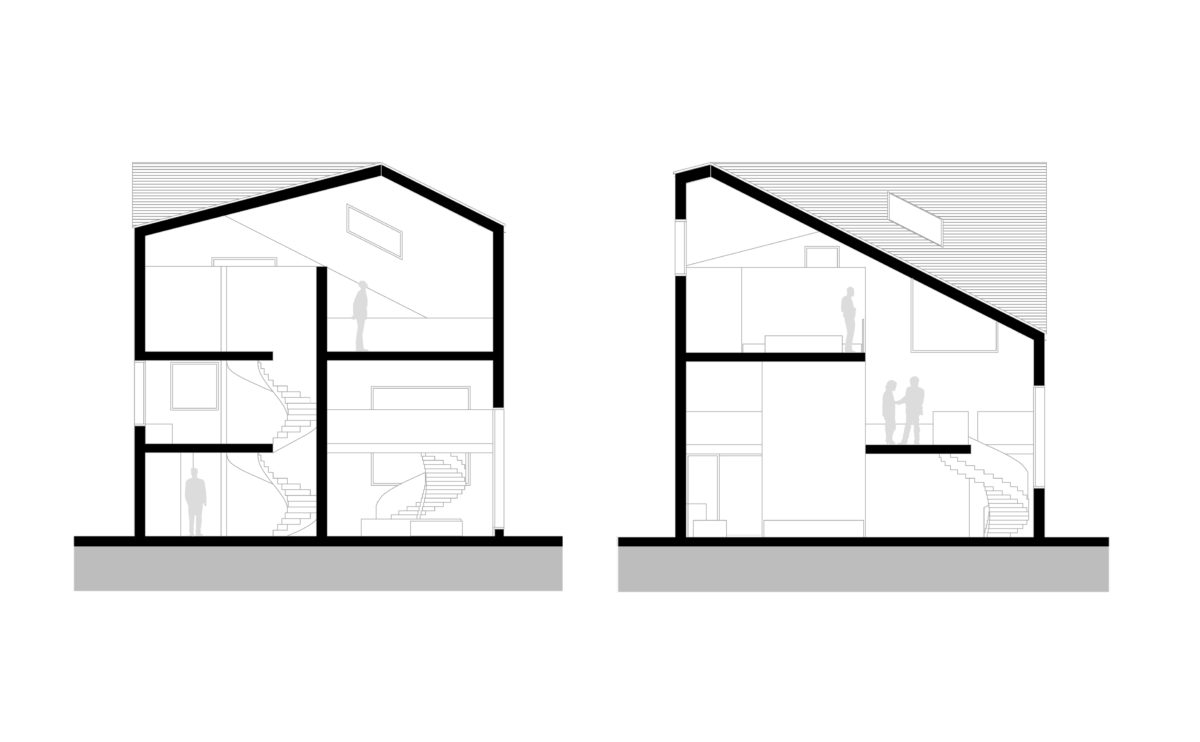
The elevation and section of the house show the simplicity of the volume, a simple wedge-shaped pitched roof allowing for two storeys, double-height space and a courtyard open to the sky.

Slatina square
the cross and longitudinal sections

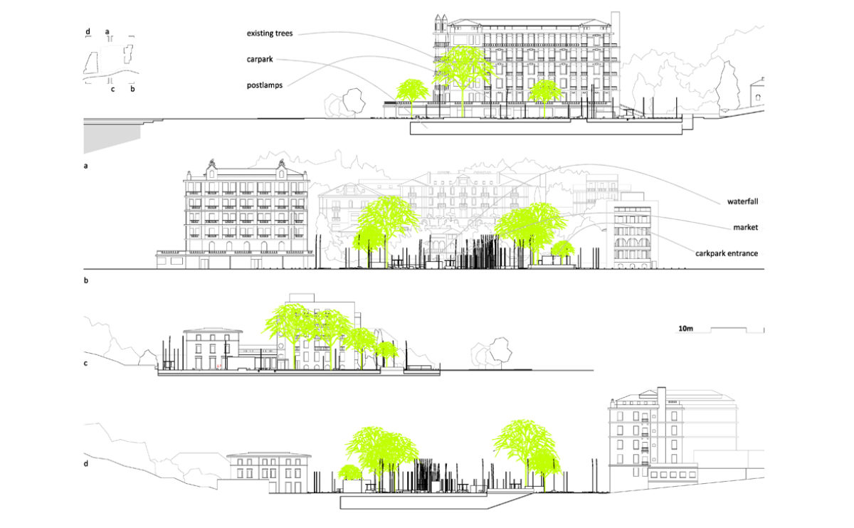
The section of the square shows the relationship between the underground car park and the urban design of the public space. The square, which faces the promenade and is surrounded by old buildings, retains its leafy trees, which are integrated into the design.