market eight
the rear facade
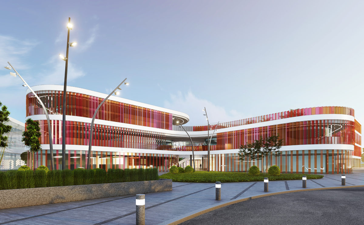
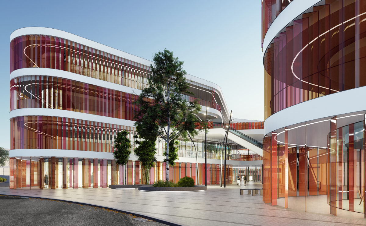
Market Eight is a free-form, undulating building that encloses courtyards between its curves. The façade is a permeable envelope formed by coloured glass louvres. The landscape design surrounding the building continues this organic language.
Shoreditch hotel
the aerial view
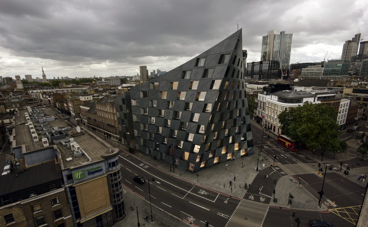
From the aerial view, the urban presence of the hotel can be seen in its context. The dark figure slightly turned towards the intersection and the design of its iconic checkered façade create a symbolic and recognisable image.
market eight
the view from the courtyard
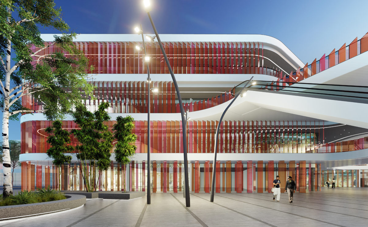
The main entrance to the shopping centre is located in one of the larger courtyards. This public space serves as a plaza for events and visually articulates the different levels of the building.
performing arts complex
the birdview
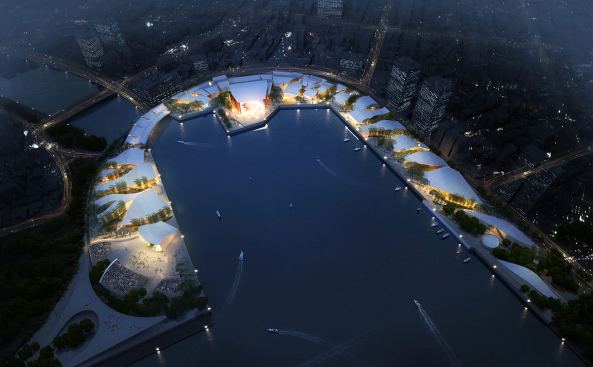
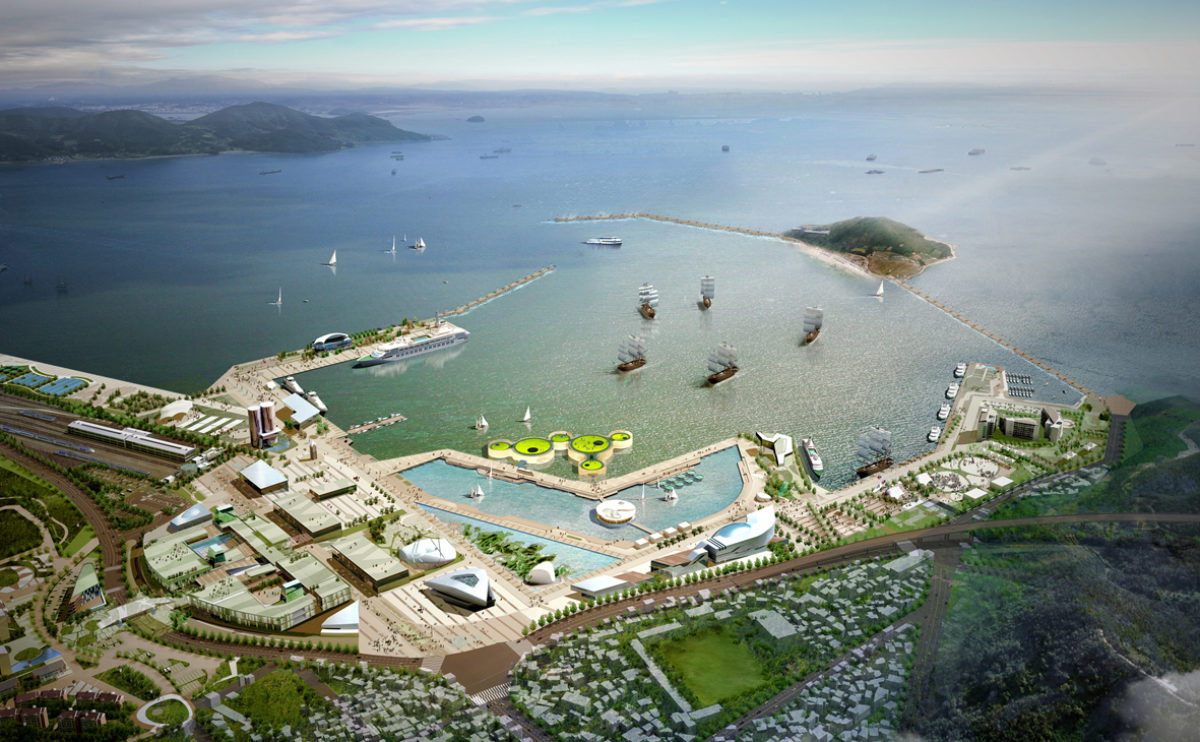
The bird’s eye view of the performing arts complex shows the radial layout of the master plan, with buildings covered with undulating roofs around the marina.
hospital in the forest
the main elevation
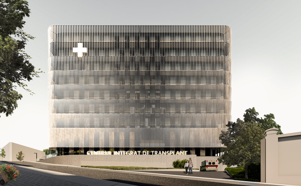
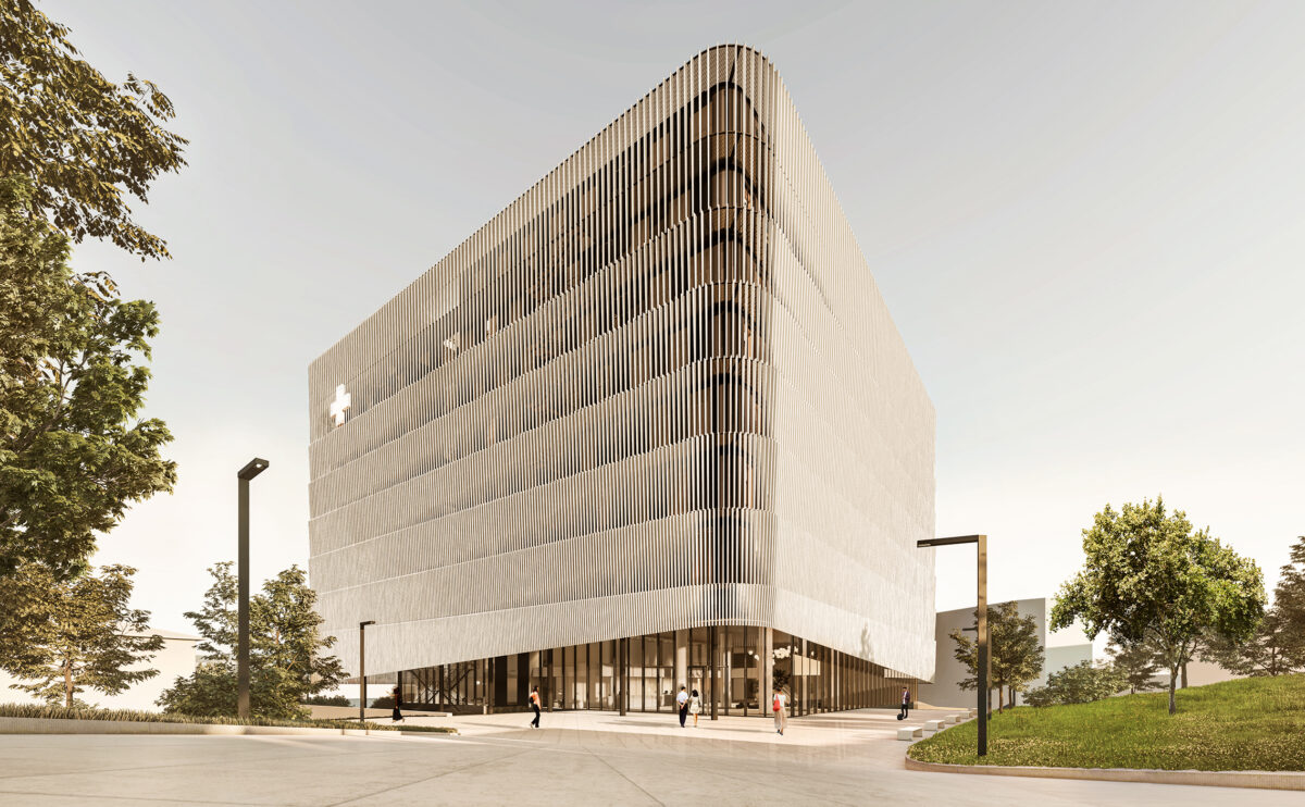
From the main road, the building looks like a floating volume above a podium. The exposed basement provides access to the emergency room while the main lobby can be seen through the transparency of the ground floor.
spliced towers
the landscape design
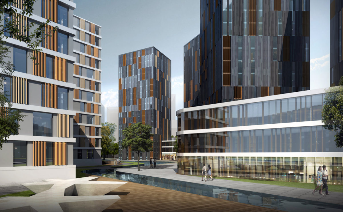
The landscape design combines pedestrian areas, gardens and a man-made stream separating the residential area from the commercial area. A network of streets connects the buildings to facilitate vehicle access.
Slatina square
the physical model
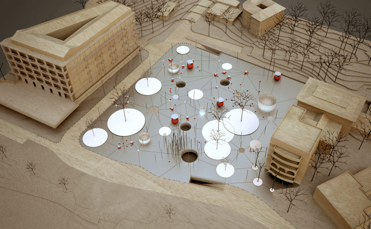
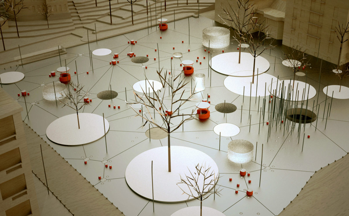
The urban design of this square in front of the promenade is like a pattern of circles of different sizes. The skylights, lampposts, gardens and fountains are linked together like a constellation. The wood and aluminium model also shows the entrances to the underground car park beneath the square.
hospital in the forest
the view from the urban park
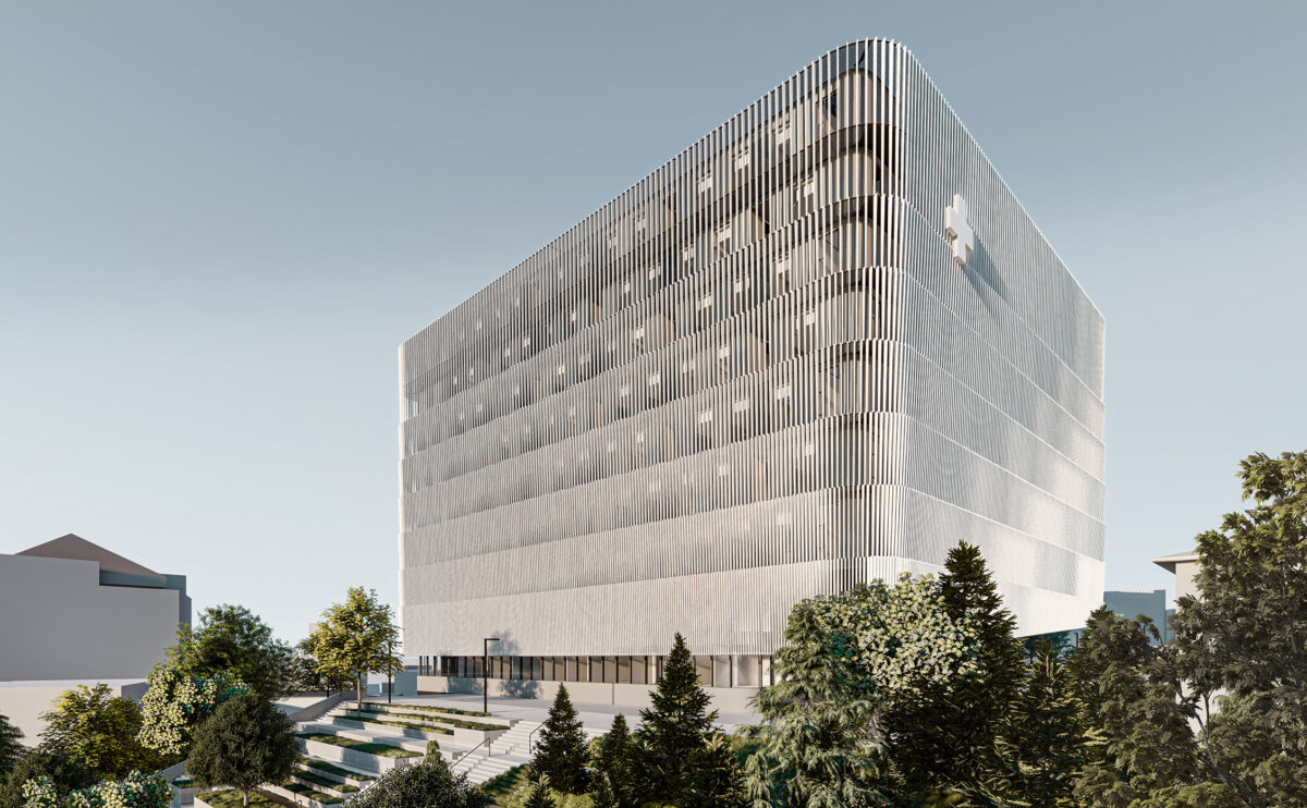
The park connecting the campus and the new transplant centre slopes up towards the south. The landscape provides access through stairs and ramps, so the building is discovered through the forest on the way up to the main plaza.
folded auditorium
the view from the plaza
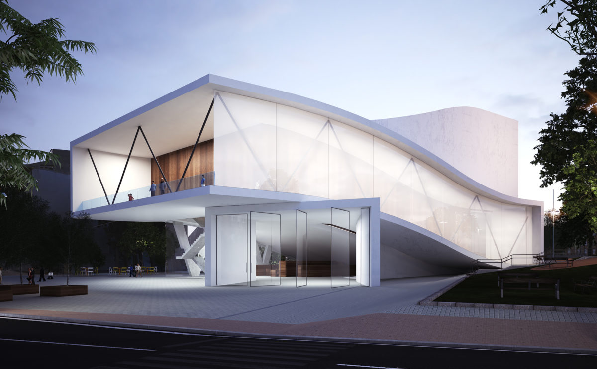
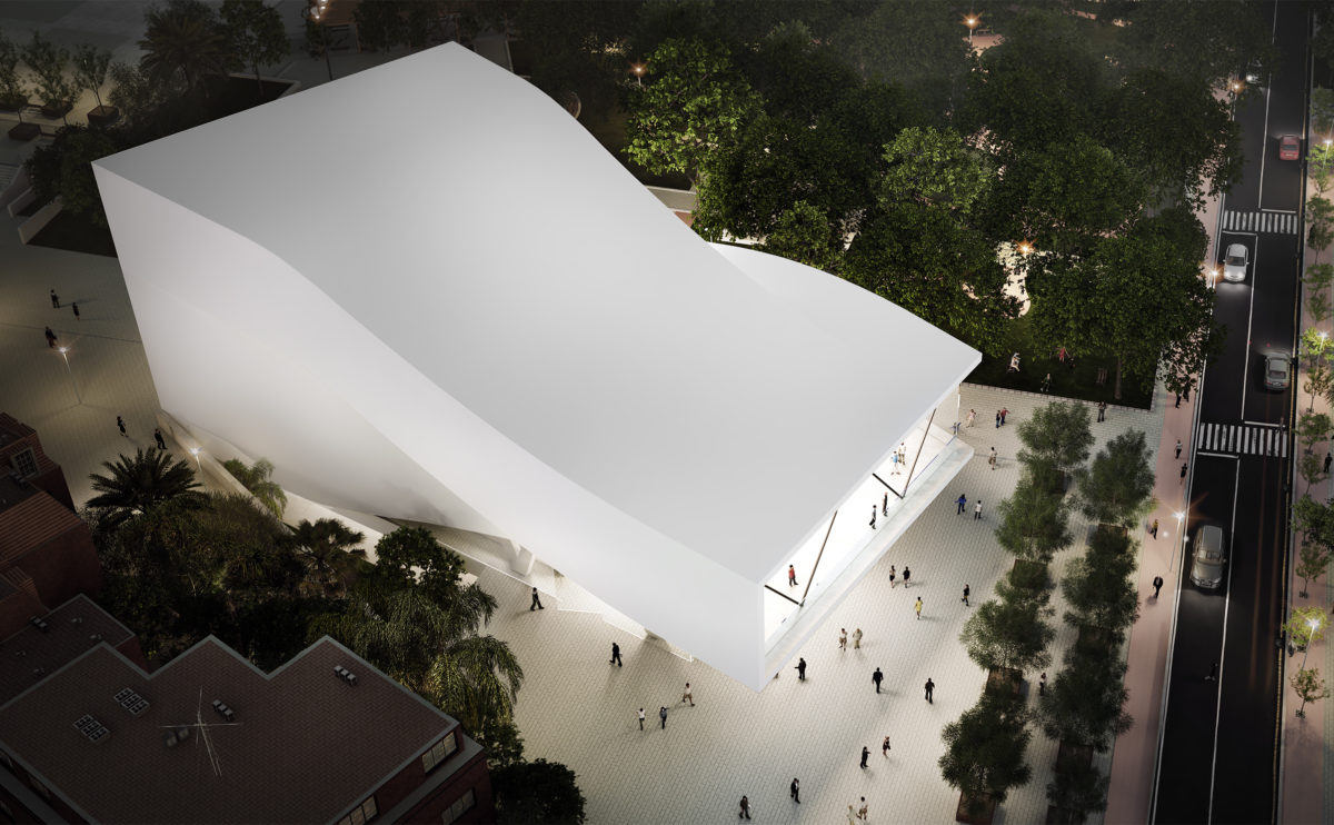
The auditorium has an undulating shape, the white concrete façade forms a balcony over the main entrance facing the square. It is an organic, futuristic design that blends into the vegetation of the urban park.
market eight
the view from the river
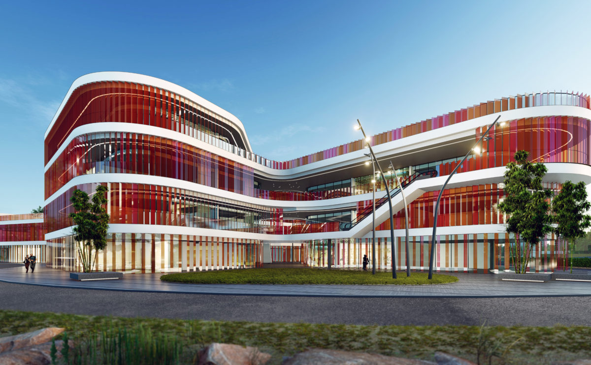
The different levels of the shopping centre stand out as horizontal lines on the colourful façade of the building. The escalators connecting the different floors on the outside contribute to the organic and dynamic image of the building.
elemental complex
the view from the courtyard
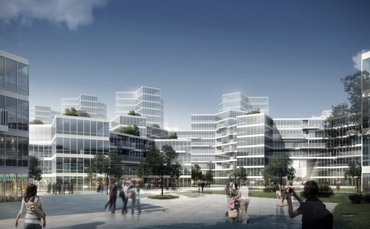
The hexagonal configuration of the residential complex gives rise to pedestrianised public squares with commercial premises on the ground floor.
Shoreditch hotel
the view from Old St
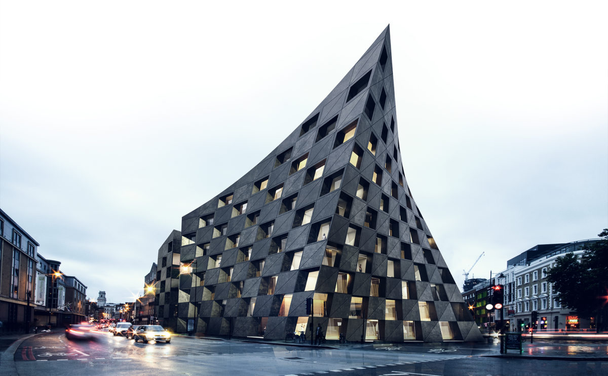
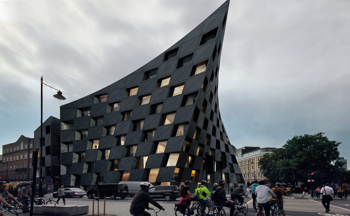
The building is presented as a rotund, stone volume with a chequered pattern of façade openings. This solid, almost tectonic composition is distorted by the deformation of the solid, which turns into a provocative gesture as it reacts to the flow of urban traffic.
Shoreditch hotel
the view from Paul St
At nightfall, the light from the hotel windows underlines the chequered pattern of the black concrete façade, creating an easily recognisable icon that serves as an urban landmark for the restaurant and shopping area.
ramp up the 'mun
the view from the plaza
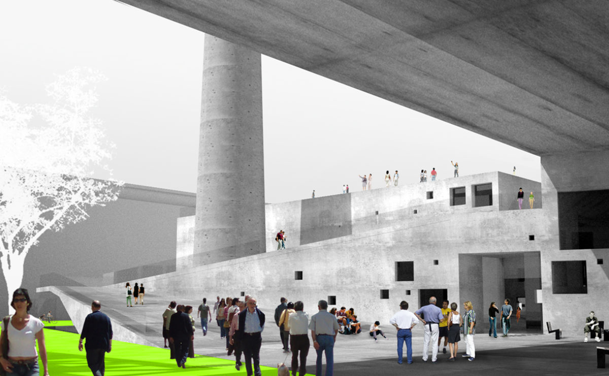
The structure of the old boiler house is extended by an apartment building to enclose a public square with a ramp leading up around the chimney to the roof.
Shoreditch hotel
the view from Pitfield St
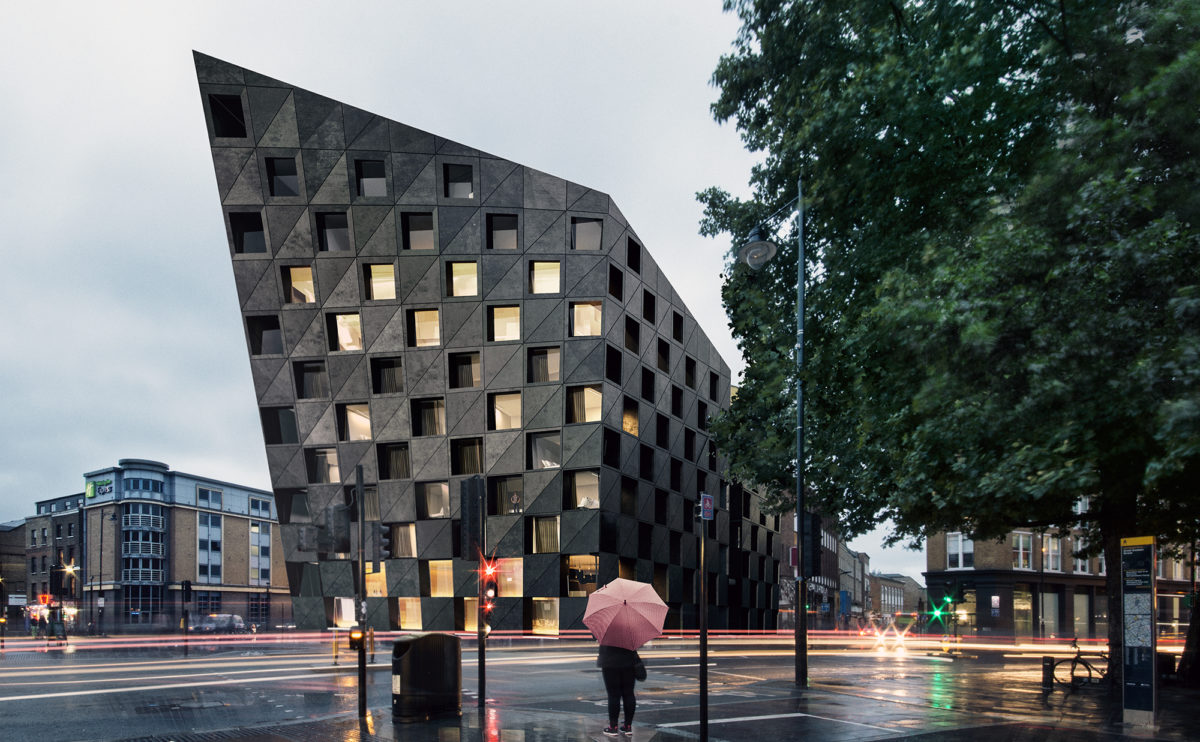
The curved shape of the façade responds to the flow of pedestrians and bicycles crossing the intersection between the two main streets. The building opens up like a giant curtain to allow passage with a welcoming gesture.
Slatina square
the cross and longitudinal sections
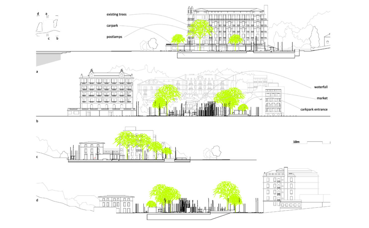
The section of the square shows the relationship between the underground car park and the urban design of the public space. The square, which faces the promenade and is surrounded by old buildings, retains its leafy trees, which are integrated into the design.
Slatina square
the furniture detailed view
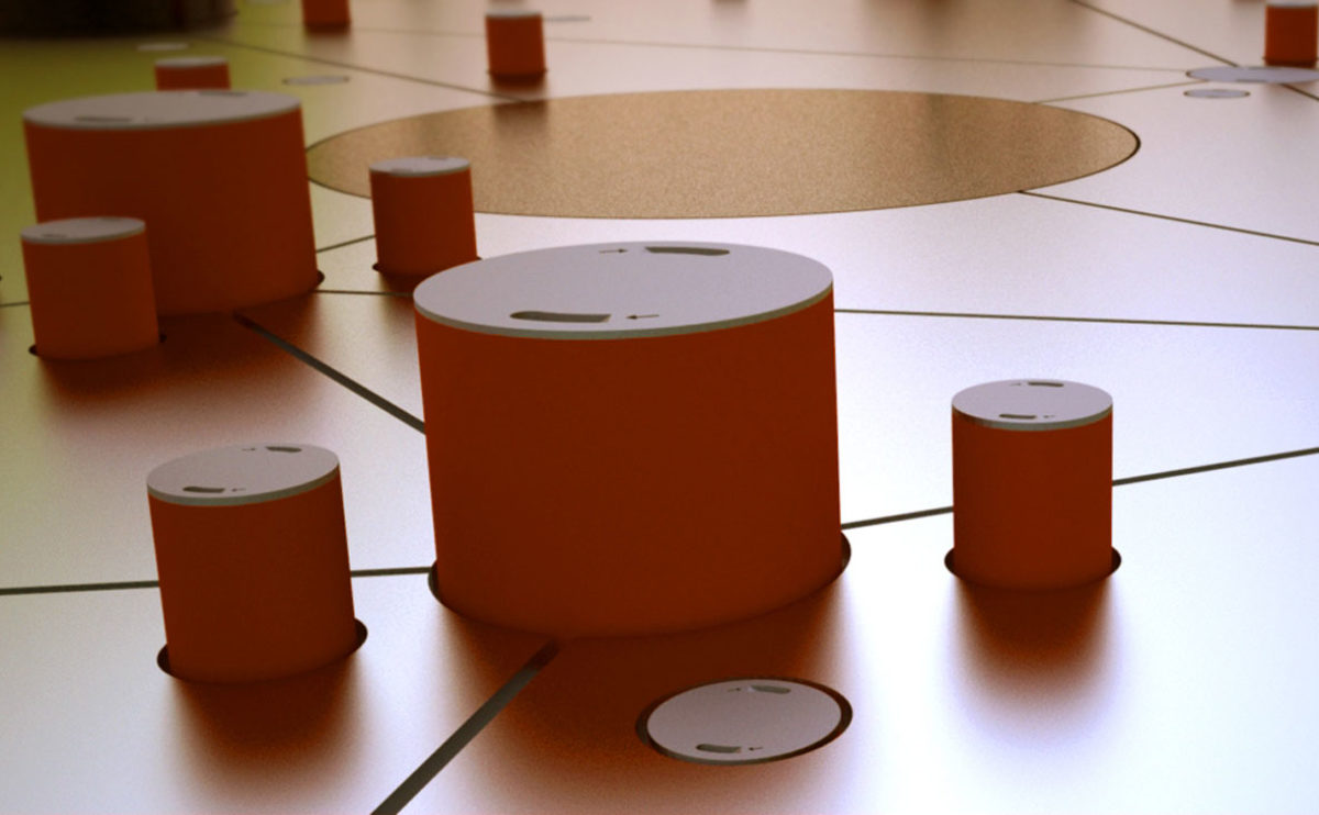
The proposal for the urban design of this square proposes an ingenious and experimental system for temporarily removing street furniture when necessary. The tables and chairs are hidden under the pavement by means of a hydraulic system.
hospital in the forest
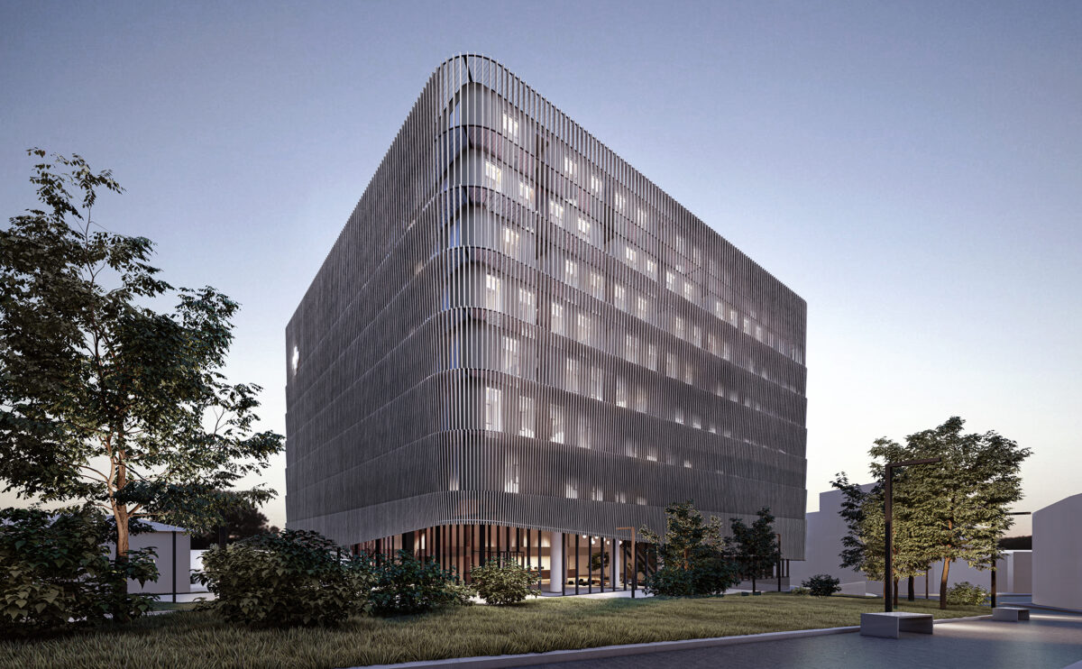
the night view
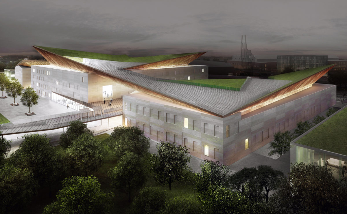
The sober form of the building is wrapped in translucent louvred skin. This permeable layer allows seeing the inner facade, made of large openings and courtyards with greenery.
hospital in the forest
the view from the plaza
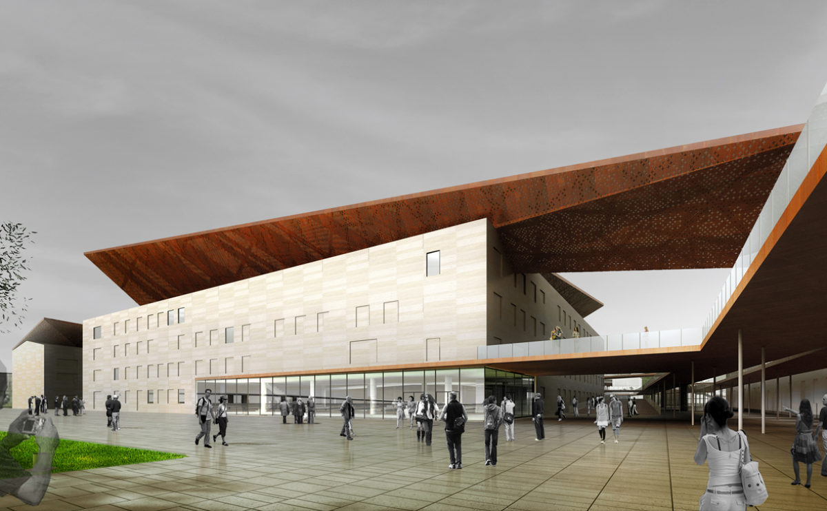
The comprehensive transplantation centre is a building that, despite its powerful form, has a friendly appearance thanks to its wooden louvred façade. This double envelope protects and unifies it, allowing a highly functional interior space planning.
Slatina square
the physical model detailed view
The urban design of Slatina Square features a series of circular elements that function as water features, gardens, kiosks or street furniture. The result is a fun and informal design that allows for multiple uses of public space.
Xu Beihong foundation
the main facade
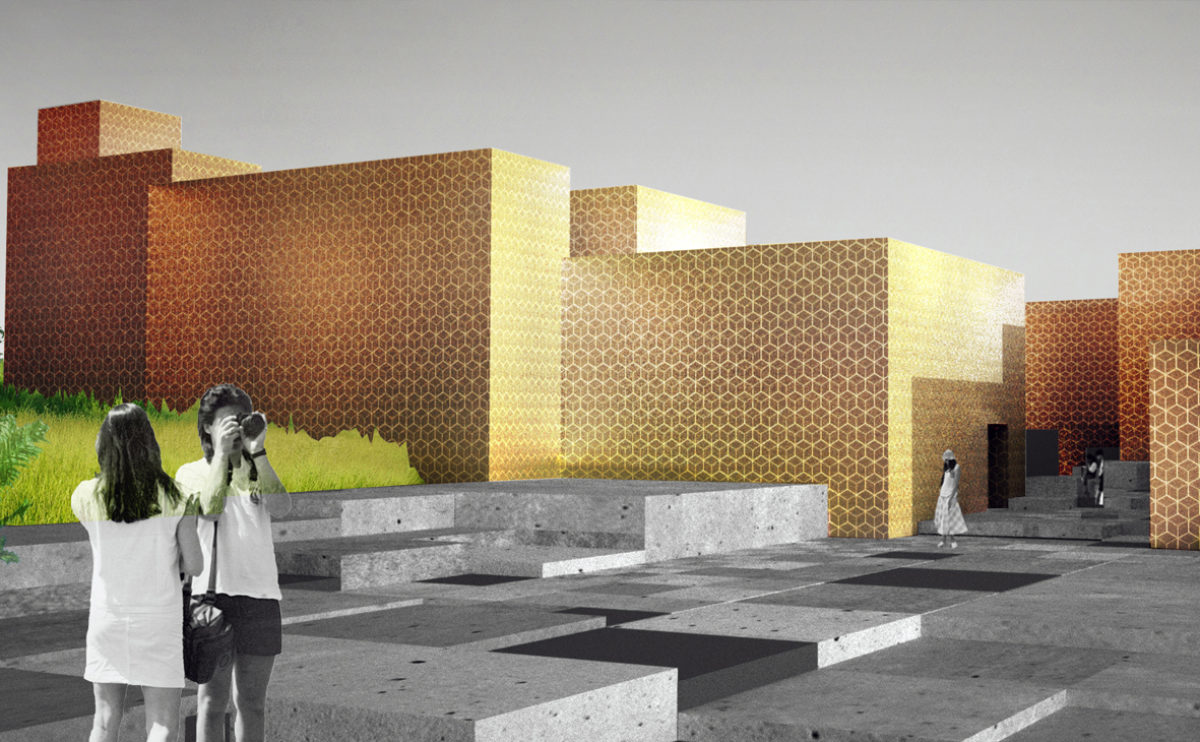
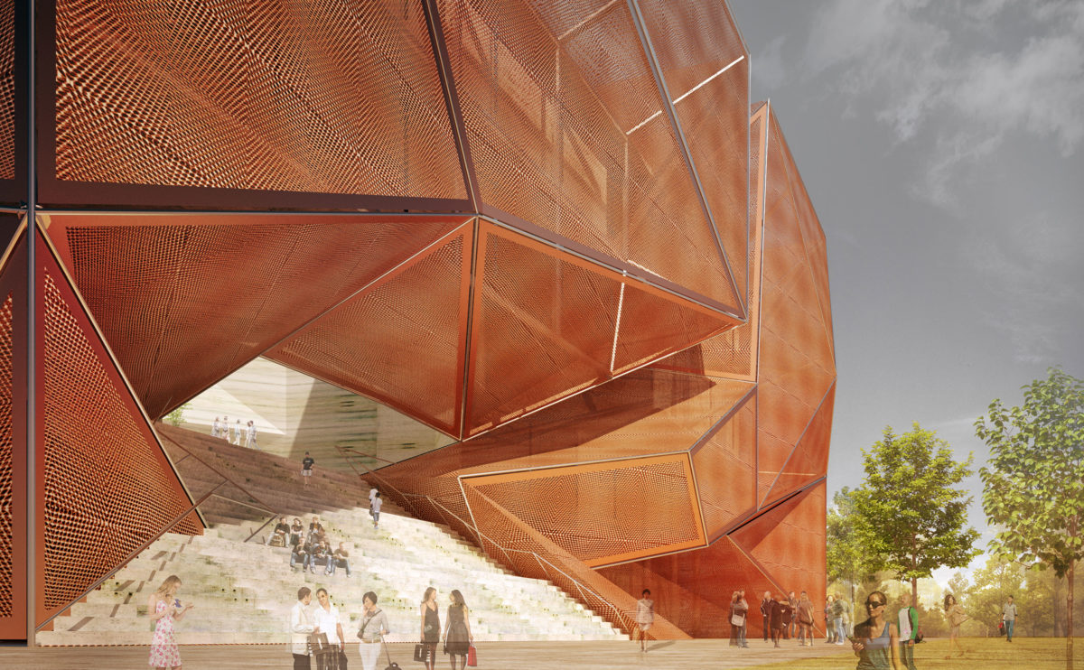
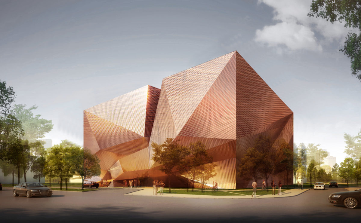
The façade of the building consists of a double metal mesh envelope with angular shapes. The access is located on the first floor, through a grandstand that connects the street with the inner courtyard.
folded auditorium
the bird view
A bird’s eye view shows the sinuous shape of the auditorium roof. This white concrete building has a folded shape that contrasts with the vegetation of the urban park.
Xu Beihong foundation
the exterior view
The museum is located in an urban park with abundant vegetation. The form of the building is simple, a sober box, wrapped in a semi-transparent façade of angular shapes in shiny metal.
Atienza music hall
the site plan
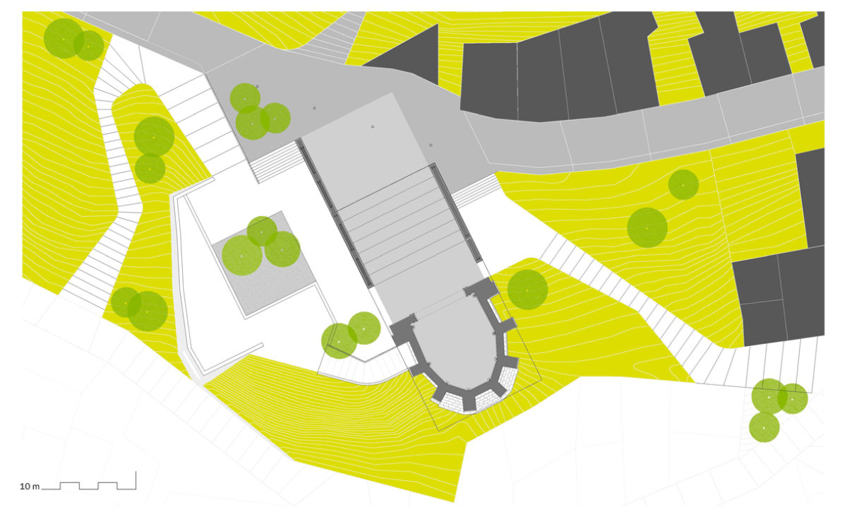
The intervention integrates the building into its surroundings through comprehensive landscape design. The new access ramps, the trees and the gardens help to enhance the monument in context.
market eight
the main entrance
The image of the mall at night is dynamic, colourful and vibrant. The pink glass louvres are oriented in opposite directions on each floor, creating an interesting glare and reflection effect.
wavescape pavilion
the birdview
The pavilion occupies a central position in the bay in front of the thematic exhibition site. From the pavilion’s terrace, you can see the marina, the quay and the breakwater.
Slatina square
the birdview
The bird’s eye view of the square shows the street lighting system, consisting of flexible illuminated poles that move in the wind to create a dynamic effect. The spatial organisation of the square is based on circular shapes.
Atienza music hall
the architectural model
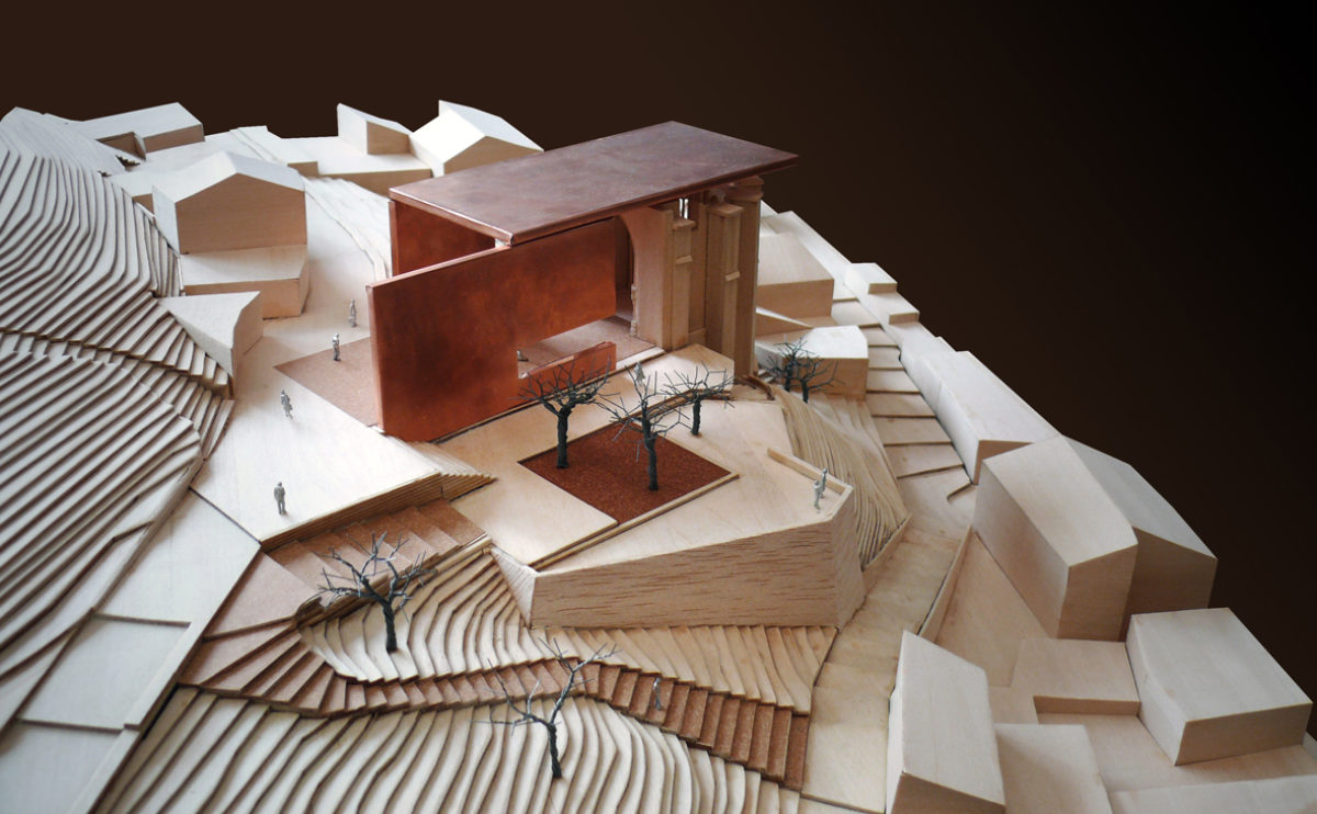
This three-dimensional representation, made of wood and copper, allows us to observe the project as a whole, and to understand how the accesses and levels are resolved in the steep terrain where the church is located.
Atienza music hall
the building and the landscape
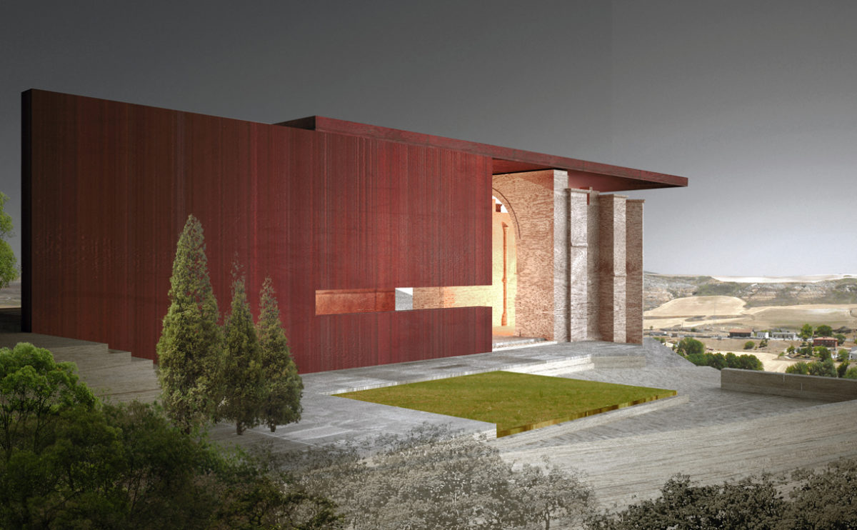
The intervention on the ruin is shown as a sculptural element with a protective character. Its form, with a definite contemporary language, responds to the distant landscape while intends to become a landmark.
Pengshui city planning
The pedestrian mobility diagram
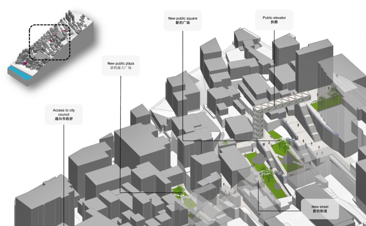
Green areas, stairs, ramps and lifts for public use are proposed to overcome the slope of the terrain in the steeper areas of the city.
