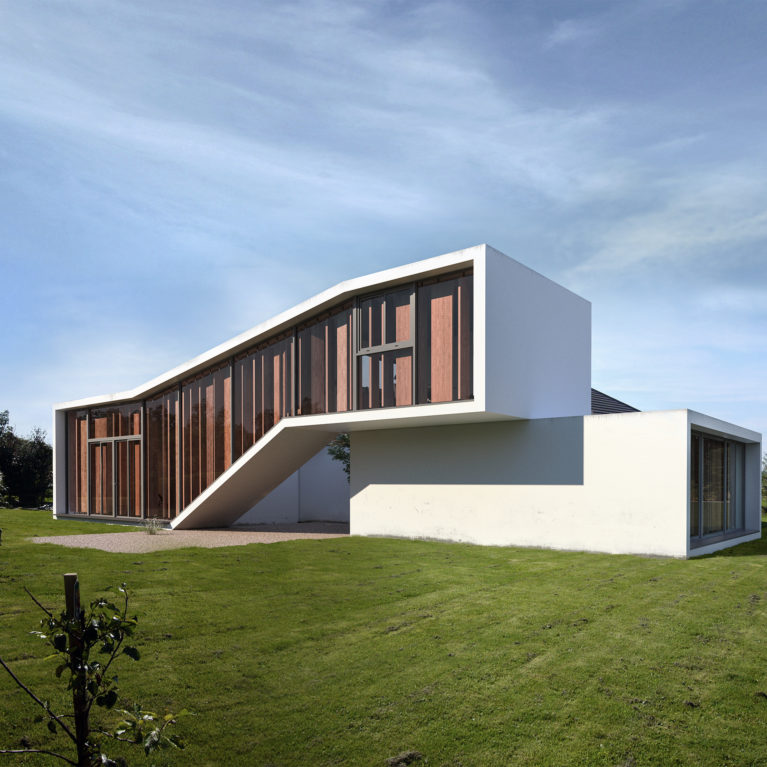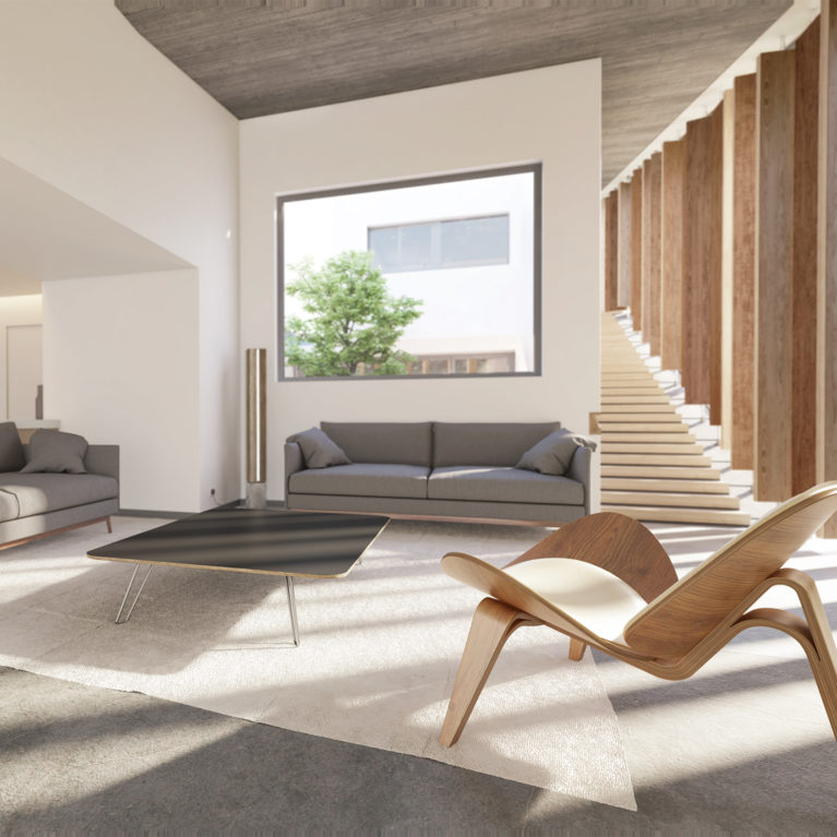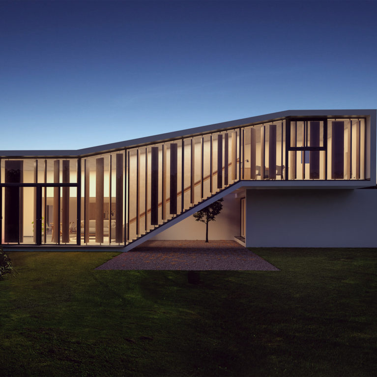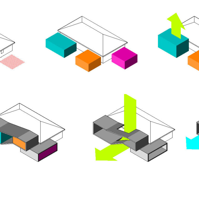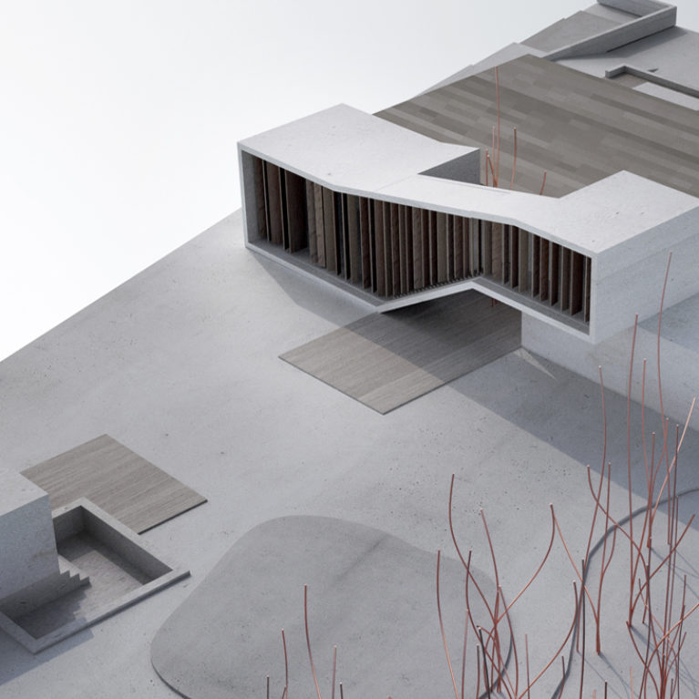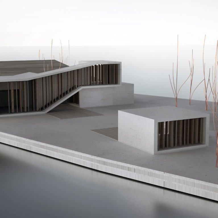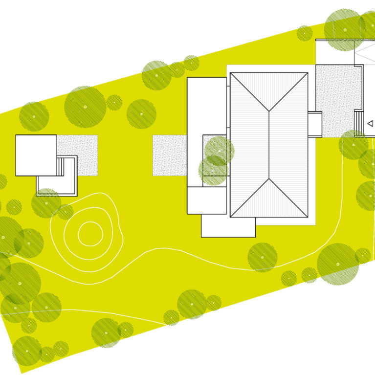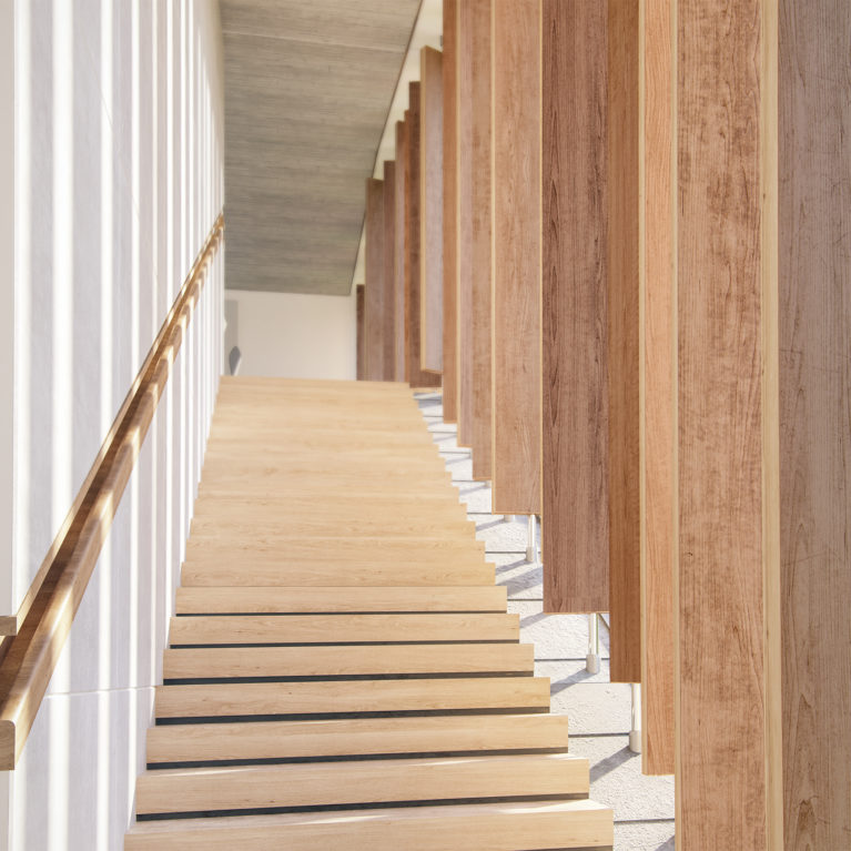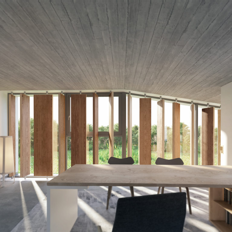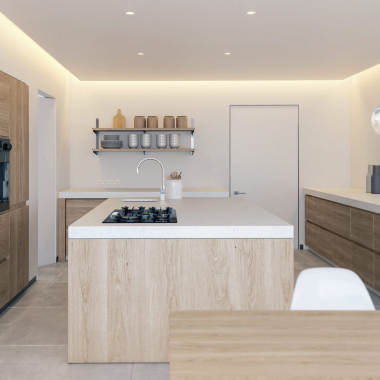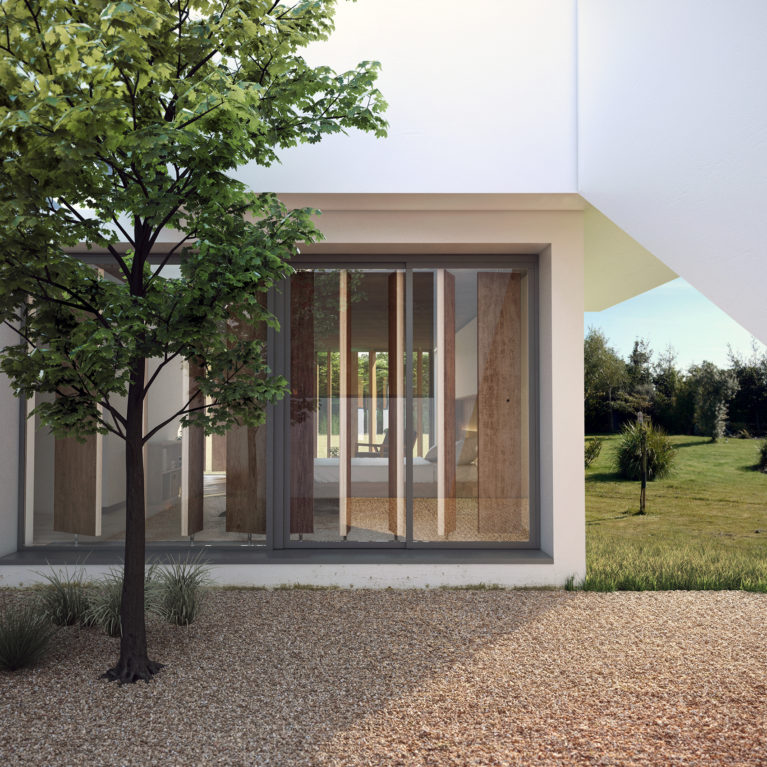
The design of the building is contextually grounded to allow maximum natural light inside. The lower floor has aluminium sliding doors on one side with double glazed glass and a sturdy aluminium frame around the edges. Movable rotating louvres not only enhance the aesthetic appeal but also serve a functional purpose, controlling the light and privacy of the interior space.
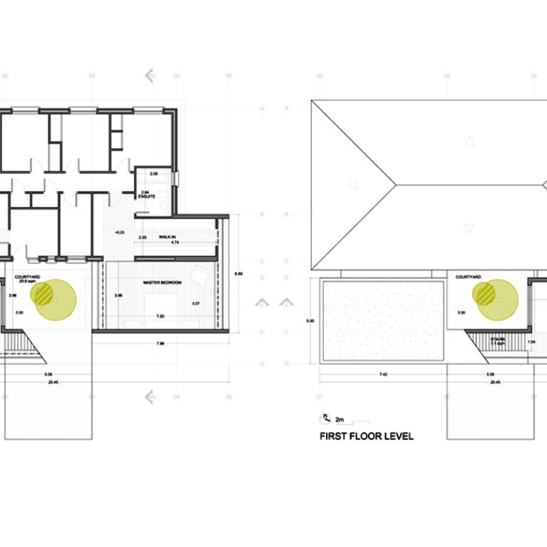
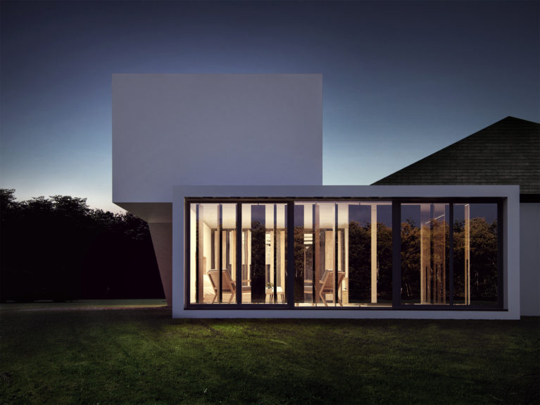
A cantilevered slab provides support and access to the upper floor, which features an office that rests on top of the bedroom structure. Following a similar design, the office walls also feature full-height louvres, double glazed glass to keep the place adequately illuminated. Minimalistic curtains can be drawn for more privacy. The flat roof of the extension contrasts with the four-way roof of the existing building, introducing a simple and contemporary language.
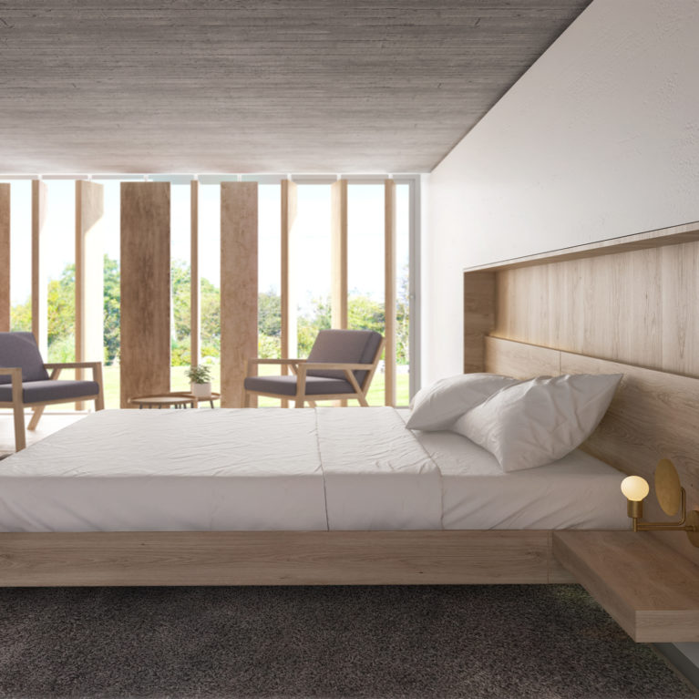
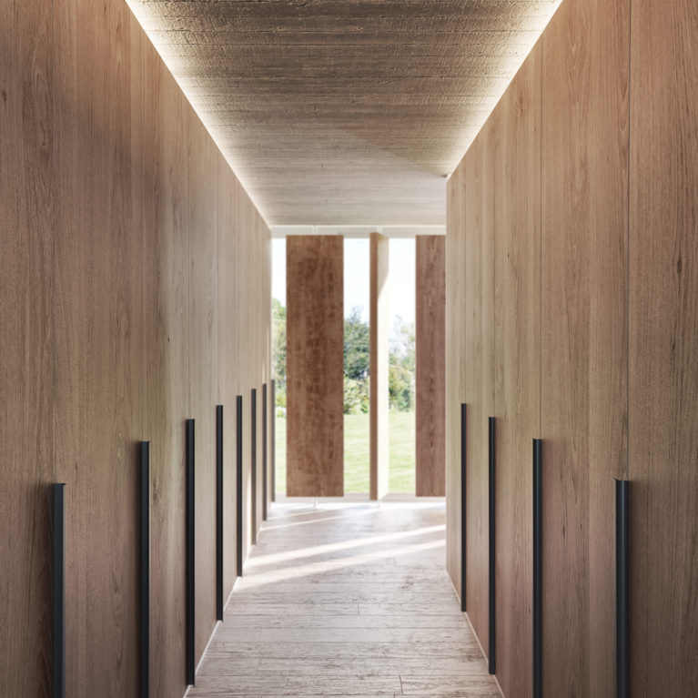
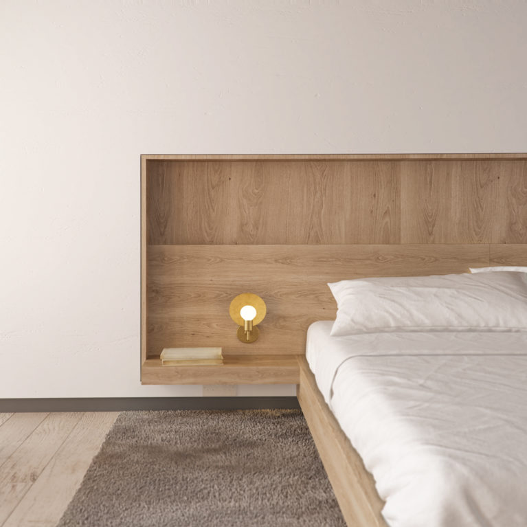
The master bedroom is neatly furnished and features a walk-in wardrobe to one side. The arrangement serves as a creative solution to otherwise simplistic exterior design. The new design contrasts sharply with the old building, but the two merge perfectly to create a spacious, yet highly acquainted area. The white rendered façade contrasts with the black windows and the different tones and textures of the oak slats.
