Circulation in public buildings is a critical factor to consider in the design process. Flow becomes the emblem of the building's concept and even shapes its form. In simplistic terms, it is how people move and interact with space.
Architecture and social behaviour have a direct and interdependent relationship. Social behaviour shapes architecture, just as much as architecture can influence social behaviour.
We believe that circulation is one of the creative interpretation of a building’s functionality.
We start our design process with the schematic design phase. During this preliminary stage, we conduct different observational studies and forecasts for the analysis of the circulation. First, we identify the client’s needs from a macro perspective and translate them into spaces. These spaces will be grouped according to their similar programs and functions.
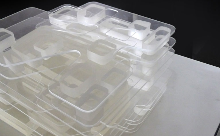
Once these are categorised, we draw bubble diagrams to study the relationships between the spaces. We break down the programs and move from macro to micro scale.
From there, we determine how we can allocate the spaces and connect the private and public areas. We blend them seamlessly in different ways until we can create an efficient circulation, merging the building’s function and form together.
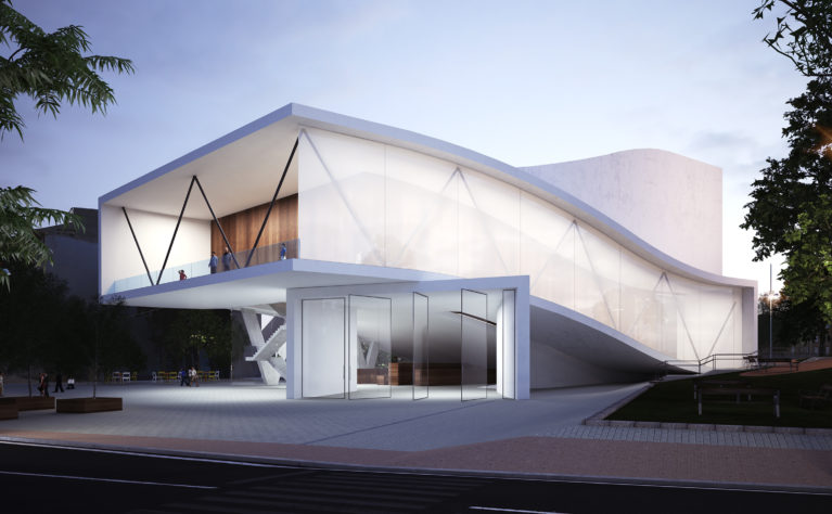
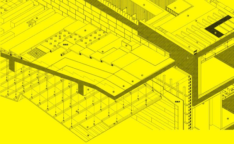
Our project, Folded Auditorium, perfectly exemplifies the function of circulation in a building. In this performing arts centre at Alhama de Murcia, efficient design is achieved through a clear delineation between the flow of the public, technicians and workers.
The southern side houses the stage of the auditorium. This area is strictly intended for the circulation of the technicians to keep the machinery hidden in plain sight. Its wide loading area at the rear of the plot also makes it unobtrusive for other circulation lanes. The southern side, which mainly serves as the back of the house, provides direct access for the actors and workers.
On the northern side, the Folded Auditorium faces the hustle and bustle of the public plaza, streets and gardens. Serving as the front of the house, the vestibule at the ground floor welcomes the public and leads to the entrance of the auditorium. The segregated spaces are united through natural cues of transition like the visual perception of ramps and fluctuating ceiling heights.
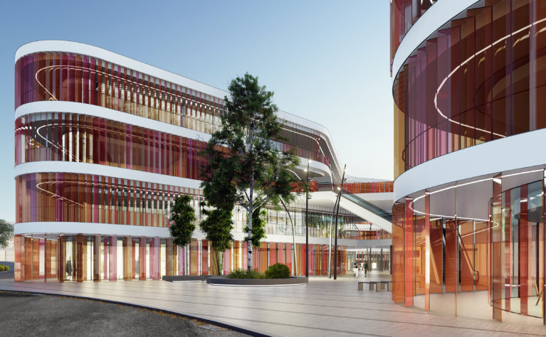
Market Eight, a commercial centre in Lianyungang, takes on another form of circulation. The five blocks are interconnected through a subtle eight-shaped distribution. The varying heights of the promenades offer a diagonal view, while escalators connect the vertical flow.
This internal mobility serves as an unconscious marketing strategy for the customers to walk long, uninterrupted distances. More prolonged exposure and navigation equates to higher chances of profits for the commercial centre. The intrinsic nature of a project dictates the right form of connection.
Circulation is an essential criterion of the building’s functionality and value, and we perform this analysis at its finest.
